Ten bright and bold interiors that make use of colour therapy
Ten bright and bold interiors that make use of colour therapy
Share
For our latest lookbook, we’ve chosen 10 projects that use colour not just with abandon, but with a clever understanding of colour therapy.
Also known as chromotherapy, colour therapy is based on the idea that colour can cause subtle changes in our moods and biology.
Colour therapy has a long history with records suggesting it was practiced in ancient Egypt, Greece, China and India.
And while there are plenty of people out there who think it’s pseudoscience, there is no denying that these interiors will bring a little brightness to your Monday morning!
Dreamweaver by YSG
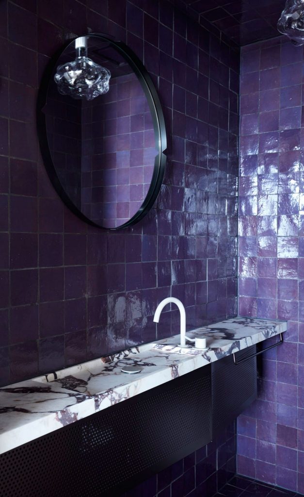
2001: A Space Odyssey-meets-Mies van der Rohe’s-Barcelona-Pavilion is how YSG describes the bathrooms of its latest apartment – a luxury Sydney penthouse overlooking the harbour.
Here, a Calacatta Viola marble sink and counter is paired with glossy violet tiles in shades that are thought to soothe, calm emotions and restore balance. Some even say purple aids creative intuition and clairvoyance. Mirror, mirror on the wall, anyone?
Concrete Blonde by Carter Williamson
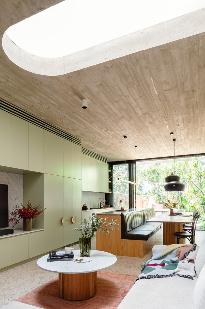
The integrated long dark green leather banquette schisms the kitchen space in this Sydney home, which features custom joinery by Crafty Kabinets in a lighter hue.
Colour therapy aficionados know that green inspires peace and emotional calm and is even said to have antibacterial effects, making it a clever choice for a kitchen.
Read more about Concrete Blonde.
Sydney Tower redesign by loopcreative
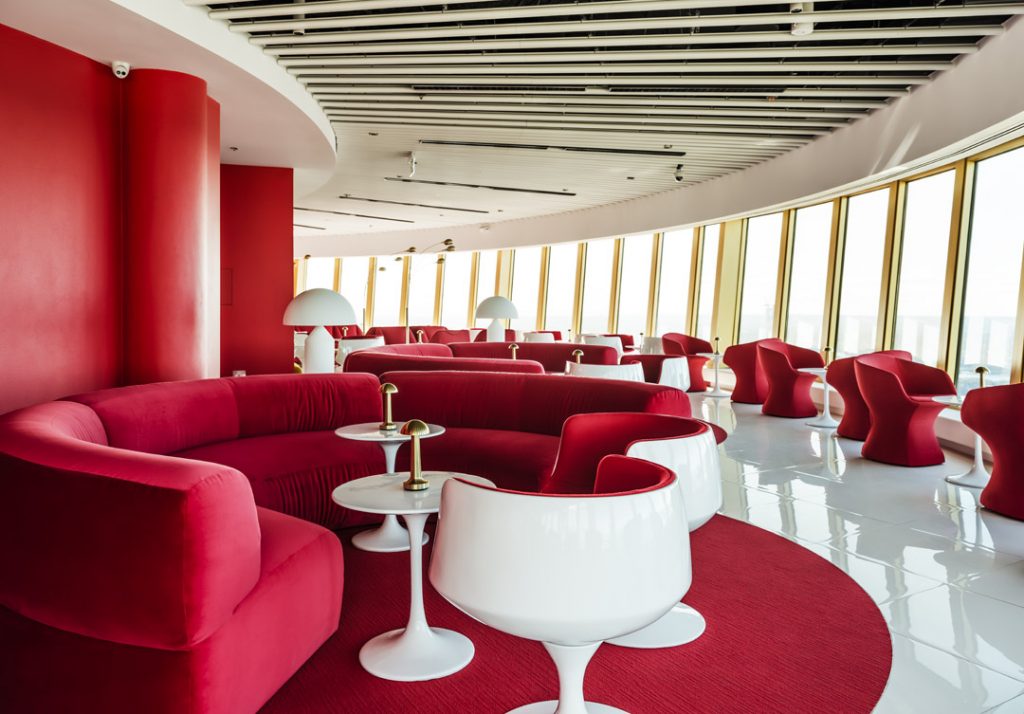
Another nod to 2001: A Space Odyssey, this time in the multi-million dollar refurbishment of one of Sydney’s most iconic destinations.
The hyper-saturated red hues and luxe gold details of Bar 83 speak of the “glorious, hedonistic excess” of the 1960s and ’70s. Red is also thought to bring about a sense of energy, strength and self-confidence, which are all nice things to have with a drink in hand.
Read more about the Sydney Tower redesign.
Private Residence by Richards Stanisich
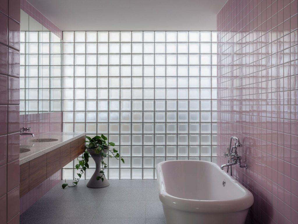
Pops of baby pink abound in this mid-century-inspired Sydney family home, which also happens to be the IDEA 2020 Overall Winner.
The colour was chosen by Richards Stanisich in an effort to bring joy to its residents. Pink is thought to lift spirits and encourage happiness. It also, according to some colour therapists, is said to restore youth, which might be why it features so perfectly in this bathroom?
Read more about Private Residence.
Ban Ban by Genesin and Peculiar Familia
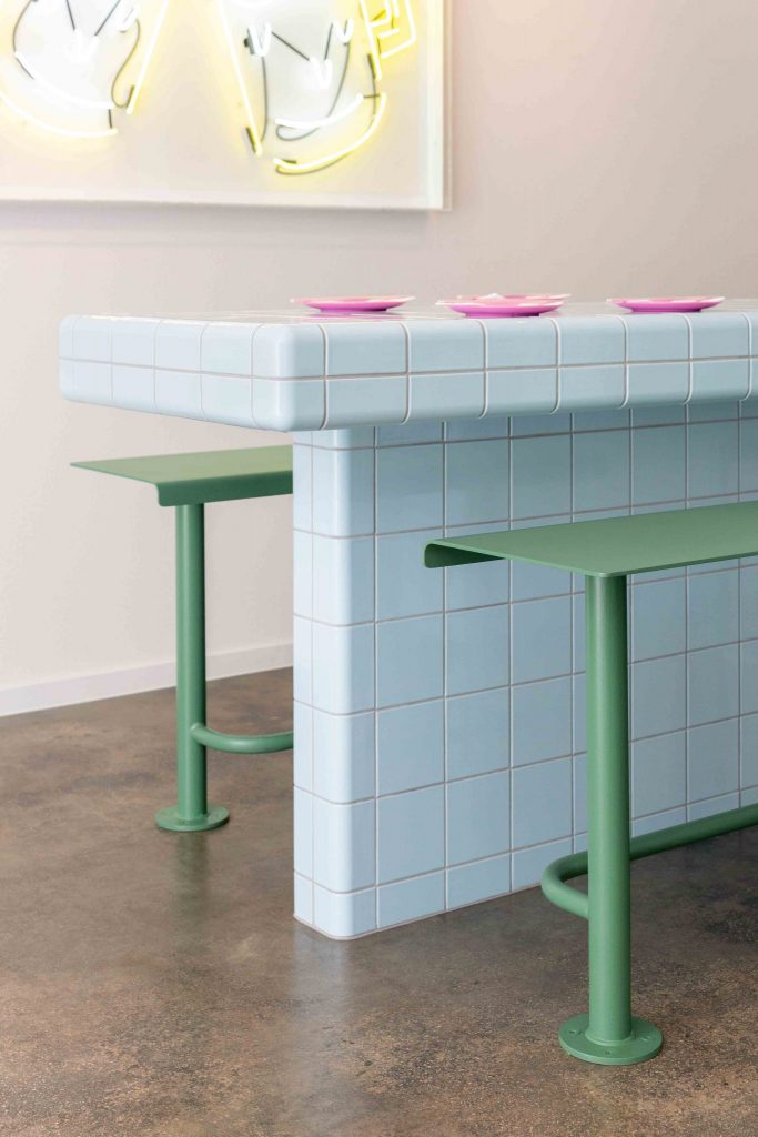
More pastels, this time Genesin Studio and Peculiar Familia’s Ban Ban, which just happened to be Adelaide’s first Korean fried chicken restaurant when it opened in 2018.
The baby blue tiles serve as a calming base for the soft green stools, electric pink plates and vibrant neon art designed by Japanese illustrator Masao Takahata.
Blue is thought to have a soothing presence, encouraging contentment and improve communications. We’re not sure about the latter, but the former seems to be the order of the day for us whenever fried chicken is in the picture.
The Budapest Cafe by Biasol
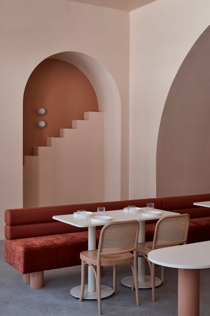
Biasol was thinking all things Wes Anderson when it set the palette for this Melbourne cafe, pairing earthy pinks and oranges with bright crimson seating.
Orange stimulates creativity, optimism and enthusiasm. It’s said to increase resilience and encourage sociability and can even eliminate localised fat, which might just come in handy when you’re surrounded by plates of this cafe’s signature take on the Courtesan au Chocolate pastry featured in Anderson’s The Grand Budapest Hotel.
Read more about The Budapest Cafe.
Subtype Sydney by Noise Noise Noise
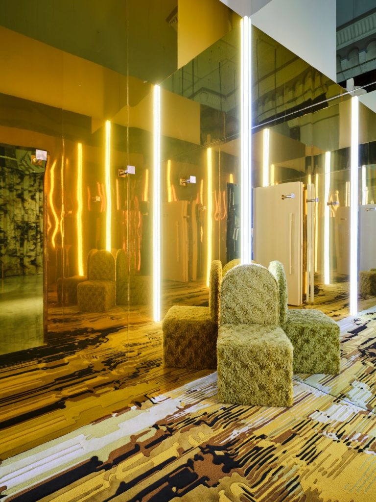
It has been more than six months since I spoke to Noise Noise Noise director Blair Cooper about this Sydney streetwear store, but this gold gilded dressing room is seared in my memory.
A custom-designed “furry-monster”-like longhair fur chair and hand-tufted rugs in various tones of yellow and mustard also features in the space in an an “expressionist example” of a playful retail design set.
Yellow increases fun, humour, lightness and personal power, while also reducing stress and encouraging a sense of wellbeing and security – all great things to have when trying on clothes.
Read more about Subtype Sydney.
Divided House by Jackson Clements Burrows
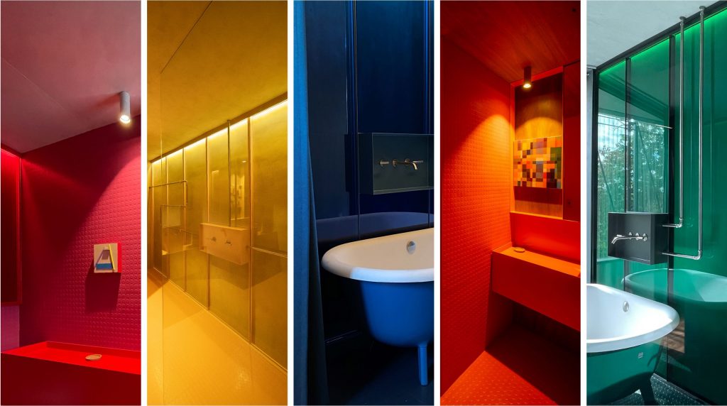
Bright bathrooms abound in this Melbourne home, which was designed by Jackson Clements Burrows for its very own director Jon Clements.
Turquoise in particular is a great choice for any bathroom setting as it’s thought to inspire tranquility, restoration and refreshment.
Read more about Divided House.
Love Street by Anna Spiro Designs
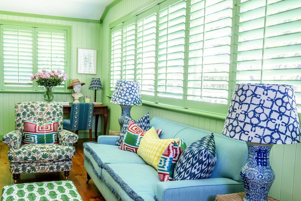
The queen of all things colour and texture brings a kaleidoscope to this Brisbane bungalow.
Green supports balance and harmony, communication and acceptance. It also increases love, which is perhaps one reason why it features so heavily and heavenly in Spiro’s aptly named Love Street address?
Chromatic Fantastic by Danielle Brustman
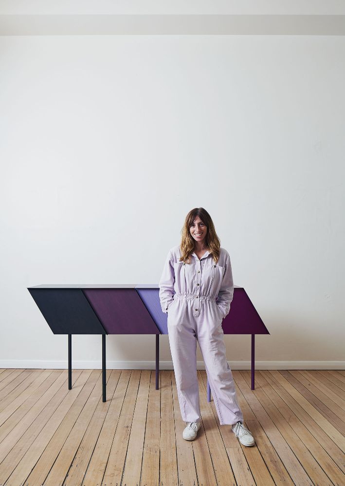
Whether you swear by colour therapy or think it’s all a load of phooey, there’s no denying our relationship with colour is intensely emotional.
Colour is one of the tools in our arsenal of personal definition. That goes double if you define yourself as an interior designer or architect. Triple if you happen to be Danielle Brustman.
I spoke to Brustman on the eve of her exhibition Chromatic Fantastic, which explored her lifelong fascination with colour – not wheels and palettes and perfect pairings, but our relationship with hues.
Lead photo: Biasol’s The Budapest Cafe by Derek Swalwell.
You Might also Like


