Cera Stribley creates a fun-loving flagship store for the memo
Cera Stribley creates a fun-loving flagship store for the memo
Share
With an upbeat appeal with playfulness at its core, Melbourne-born boutique the memo has unveiled its flagship store designed by Cera Stribley.
Located in High Street, Armadale, the memo is a Mum-and-bub retailer and is conceptualised to elevate the shopping experience for new and expecting parents.
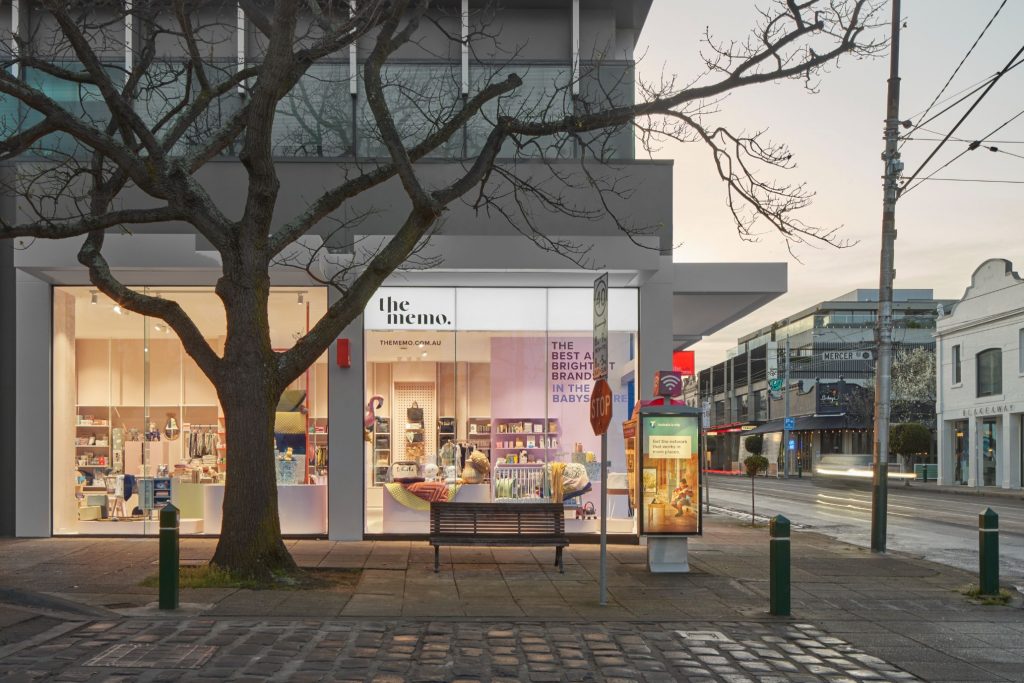
Architecture and interior design studio Cera Stribley has designed the store to burst with colours and an assortment of shapes and forms, replicating the brand’s welcoming identity in the digital sphere.
Cera Stribley’s head of interior design Jessica Coulter says the retail experience of the baby sphere is dominated by two retail models, which are both extreme in their offerings. This opened an important gap in the market for a rental space such as the memo.
“There’s your ‘one-stop-shop’ retail model that claims to provide all your baby/parenting needs but these are often under-curated and overwhelming, making it difficult to navigate, particularly for first-time parents. Then there are high-end boutiques that are often hyper-curated, exclusive and unapproachable.”
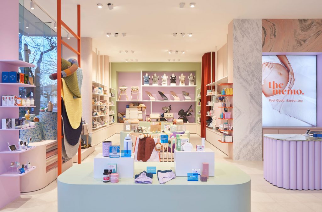
An important design consideration was to avoid creating a physical space that would feel cluttered and uncurated, especially when the store itself only spans 75 square metres.
“Finding a way to unify the memo’s broad product range in a way that felt visually and experientially cohesive was fundamental to achieving a successful outcome.
“The concept of zoning and engaging colour to demarcate certain zones is key to this success,” explains Coulter.
Cera Stribley also sought to ensure the space never felt too serious but rather foster an inclusive and strong customer engagement.
This was achieved by leaning into a lively palette of colours and materials, “to really transpose the memo’s digital brand identity into the physical realm,” adds Coulter.
“The juxtaposition of coloured stone creates a feature moment at the point-of-sale, while the purple ribbed façade of the counter adds an element of texture to the space.
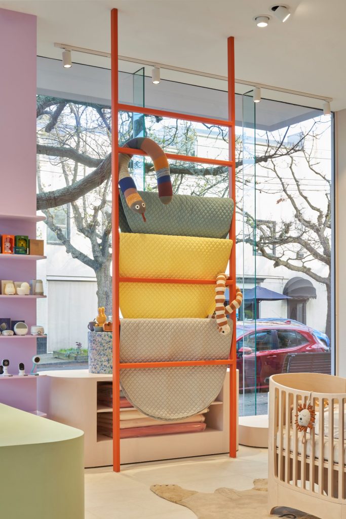
“Colour blocking in the memo colour palette was used as a tool to activate the store from the street as well as demarcate distinct ‘zones’ throughout the space, making it an intuitive shopping experience.”
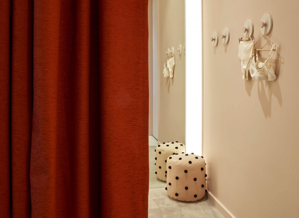
the memo is an alternative retail experience for new and expecting parents, one that is approachable and enjoyable to explore with tongue-cheek moments such as ‘boobie hooks’ while lighting within changing rooms is gentle and unobtrusive.
“Everything about the memo – from the product range and the layout of the store to the material palette and quirky design elements. We’ve designed to provide the optimal retail experience…one that is uncluttered, and playful.”
Photography by Damien Kook.
Also in Melbourne retail news, Brahman Perera sought inspiration from art and the artisan craftsman, both local and far-flung while designing Australian fashion label Henne’s first-ever bricks-and-mortar store.
You Might also Like
