
Chenchow Little: exploding conservative notions of the office
Chenchow Little: exploding conservative notions of the office
Share
inside co-editor Gillian Serisier sets her foot on the stage, as Chenchow Little’s latest office, for real estate brand BresicWhitney, once again challenges the commercial sector with an interior like no other.
Dramatic, theatrical, sumptuous, functional and to both budget and Heritage restrictions, this project sees Chenchow Little continue to explode conservative notions of what a commercial office should be. Importantly, it has done this with elegance, requiring none of the geegaws of out- there nonsensical response. Rather, the solution is befitting the environment and use, while being, as BresicWhitney director Shannan Whitney states, “a lovely place to work”.
Housed in an industrial warehouse in Rosebery, the project brief was typically loose and a continuation of the approach BresicWhitney has taken with Chenchow Little. Several years ago when Shannan Whitney first approached the practice, the fact that it then had little commercial experience was exactly what he was looking for. As project lead Joshua Mulford explains, “He wanted, a fresh different take on the office, to bring in the level of detailing and craft we would normally apply to a house. What he really didn’t want was a duplicable and repeated brand interior.”
Chenchow Little’s response to the four iterations – Darlinghurst, Hunters Hill, Balmain and now Rosebery – has been driven by a unique and specific response to the real estate perspective of the area. As such, Darlinghurst has an edgy quality of grunge, Hunter’s Hill uses a more refined material palette and Balmain is an amalgam of simple and aspirational. The Rosebery office similarly echoes the suburb’s current profile as one of Sydney’s first model industrial suburbs, with factories and warehouses slowly being converted into commercial tenancies and apartments. “It’s an upcoming young professional suburb, quite relaxed in terms of approach and aesthetic,” says Mulford.

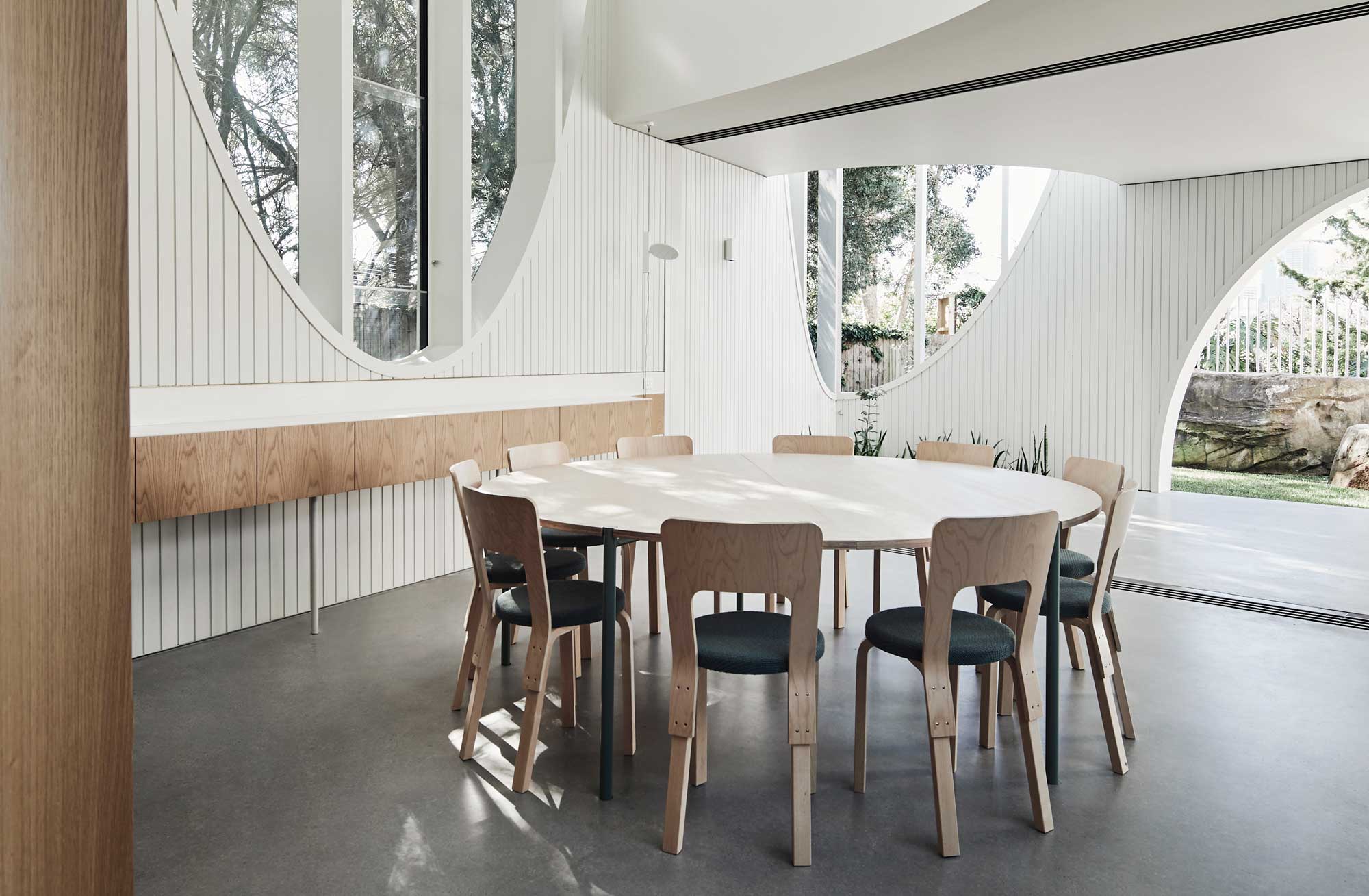
Several additional elements informed the design approach – chief among these was the Heritage constraints for two of the interior walls and the large overhead trusses. Site was also an influencer, with the front of the building being the entrance least likely to be used. Compounding these issues was a sharp turn-around of four months and a small budget. The design also had to accommodate 25 staff.
Chenchow Little’s response has been to create a stage-like setting of velvet curtains forming pods that, as Mulford says, “Float like jellyfish through the space.” The pods have been arranged as two curves to create a waving negative space across the floor’s diagonal. The reception counter has been placed at the centre of this void to effectively afford both front and rear access equal status. With the rear entrance comprising both a Heritage wall and ugly old roller door, Chenchow Little proposed filling the lower portion of the roller door cavity with a short wall of original bricks found on-site, to create a window. The void was then finished with a pink trim to match the most immediate of the pods.

The pods themselves are sublime. Executed in Velluti velvet (James Dunlop) in shades drawn from the building’s era – olive green, dusty pink and indigo – the pods’ presence shifts dramatically. “We chose the colours to suit the look of the turn of the century building in a contemporary way. The three colours work together as a family of layers, where in combination they are the strongest,” says Mulford. In the closed position each reads as a strong vertical; however, as they are opened, the spatial arrangement becomes less formal and more permeable as the interior is revealed. The six pods – comprising three working pods in olive green, two meeting rooms in dusty pink and one conference room in indigo – are of different sizes and lengths.
The only iteration to reach the floor is the conference room, which, as the more formal of the pods, has been given the extra length for acoustic properties. That said, the velvet, while thick and weighty and giving some sound absorption, was never heralded as soundproof, but instead posits a simple spatial division and theatrical aesthetic. The remaining pods stop just above the floor, casting dramatic shadows when drawn and fabulous zigzags when the ‘s’ fold drape is extended. The pods also answer Heritage concerns that the walls and trusses remain unscathed. “None of the circles touch the walls and the tracks are all suspended to avoid the tresses; it was like a game of Jenga, where you come close but never touch,” says Mulford (Simple Studio).
The floor was very much a record of the site’s extensive history and as such a palimpsest of different eras and industrial uses manifest as different pours of concrete and terrazzo without much rhyme or reason. There were also height variations. Keeping to the budget and time constraints was an important factor, as was keeping the character of the industrial building. The whole floor was ground to a single flat surface and sealed with a natural finish, while the circular motif of the pods was then painted below each space using a microfilm industrial paint for minimal intervention. This very flat industrial paint, while compounding the colour blocking effect, also negates the slight bling of velvet.

The birch ply joinery throughout the project (JP Finsbury) is similarly a counter to the velvet. Executed as very simple lines, where the materiality is brought to the fore, each piece in some way is marked by a circle. For the lockers, it is the opening device; on the long communal desks, notches delineate workstations; while other manifestations are the curve of the piece itself. Lighting is similarly round with Multiline Sferio pendants (Euroluce) within the pods customised with powder-coated frames to strengthen the effect of colour blocking.
The entrance Teti light (Artemide) is a particular favourite. The entrances themselves are marked by circular motifs or launch pads of pink that contain as a neat circle for one and lap up the walls like a tray at the other. Circles are in fact everywhere, and while the roundness of the Artek tables and stools (Anibou) are a given, the fatly round lounge chairs are a delightful inclusion (Moroso Panna armchair, Hub).

More than a fabulous aesthetic, the interior is very well-considered for both staff and clients. The pods are gorgeously cosy from within and a visual tour de force for impressing clients. They also answer both sides of the open plan/traditional office debate with segmented lengths that allow each worker to choose how and when they interact with the office. But, mostly, it is the total magnificence of the pink, indigo and green curtains that makes this simple solution so very, very impressive.
Photography by Ben Hosking and Peter Bennetts
This article originally appeared in inside 102 – available online and digitally through Zinio.
You Might also Like


Related Stories
© Niche Media 2026