
Flack Studio defies colour conventions in Melbourne vintage store
Flack Studio defies colour conventions in Melbourne vintage store
Share
Flack Studio combines colours with its signature gleeful abandon in this recent interiors job for Italian vintage store Castorina & CO.
The world of retail is fast and trepidatious, particularly when taking a mid-century Italian vintage store from a cosy and known location to the fast lane of high street.

Granted, the vintage is more a collection of unique and iconic masterpieces but, still, nerves of steel are required. Moreover, a three-month turnaround from first concept to doors open was needed.
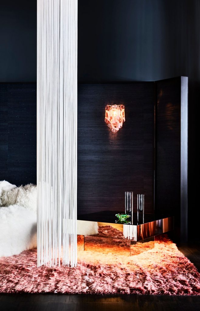
For David Flack, a challenge is more or less a springboard for creative adventure. Yet, there is nothing frivolous or light about the design. Instead, a palette of deep and moody colours creates a serious backdrop to the very elegant tableaus.

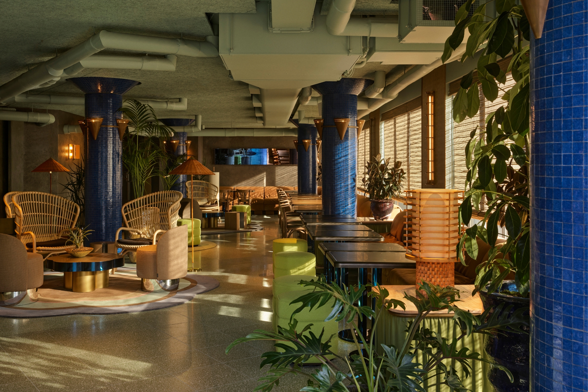
Making good use of the long thin footprint, the landscape of the interior reads as a series of room settings – dining, living and so forth with a clear frontal perspective. This is augmented by large portholes cut into the dividing walls, which invite a glimpse to the next and then the next arrangement.
“It’s like a pinball machine: with such a large open space in traditional retail, consumers never seem to get to the back, so you need to navigate them through the room: think of a ball getting pinged! We created lower partitions, but with cut-outs to give weight and define the room, but really it’s a divisive design strategy to get clients through the spaces and make it a more intimate experience of the furniture,” says Flack.

Moreover, the renovation is structurally deep with no Band-Aid solutions to carry it over. Working with a dilapidated shell, rotten floors, a staircase with a footing so broken it appeared to float in mid-air and the layout legacy of the former furniture bazaar, Flack’s response was a structural greenfield solution via a complete overhaul before any design could take place.
To this end all floors were replaced, the staircase rebuilt, new walls introduced and the end room reconnected to the whole.

The complementing tones of blue and olive are a perfect pairing with the mustards, timber and glass of the store’s era. The colours are also rich and deep enough to blur corners and create a cocooning effect that allows each setting to exist in its own right.
“The last showroom was more of a warehouse: all white with no partitions. I did a lot of testing and, really, vintage looks better against dark colours. It’s often patinaed and worn, so when you put it against a dark colour it looks fresh and vibrant and emphasises the product; it just feels sexier. And it has worked, it gives depth. Italian furniture has depth, so you don’t need to show it in a wishy-washy environment,” says Flack.
It’s a neat trick and rarely done well, but Flack has been working towards this expertise with a talent for colour that few could refute.
To expand on an old saying, there are no two colours that can’t be put together if you choose the right third, there is no combination that Flack can’t improve with something just a little bit wrong! And it is here that he excels, with combinations that, on paper, fly in the face of good taste, but with his touch become layered, decadent and so much more interesting and exciting than the safe.

Texture and form are similarly combinations he deliberately delivers counter to convention.
“It’s an Italian furniture store, so (I was) thinking about Milan and the beautiful entry ways that are often scarce on materiality, so there is a pairing of materials to create a bold gesture that is still soft and serene despite being highly questionable together. It’s a weird little balance that you have to strike,” says Flack.

To understand how Castorina & CO would work and how to create a frame for display, the current portfolio of merchandise was closely scrutinised. Flack also went through the lists and images of the next few shipments to ensure the platforms being created were universal to the style and not just of that particular moment in the store’s inventory life.
“Creating that sense of permanence and longevity was really important to the design. And because we do like working with colour and texture, we are always looking to find those materials that will work together and have that longevity without being overpowering for the products or consumers, because ultimately it has to work as a showroom.”

Lighting plays a pivotal role in focusing attention on each of the settings as a stand-alone arrangement, while showcasing the whole by night. It was essential that window shopping be taken to new heights of an immediate ‘wow’ factor, generating aspiration that would ultimately turn any passing driver or pedestrian into a potential shopper.
To this end, the front window of Castorina & CO is a beacon of artfully lit eye candy that has been very carefully curated to set both tone and calibre.
“It’s on Gertrude Street with not much sunlight, so at night it’s all about the theatre, hence the dramatic curtains and really beautiful lighting. It was important to have that stage for people to be intrigued,” says Flack.

Intrigue is exactly what this design for Castorina & CO provokes. Yes, there are grand elements and bold gestures, but nothing feels overblown or out of step with the whole. For Flack it was about creating the feeling that equates to the charming nature of Italian style.
Effectively, he is seducing the audience, but, and this is where he is oh so very good, while the seduction is subtle, we are aware of it and willing to be seduced.
Flack Studio took out last year’s Editors’ Medal at IDEA with inside editors making particular note of the studio’s expert use of colour. The Melbourne interior designers recently added their touch to another Italian institution, the Lagotto wine bar.
Photography: Sharyn Cairns.
You Might also Like


Related Stories
© Niche Media 2026