
Oki & Oro by Bullock de Barbera Architects
Oki & Oro by Bullock de Barbera Architects
Share
Situated within one of Brisbane’s largest urban renewal projects, the Oki & Oro eyewear store in Newstead’s Gasworks development stamps a unique identity on the local retail landscape.
With reference to the watch face and vintage eyeglasses, the Oki & Oro store design is a combination of circular motifs coupled with a palette of humble materials including limed plywood, raw cardboard, and polished concrete.
The store’s warmth is created in the simplicity of the milky plywood watch piece displays, the overhead skeleton of ply beams and the rawness of the cardboard cylinders that embrace the main retail space.
The use of simple materials and the restrained palette gives visual priority to the products on display, allowing the viewer to focus on the fine mechanisms of the Swiss timepieces and the colours and shapes of the boutique handcrafted eyeglasses.
The main display gallery wall is fragmented into smaller angled segments to visually break the symmetry of product on display and provide order to the different styles of eyewear and watches.
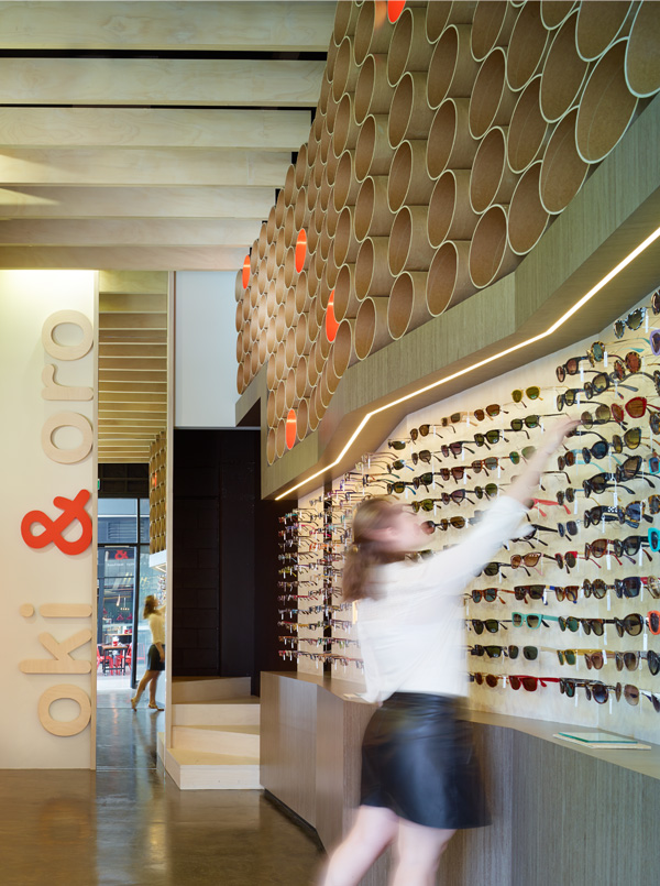
Image courtesy Scott Burrows
The height of the tenancy shell allowed for a small mezzanine at the rear of the space, creating an intimate customer lounge for viewing and fitting of merchandise.
The store’s main volume is defined by a series of limed hoop pine ply beams, mimicking the temple shape of spectacle frames. The design provides interplay between the higher ‘display gallery’ space and the more intimate service zones, which include a reception, consulting room and patient lounge.
The wall space above the main display gallery is used to reinforce the circular motif, common to both watch faces and eyewear. Recycled cardboard tubes [used for forming concrete columns], are used to create a mass wall of protruding cylindrical shapes, stepped to match the line of the angled display gallery below. The effect provides a textural element to the interior and creates a circular architectural language, replicated throughout store elements including; the reception desk, consulting room door, front window display and signage.

Image courtesy Scott Burrows
Continuing the circular theme, recycled cardboard tubes are incorporated into the window display, housing both watches and frames and accompanied by an oversized backlit poster display, alerting customers from a distance to what lies within.
Bullock de Barbera Architect’s consultation extended beyond the interiors to create both the store’s name, brand identity and stationery design. With reference to the Italian heritage of the store owner the abbreviations of Oki & Oro were chosen in reference to Occhiali, meaning spectacle frames and Orologi, meaning wristwatches in Italian.
The resulting interior design and store branding reinforce the concept of a playful, design-centric space, inspiring customers to co-create their own unique identity with the boutique eyewear and watch collections.
Architect: Bullock de Barbera Architects (Daniel Bullock and Dianne de Barbera)
Photography: Scott Burrows Photography
You Might also Like


Related Stories
© Niche Media 2026