Pop Architecture injects ‘contemporary lightness’ into Melbourne renovation
Pop Architecture injects ‘contemporary lightness’ into Melbourne renovation
Share
Pop Architecture’s brief for South Yarra house specified a reverence for the period features, but also a revitalisation to the space in terms of its engagement with light and texture.
In other words, the preservation of the original character with an injection of contemporary lightness and ease.
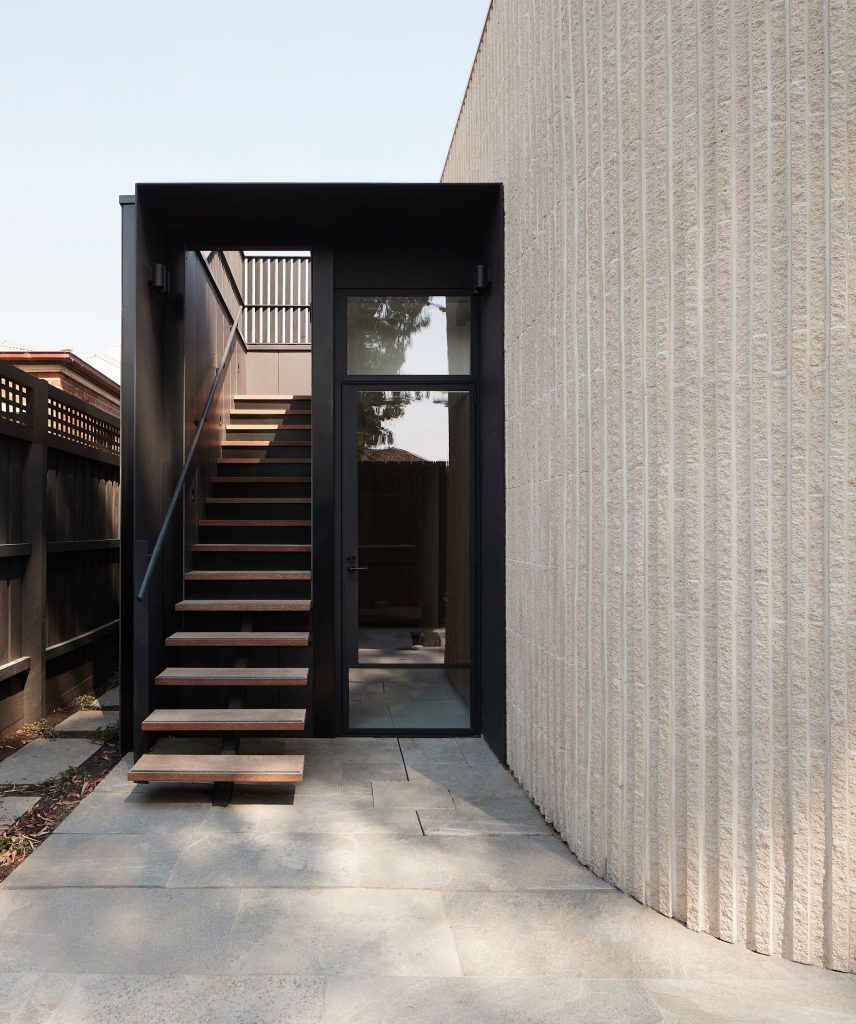
The clients had carefully considered their brief and one of the key criteria was to be efficient in what they were requesting in terms of space. As a result, the brief scantily stated that they wanted curves and real materials.
Outside of that, Pop Architecture was presented with a carte blanche to work with the space how the practice saw fit.
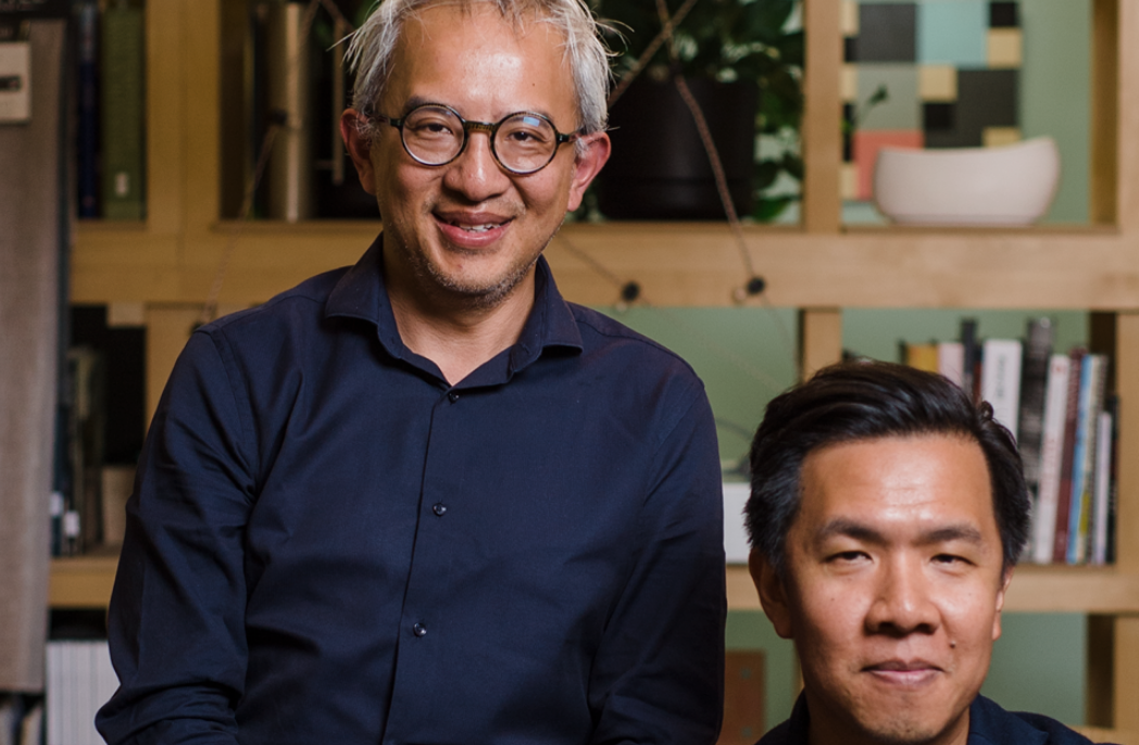
“We always go to site together and take it in,” explains co-director Katherine Sainsbery of their process.
“We try to avoid oversaturation of a thousand reference images from other architects or projects, and we will try to come up with what we refer to as the abstract concept for project.
“It can be as simple as ‘solid versus fine’, that you then use as an overarching concept to apply to details and the main form.”
From their first experience on-site, it was evident the pair extracted the same core themes that would eventually inform the design.
“Even when we’ve been circulating separately, we’ve often taken very similar photos of the site. Those are the things that we will then distil and explore more deeply,” says Sainsbery.
“We had both taken photos of light on this weathered piece of corrugated fencing,” adds fellow Pop Architecture co-director Justine Brennan and, as banal as it may seem, that texture has been explored explicitly throughout the home, from the texture of the brickwork to the changing vertical motif of the terrace.
From the project’s conception, the design became centred on the penetration of light into the house.
“We’re always breaking up a form to see where we can get light in,” says Sainsbery. “And it’s amazing how varied the outcomes are.”
The pair started with key incisions where they wanted to direct light in.
“Beyond that, it’s about how to explore what the light is doing in an interesting way. In this project, there were a couple of ways that we did that: one was to do with light on curved surfaces, and the other was light on textured materials. In both cases it was the ephemeral effects of each – the changing experience of those finishes over the course of the day,” says Sainsbery.
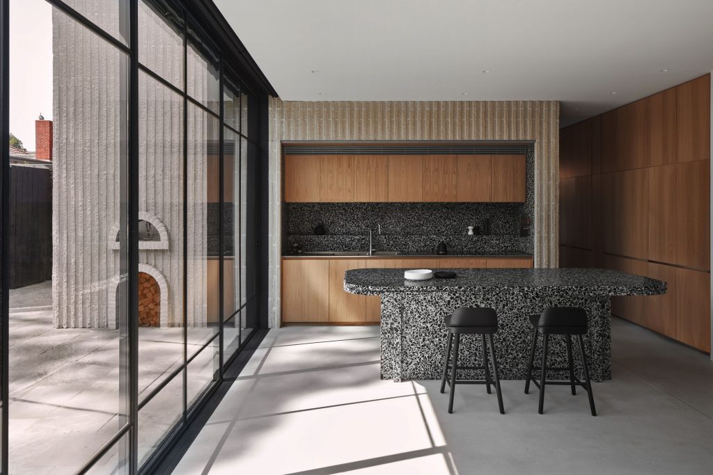
Incoming light glances off the curling apertures to create a natural and animate glow.
“It’s not as static or two-dimensional,” Sainsbery explains.
“When you have a rectilinear form, the light is either on one surface or another. Whereas, on a curve, it’s a bit more ambiguous.”
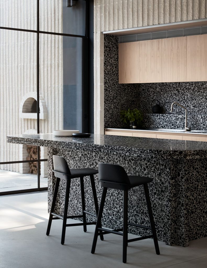
The rear extension faces due north.
“You always hear that it’s best to face north, which is true in theory, but when you’re talking about an inner city Melbourne block, they’re long and slender,” says Sainsbery.
“Yes, it’s nice to have a north-facing backyard, but often it means the rest of the house is in complete darkness.”
“On South Yarra, we were trying to avoid that stereotypical experience of a renovated Heritage home, where you rush through the existing part and your whole experience of the project is trying to get to the end. We wanted the family to enjoy being in the house as soon as they stepped foot in it, rather than having to wait until the end,” adds Brennan.
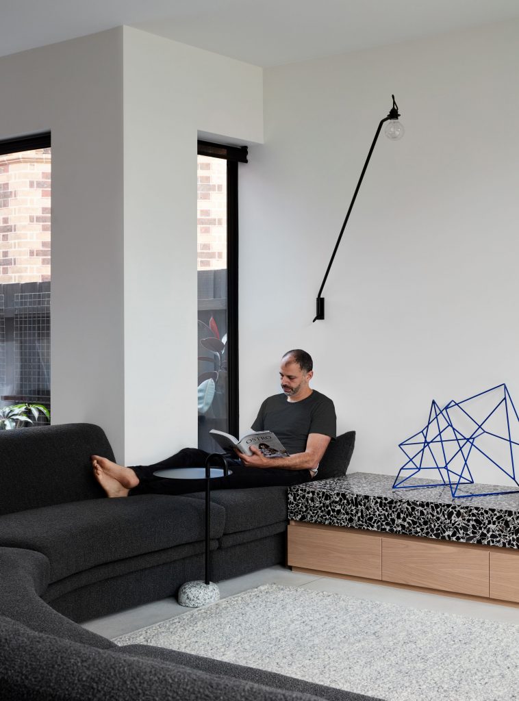
There’s a large clerestory window at the end of the hallway, so as soon as someone steps foot in the house, they are greeted with a great flood of light and view of the tree beyond. The silver eucalypt breaks the horizon, fracturing the light to create a dappled experience on the interiors.
The slender line of the trunk and carved bough of the branches engages with this polyphony of lines and curves. This repetition appears in the intricate layering technique of the brickwork on the outer extension.
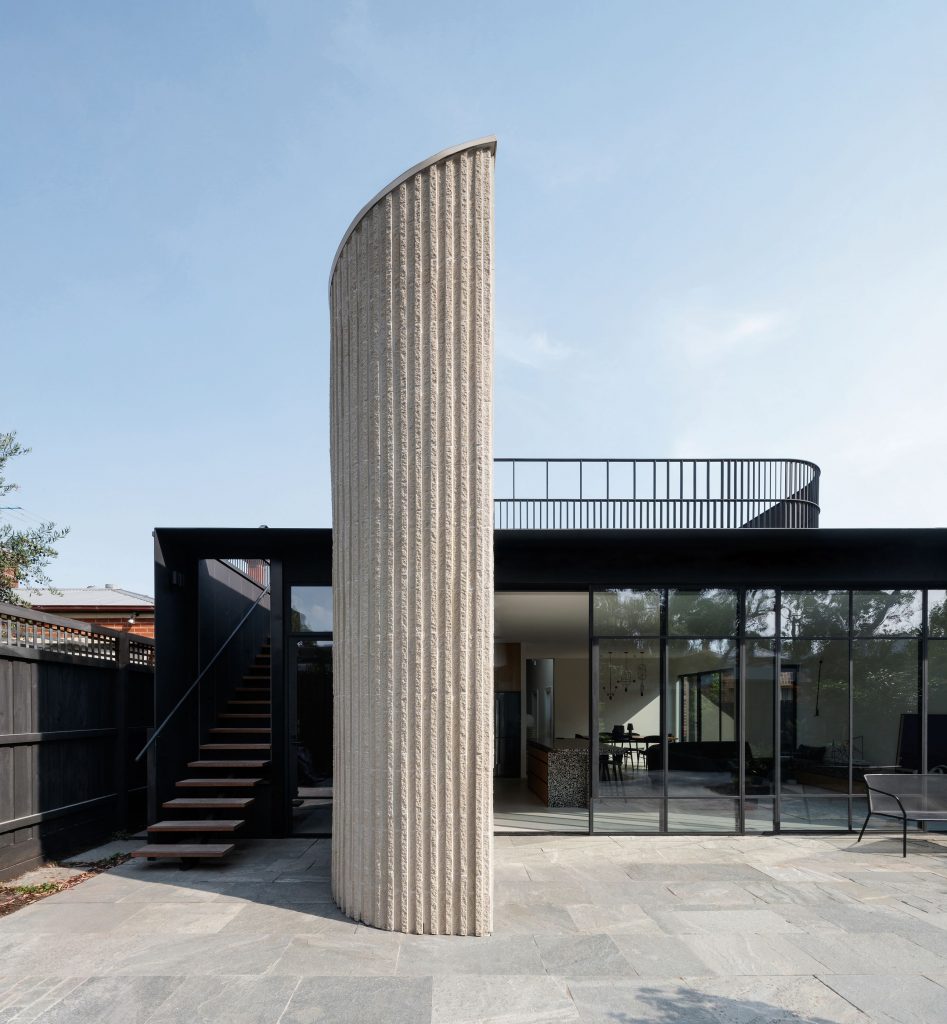
“The bricklayer calls it the corduroy method, which gives this corrugated feel to the brickwork,” says Brennan.
The play of light over the undulating surface perfectly mimics what captured the architects’ imagination about the weathered fence detail on their initial visit.
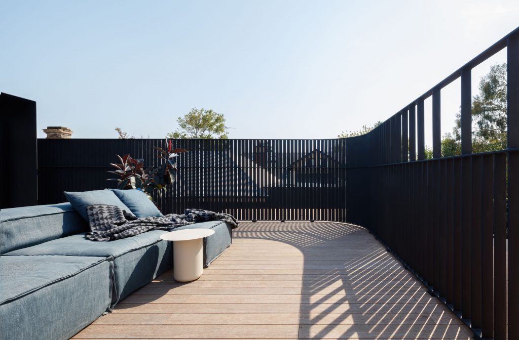
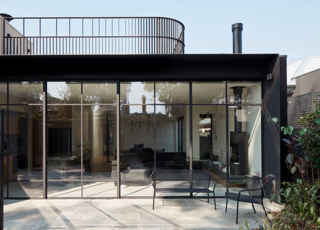
The vertical corbelling of the brickwork paired with the round, meandering corners gives the exterior a sculptural feel. This repetition can be seen again on the roof terrace.
“One of the good things about being a single storey is that you can explode the roof form,” says Sainsbery.
The pair had to use an overlooking compliant screen, which they saw as another opportunity to explore the concept of light and curves.
“It’s sort of the inverse of the solid brick form: it’s a fine form with gradient in opacity and transparency from one side to another, which creates some really beautiful shadows on the terrace upstairs that shift across the course of the day,” says Sainsbery.
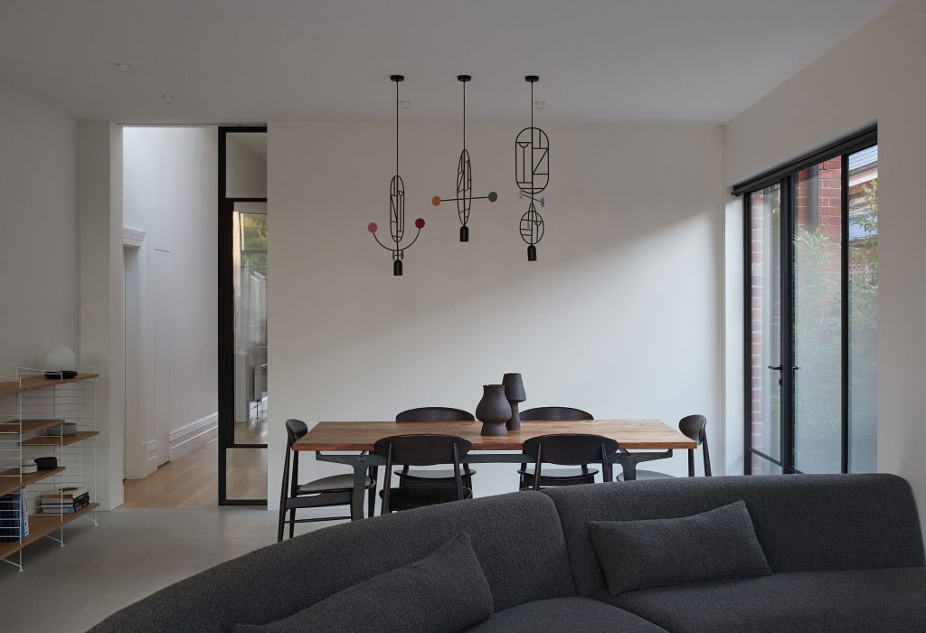
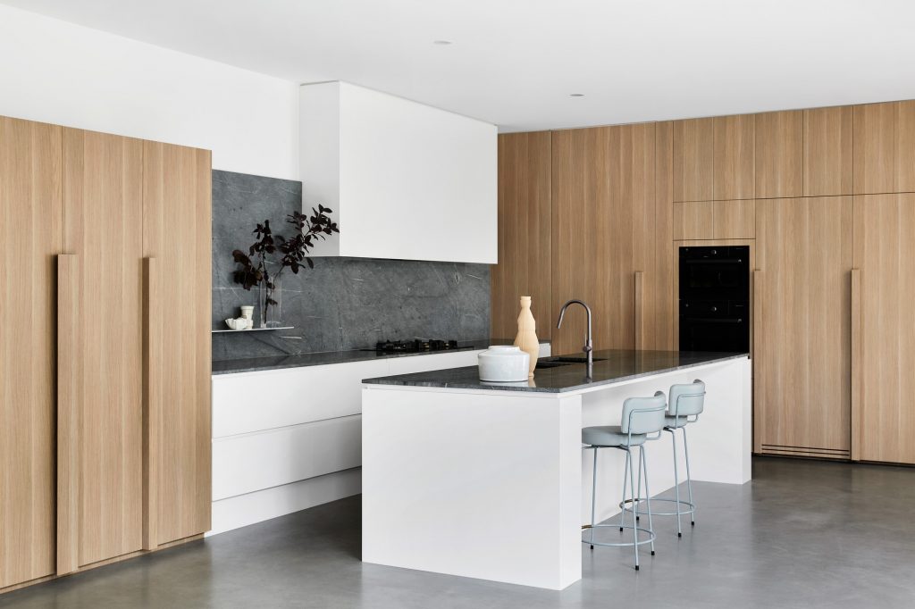
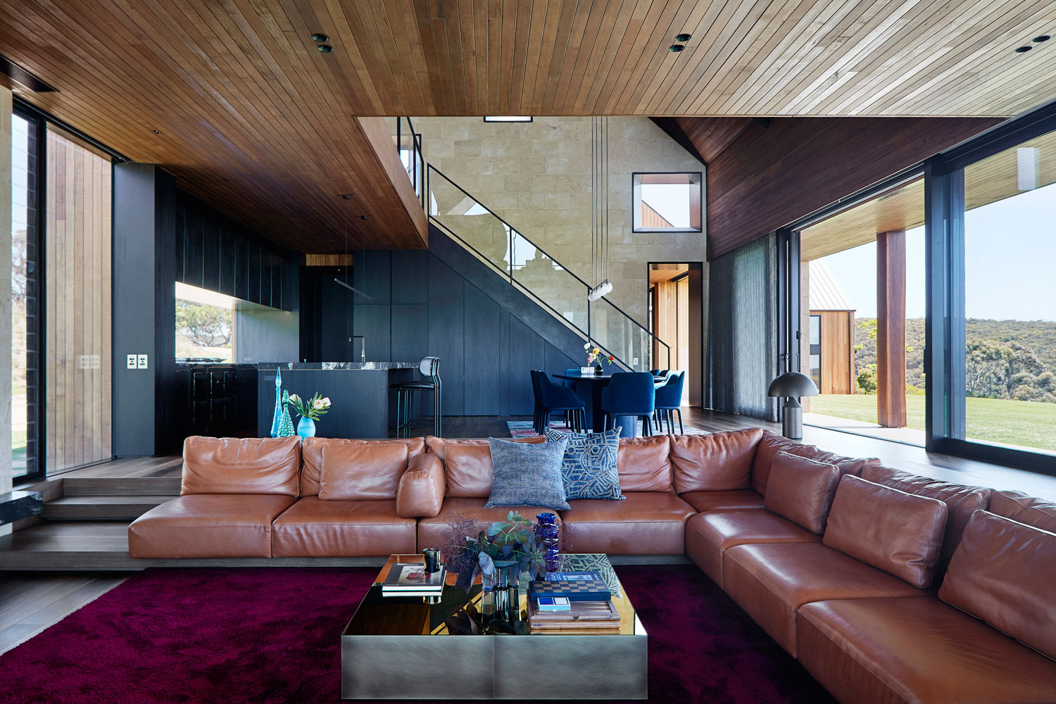
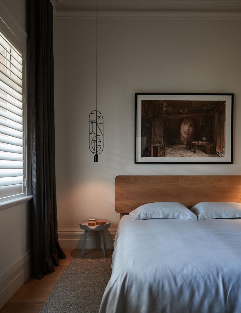
For the interiors, Pop Architecture collaborated with interior designer Beatrix Rowe. She too has engaged with this tension between bold and fine, played out in the restrained palette and striking terrazzo surfaces.
Rowe has combined linear track lighting with curvaceous stone surfaces that recreate that almost sculptural consolidation of hard lines and roundness. Contrasting elements like the brickwork and hard plaster are offset against the fine fenestration and timber fretwork.
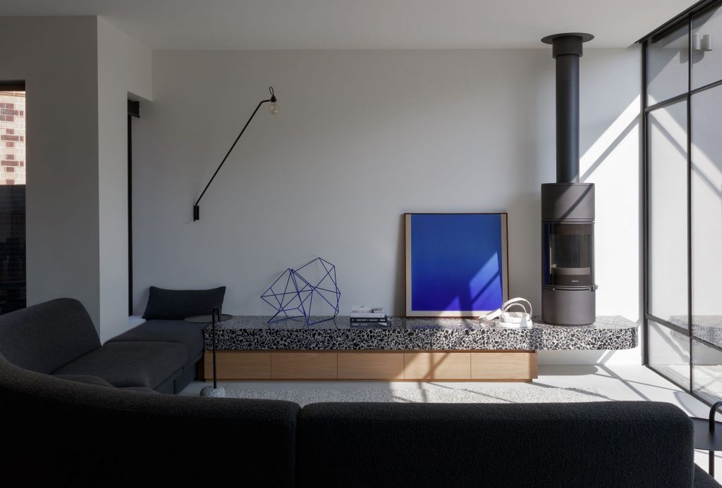
The resulting home is a playful engagement with tensions, recontextualising a period house with a contemporary overlay.
The completed work is both new and timeless, permeating with soft, diffuse light that undergoes an intriguing mercuriality throughout the day.
Photography: Willem-Dirk du Toit.
This article is from Architectural Review 169. If you would like to read the full latest magazine, click here to receive a complimentary copy of our first digital issue.
Also featured in the issue was an exclusive interview with Pop Architecture in which its directors discuss what it’s like to be a female-led practice in the Australian design landscape.
You Might also Like
