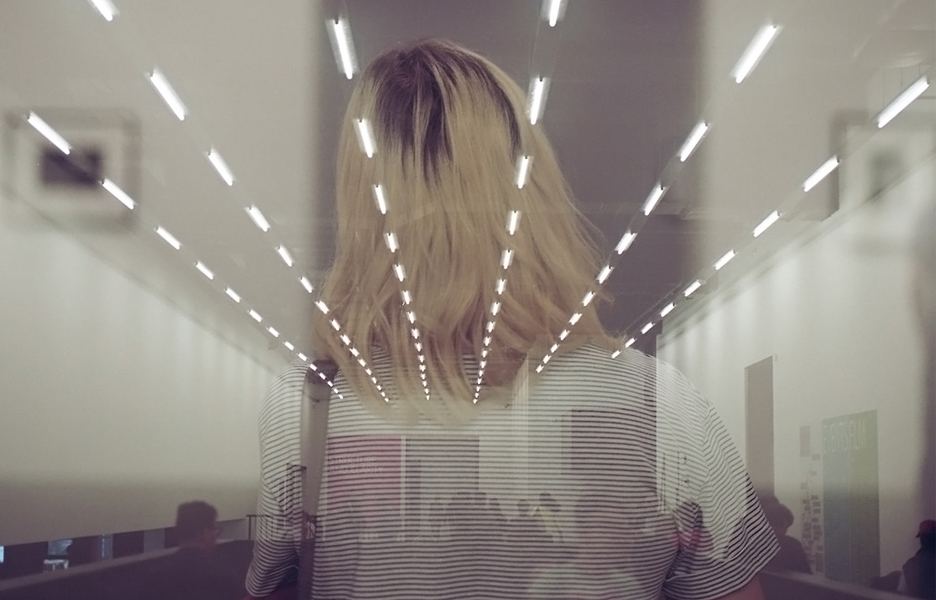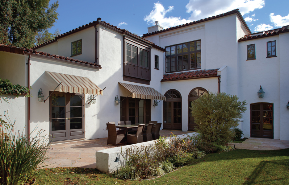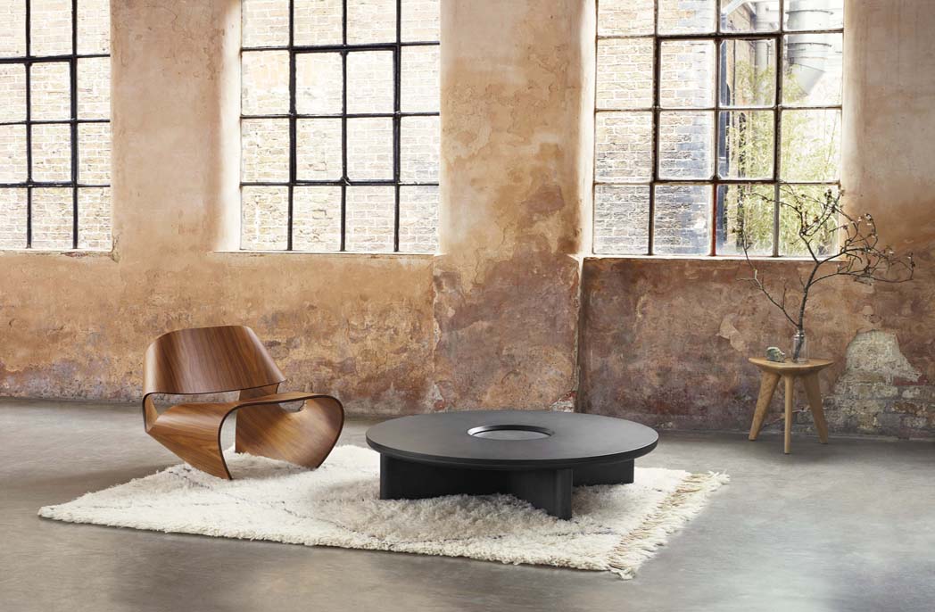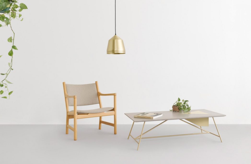
Retreat, Nourish and Reset are the 2021 colour palettes from Dulux
Retreat, Nourish and Reset are the 2021 colour palettes from Dulux
Share
Paint brand Dulux Australia has chosen three tonal palettes that “prioritises natural colours and textures” as its forecast for 2021.
Combining softer tones “for comfort and security” with moments of stronger colour to “brighten our outlook and wellbeing”, the palettes are dominated by greys, creams and browns.
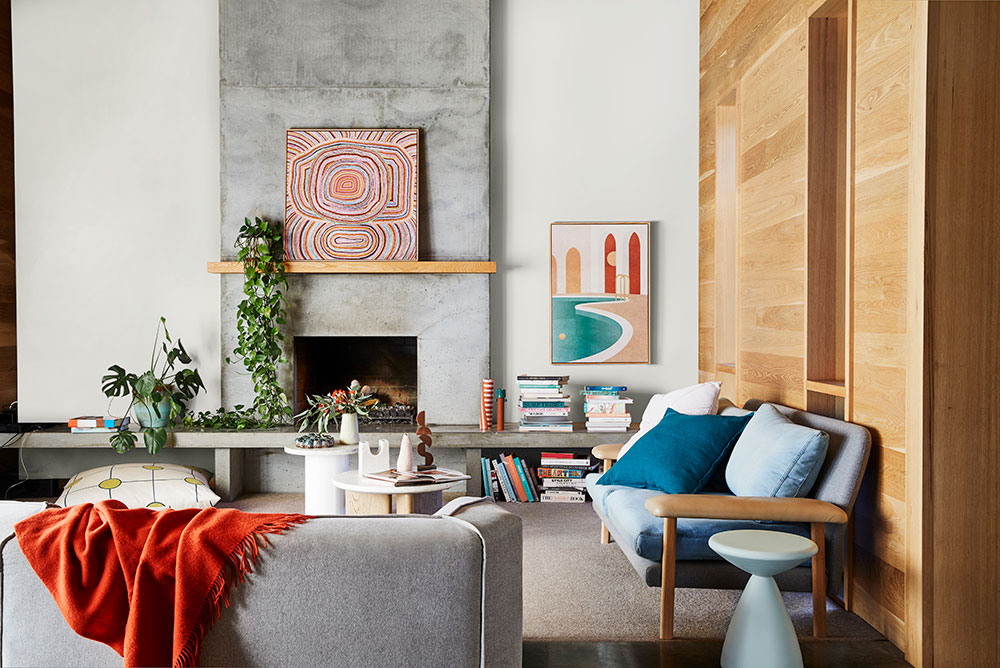
Dulux Australia says its 2021 Colour Forecast stems from the collision of work and home life following COVID-19 restrictions and reflect “people’s desire for greater balance and continuity” within their spaces.
The paint brand releases a forecast annually, drawing on international influences and research analysis to compile its predictions.
With many of the European design and architecture shows cancelled this year, Dulux colour and communications manager Andrea Lucena-Orr and trends forecaster Bree Leech looked to virtual exhibits and seminars to inform their thinking.
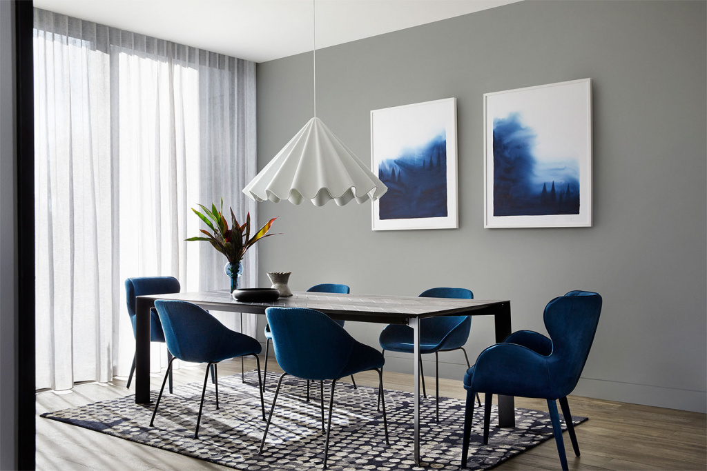
“We have been diligent, collaborative and considered with our approach to understanding the impact that global and local societal issues have had on design and the subsequent application of colour, with this year being no exception,” says Lucena-Orr.
Similar to last year’s forecast, the Retreat, Nourish and Reset palettes point to an “increased desire for a digital detox” and “meaningful connections” with the outside world.
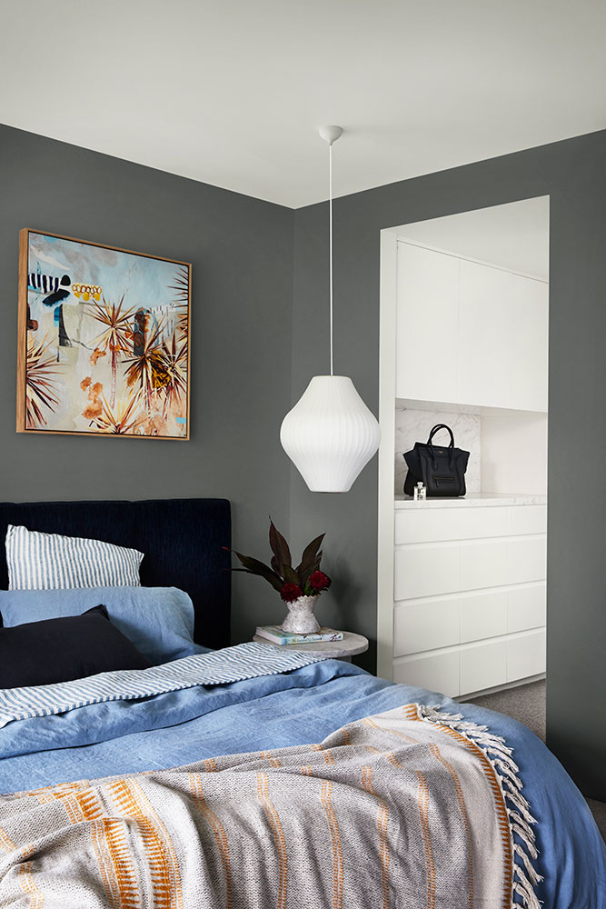
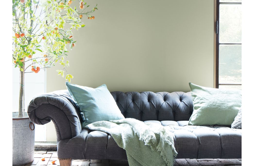
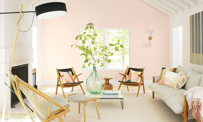
The Retreat palette draws on nostalgia to “create that sense of familiarity and refuge we crave”.
It incorporates “up-cycled” materials like raw and natural timbers, and vintage accents such as ceramics and weavings. A handful of blue accents complete the palette, “signifying better times to come”.
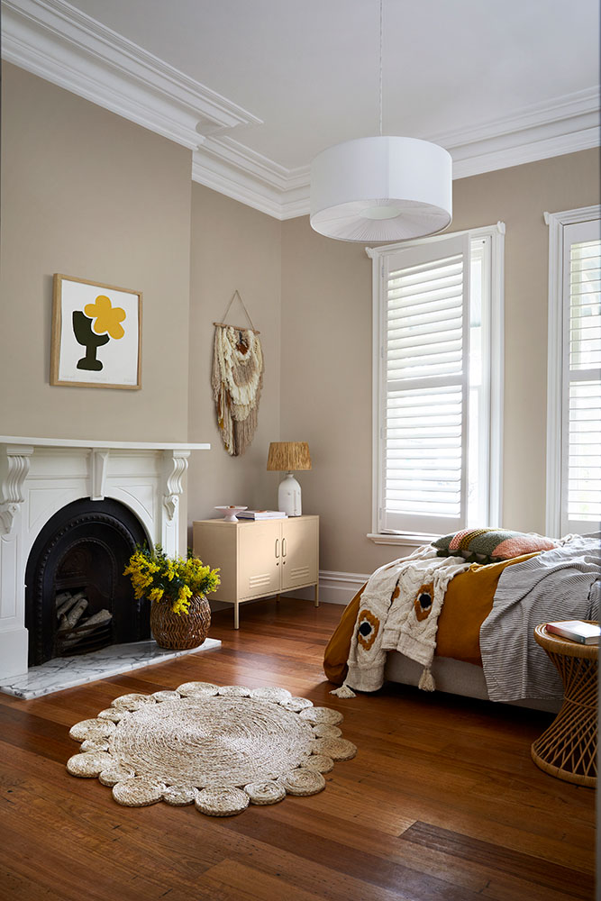
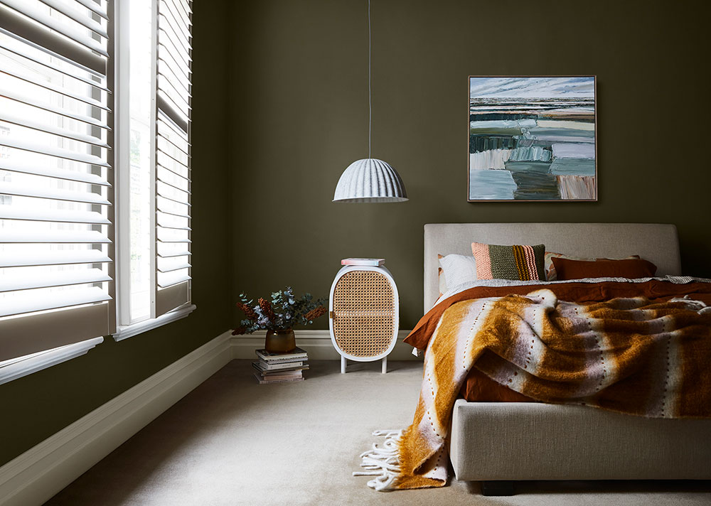
The Nourish palette plays into our “longing for natural beauty and earthly connection”.
Biophilic hues of mossy and sage greens, turmeric and citrus dominate, “inspiring us to fill our homes and workspaces with plants and blooms”.
Shades of tan and olive standout amid the natural and neutral palette.
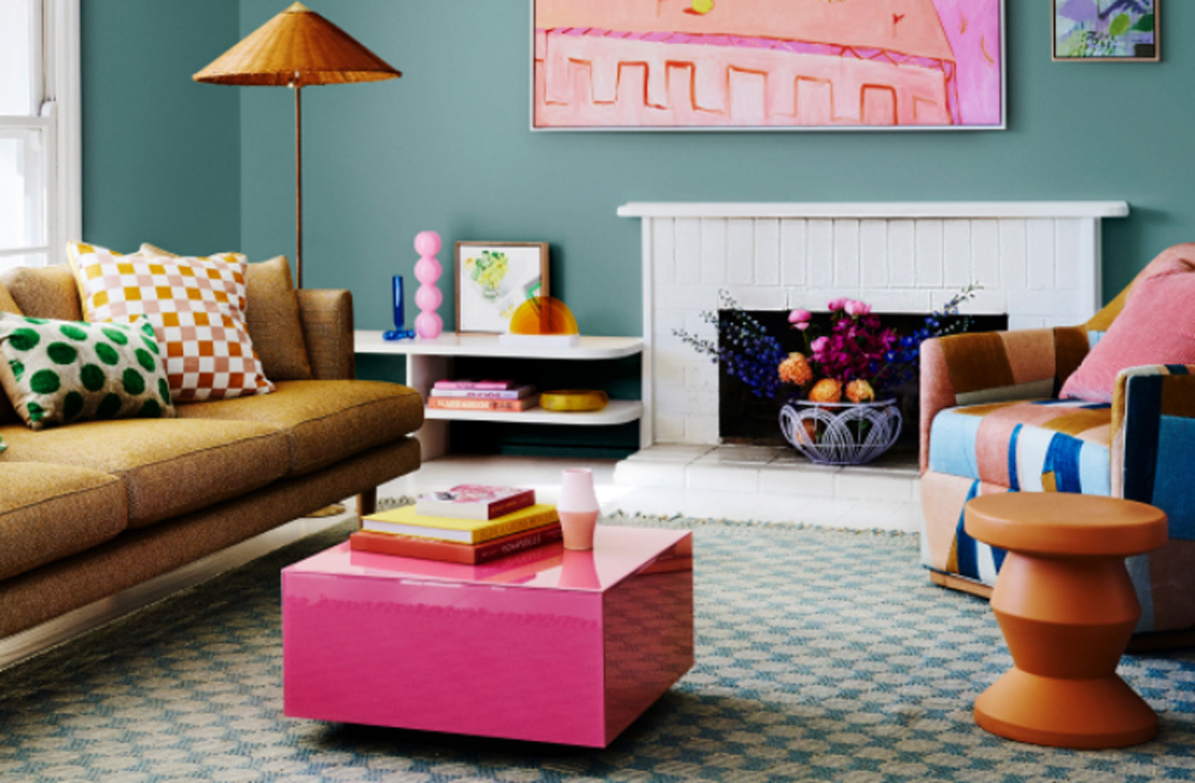
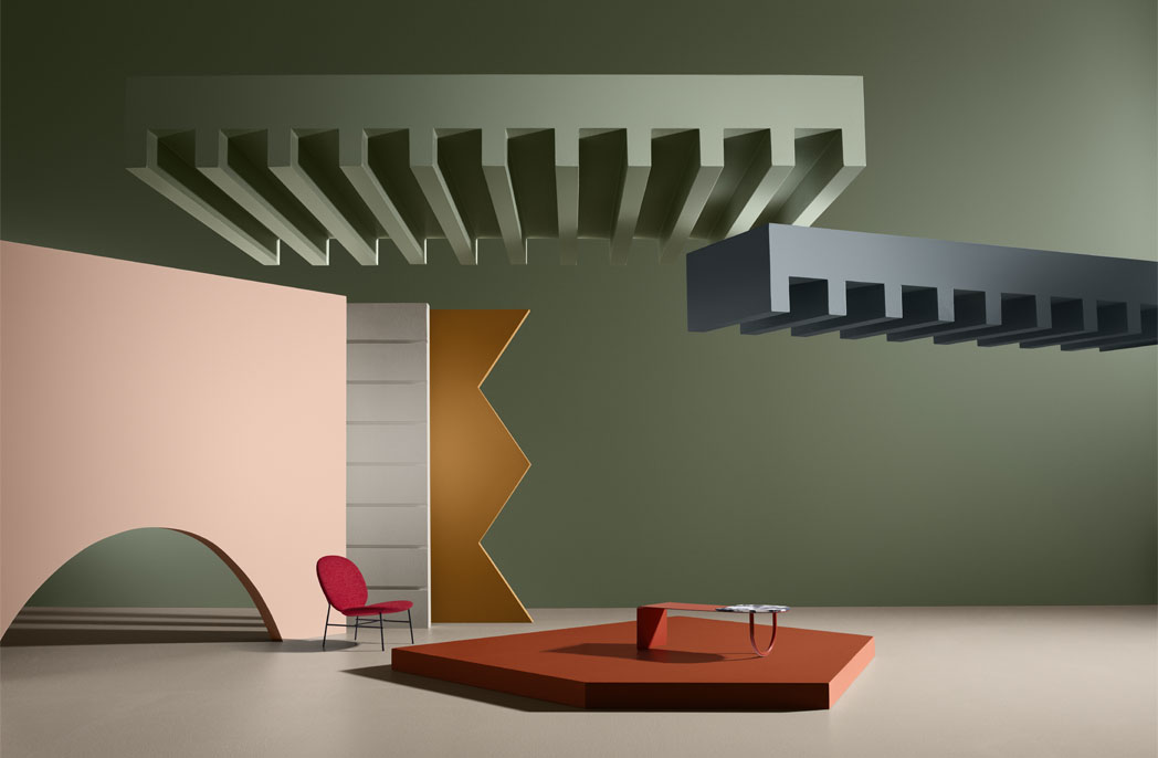
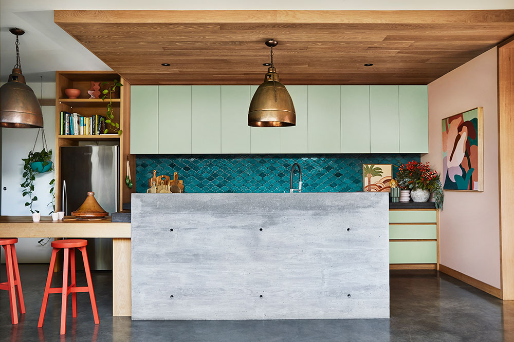
Finally, The Reset palette reflects “our renewed energy and desire to brighten our outlook as we adapt to home life”.
Subtly inspired by the ’70s, hues of blue-green and “energetic” reds offset contrasting whites and neutrals.
Dulux Australia describes all three palettes are being underpinned by “nostalgia, comfort, security, sustainability and conscious living”.
“We’re seeing more nature-inspired and earthy tones, which work to evoke feelings of comfort and wellness,” explains Lucena-Orr.
“With accents of brighter hues to incite energy and inspire a positive outlook.”
Images courtesy of Dulux Australia.
You Might also Like
