The colours of 2018 by Dulux
Share
The annual Dulux Colour Forecast has been released with 2018 homing in on the concept of ‘Balance’. The collection of four colour palettes has been carefully considered and pulled together by creative director Bree Leech and Dulux’s colour planning and communications manager Andrea Lucena-Orr. Each palette within the forecast comes back to the overarching theme of Balance, whether it’s work-life balance, give and take or past and present.
“The 2018 Dulux Colour Forecast articulates design visions that are capable of reflecting global trends at a deeply personal level. Our analysis indicates that interiors capable of fulfilling our need to escape, connect, replenish and move forward will all be of key interest in the 2018 design landscape,” explains Lucena-Orr, on the motivation behind this year’s forecast.
The range of palettes and colours are an exploration of global cultural trends, filtered down and forecast to influence the design industry in the coming year.
The 2018 Dulux colour forecast is as follows:
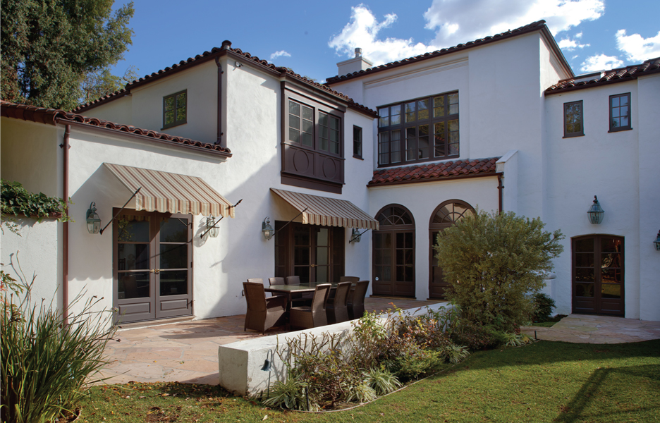
Kinship
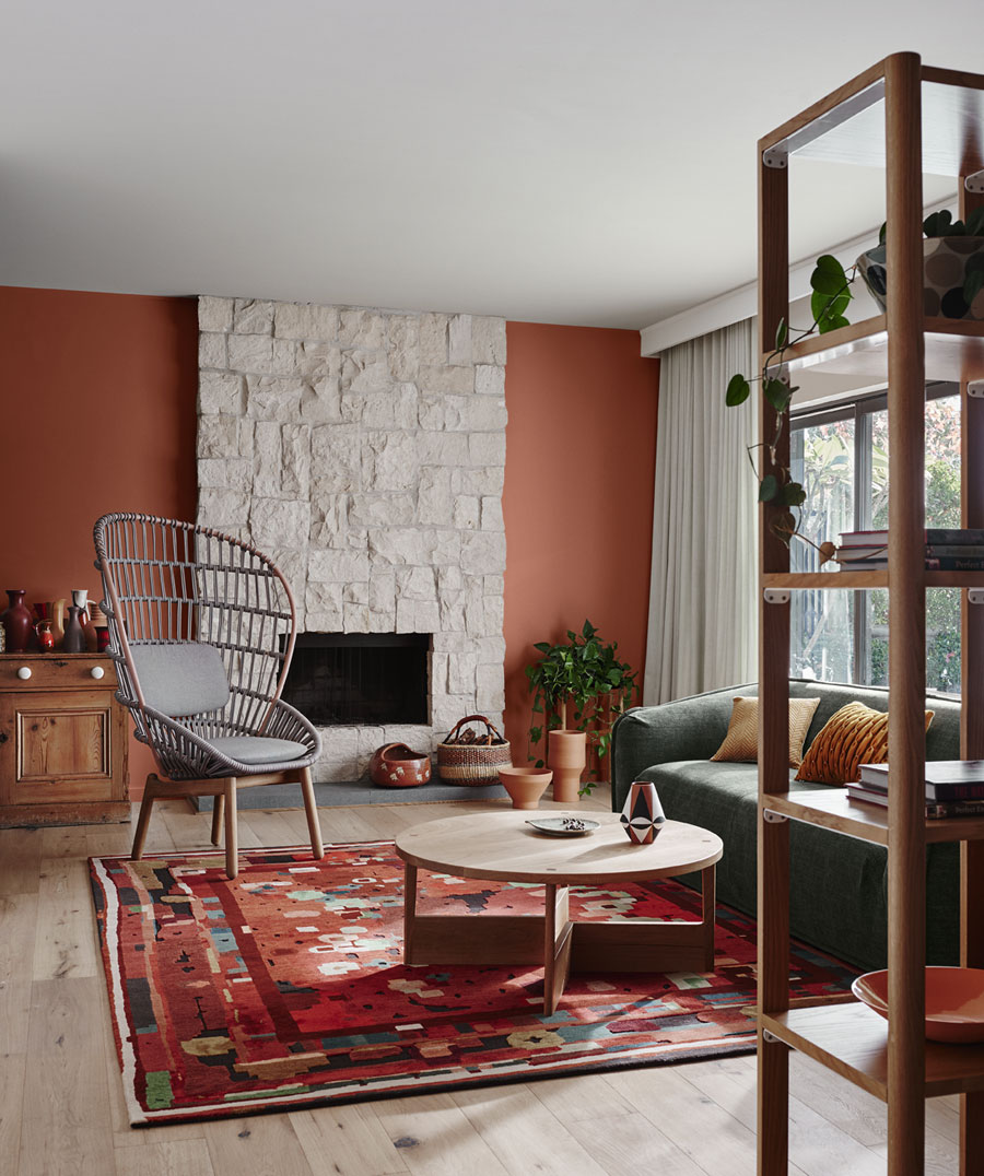
A rich and earthy palette, this trend celebrates cultural heritage, drawing on folklore and the revival of old traditions. This is in part as a reaction to social and political unrest in an age of ‘glocal’ cultures. In this new age of diversity, designs combine folkloric patterns with rich, neutral shades.
–
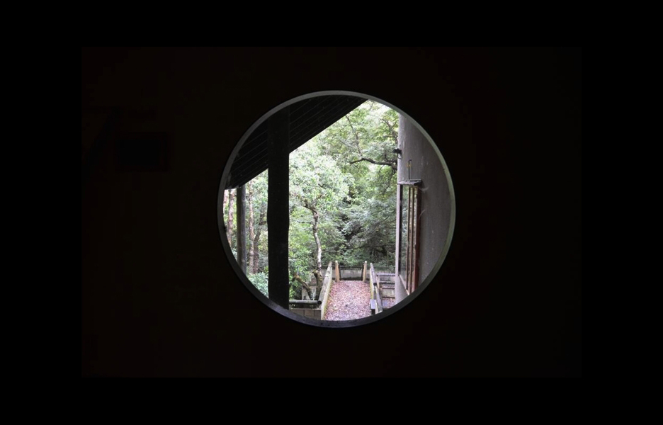
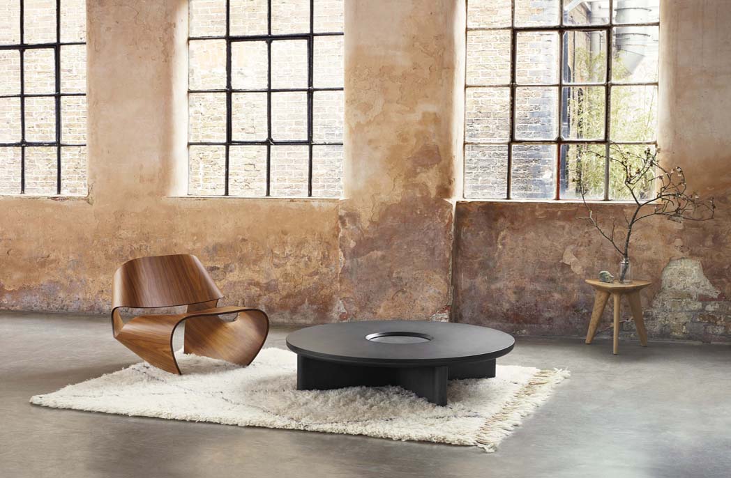
Essential
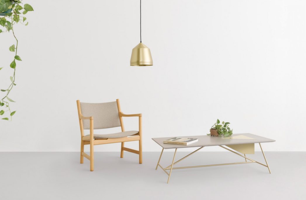
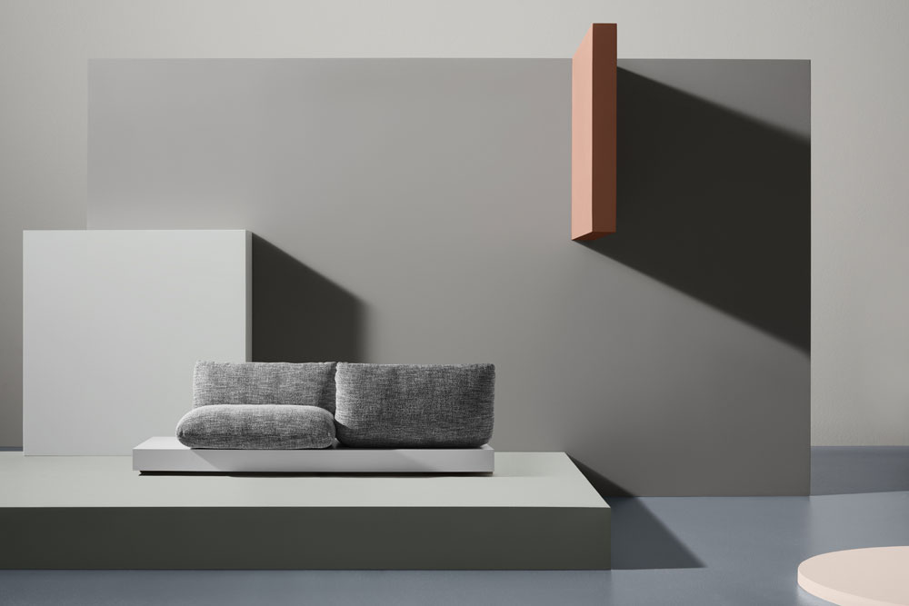
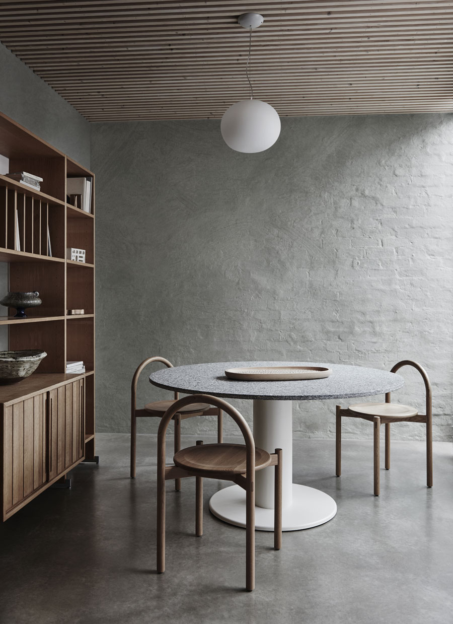
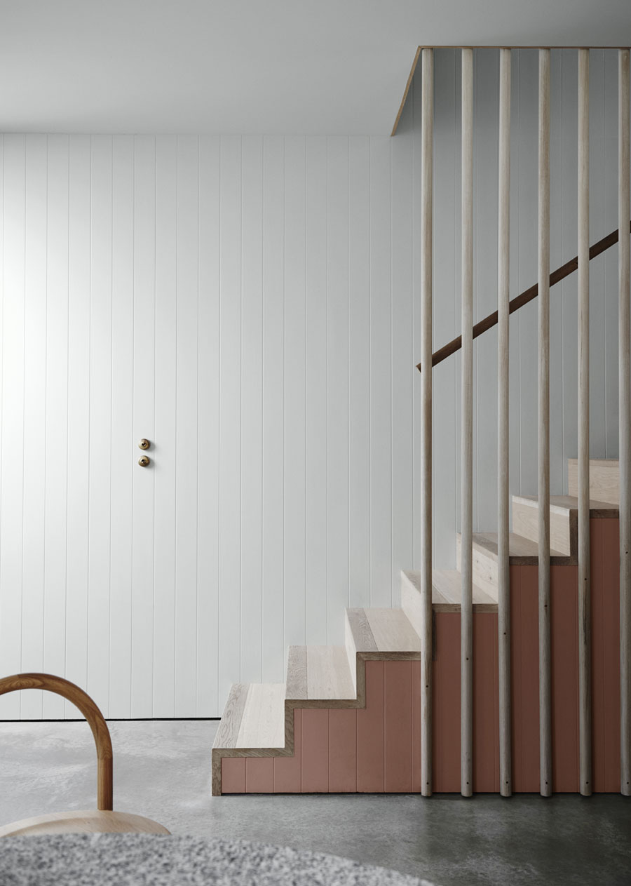
Looking at the over-consumption that is so rampant in the world, this palette is a response to a global social consciousness that is arising around waste. It also speaks of the growing appetite for the minimal, simple and more authentic approach to life. The colours in Essential lend themselves to the notion of Hygge, with calm, pale hues coupled with imperfect finishes and raw forms.
–
Escapade
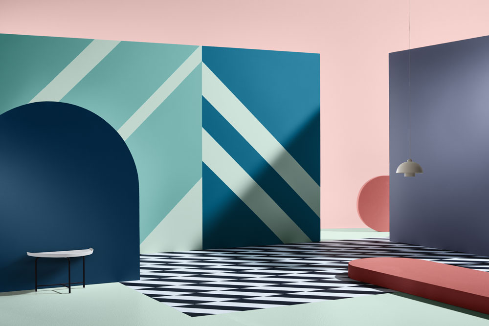
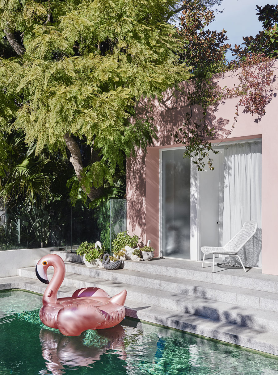
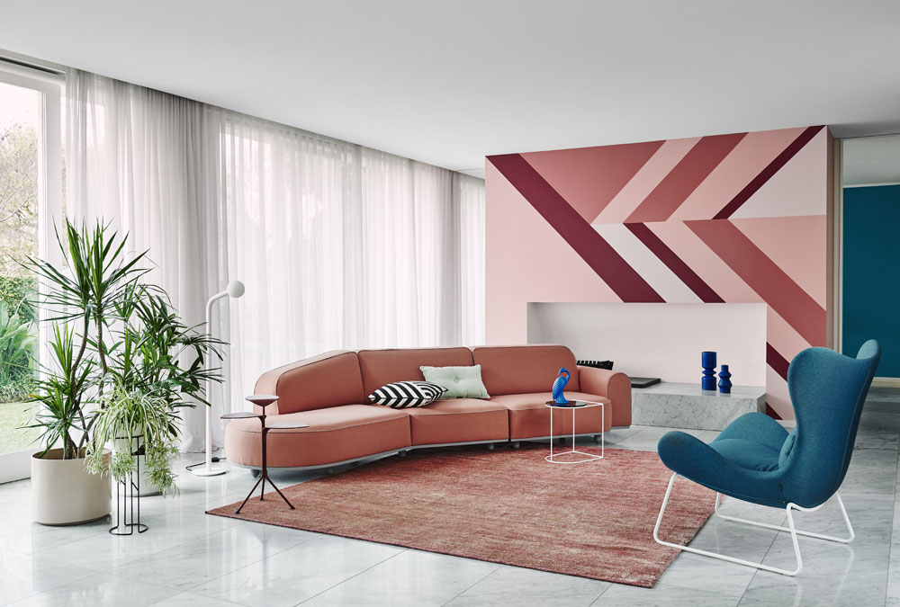
Running off the need for escapism and the growing affordability of luxury, this palette is playful and rounded out with a holiday vibe. Referencing tropical destinations and a distinct ’80s aesthetic, Escapade includes pale mints, pops of pink and the odd bit of black. The overall feel is the glamour of travel from both a nostalgic reference and a futuristic feel.
–
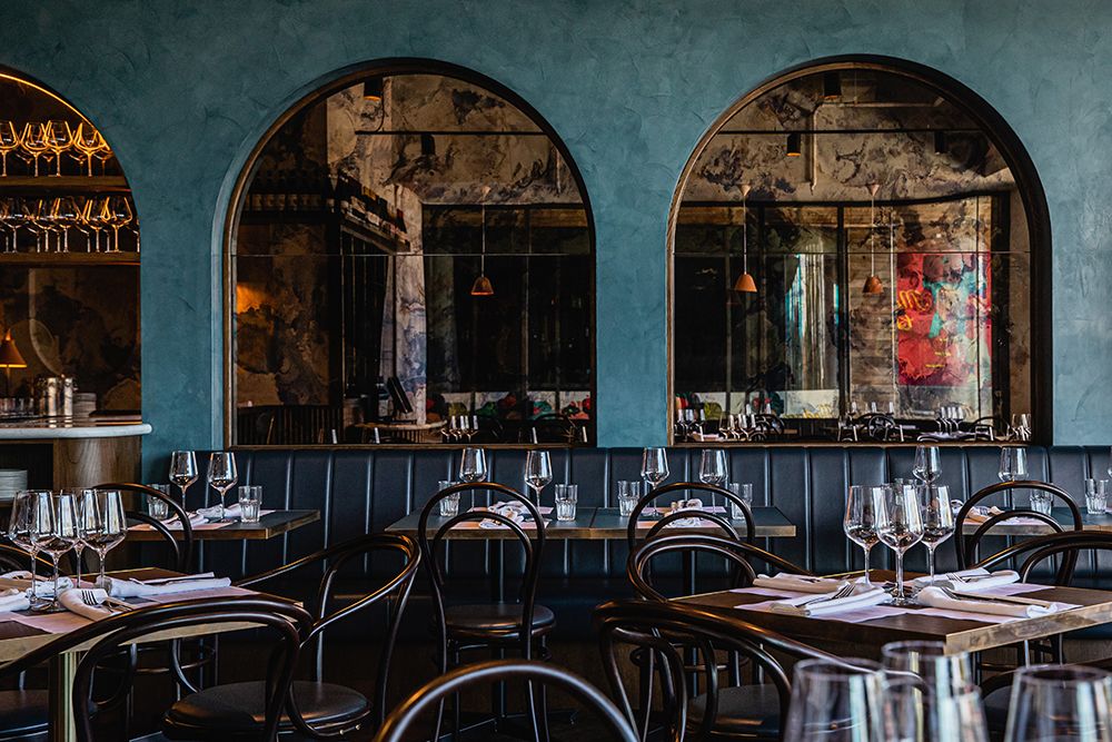
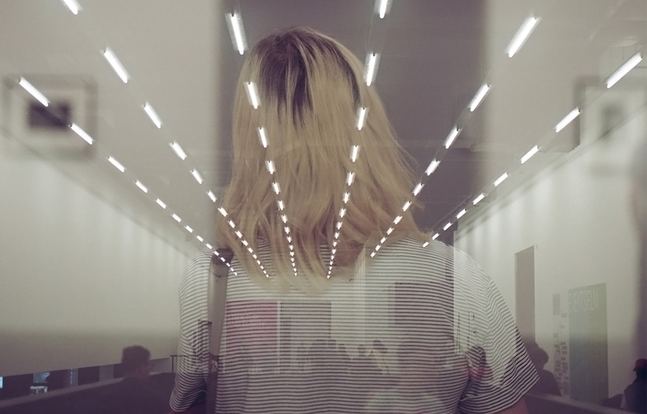
Reflect
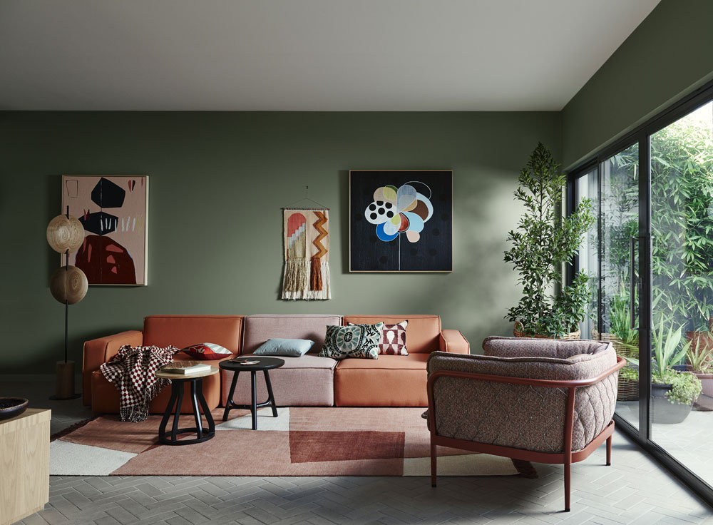
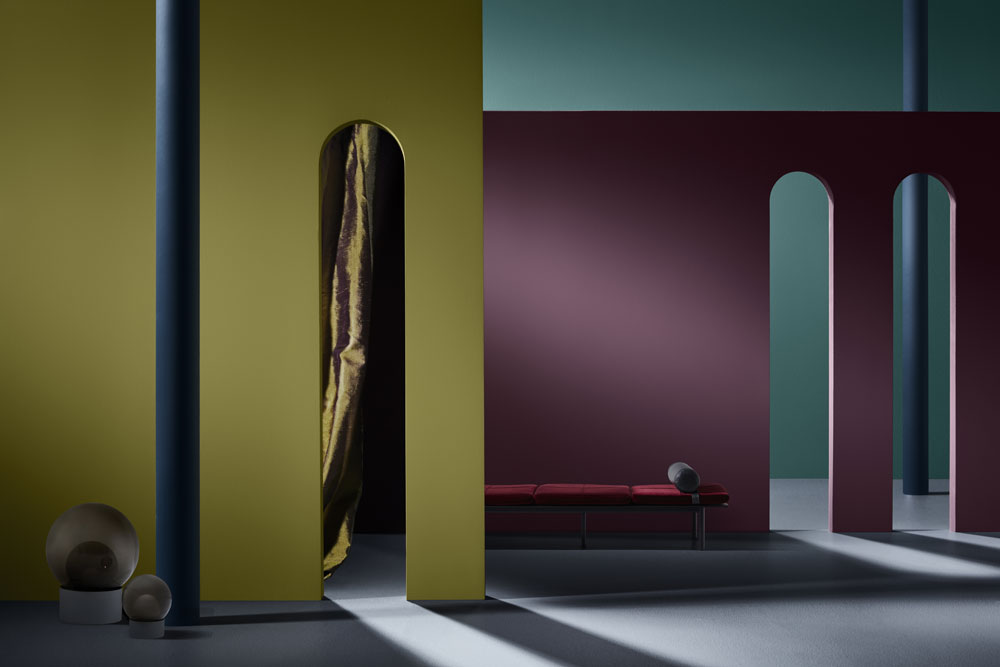
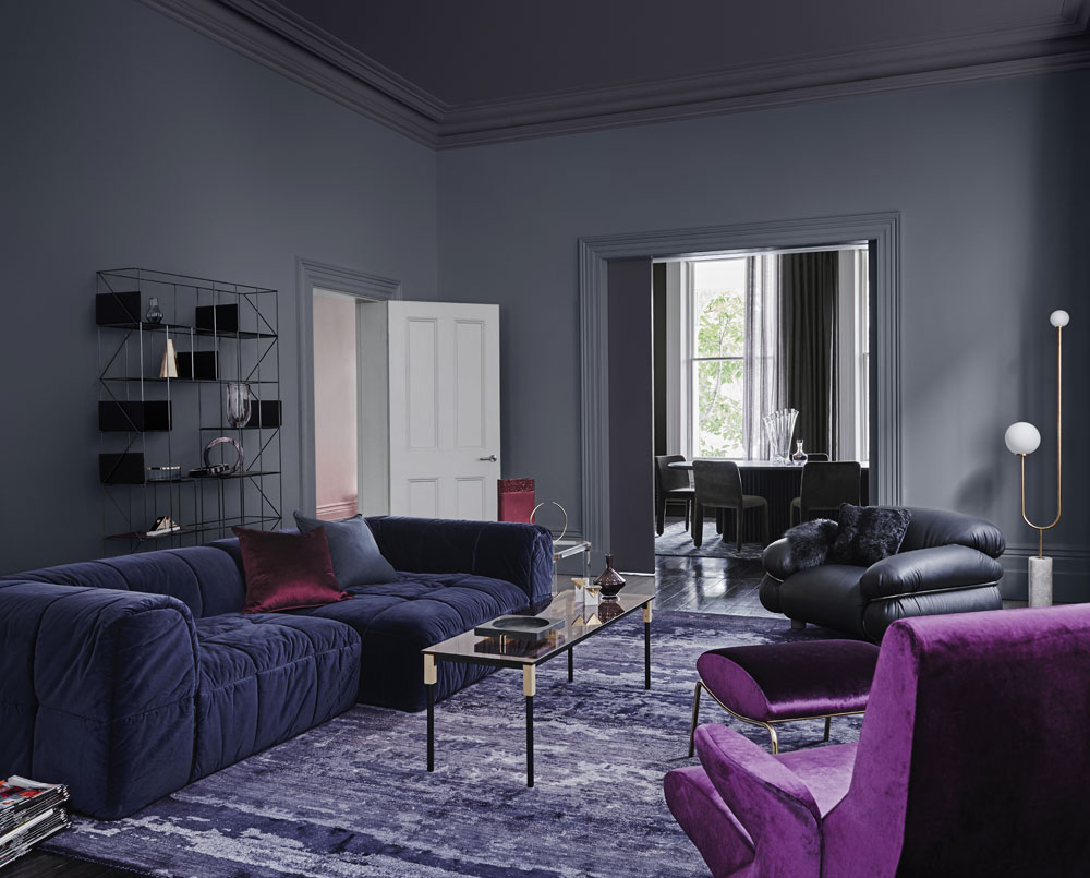
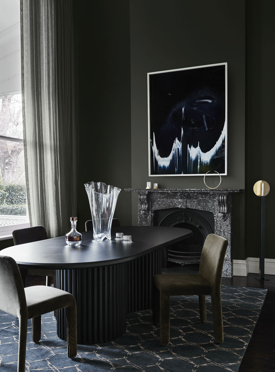
Moody, velvety and rich, Reflect borrows eclecticism and charm from bygone eras. Classic 1930s and ’50s colours play off against more vibrant hues from the ’60s and ’70s. The palette runs the gamut from deep green to warm pink tones, and grey-based purples, all rounded out with a strike of avocado green.
To find out more about the 2018 Dulux Colour Forecast and research behind the trends, or to view the full colour palettes, visit the Dulux website.
–
See the trends from the 2017 Dulux colour forecast here.
You Might also Like

