The belle of Bondi by Greg Natale
The belle of Bondi by Greg Natale
Share
The desire to create a holiday lifestyle and a palette that draws from 1970s eclecticism are at the height of Greg Natale’s latest residential project.
Starting with the architectural intervention, Natale’s design for this three-bedroom ’70s apartment has stripped away anything non-essential and reclaimed all the ceiling space by shifting everything to the perimeter. In the main living space a perforated bulkhead conceals all utilities, including air-conditioning, curtain pelmet, fireplace flue and new structural beams. In smaller rooms a curved bulkhead conceals air-conditioning while freeing the remainder of the ceiling.
The original layout was typical of the era with every utility given its own room. As such, the whole was structurally changed and supported to remove redundant room separations. Natale has also considered how the two very small bedrooms can be arranged optimally for the teenage children. As such, the rooms are laid out lengthwise with beds running along the length and a desk and wardrobe fitted at the end.
What is always more exciting in a Natale design, however, is the gorgeous layering that creates the visual narrative. The redesigning of the hallway, for example: “Hallways are always under designed, so we have been paying a lot of attention to hallways lately,” says Natale. For this project the hall ceiling has been vaulted with curve topped doors in vertically panelled duck egg blue and with a brass skirting board. The hand-plastered walls are extended to the ceiling for visual cohesion, but also to cause light to bounce and reflect through this narrow space. The curved and slightly inset doorways give peeks into the rooms rather than clear views, while the end of the hall acts as a perfect frame for the magnificent coastal view.
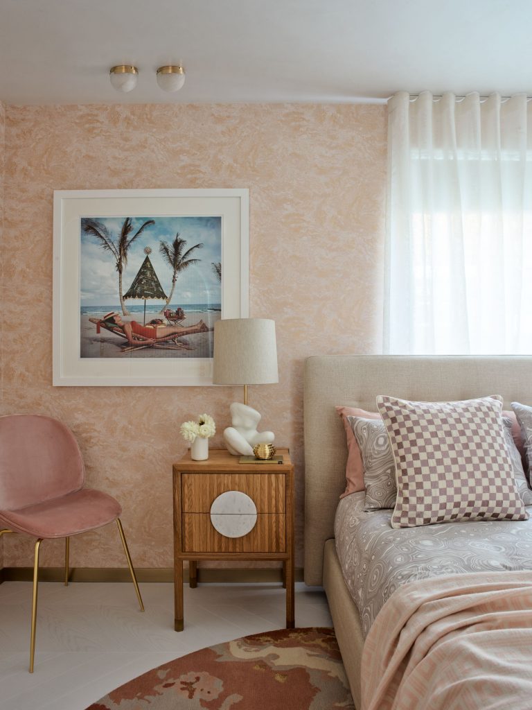
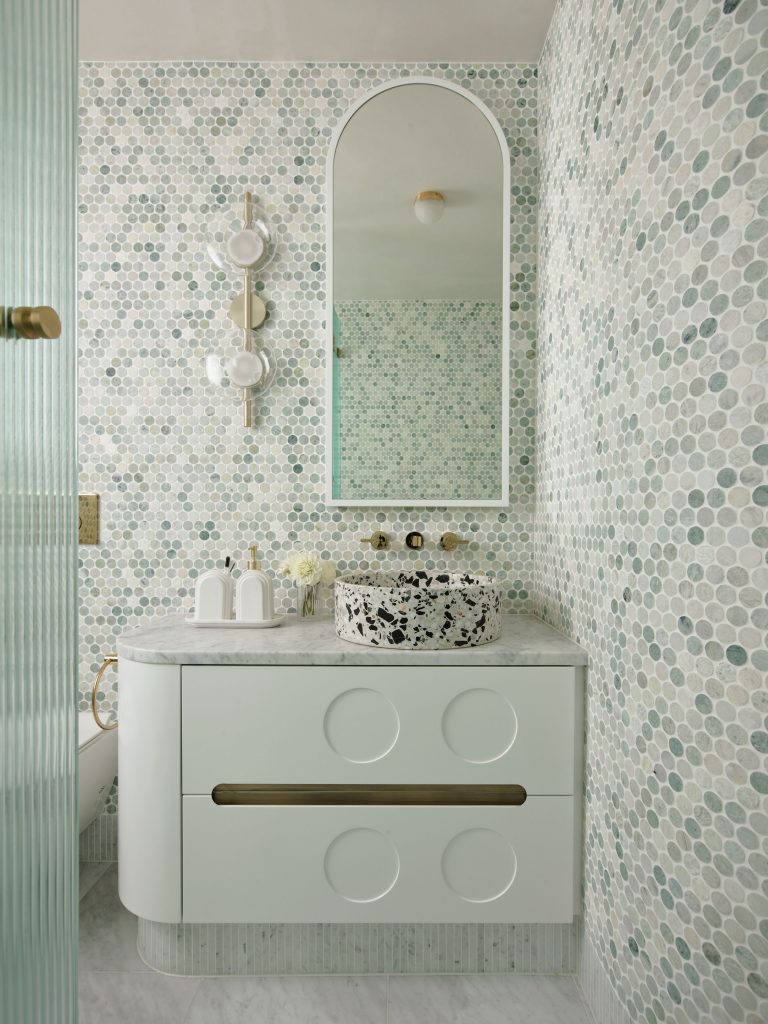
Colour is worked masterfully throughout with a subtly shifting palette of blues and tans that range from grey blue to pale mint on one hand and burnt orange to mushroom on the other. Each of the bathrooms, for example, has a slightly different take on the palette with the main shared bathroom executed in a mix of grey to blue circular tiles (Teranova) with cool grey cabinetry and Carrara flooring and vanity surface (Teranova). A fluted glass shower screen curves into the space to stop water from splashing the window, but is gorgeous enough to need no excuse. For the master en suite, the tiles are a mix of brown, pink and grey with the same cool grey cabinetry and terrazzo washbasin (Bentu).
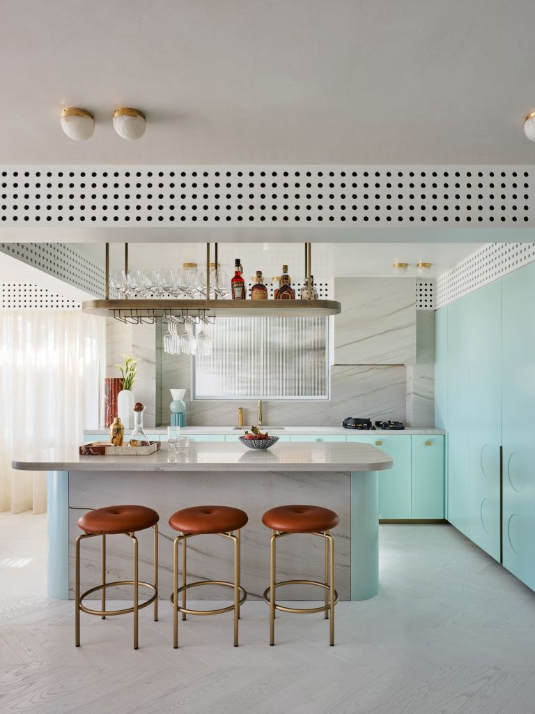
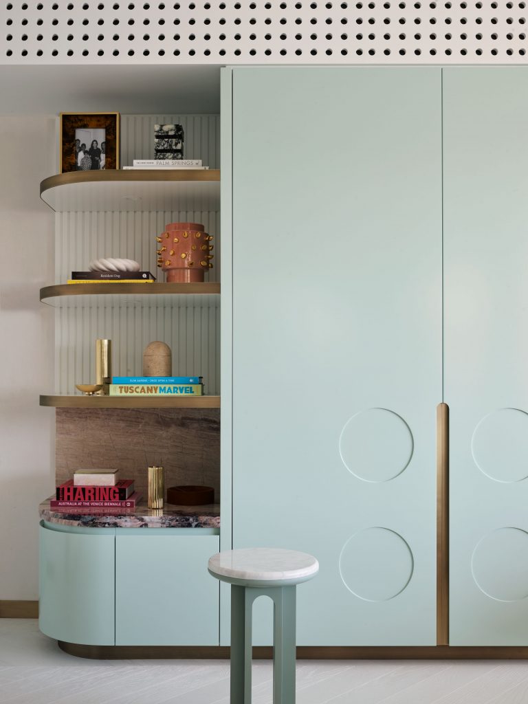
The main living space is contained with cabinetry to both sides in a pale, mint blue. Undeniably beautiful, the colour use shifts from storage on one side, to the kitchen on the other. A circular motif worked into the larger expanses denotes the circular form explored throughout from lighting to tiles, mirrors and objects. The kitchen itself is open and very much about entertaining with a ceiling suspended glass rack usually reserved for hospitality, above a table topped island. Large expanses of Mont Blanc Quartzite (CDK Stone) and the pale mint cabinetry reduces the material palette. There is also a good dollop of bling with brass handles (Designer Doorware and Spark and Burnish) and trim. This is picked up in the overhead lights of brass crowned alabaster spheres. “We played with them as singles, but it looked under designed,” says Natale of the unusual pairing of lights he has created for this project.
Throughout the whole Natale has used a white chevron timber floor from Mardegan, an interesting company delivering some exciting pre-finished European-style floorboards.
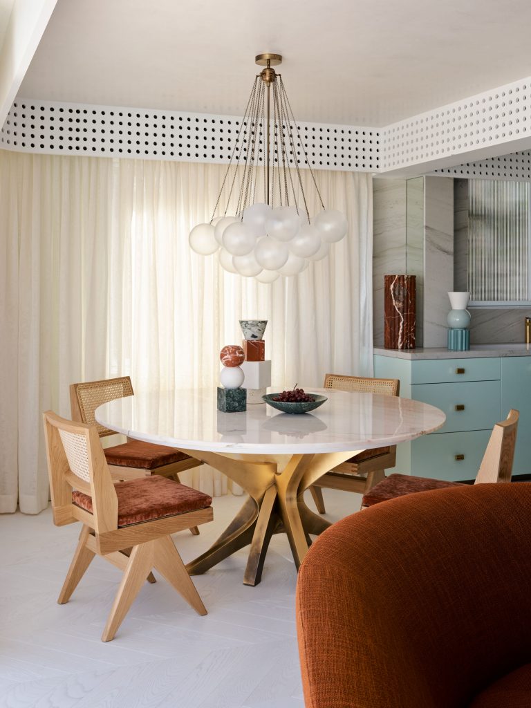
Round rugs in each of the bedrooms emphasise the chosen colour palette, while a large oval rug in a burnt orange demarks the lounge area and frames the three very different seating options. Comprising a Jacques Angled sofa (De De Ce), blue velvet and timber lounge chair and sheepskin chair, the selection could not be more diverse, and herein lies Natale’s very particular talent. Each piece is selected for its scale and form with colour overlain to suit the project. The result is a strong curving horizontal of tan with two gestures of almost insouciant lightness. He has also designed this space to have a large open volume on arrival. This acts as a gathering zone when guests arrive but also negates any compression. For the dining suite, the selection is similarly bold with a custom Boca do Lobo Patch table in gold leaf and marble, with Capitol Complex chairs (Mobilia) and the sensational Cloud pendant (Apparatus) anchoring the whole.
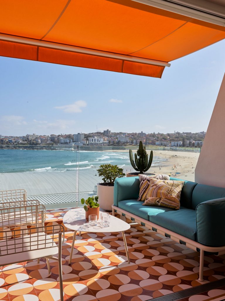
Moreover, while this design was to be beach and Bondi, it was also to be elevated. As such, the references are to the Art Deco era of much of the surrounding architecture, rather than to retro or beach house tropes. There is also a feeling of old world Europe, once more pronounced in Bondi, and clearly articulated in material choice and pattern, such as Natale’s wonderful orange, tan and cream tiles of the terrace: “It’s my nod to Gio Ponti’s Sorrento hotel [Parco dei Principi], which I totally love. I just love, love, love it,” says Natale. Then there is the extraordinary awning of bright sunshine orange that spills colour into the interior and brings the whole building alive when viewed from the beach. Divine.
Photography by Anson Smart.
This article originally appeared in inside magazine, which is on newsstands and available online now!
You Might also Like
