Inside-out outside-in: Amber Road
Inside-out outside-in: Amber Road
Share
Practice – Amber Road
Project – Inside-Out house
Location – Sydney, Australia
Text – Gillian Serisier
Photography – Prue Ruscoe
In a reversal of material delivery, the merging of interior with exterior is uniquely conveyed, while comfort is assured.
Pervading Inside-Out house is a design maturity born of rhythm and layered nuance that is usually reserved for far older and far larger practices. Rethinking, clarifying and reconceiving the house as a home, furnishings, lighting and an abundance of customisation are all considered and wholly fitting to the project. But, perhaps what makes it so exceptional is the unique and singular solutions created for each of the transformation’s needs. That these elements bind together as a visually continuous aesthetic, without suffering the tedium of repetition, gives the project a rich undercurrent while delivering a calm ambience. Very nicely done. Leveraging the dual expertise of the practice’s principals (interior architecture: Yasmine Ghoniem, and landscape architecture: Katy Svalbe), Amber Road has addressed the renovation holistically from inception. And while this may be nothing new, what makes it pertinent to the project’s success is the blurring of lines and sense of completion the whole conveys. Indeed, the home is aptly named the Inside-Out house, with visual and physical connectivity a mainstay.
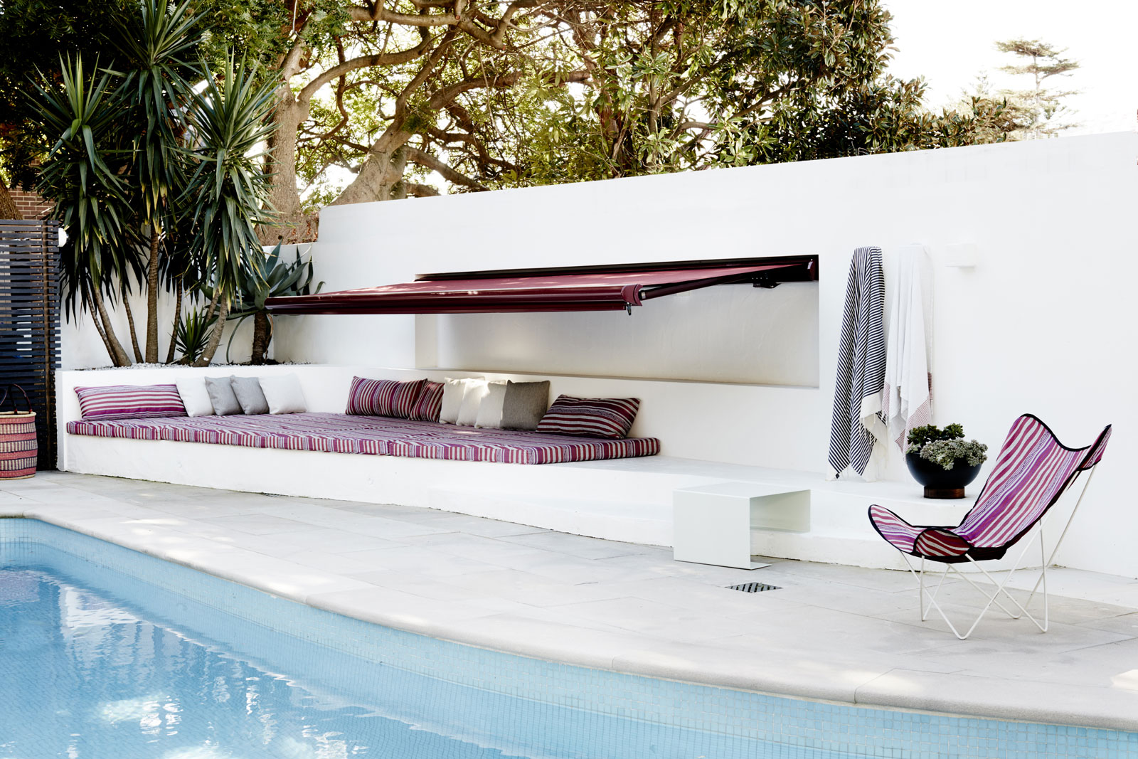
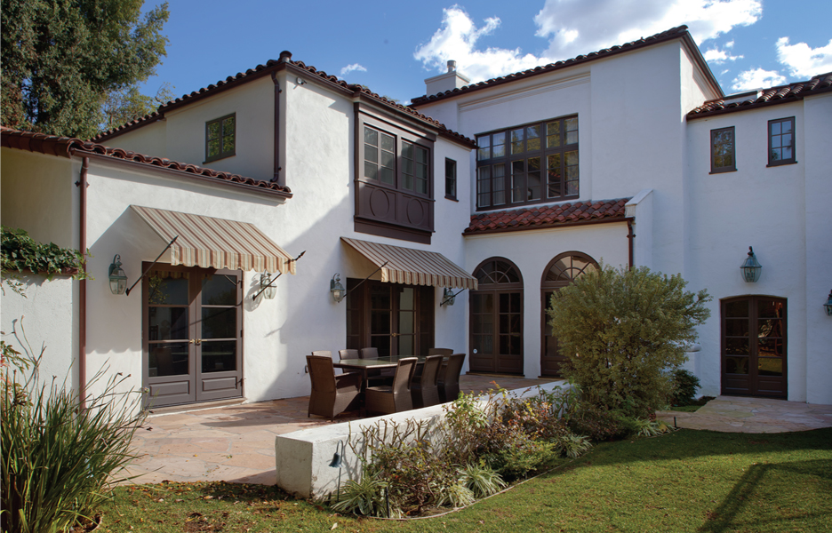
Striped upholstery on custom built forms provides a connection to interior details while adding colour and a lively mood to the courtyard and pool area.
As Ghoniem explains, the home was a bit Mission style, a bit renovated and a lot of bits and pieces that didn’t work, didn’t fit and were consequently unutilised. The task then was to create a retreat that was conducive to relaxation and expanded use. The owners also wanted a balcony from the master suite, instead of the sliding doors that opened to air and a full storey drop! From an interiors perspective, the key was a simplification of everything. The elaborate balustrade detail, for example, was removed, as were walls, rooms and anything superfluous to a clear flowing arrangement. Similarly, the landscape was addressed with new boundary walls, custom entrance gates, clarification of areas and an integrated seating area with a roll-out striped awning, upholstered elements and matching butterfly chairs. Small areas were removed to facilitate flow, while seating nooks create a new set of options and visual consistency. Going against norms, the sandstone and render were resurfaced or replaced only where deemed appropriate, while other areas were stained charcoal, almost a blasphemy in real estate speak, where sandstone is among the holy cows of architectural gravitas. The result, however, is fabulous.
Providing the visual key to the design is a large, multicoloured woven artwork that the clients acquired in Mexico. Rather than thematically exploring this device, the artwork’s qualities – including colour, circular motif, physical layering and perforations – inform the details and textures of the project. Perhaps this is most directly so in the graphic stripes of Patricia Urquiola’s Tropicalia Cocoon swing chair (Moroso, HUB) and the PET ES set of six pendants (Spence & Lyda). More subtly, the balcony return has been perforated to negate any sense of containment, while linear elements of the weaving are explored in the regular repetition of the fine verticals of the external balcony upper rails. The circular motif is similarly nuanced and makes its appearance gently in the custom gate and entranceway mirror.
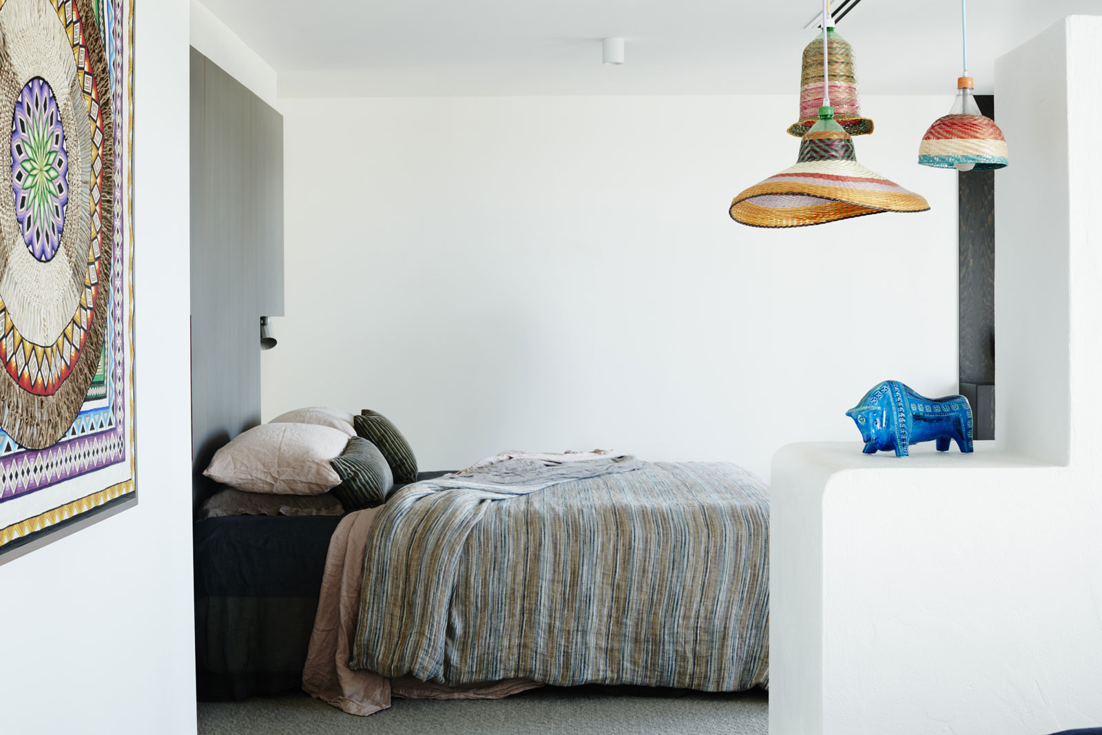
The artwork from Mexico that informs much of the home’s detail including the choice of Missoni bed linen (Spence & Lyda).
With a huge amount of Mission render to visually negate, the entrance foyer has had containing walls removed and been clarified as an expanse of pure white (Bianca, Resene), where details have been rendered to a smooth surface. Effectively, this creates a feature of the remaining Mission render, while excising it from its previous dominance. Instead, it is the coloured panels of glass in deep oranges and pinks that catch and hold the eye. Drawn from the artworks in this zone, each panel of glass replaces a section of decorative ironwork. A large skylight, which sends shards of light through the coloured glass, has been made more dominant with radiused corners and a coat of pale pink paint applied to the deep reveal. It is, however, the fusing of the inside with the outside that makes this project sing. Rather than extend interior flooring and finishes outwards, the designers have extended exterior finishes inwards. The upper balcony, for example, is realised as a two-metre wide expanse of charcoal slate tile (Onsite). Rather than end at the sliding window, this treatment has been extended into the interior for a further metre. Visually, this shifts the parameter inwards, while creating a horizontal version of a dado line.
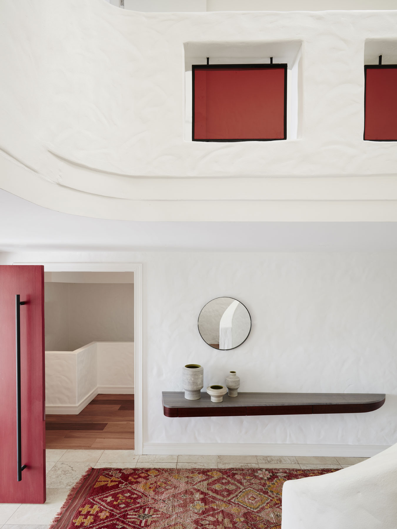
Brightly coloured panels of glass create luminous expanses of colour through the white on white of the entrance foyer as the sun streams in from a large skylight.
In another unusual move, from the metre point inwards, the floor has been carpeted (Cinder and Pumice from Galet range, Cavalier Bremworth). In the choice of a carpet rather than rug, the design allows the casual nature of the inside- outside melded living space, while also providing warmth and luxury, which is reiterated in furnishing choices such as Eero Saarinen’s Womb chair (Knoll, De De Ce) and Mags Soft sofa (HAY, Cult) The addition of the dense tactility of the carpet further references the artwork, and works exceptionally well with the Missoni fabrics (Spence & Lyda) used throughout.
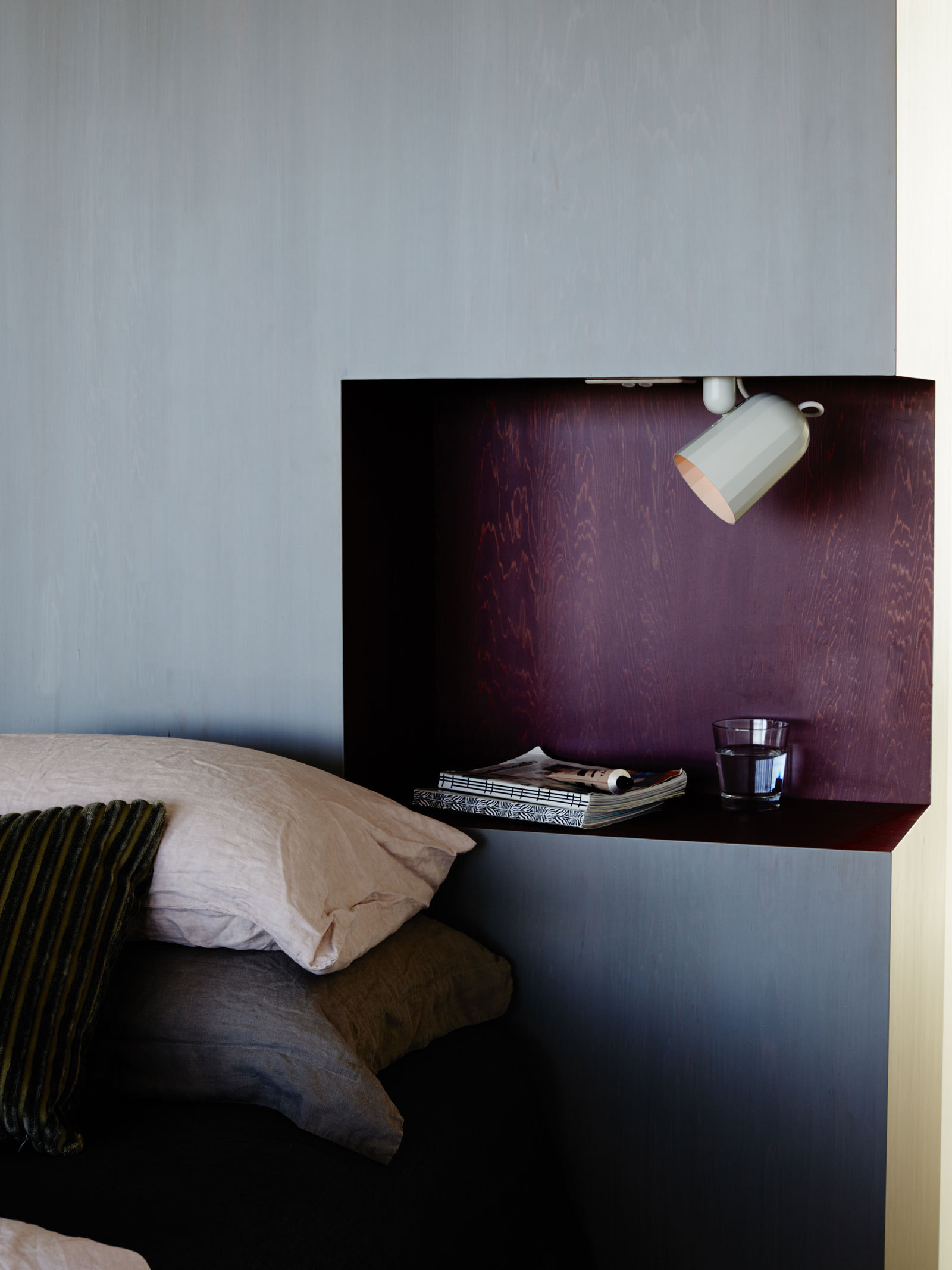
Cabinetry stained in rich tones of mulberry and silver grey adds depth and luxury without detracting from the overall sense of calm. Noc lighting by Wrong for Hay (Cult).
Bespoke cabinetry stained in unusual combinations, such as mulberry and silver grey, provides strong boundaries, as does the carpet, which anchors and centralises each of the living areas. It is, in fact, a very clever way of balancing the free flow of an indoor-outdoor periphery, and a solution that has been used externally with bifold cedar shutters that create a movable external screen. On the ground floor this device allows a portion of the balcony to have an exterior role, while on the first floor a partial wall is created. The result is an exterior world that visually breaks into the internal, while the lower levels of paving delineate the outdoor spaces.
The most remarkable element of this project, however, is that, despite all these various layers and colours and textures, the whole is remarkably calm. The design has delivered an exceedingly liveable house with swathes of outdoor relaxation, lovely breezeways, generous proportions and a nice combination of clearly delineated and multi-use zones. It is also sufficiently clear to be eclectic, personality-infused and entirely fabulous.
This article originally appeared in inside 94 – available digitally through Zinio.

