
Greg Natale: Cool school, Italian style
Greg Natale: Cool school, Italian style
Share
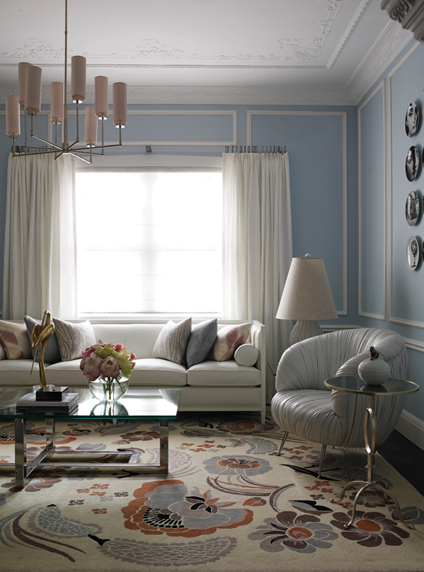
Interview by Gillian Serisier. Above Image: Tennyson Point House. Photography by Anson Smart.
While those around him dreamed in white, Greg Natale envisaged a world of pattern, texture, layered geometrics and the promise of recontextualising his Italian heritage, whereby a Murano chandelier or Baroque chair could be imbued with cool. Natale sat down with Gillian Serisier, co-editor of (inside), to discuss his past influences, present success and future projects.
Serisier: What started you in interior design?
Natale: I was one of those kids that knows what they want to do from age 10. I watched a lot of television and film and was inspired by the sets I saw. I decided really early on interior design. So from year seven, I was doing art and tech drawing for the HSC.
Did you start your practice straight from university?
No, my practice started in 2001. Before that I worked for three different architectural design firms from 1996 to 2001. Garth Barnett Designers, he’s high-end residential. Then HBO + EMTB and that really taught me the art of producing drawings – awesome. We worked on some really beautiful projects like a Hilton in Auckland and ABN AMRO headquarters in Sydney. Then SJB working with Andrew Parr for a while and by that stage I was ready to start my own business.
Parr’s one of the greats, but you have a very different aesthetic. Did that go towards going out on your own?
In 2001, it was pretty entrenched in minimalism everything was super built-in – it was almost like a spaceship where everything was integrated. So I could see that the next phase was going to be layering and decoration and where furniture pieces would become objects.
So how did that drive your thinking?
I had to ask myself, ‘How am I going to look different? If I’m going to start my own business, am I going to keep doing what everyone is doing, which is basically minimalism, or am I going to do something different?’
Natale’s interiors at Croydon House
Was there a key starting point?
I got the opportunity to do an apartment for my sister. I had no budget, but she didn’t want a white box, so she pushed me out of the white box. Then I discovered Florence Broadhurst and Signature Prints and came up with this crazy scheme of doing this whole pattern on pattern thing. It was a Verner Panton response and it won the Belle magazine award and got into Wallpaper* magazine and it really got me noticed by all the editors and that set the DNA for what I do now.
When did you start bringing in your Italian heritage?
I was this ‘new kid on the block’, so I needed to do things differently, set a new aesthetic. So, for my first apartment, I really looked at inspiration that only I could have. It was a BKH [Burley Katon Halliday] apartment, in Republic. I bought it because it had great bones, great space, clean lines, I didn’t have to do anything to it structurally, but I didn’t want to live in a white box. I thought, ‘What is the opposite of white?’ But I didn’t want to live in a black box, so I did this whole charcoal thing. Then I thought, ‘How do I make this different?’ And I started looking at the family home.
My parents built their dream home and decorated it in the eighties. Back then, Italian immigrants decorated their homes in reproduction Baroque furniture. I brought one of the armchairs into the apartment. It now had different context and was cool. I started looking at my background and added a big Murano chandelier. An aunt had decorated a Federation house with Murano chandeliers, but I was giving it a new context and it worked.
I was very inspired by the late English [designer] David Hicks and Verner Panton – the way Hicks mixed classic and clean lines together and layered them over with geometric patterns, and Panton did the pattern on pattern thing. I was doing my thing in Australia and then I discovered the work of Jonathan Adler and Kelly Wearstler and the whole Hollywood Regency exploded and I was part of this international style and the phone started ringing off the hook.
Hollywood glam has become a part of Natale’s signature style.
What impact did that have on the business?
We have 10 in the office now, with 40 projects this year. We do a lot and the office is growing. Five years ago, I had three people.
Are people seeing your work and saying, ‘I want that’ or ‘I want you’?
It’s a bit of both. I know I have a signature style, but it is very adaptable. There is a hard-edged minimalist house we have done, but it is still layered and warm. And I think to me that is what I want the common thread of my work to be: very warm and layered. There is a new build in Brisbane and that has morphed into a contemporary art deco feel, while the guesthouse on that property is in the New England style, so it is very varied.
You are one of the few Australian designers that admits the American influence.
I do have American influences. I think what Americans do so well and Europeans don’t do as much of and Australians not at all, is layering. And without even realising it I started using American furniture. It straightaway made my work look different to others.
Do you mix in antiques?
It depends on the project. There is a stud ranch we have done, which uses antiques. The client breeds Melbourne Cup horses, so he bought an established stud with an 1880s Victorian bluestone homestead. Amazing. The house uses a guesthouse for buyers and conferences, like a private hotel.
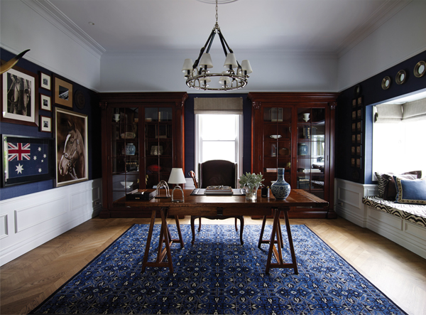
East Brisbane Guest House by Greg Natale
Who are your influences?
I see myself more in Philip Johnson than [Ludwig] Mies van der Rohe, but van der Rohe is a huge influence on my work. I’m highly inspired by his materiality, the travertine marble of the Barcelona Pavilion. There is a minimalist house we are working on that is inspired by van der Rohe – it’s all marble, travertine and granite. I’m inspired by a whole lot of people – the early modernists van der Rohe and Le Corbusier. Then mid-century I’m inspired by Paul Rudolph, and Harry Seidler is like a god. Modern architects: I admire the work of David Chipperfi eld. Decorators: I’m inspired by the late Englishman David Hicks, a huge inspiration; Dorothy Draper, William Haines – both American designers. Now I’m influenced by William Sofield, who does all the Tom Ford stores – amazing designer. Kelly [Wearstler], Jonathan [Adler], I think David Katon is a genius, I think Paul Hecker is very clever. I think locally they are amazing.
Who’s doing good wallpaper at the moment?
Me! I’m doing another range for Porters at the moment – I have my striped collection that was released in 2013. Cole and Son always does great papers.
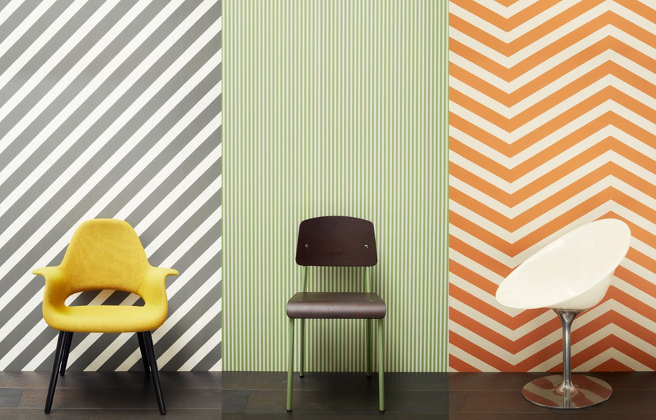
Natale’s previous wallpaper collection for Porter’s Paints
Who is doing good rugs?
I think Yosi [Tal] at Designer Rugs is doing an incredible job. He really is the only Australian retailer who says, ‘I am going to push Australian design and make it the core of my business.’ And he does it with all the collaborations.
What’s next?
I’m doing a lot of collaborations at the moment, more wallpaper, more rugs and furniture. My big thing for this year is my first book, The Tailored Interior by Greg Natale, which is being published by Hardie Grant and coming in November 2014.
You mentioned your signature style, how do you manage that?
I know it’s a very signatured style and I know my work is on trend, and I like it being on trend, but I inject the client’s personality into it. I spend a lot of time with them and really get into their heads and when I am choosing something I really put my feet into their shoes.
Greg Natale is nominated in various categories at IDEA 2014, including Designer of the Year. Preview one of his shortlisted designs here.
Click for your tickets to the highly anticipated IDEA 2014 Gala party!
You Might also Like


Related Stories
© Niche Media 2026