Five projects that lean on muted grey palettes
Five projects that lean on muted grey palettes
Share
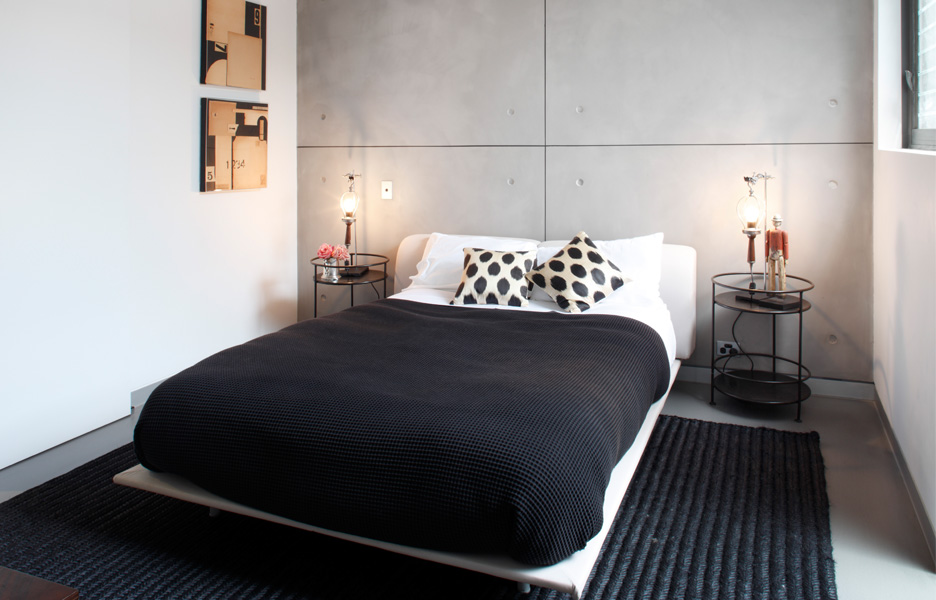
For our latest lookbook, ADR is examining the quiet confidence of interiors with overcast colours. Sometimes, less is more!
Featured today are some recent residential and commercial projects covered on ADR, all of which, spare time and attention to fostering rooms that don’t rely on bold colours or materials to speak their purpose.
Glebe house, Sydney, Tribe Studio Architects
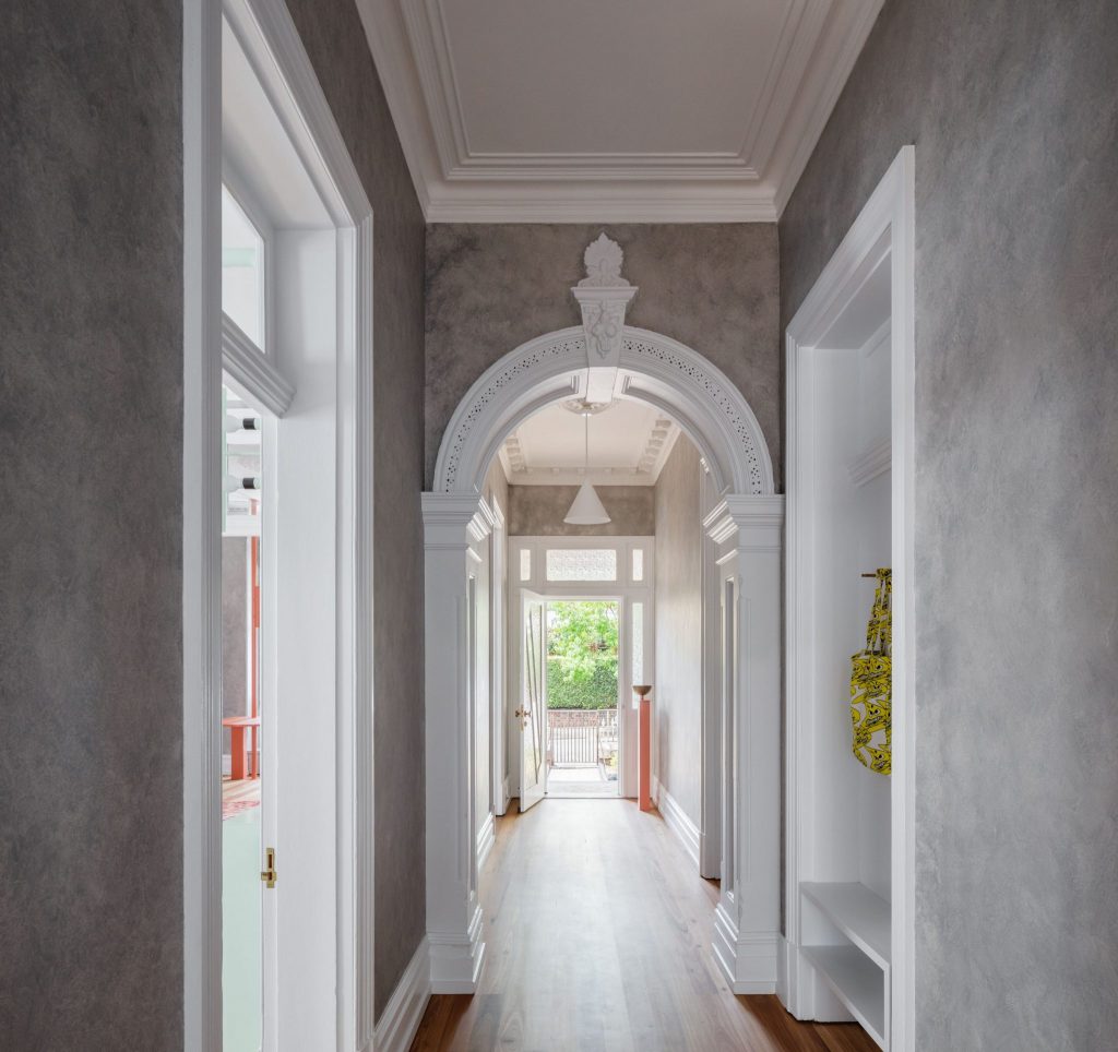
Designed for a busy couple with two boys, Glebe house also features work-from-home options and a secondary space that switches between Airbnb rental and self-contained accommodation for relatives. Awash with natural light and over-scaled spaces, the residence is rich with arched portals, pops of softness, and cheeky nods to the old and new.
Keeping in mind the frilly and decorative nature of Victorian architecture, Tribe Studio opted for a more contemporary response. Featuring limited pops of colour in neon orange and marshmallow pink, the spaces sit within a cloudy grey interior that remains in charge of the overall feel.
Read more about the project here.
Gridded house, Melbourne, Carr
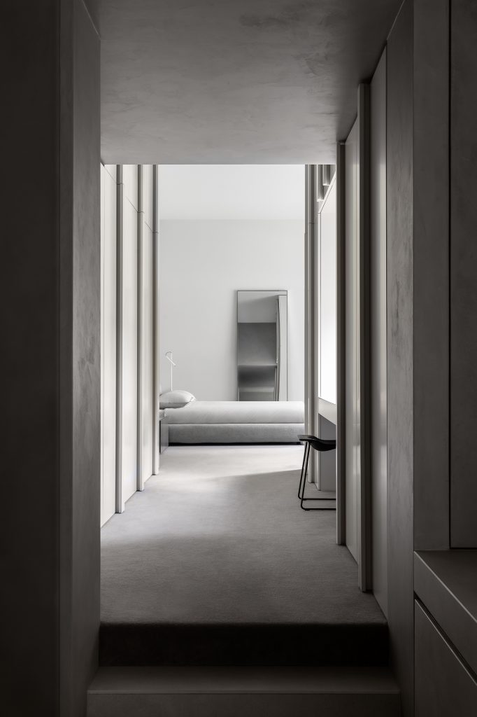
Posed with a similar brief for a heritage project, Melbourne-based architecture and interior design studio Carr was engaged by long-time friends and previous clients of Carr to create a modern intervention that celebrated the historic design of the original dwelling.
To achieve this, the interiors of Gridded house were painted a soft grey that simultaneously emphasises heritage detailing and provides a unified backdrop for the client’s extensive contemporary art collection. All the joinery details also continue in similar tones to promote an effortless visual narrative between rooms.
Read more about the project here.
Barwon Heads house, Geelong, Adam Kane Architects
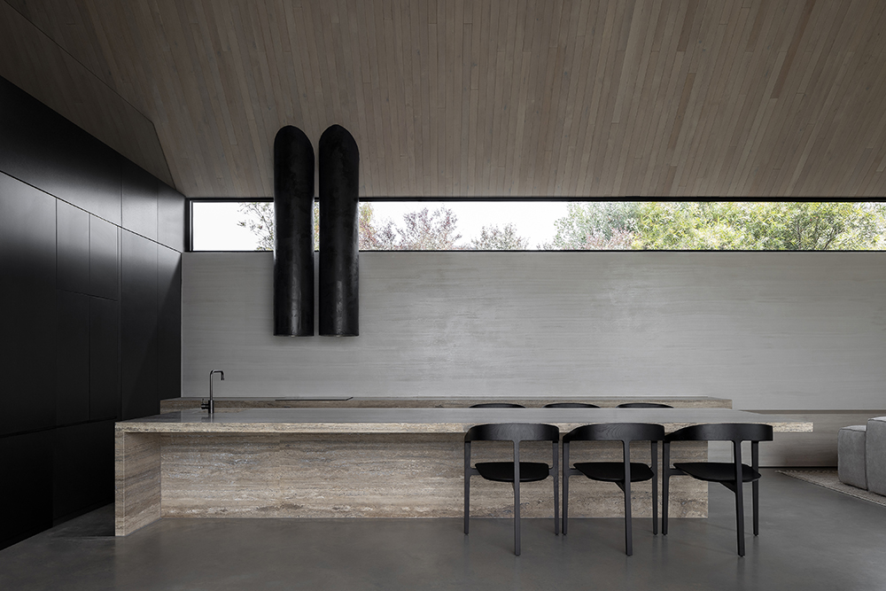
Adam Kane has made a space for himself in the Australian design scene, carving his way to the top with an aesthetic that is beautifully Brutalist and monastically memorable. Case in point, 2021 IDEA Residential Single winner Barwon Heads house.
Displaying a fondness for Western European Brutalism, Kane describes his style “as playing with the level of refinement and subtlety, often through textures of the same material rather than going to the extremes of busy for busyness’ sake.”
Read more about the project here.
Glen Iris house, Melbourne, Luke Fry Architecture + Interior Design
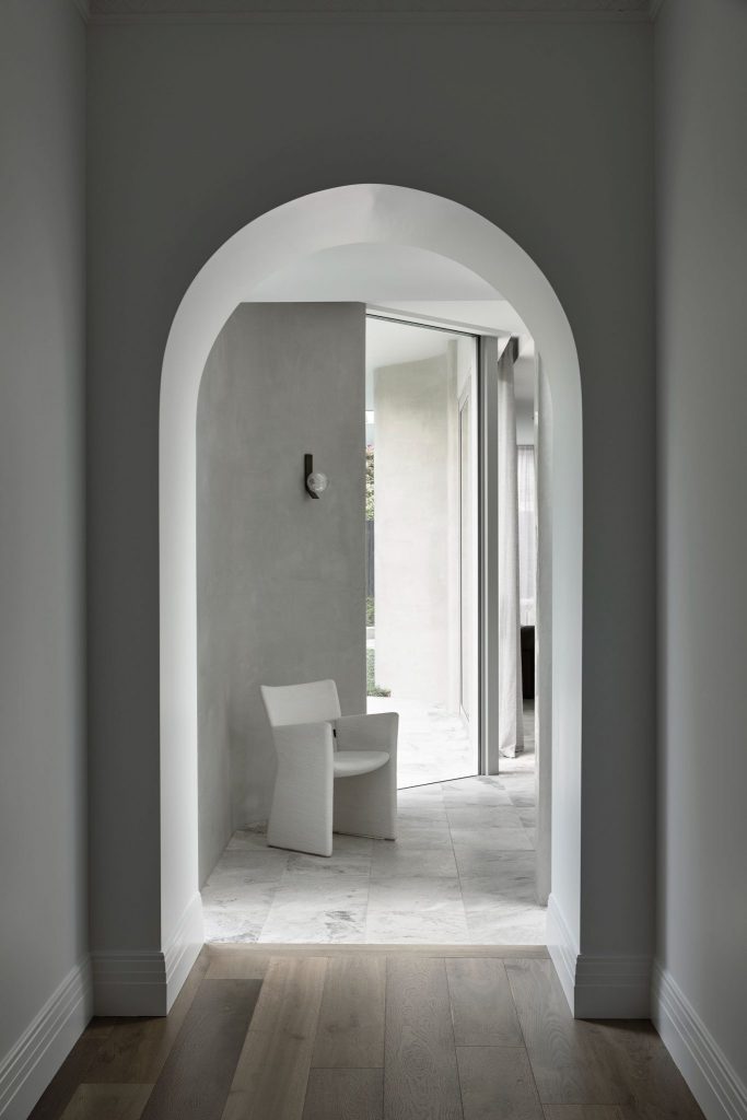
Given full creative rein to modernise an unrenovated period home in the leafy Melbourne suburb of Glen Iris, Luke Fry relied on simple forms and a pared-back aesthetic.
Speaking to ADR, Fry says that while the house does feature pops of colour in some spaces, such as the kitchen, the home is primarily for edited spaces featuring simple forms.
“My favourite element of the project is the curved concrete rendered walls of the pavilion, and in particular the bullnose rounded corners, which gives an incredibly soft language to the otherwise solid construction,” explains Fry.
Read more about the project here.
Hames Sharley Perth studio, Perth, Hames Sharley
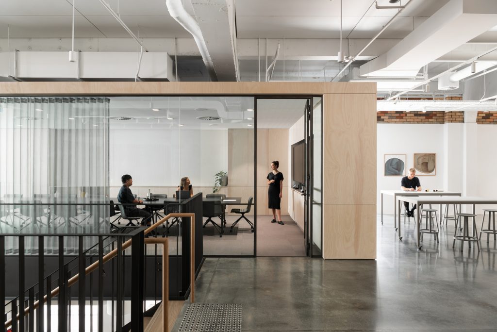
Hames Sharley was commissioned by the City of Perth to examine reactivating vacant tenancies, and worked with site owners, the Humich Group, to restore life to the redundant and long-neglected 1100 square metre space.
The staff was heavily involved in the design process, including extensive consultation to accommodate a range of workplace approaches. All of this resides within a palette that is authentic, timeless and natural and links the physical expanse to enhanced creative thinking.
Read more about this project here.
Featured image by Timothy Kaye.
On the other end of the spectrum, check out seven Australian retail interiors that let colour do all the talking.
You Might also Like
