Techne-designed ice creamery delivers retrorama fun to Albury
Techne-designed ice creamery delivers retrorama fun to Albury
Share
Melbourne-based architecture and interior design firm Techne completed the fitout for Monumental, a beloved ice creamery in Albury, a major regional city in southern New South Wales.
The independent and locally made gelato business is reining in their 10th birthday with an interior upgrade that reflects a company ethos grounded in community and joy, and also pays homage to the quintessential Australian milk bar.
Clients Matthew Vogel and Shannon Clark were eager to poach Techne to redesign Monumental after seeing the firm’s renovation of Albury’s Astor Motel and the Esplanade Hotel in St Kilda, Melbourne. The pair had faith that Techne would beautifully represent the history and strength of their small business in a high-end manner.
Over only four months, Techne refurbished the petite 56-metre-squared ice creamery’s front-of-house, kitchen, and street level area. The team combatted the poor flow in the front and back of house by creating more seating and serving space, and a larger kitchen and ice cream production area.
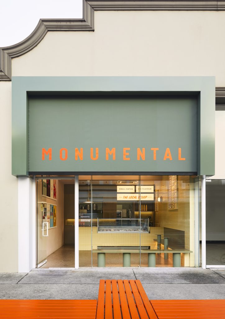
Techne’s Albury studio leader and associate Dana Hutchins explains how the upgraded interiors imbue Monumental’s quaint space with familiarity and brightness, drawing in customers from all walks of life.
“We saw the building’s lack of vernacular as an opportunity to frame the space in a way that speaks directly to the ice creamery’s character as a welcoming, genuine and dependable pillar in the community,” says Hutchins.
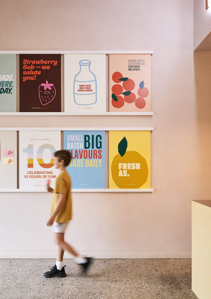
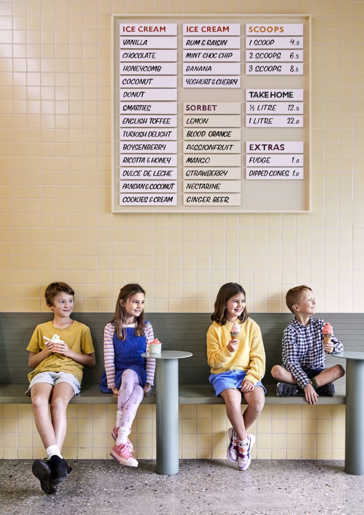
The interiors include details that showcase the store’s appreciation for the patrons and suppliers that represent the “Monumental family”. A1 boards designed in collaboration with Albury-based Kindred Design, and flavour boards hand painted by Killing Time Studio occupy an entire side of the store.
Hutchins says the contributions from other local businesses salute the intimate community that Monumental occupies a vital role in.
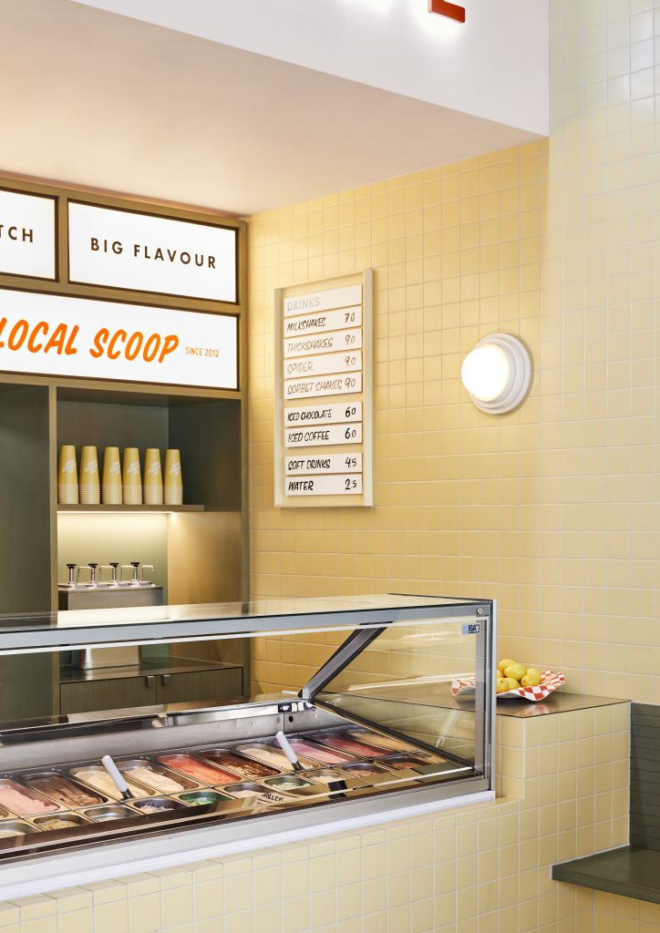
Additionally, the re-design involved steadfast investments into improving the quality of the gelato, such as replacing second-hand equipment with specialty Italian gelato equipment that enhances and sustains rich flavours. The ice creamery has made over 100 flavours and there are 24 flavours on display at any given time.
“Above all, we were empathetic that the quality of the ice cream is integral to maintaining this Monumental family, which had to be preserved as a priority before the fitout,” says Hutchins.
Retrorama interiors – reminiscent of a classic milk bar – were inspired by old photographs Vogel and Clark found of 1950s ice cream cone signage outside a petrol station once located on the current site of Monumental.
A long, thin layout, subtle colour palette, and warm finishings and joineried achieve a vibrant nostalgia inside Monumental. Monumental’s recognisable orange brand colour sits on top of the hierarchy, but the interior base layer by Brent Seach provides retro Australiana tones – lemon yellow, eucalyptus green and pale pink.
Techne opted not to incorporate the Pozzetti display into the fitout as it inhibits a full view of the product. Instead, patrons are offered an unobstructed display of all the flavours on offer.
The team also made judicious design choices that honour Monumental’s regional location.
“We choose not to use timber as a finished material because of its prevalence here, and instead included blackbutt plywood and hardwood which, when washed with the custom Porters timber paint, gave the texture and subtlety of timber that infuses the space with a natural warmth,” says Hutchins.
The team also saw to the site’s tricky east-facing orientation with ingenious solutions and a comprehensive grasp of the local climate. Automated blinds, awnings and a lighting system shelter the icecream from the easterly sun, particularly during the aestival months. Techne demonstrated a commitment to Monumental’s community-first mantra by working with local craftsmen such as Allan’s Flat Engineering and Corowa Signs to manufacture said blinds and awnings.
When these features are raised throughout the late afternoons and early evenings, the snug space capitalises on the high ceiling heights and windows and delivers clear sight lines into the shop.
“Once the blinds are retracted and the back-lit signage above the display counter is switched on, a captivating glow spills out onto the streetscape,” says Hutchins.
Vogel and Clark confirm that the reception towards the new fitout has been nothing but heartwarming. They’re thrilled to provide an inviting space for the local community to continue wolfing down their scrumptious ice cream.
Photography by Caitlin Mills.
Check out EJE Interiors funky design of Newcastle milk bar Larrie’s


