EJE Interiors-designed milk bar Larrie’s celebrates Newcastle’s rich surf history
EJE Interiors-designed milk bar Larrie’s celebrates Newcastle’s rich surf history
Share
The Newcastle-based firm completed the interior fit out for a retrorama milk bar at Merewether Beach.
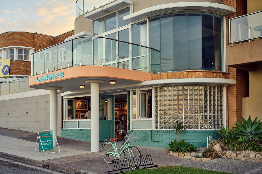
Larrie’s – an abbreviation of ‘larrikin’, a happy-go-lucky, playful and mischievous character – is snugly nestled underneath the Merewether Beach Hotel. Inspired by classic Australian milk bars, the takeaway food store exudes comfort and cosyness, and also embraces the groove and fun of the town’s surfing history.
Owner Glen Piper – who holds a special fondness for Merewether Beach – bought The Beach Hotel in 2022, and was inspired to transform the underutilised space that Larrie’s now occupies into a homage to Newcastle’s history as a paradisiacal and bustling surf town.
Piper has a deep connection with the community as he spent many summers visiting family in Merewether. He saw the potential of the space, and the value of developing a takeaway store which celebrated the energy of the area.
EJE Interiors is a small but mighty team of ten, who specialise in heritage-listed hospitality and commercial projects. They gleefully jumped on board as the designers for Larrie’s.
Senior interior designer Jodie Duddington – who has tallied 25 years in the interior design business – described the gratifying process of designing Larrie’s.
“This was such a significant community project – we did not lightly hold the responsibility!” says Duddington.
Duddington, who believes it is imperative for “every hospitality venue to have an identity,” reflects on the pressure the design team experienced to create a space that not only honoured Newcastle’s surf history, yet also provided a comforting and leisurely space for the community.
“There was a lot of pressure to get it right, as the venue was well watched. The building also has a chequered past, and there’s been many different incarnations of the venue,” she says.
Home to Australia’s largest surfing festival, Newcastle is emblematic of the vibrancy, fun and ‘endless summer’ energy of the surfing craze in the 1970s and 1980s. Duddington says the team wanted to anchor the design in the history of the town, yet also honour Newcastle’s status as a steel city, and the gradual transition to a metropolitan town.
“Newcastle is undergoing a massive identity shift at the moment and developing into a multi-faceted metropolitan area. We don’t want to be like Sydney, and we have the age and the history, so I think people feel more of an identity connection to the pace of Melbourne,” says Duddington.
The people have remained honest and authentic, and Duddington says this sincerity is reflected in the simple yet robust design which also avoids cheesiness and kitsch.
“We were conscious of not over-designing – the beauty of the building is the connection to the ocean and culture of the town, not the fastidiousness of interior design,” she says.
Duddington says designing a space in honour of the surforama iconography of the 1970s is so rewarding, as the decade was a fantastic era for colour and brands, providing ample opportunities to experiment with pastels, fun and vibrancy.
‘We wanted to make the space seem like it had been there forever, which is hard to do for an existing interior fit out,” she continues.
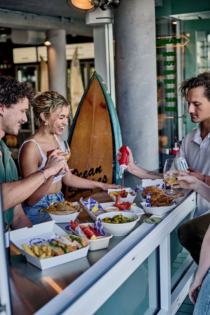
However, the team was cautious not to develop something that looks like a curated ‘Disney set,’ rather capitalise on how small design choices evoke the memories of the town at the height of the surfing craze.
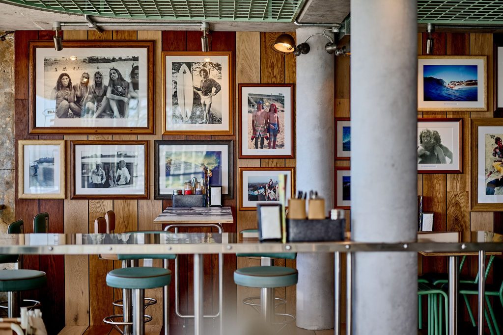
EJE collaborated with the boardrider’s club and displayed photographs from bygone eras in Newcastle’s diverse history.
“We spent months collecting images from Newcastle in the 1970s, and then my team and I actually pasted the images as wallpaper ourselves,” says Duddington.
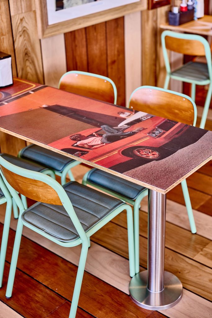
The fit out also includes a custom surfboard rack for patrons to leave their boards in, and vintage photographs are also printed on the fixed tables– one in particular with a photo of the archetypal larrikin, former prime minister Bob Hawke.
“We found this photograph of Bob Hawke before Piper decided on the name Larrie’s, so it seemed like a serendipitous discovery. And now patrons can eat their fish and chips off Bob Hawke’s face!” Duddington jokes.
The location of the store next to the ocean meant the team opted for stainless and galvanised steel as both a practical choice, and a nod to Newcastle’s history as a steel industry town.
The low ceilings challenged the team, as they had to ensure the space achieved optimum functionality for patrons and staff, whilst sticking to a tight Development Application.
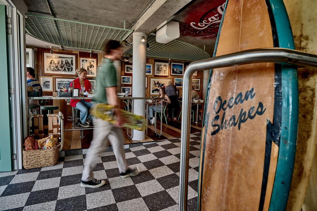
In order to ensure the space is suitable for social connection and togetherness, Duddington says determining the needs of the clientele was essential.
“It’s about the current and future users and making sure they feel comfortable – whether they’re the older locals who have their spot in the corner or those who will flood into the store straight from the beach in their salty bathers,” she says.
The menu boasts the usual suspects: scrumptious fish and chips and pineapple fritters, and modern interpretations of classic takeaway treats such as a prawn and mango bowl, fish tacos and a sashimi plate. Piper was adamant that the seafood was locally sourced and sustainably caught.
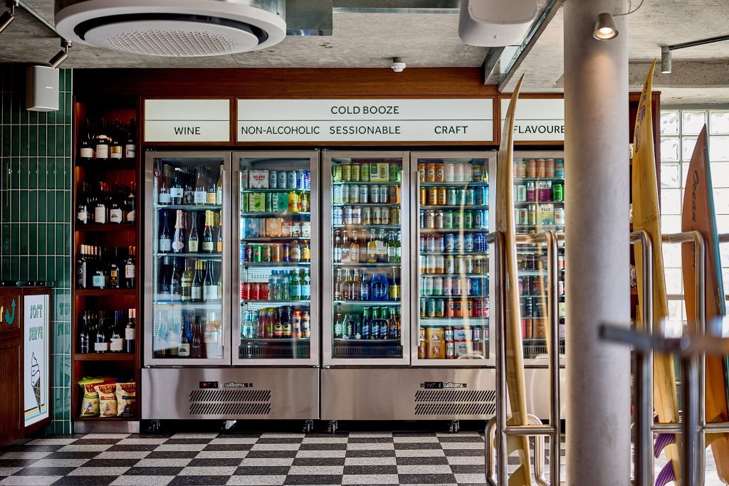
The upstairs section of The Beach Hotel will function as a higher-end restaurant, whereas Larrie’s will maintain a leisurely and relaxed vibe – patrons can use the supplied picnic rugs and wander over to the lawn with their goodies.
Overall, Larrie’s captures the irreplaceable feeling of dining, drinking and laughing at a beachside hospitality venue.
‘We love that the floors will always have sand on them!” finishes Duddington.
Photography by David Griffen.
Check out how St George’s Standing Room represents the history of Fitzroy North


