Milan trends
Share
It’s always interesting to see the way colour and design move over the year and organically culminate at I Salone. With so much product on display, Milan is certainly the place to investigate trends or directions and emerging styles.
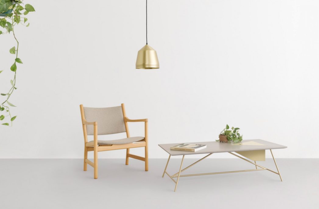
This year it wasn’t exactly that ‘anything goes’, but there were two quite distinct streams of colour inspirations that stood out, with something for everyone. The first was a palette continuing an embrace of the soft timber hues, the neutrals, lavenders, eau de Nil, greys and whites, even with a hint of soft pink.
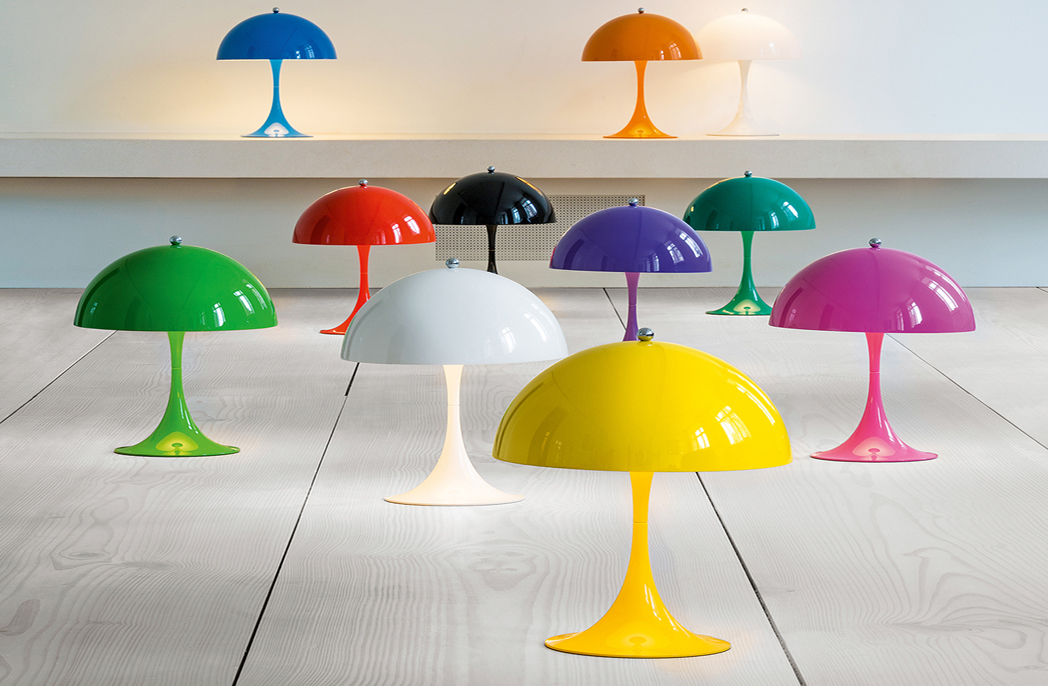
The second encompassed strong clear, saturated colour in forest greens, aquamarine or cobalt blues, brick terracotta reds and sunflower yellows (stepping up from the mustards of recent years). Again and again, these four colours were seen in collections of furniture, fabric, lighting, objets and as the theme for many of the installations and stands at Rho.
Along with the strong blocks of colour there was also colour graduation – the same colour but with differing depths of intensity. An example was the Bramante cabinets at Cassina in high-gloss mirror finish (high-gloss is back, did it ever really leave?) with strong colour at the bottom moving to lighter at the top.
There was also the fading ‘in and out’ of colour in fabrics, carpets and wall coverings as seen at Moooi’s and Texturae and Karpeta’s installations.
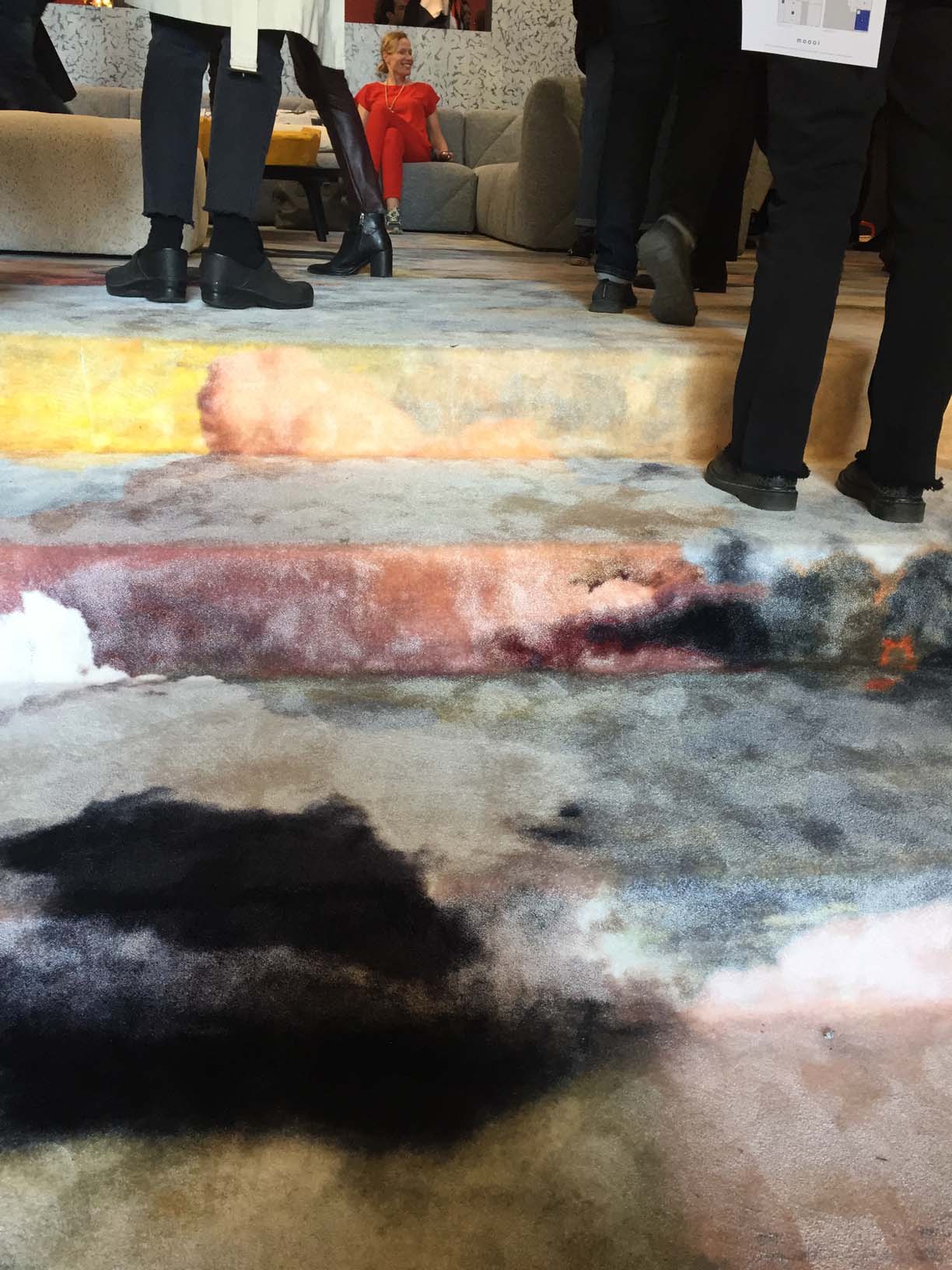
Carpets at MOOOI
2019 seems to be the year of the rainbow with every colour under the sun displayed not only to showcase a brand’s range, but within fabrics, wallpapers, glass and chandeliers. Of course, bright colours have been Missoni’s hallmark forever, but it was evident that other brands are embracing this direction.
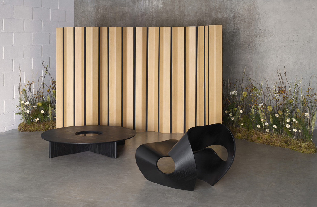
With furniture it was all about the detail – for example, the geometric pattern of the timber, the inlay of brass or the leather cuff or pull and also the inclusion of gold and rose-gold. In fact, the brass and gold were discreet, not garish but rich and concentrated, dull and brushed.
The curvaceous sofa was on point and modular lounge systems floated off the floor on timber or fine steel frames. The sizing was not overly large and there seemed to be more of a human-size dimension to depth and length.
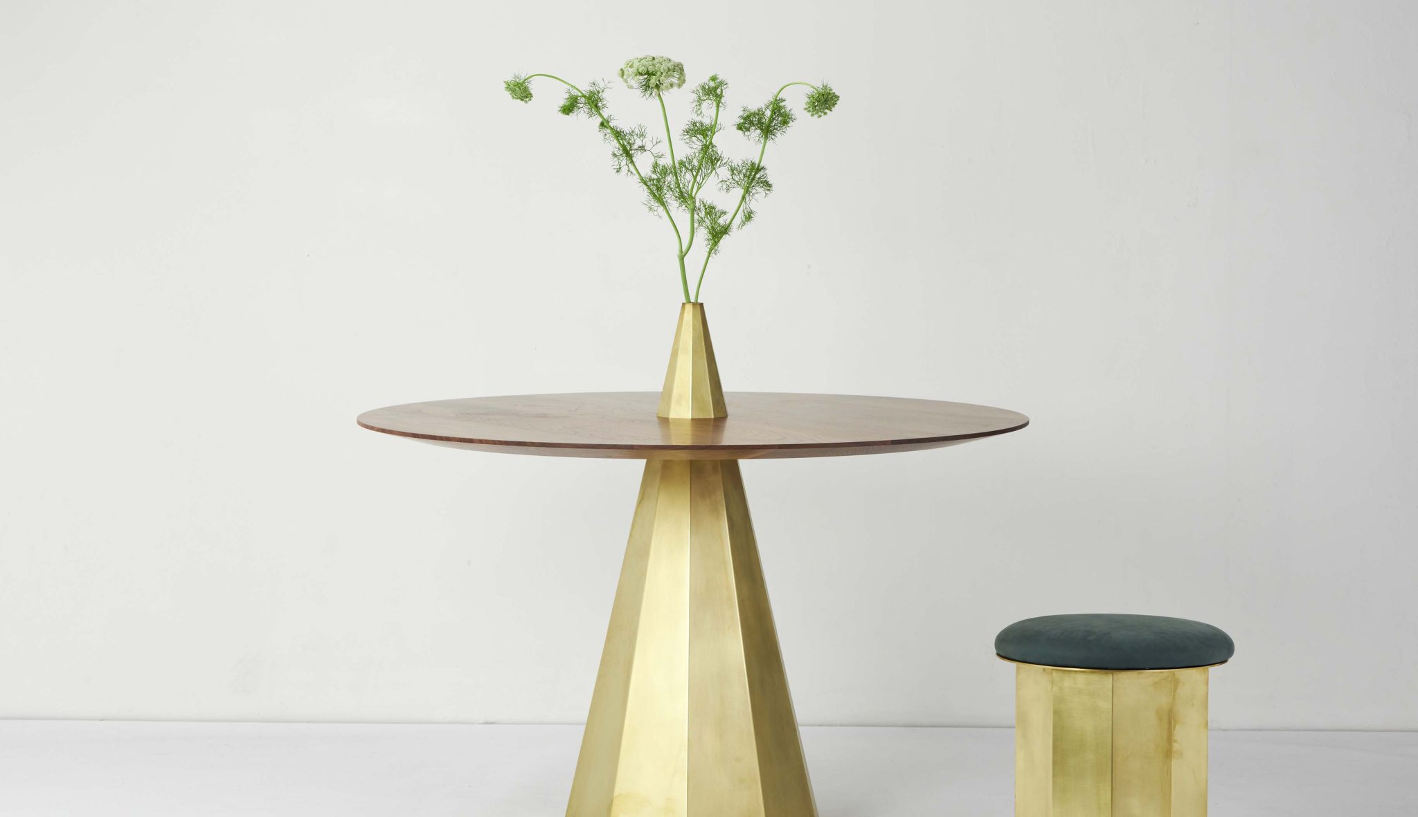
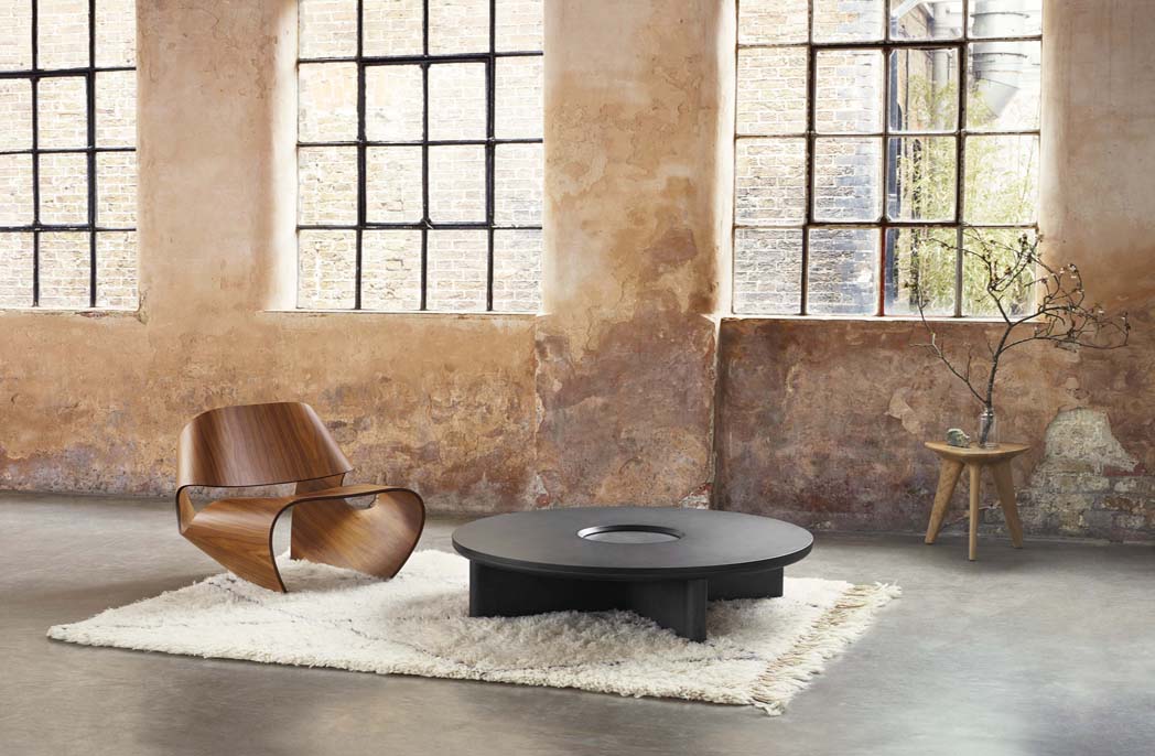
GE BY TOM FEREDAY X STUDIO KYSS
Overall, many chairs had finer lines, especially in the stackable range, such as Emeco’s On & On chair. With technology speeding ahead, new materials are allowing for strength and a paring down of size in frames. Even occasional and lounge chairs were not as flamboyant as they have been.
And then there was the glass – clear, with bling, with air bubbles and also coloured for lighting. In fact, coloured glass, especially in the four strong colours, had been incorporated into objets such as large gallery sculptural pieces, vases and bowls.
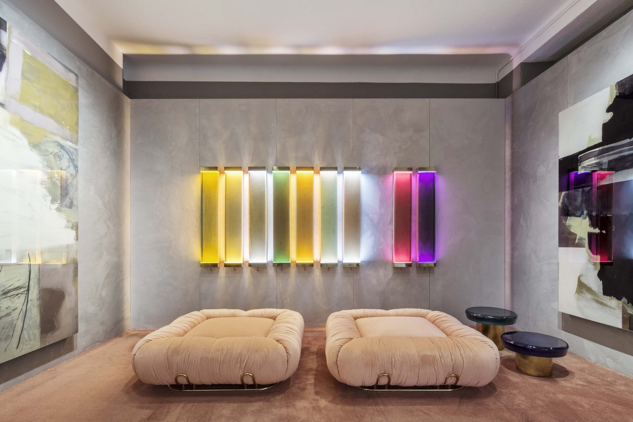
Draga & Aurel
Chandeliers were big, sometimes enormous, and of course, there were the traditional styles, but designers had clearly been having fun with shapes and presenting colourful and interesting designs.
With the touchstone of the 1970s style, there was a continuation of the circular wall sconce that embraced the idea of space and outer space. Other pendants encapsulated the idea of ethereal or whimsical; however, on the opposite side of the spectrum the vertical line was strong in wall and floor lights and there was again the attention to detail with materials of leather and/or metal trim.
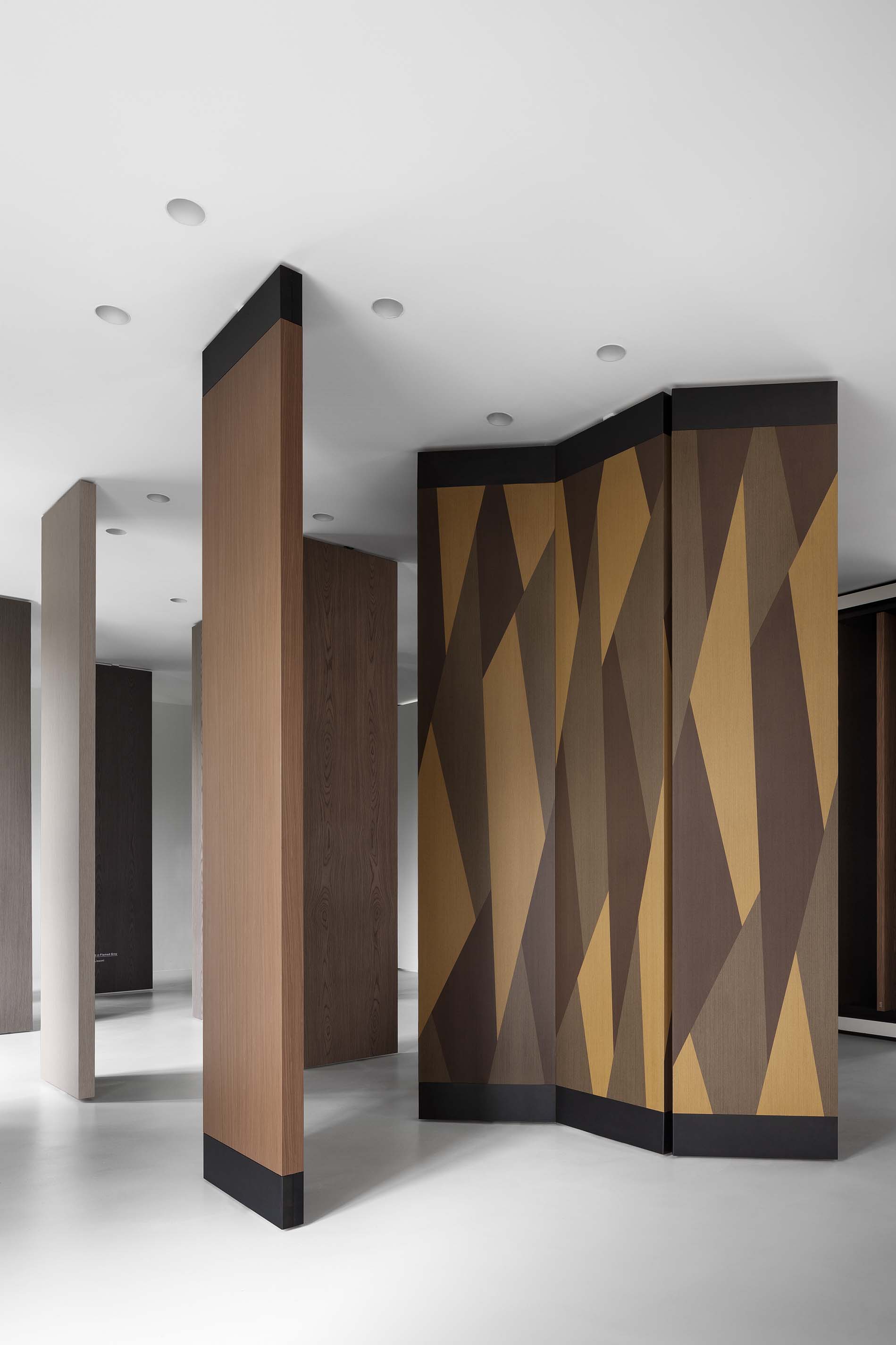
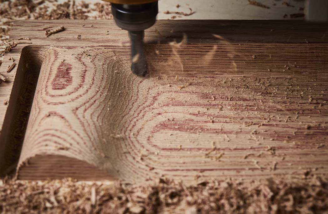
Timber was ubiquitous and also incorporated as a detail element. It was also used in geometric shapes, with different shades combined, such as Alpi’s timber wall coverings curated by Piero Lissoni. Marble and stone were included as a detail material in furniture and again used in tables and side tables and lighting.
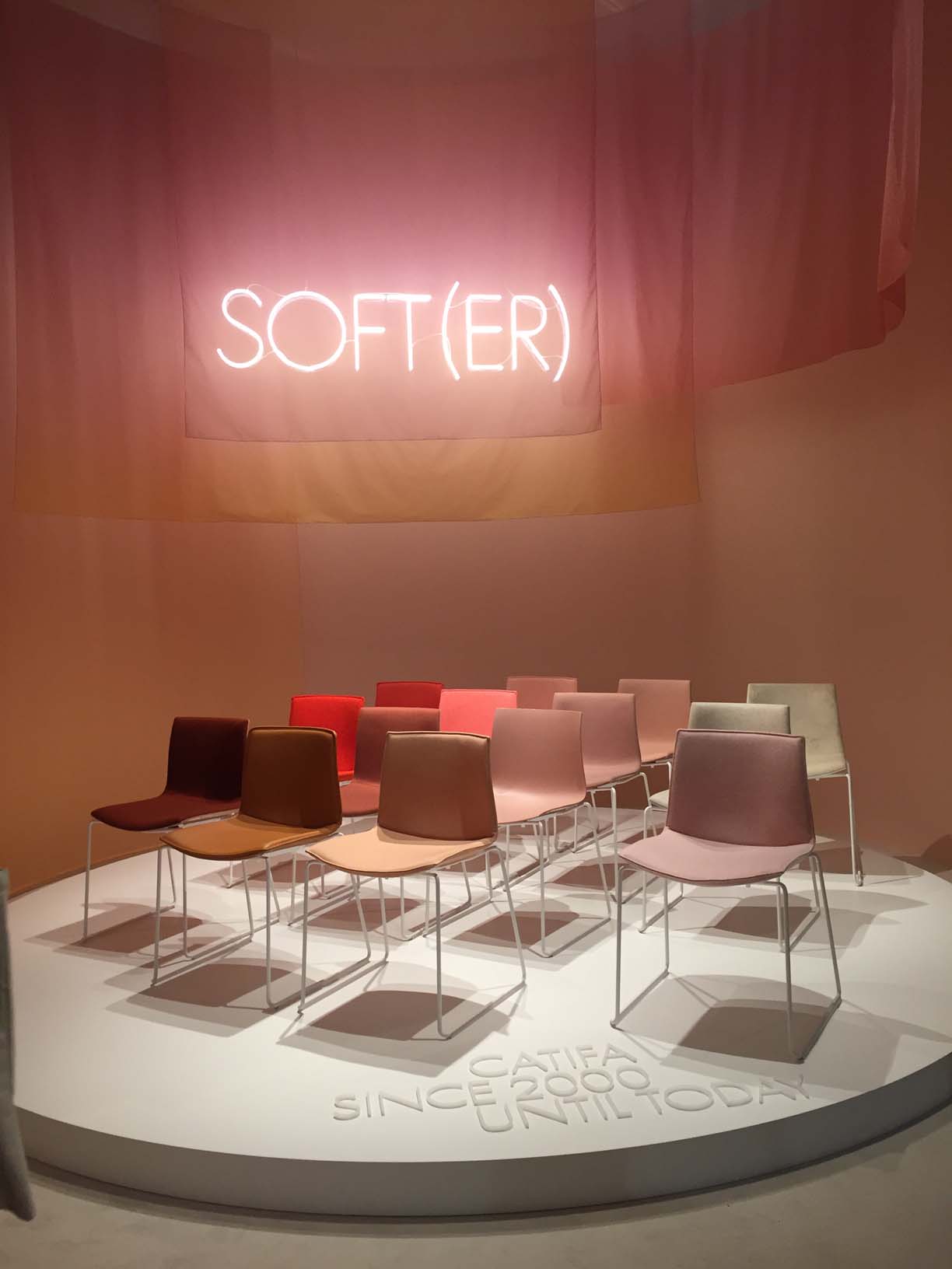
Arper chair
Overall, if you wanted cool and relaxed, the muted tones had it and there was much to choose from. If, on the other hand, you desired some zing in your interior, then the full and vibrant colours of the four– green, blue, brick and yellow were there to brighten your day. Perhaps, however, the most important thing was the detail – detail in the use of material and the way that those materials were combined, either subtly or overtly. But for this I Salone the rainbow ruled!
You Might also Like
