Alexandra Buchanan Architecture’s Hawthorn house
Alexandra Buchanan Architecture’s Hawthorn house
Share
Architect’s statement:
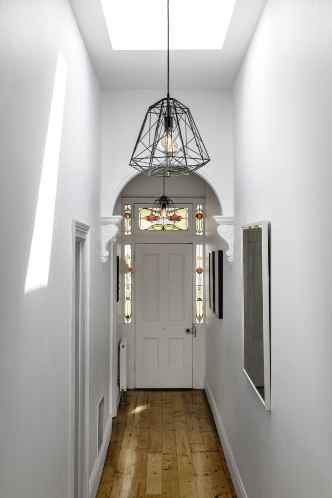
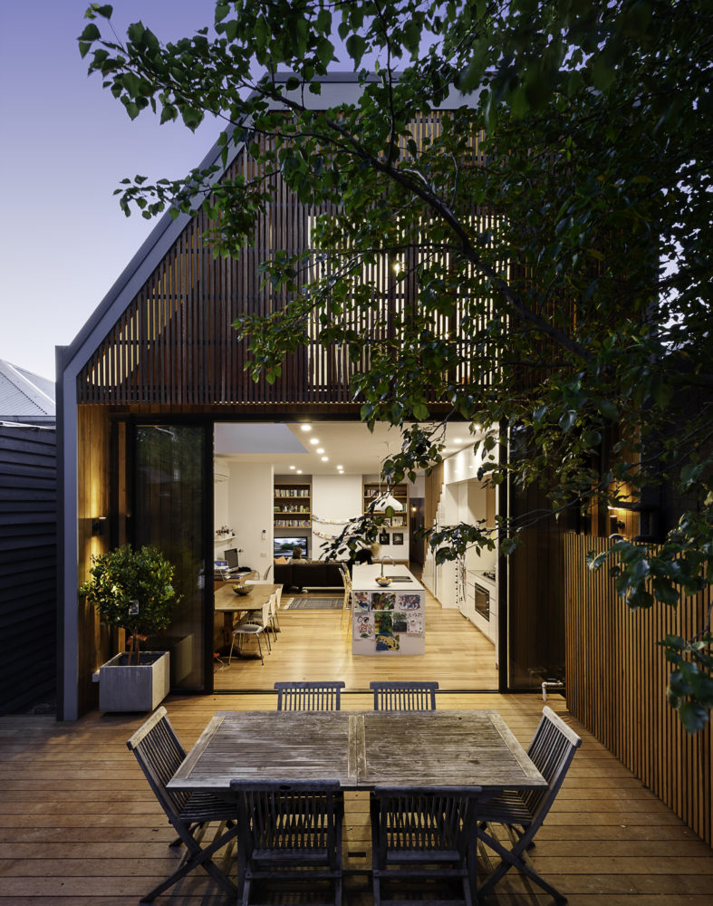
The extension to this 1890s single-fronted, weatherboard cottage in Hawthorn, Melbourne is an exercise in clever, compact planning that seamlessly weaves together traditional and contemporary architecture. The extension preserves the scale, materiality and character of the traditional Victorian frontage while introducing an elegant two-storey extension to the rear.
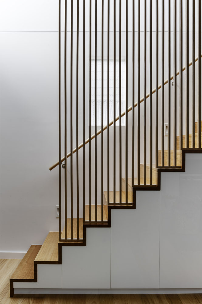
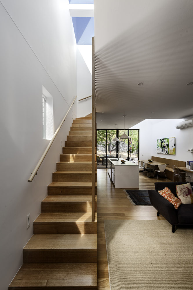
A delicate screen of vertical timber slats tempers light and view to create the characteristic ‘veil’ that encloses the upper-level bedroom suite. The rhythmic timber screen becomes a unifying design element of the Hawthorn house that extends into the interior in the form of a staircase balustrade. The balustrade screen visually animates an otherwise muted interior sensitively set within the historic shell.
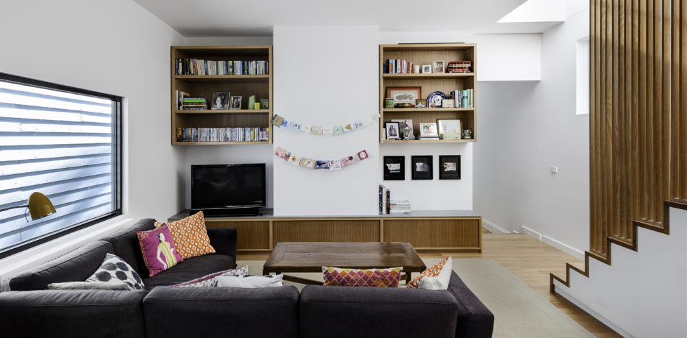
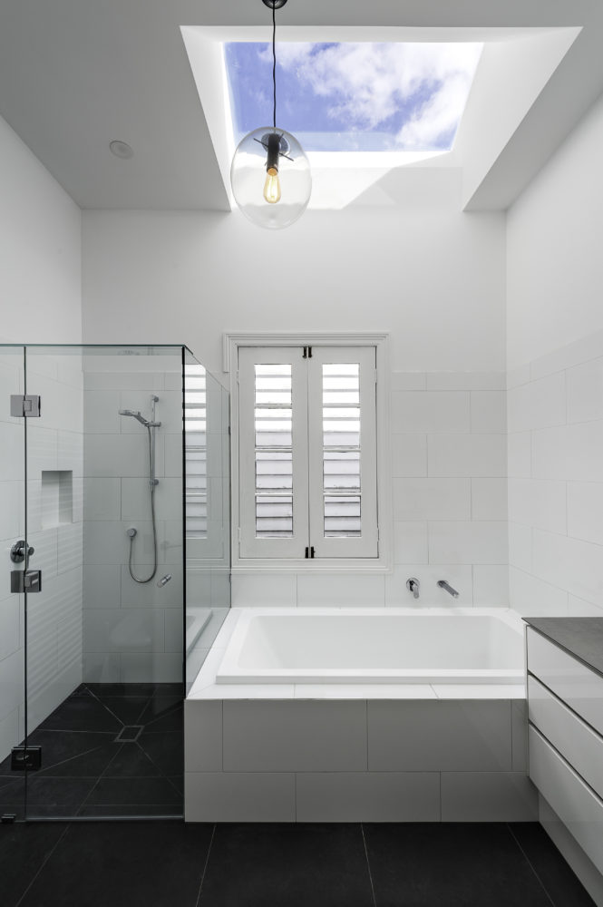
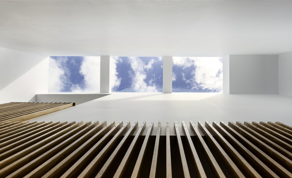
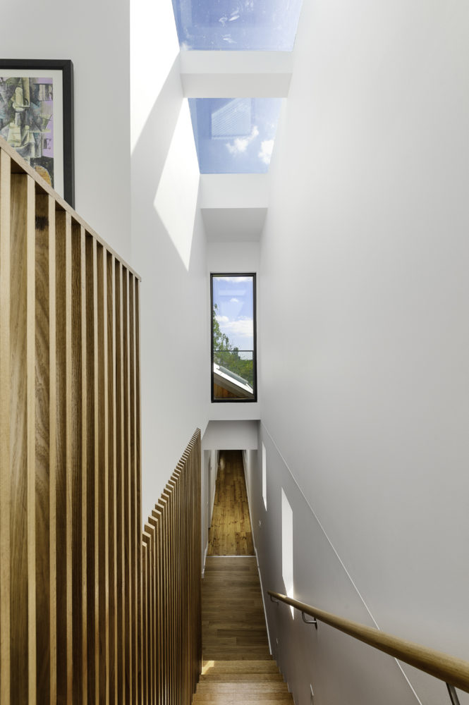
Light wells distributed across the roof plan sun-wash walls and flood the open plan interior with natural light. Double-height spaces established above the staircase and dining room table create volumetric interest. Improved visual connections to the back garden evoke a sense of spatial generosity that far exceeds the modest dimensions of the home’s interior footprint.
AR: How did the Hawthorn house project come to you and evolve?
Alexandra Buchanan: The owners were recommended to us by a friend with whom we were doing some work. Ingrid and Michael were open, clear and decisive, so we established a very collaborative and responsive process right from the get-go.
What were the key elements of the brief?
The brief was to remediate a dark and restrictive interior and to create additional family spaces for a growing young family. A dated extension that was well used, but equally worn provided the main living space for the expanding family of four. The daily dance around toys, furniture and poorly located bathroom and laundry spaces was wearing thin and Ingrid, in particular, was longing for some private, grown-up space.
Were the clients very involved in the creative direction of the home or did they let you take the reins?
We had a very positive and proactive process with the clients from the outset. What was great in working with Ingrid and Michael was how confident and clear they were in their needs and preferences. It made the very strong brief transform into a very linear design process. They also encouraged us to challenge their thoughts and perceptions, within the boundaries of the brief.
Can you give us more detail on their plans for the space and where their inspiration came from?
Despite having a great brief and wish list, they didn’t have a defined idea of how they wanted to achieve it. In existing houses where the client’s experience of space is encumbered by a badly configured plan, it can be difficult for a client to see past the day to day to what might be.
Our role, given that we were tasked with reimagining the space within the same footprint (due to a desire to save as much garden as possible), was to tease out the aspiration and to marry each of the family member’s individual needs and hopes for the space. The inspiration was ultimately the unique story that came from that process.
The timber screens are something of a motif within the Hawthorn house – can you tell us about them and how they came about?
The screen is a necessity borne of being in urban Melbourne, where overlooking of neighbouring private space is restricted by Council code. There was a multitude of ways we could have tackled this, but our client’s aesthetic preferences were clean, fresh and light, so we sought to create something very simple but also textural that could work throughout the house.
In some ways, I think this further blurs the relationship of inside and out in the way that it filters and throws the light in the stair void, as well as when the rear screen is viewed internally. It brings an incredible sense of calm to the space.
There are also many skylights in the house. Why were these important to the design and were there any challenges in executing them?
Carving dynamic light wells into the new volume at the rear allowed the interior to be flooded with light and created a sense of volume and generosity in a relatively modest footprint.
How did you improve the visual connections to the back garden?
The former extension was a small single-storey element with a skillion roof that closed down the view to the garden. We wanted to flip this by opening the view to the garden completely and opening the façade to allow the garden in. We used commercial face-mounted stacker doors at the back of the house, which allowed us to have the largest possible opening to the living space.
The screen on the first floor also allowed us to have a fully glazed façade at a high level, which allows a beautiful dappled light into the nursery.
What was the biggest challenge of the project?
Typical of single-fronted Victorian cottages in this context, the challenges of this project were to tuck the upper storey out of view of the street and to articulate the rear extension to provide light and volume without being detrimental to adjoining neighbours.
What is your favourite element of the Hawthorn house?
I love the height, light and drama of the main living area. There is a gallery-like quality about the volume that is created, and there is a simplicity and texture about the play of light and shadow throughout the day. Given the relatively modest footprint, the element of surprise this brings is lovely.
Photography by Jonathan Ng at Itsuka Studio.
This article originally appeared in AR151 – available online and digitally through Zinio.
—
Read our interview with Alexandra Buchanan here.
You Might also Like
