How dn&co designed seven miles of discovery for the V&A
How dn&co designed seven miles of discovery for the V&A
Share
Brand and design consultancy dn&co has created a new wayfinding system for London’s Victoria and Albert (V&A) museum to help visitors navigate the sprawling site.
Located in London’s South Kensington, the museum of art, design and performance, welcomes around four million visitors a year. To meet the demands of these visitors — a mix of casual visitors and paying exhibition-goers — dn&co, in collaboration with AllPointsWest, designed the internal and external signage and a new map to help them navigate the site and explore and visit lesser-known parts of the museum.
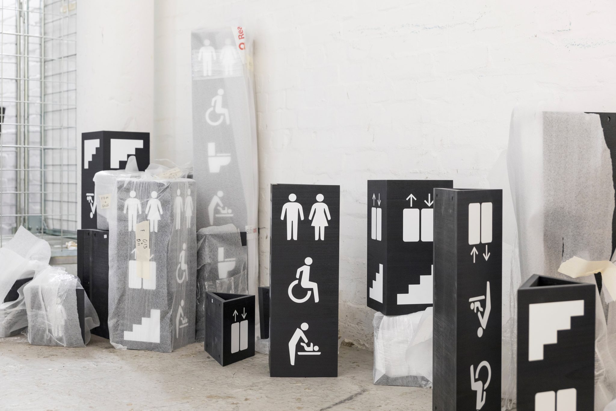
With seven floors across three interconnected historic buildings, five temporary exhibition spaces, four shops and three cafés, the wayfinding had to support a varied and dynamic offer for an ever-changing audience.
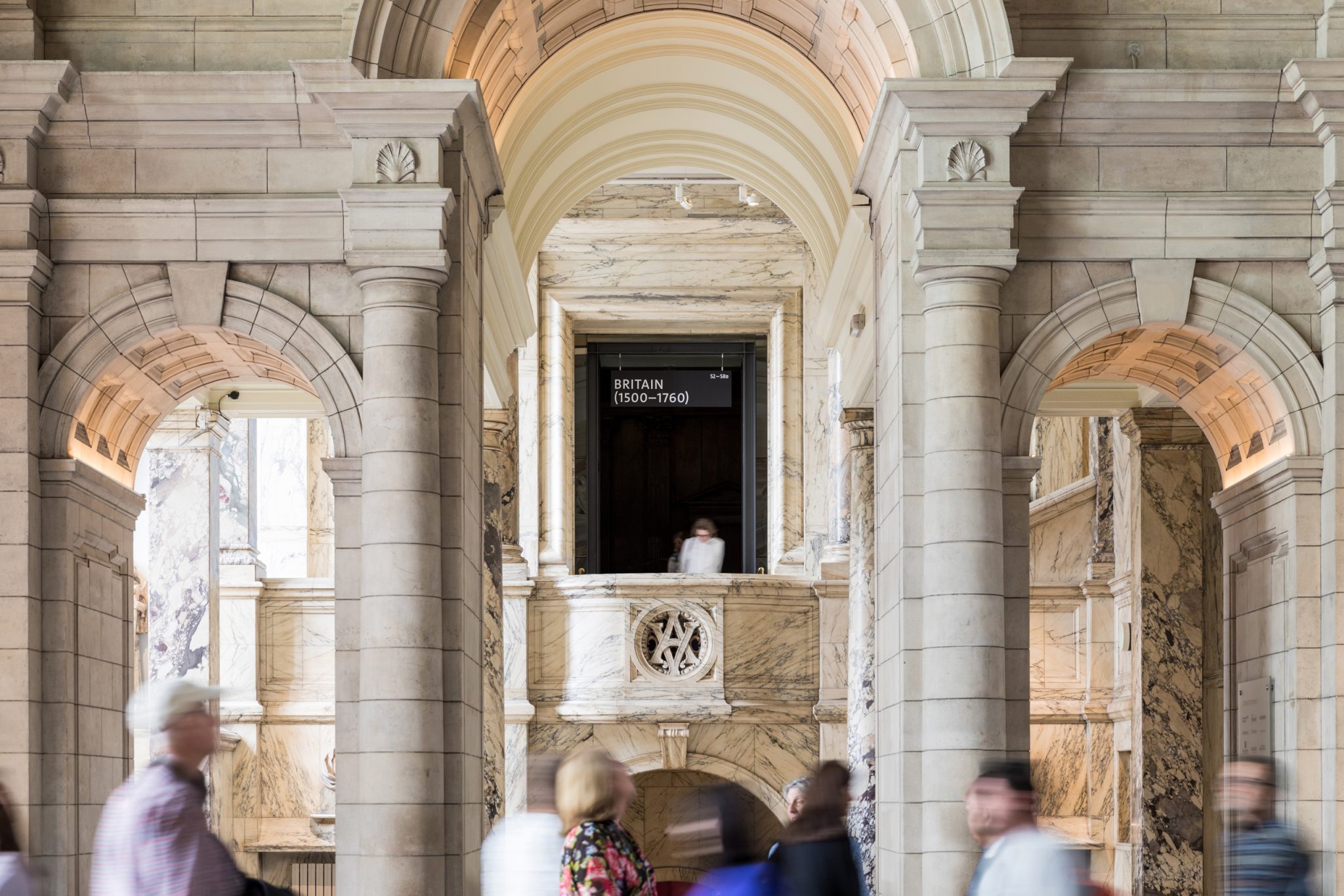
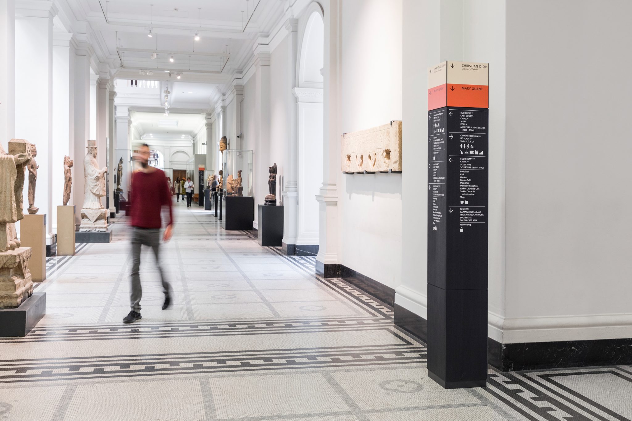
The new design befits the V&A’s collection and its Grade I listed surroundings. In a building characterised by its range of architectural finishes, quality of material was key. Made from tulipwood, dyed black and stripped from any extraneous colour except to highlight ticketed exhibitions, the signs convey a sense of quality and permanence, without competing for attention.
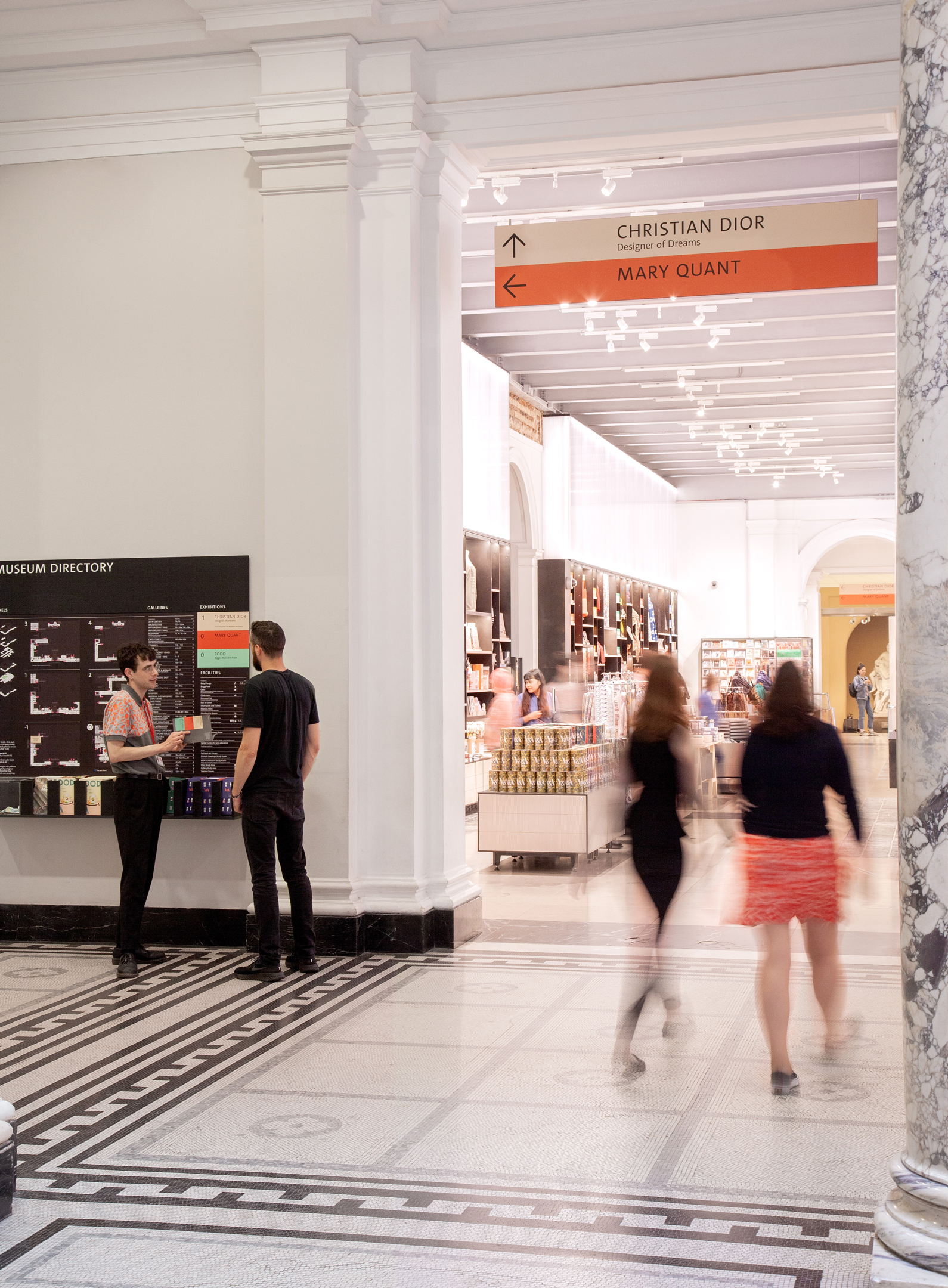
Colour was crucial in communicating the wayfinding messages, acting as a beacon and drawing those visitors who have paid for an exhibition through the ground floor to their destination faster, thus supporting revenue-generating activities that help keep the permanent galleries free to enter.
“The signs needed to have a sense of permanence while being constantly adaptable,” explains Patrick Eley, creative director of dn&co.
“They had to be ‘noticeable’, but not shouty. They had to be directive, and quietly reassuring, but also be discreet enough to hide in plain sight to let the V&A collection take centre stage. Most importantly, we knew that no wayfinding solution could ever solve all the challenges on its own; not in a building of this scale with such a diverse mix of visitors.”
Eley says that the dn&co system recognised those limitations, and is designed to work alongside the “unsung heroes of any great museum” — the gallery assistants, who are key when it comes to creating “an outstanding” visitor experience.
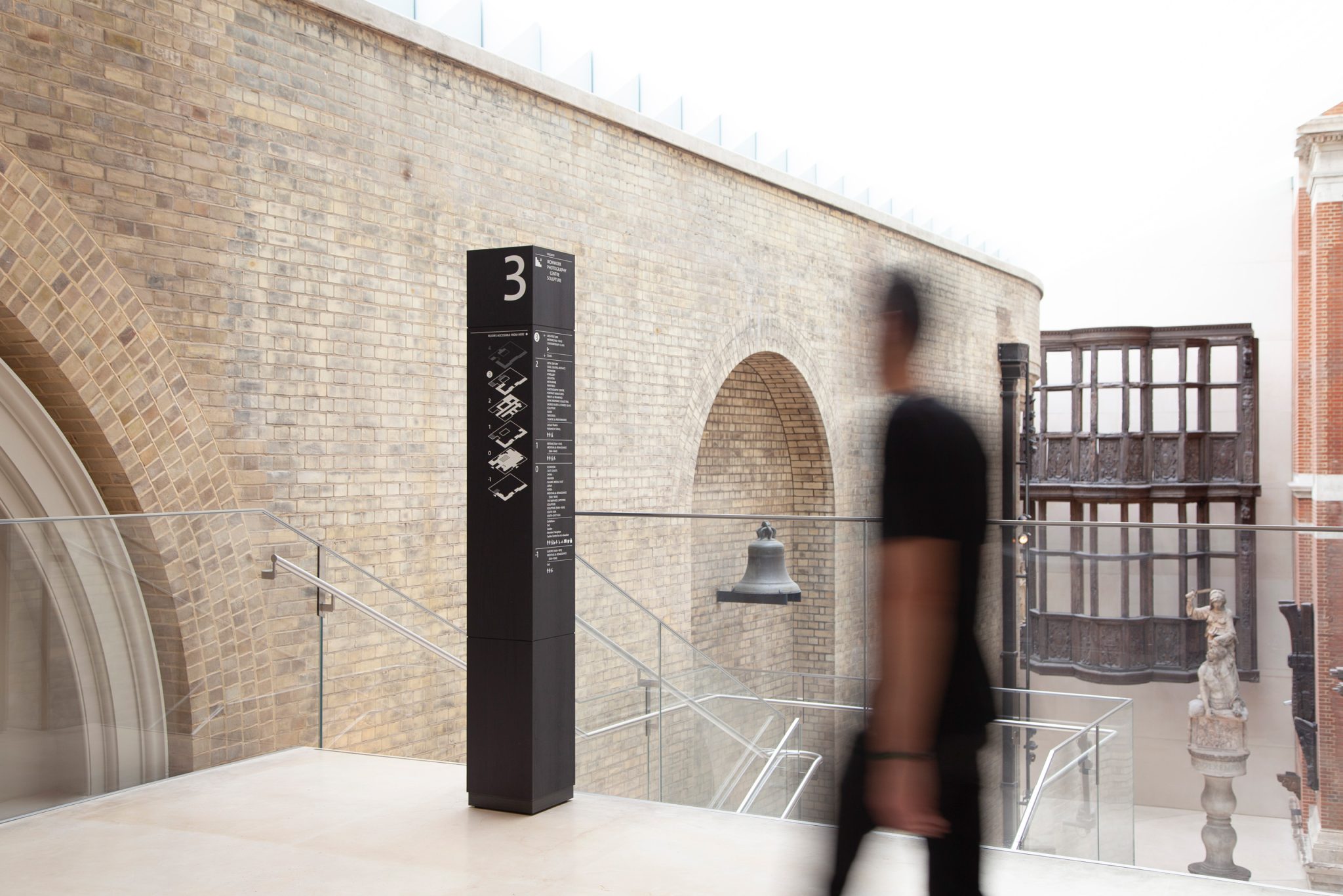
One of the most significant elements of the new wayfinding strategy, adds Eley was also one of the most discreet — the renumbering of the floors at the V&A. Based on a more coherent sequence, the new numbering reinforces the perception of the museum as one building and makes it seem more manageable within a single visit.
“Wayfinding is not a static process, it’s a dynamic one,” explains Eley.
“It’s concerned with the way people move through spaces, and the cues they follow. Signs are one of those cues; architecture itself is another, as we are innately guided by it.
“And what architecture…The V&A is a monumental environment, airport-scale, but richly detailed with no one space the same as another. Our design had to live comfortably in this world-leading museum of art and design and to do so it treads a careful line.”
Another key component of the project was a new map. Informed by archival research, the new dn&co design is more legible, compact and easier to carry around. Crucially, the new map is designed to work in a digital environment as well as in print, with vertical circulation points that align across floors.
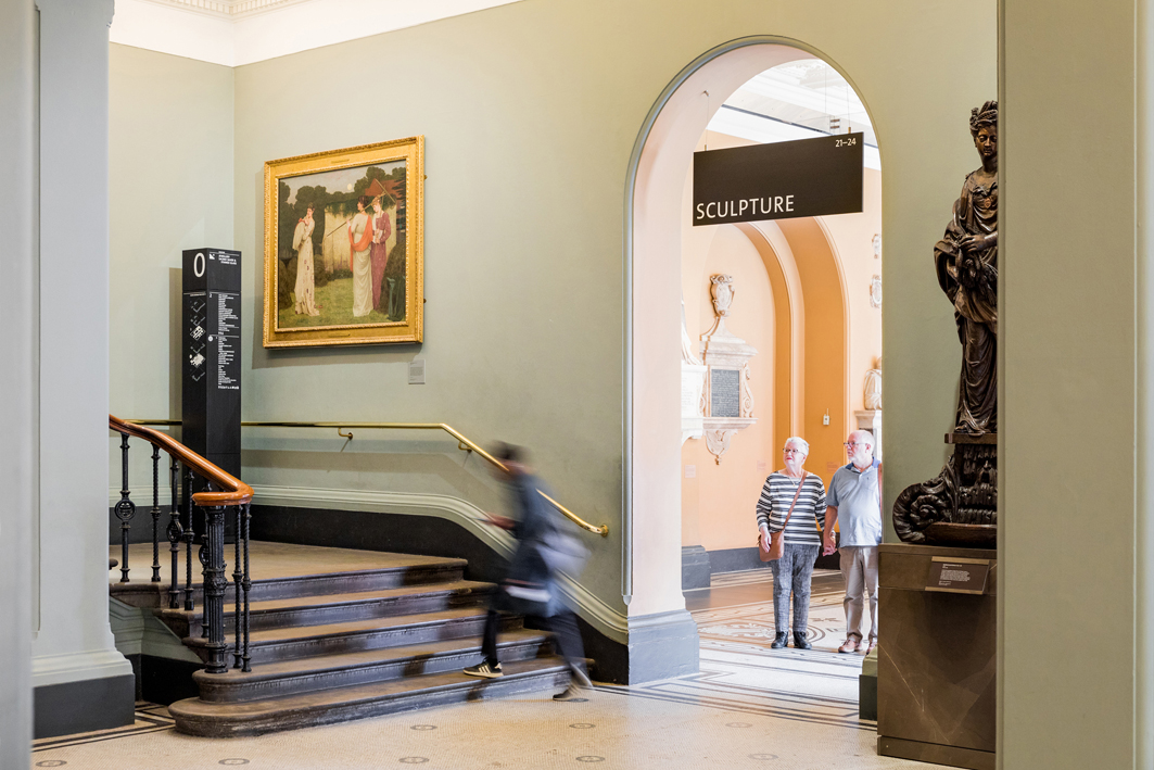
Of the system of nearly 400 signs across the museum, the design comprises 60 new totems, 130 hanging signs as well as an entirely new type of sign placed at the threshold of the galleries to help guide visitors on their journey, supported by new print and digital maps.

