Molten caramel: The Chancellery by AJ+C
Molten caramel: The Chancellery by AJ+C
Share
Practice – Allen Jack + Cottier (AJ+C)
Project – The Chancellery
Location – Parramatta, NSW
Text – Gillian Serisier
Photography – Prue Ruscoe
Bringing elegance to Western Sydney University (WSU), The Chancellery is most assuredly a very beautiful space. It is also highly functional and able to answer myriad WSU requisites in terms of sustainability and end user needs. Where it excels, however, is in its use of design to create an urbane sophistication that is not intimidating, overtly lux or less than incredibly glamorous. A very fine line indeed!
Occupying half the floor of a new building, the site offers district views to the east, north and west, as well as abundant natural light. Divided into public and private spaces, according to existing amenities, the key visual delineation comprises a crafted installation in the form of an undulating wall of timber batons (Woodform, Concept Click, Pacific teak, natural oil) that wraps the public space. It is, in fact, an exceedingly clever solution and has been used well to both define the space and create an aesthetic of textural nuance and richness.
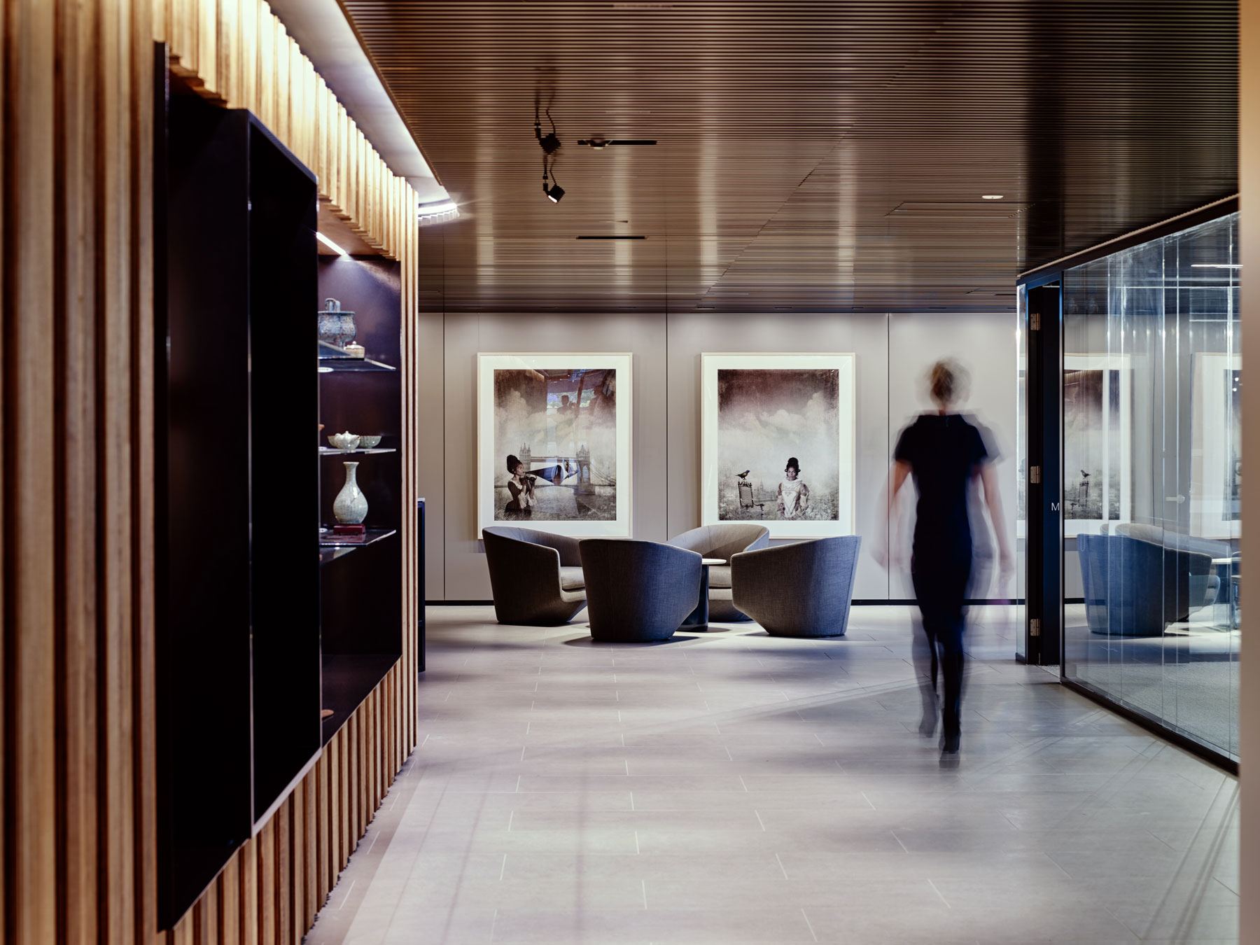
Michael Cook’s photography is exceptional, as is the use of Bensen U Turn chairs (Own World) to create a sense of containment.
Emphasised by a wall wash of lighting (iGuzzini), the timber variations are defined and exaggerated – in particular, the folded section where the wall takes on the appearance of layered curtains. Providing inset nooks, these areas contain display areas for the university’s vast collection of cultural and artistic artefacts, and tech screens for use by faculty and students.
Within these spaces, bespoke display systems of fine black steel continue a rhythm of thin horizontal lines used throughout the public space. Chief among these is the reception counter. Exceedingly elegant and seemingly floating, the counter comprises a long white form suspended from a fine black steel frame (a polished steel blade provides an invisible support). A Carrara marble countertop adds gravitas, while the choice of an opulent but understated set of three press smoked glass pendant lamps (Living Edge, Lasvit) adds essential panache without shifting into the realm of hospitality. “It’s a very difficult tenuous line you have to tread between making it feel too opulent and also making it feel accessible. A lot of the finishes are either matt finish or kind of raw. The timber battens are an oil finish, so you can still feel the roughness of the timber and smell the timber scent to reference back to the origins of Western Sydney having its campuses in rural areas,” says AJ+C director and project lead Scott Norton.
“It’s a very difficult tenuous line you have to tread between making it feel too opulent and also making it feel accessible.” – Scott Norton
It is perhaps this weight towards a residential aesthetic within a crafted shell that makes the space so intimate and inviting. That, and the exceptional selection of furnishings, which are essentially a wish list of great pieces. The very fine design thinking behind the project allows the arrangement of furnishings to read as a series of tableaux with natural progressions, and not a furniture showroom! The entrance arrangement, for example, pairs a set of high-backed Metropolitan armchairs with a Frank lounge and Diesis coffee table (all Space Furniture and B&B Italia) over a herringbone rug in silk and wool (RC&D – Rugs, Carpet and Design). And, while it is easy to say that four great pieces will create a space, it is more often the case that they do not.
What makes this work then is the sense of scale, spacing and weight the selection brings to bear. At 2.4 metres the ceilings are not high, yet the chairs do not compete. Rather, their breadth and solid angles create a counterpoint to the exaggerated verticals and horizontals. Conversely, the lounge softens the space with a rich caramel tone and a solid low weight, while the coffee table’s floating white surface mimics the rug’s design towards an active textural role within the whole. As Norton states, the textiles play a vital role. “The fabrics from B&B Italia use muted tones, but they have real texture to them, and often a weave of shine to really accentuate the form,” he says. The selection of Michael Cook’s photography from the university collection has political and cultural overtones that suit a Western Sydney campus well. They are also exceptional photographs, both conceptually and in execution.
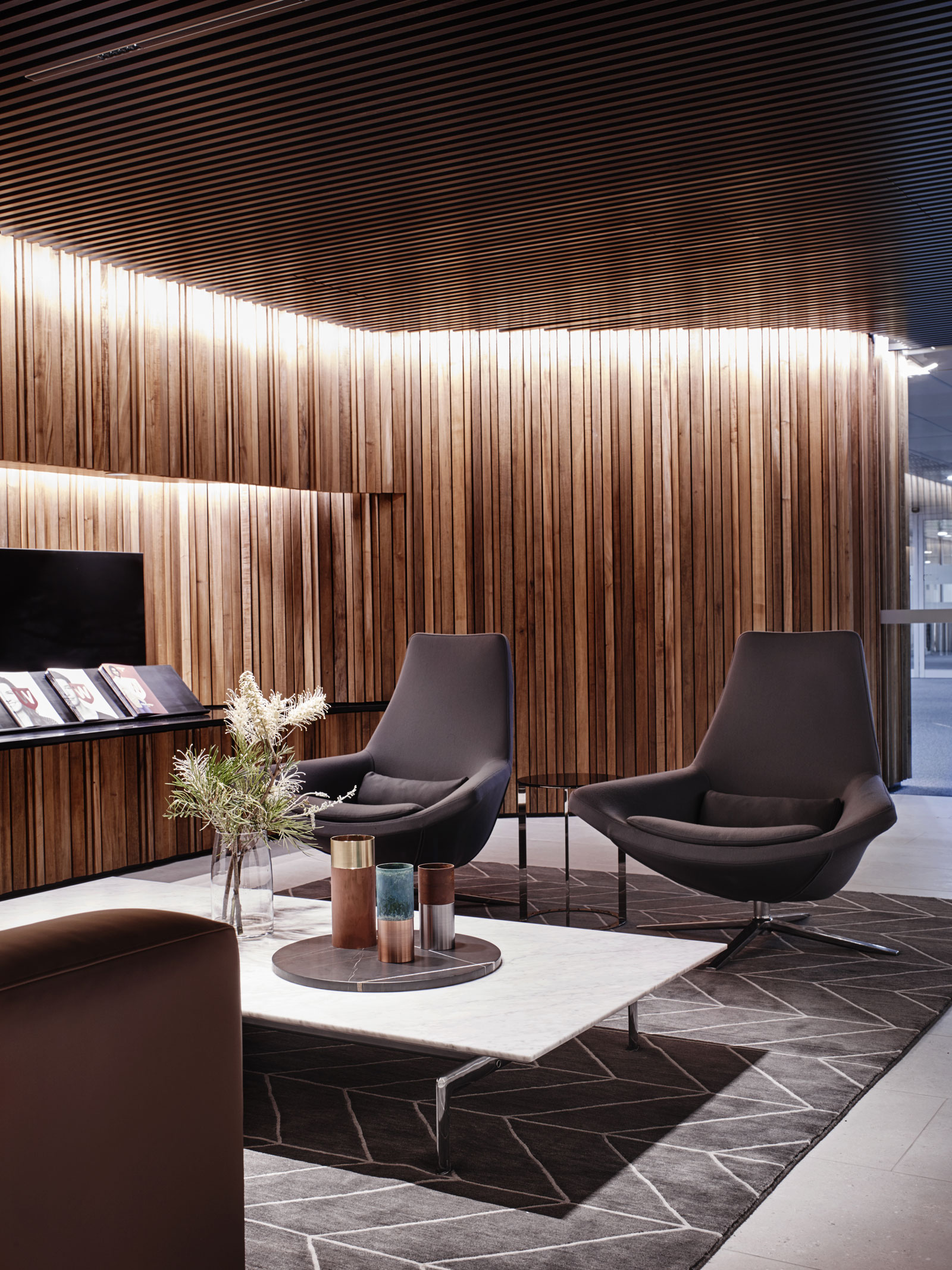
The entrance tableau demonstrates a mastery of scale with high-backed Metropolitan armchairs, Frank lounge and Diesis coffee table (all Space Furniture and B&B Italia) over a herringbone rug in silk and wool (RC&D – Rugs, Carpet and Design).
Deeper within this main space a quartet of U Turn chairs (Own World, Bensen) add their paradoxical floating weight to the asymmetry of high and low Button side tables (B&B Italia, Space Furniture). The self-containment of this arrangement acts to direct flow and essentially presides as a demi-room without truncating the spatiality of the whole. Further along, Metropolitan armchairs are again teamed with the Frank sofa and Diesis coffee table, but in this iteration the iconic chairs feature a low back and the coffee table is topped with smoked glass and a lower floating shelf of solid black. Less formal than the previous tableau, the whole is intimate and richer for being so.
Framing and containing this space is an incredible ceiling. Countering the wall heights, the ceiling exaggerates the horizontality of the space with exceedingly fine metal battens (Concept Click, powder-coated Interpon Asteroid, Pearl Matt, Woodform). An iGuzzini downlight fits between the battens to eliminate any surface protrusions. The uninterrupted ceiling surface has a rather interesting moiré effect that works perfectly with the richness of the walls and the simplicity of the floor’s large lime-washed porcelain tiles (Surface Gallery). “The fineness of the battens was selected so that it would be a very even continuous grain, and there is that slight effect, this shimmer as you walk through,” says Norton.
Complementing the public area is a series of glassed offices, boardroom and the chancellor’s office. Beautifully appointed, the rooms are an aesthetic continuum of the public area in slightly softer tones. All have access to natural light, and the spaces are visually continuous with large sliding glass walls, while light continues through to the central areas. Carrying the floor colouring through to these areas while increasing sound absorption, the floor shifts from tile to carpet (RMS 607, putty and custom plank, Interface) and takes on a slightly bouclé texture. “We’ve got a lot of comments that it’s a little bit retro, but it’s beautiful. It’s got an amazing thread through it. We were aiming for a more residential feel, rather than what would normally be used in a typical corporate office fitout,” says Norton.
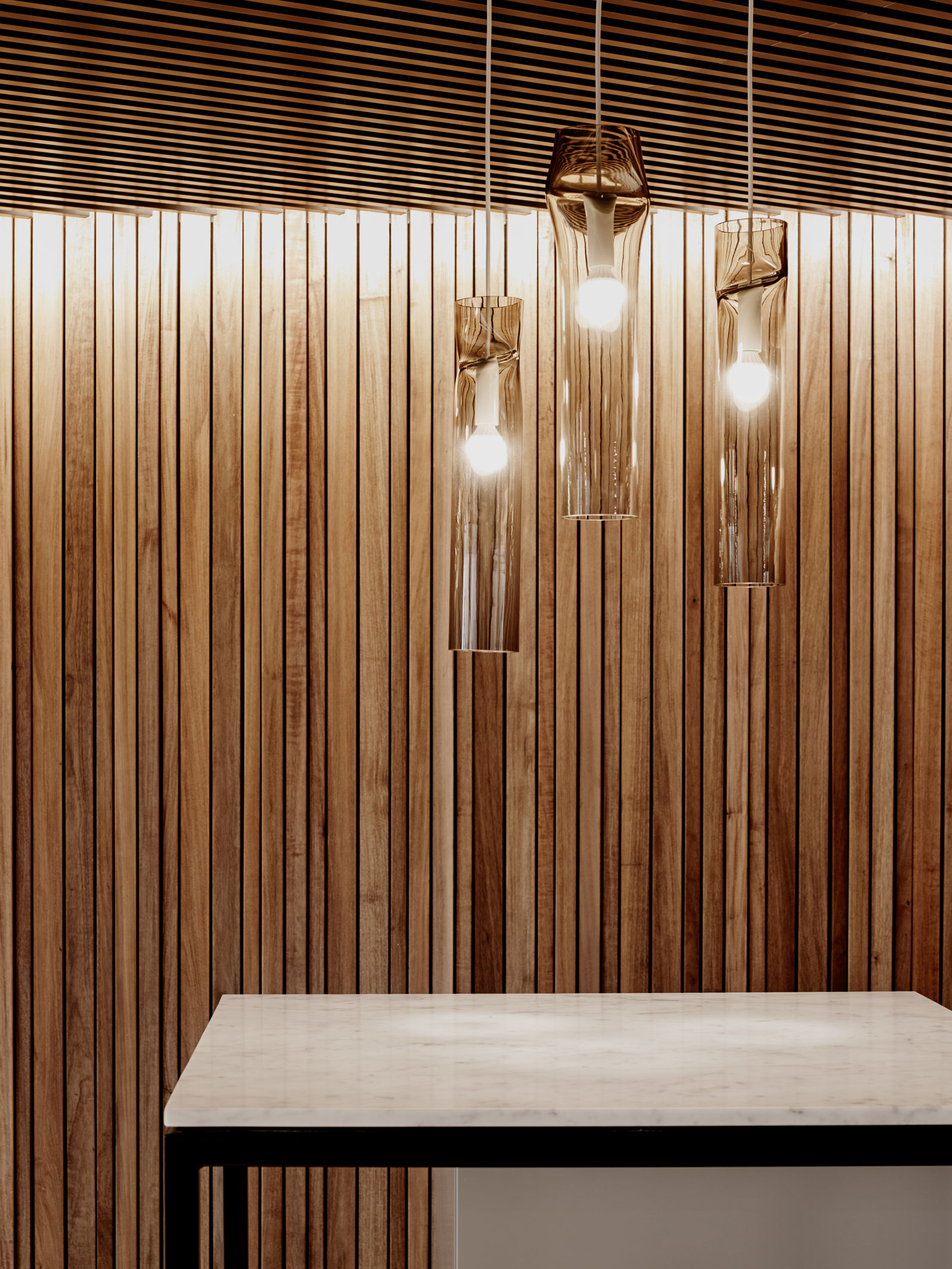
Lasvit press smoked glass pendant lights (Living Edge) create a sense of arrival without veering into ostentation. Their verticality pairs exceptionally well with the timber wall cladding.
Meeting tables in Corian (Carma, Stylecraft) are sharply defined and deliberately angular and modern. “We’ve custom designed the shape, so it’s almost like an aeroplane wing on a Stylecraft Blade base, so it’s very sharp against the texture and warmth of the timber credenza,” says Norton. This includes the boardroom table for 22, also from Stylecraft, which is teamed with Eames Group Executive chairs (Living Edge). The highlight of the boardroom, however, is the bespoke cabinetry concealing all necessary equipment, but also forming a banquette seating area.
Paired with another of the low back Metropolitan chairs, the area provides a pre-meeting lounge area and appropriate space for meeting observers, such as executive assistants. It is this level of attention to the Chancellery’s needs that gives the project such depth. Books, for example, are plentiful and in constant use, so walls are lined with Universal 606 shelving (De Padova, DeDeCe), while filing and storage are kept hidden in a good mix of bespoke and supplied storage (Kase storage system, Schiavello). Workstations by Schiavello and Aeron task chairs (Living Edge) provide the floating possibilities.
“We were aiming for a more residential feel, rather than what would normally be used in a typical corporate office fitout.” – Scott Norton
The whole is an incredibly thoughtful design, which overlays functionality with considered aesthetic solutions. The separation of informal meeting points from workstations, for example, is achieved through the partial wall of a floating shelving and storage unit. Effectively minimising sound transmission, it is also the home to a collection of artefacts, making it a beautiful backdrop to the meeting space. It also facilitates the introduction of plants with a joyous top dressing of leafy green foliage.
AJ+C has created an incredibly beautiful space with The Chancellery. But, more than that, it is a fitting space, in that it affirms the aspirational and urbane aesthetic of a cultural and academic heart. It is polished, poised and the work of master designers.
You Might also Like
