
Canterbury House
Canterbury House
Share
Location: Melbourne, Australia
Design: Beatrix Rowe
Text: Gillian Serisier
Photography: Shannon McGrath
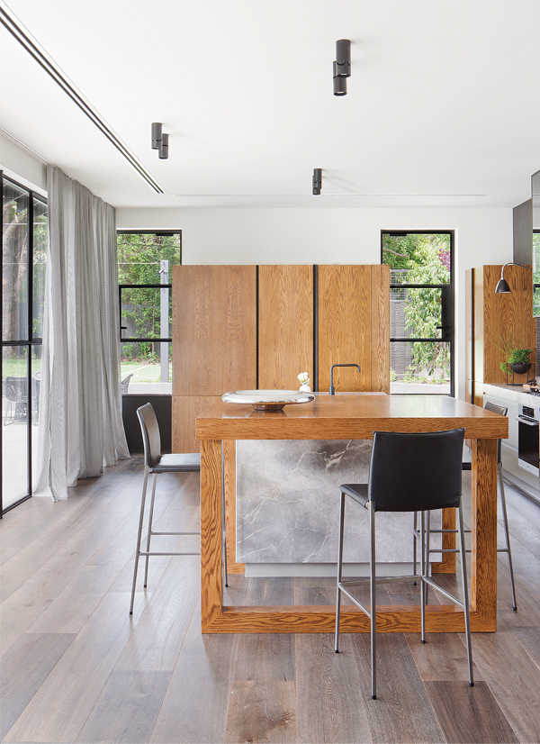
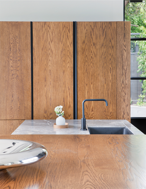
When Beatrix Rowe sets her sights on a material, its functionality is a given, allowing all focus of selection to be aimed at aesthetic integrity. As such the materials used for Canterbury House, while incredibly robust, are also astoundingly beautiful. The Fior di Bosco grey marble (Corsi & Nicolai), for example, boasts a clearly defined mark, while the stained American oak cabinetry is a river of whorls (Grange Joinery). What makes this particularly relevant is their material existence as primary elements within the palette, rather than as supporting or detailing additions. The new interior comprises three materials, the grey marble and American oak, together with wide Royal Oak flooring (Harper & Sandilands).
Responding to a brief for an update that did not change the footprint or roofline, the home needed to be open, light and connected with its surrounding gardens (Scott Yeung, Eckersley Garden Architecture). A major aesthetic overhaul was also required to better suit the client. The materials were selected for their warm masculinity, while the sophisticated yet pared back palette was implemented to highlight the strong lines and design elements of the project. In doing so, Rowe posits an interior of long elegant lines, where textural variation provides the only visual distraction, allowing the garden to blossom into view. Much like a camera focusing the eye absorbs the information by degrees, whereby the form of the furniture is read against the garden, or the grain is read against the form, but the grain recedes when the garden is viewed. It is interesting and cleverly done, but it is also creates a highly streamlined interior without fuss or compromise.
Informing the design was the very unusual (luxurious) requirement for minimal storage. Rowe translated this to a careful provision of some storage that would allow other areas to enjoy a more considered response. The kitchen, for example, no longer requiring overhead cabinets, has been designed with long, low joinery elements, resulting in a more open and spacious volume. The bespoke table’s square but open form expands this further, mimicking the form of the room. The selection of Lio barstools by Zanotta allows the table to remain visually open when viewed end on, creating a perspectival echo that draws the eye outwards for a broader reading of the kitchen. Added to this is the lengthways placement of the floorboards, which extend the reading to the garden beyond.
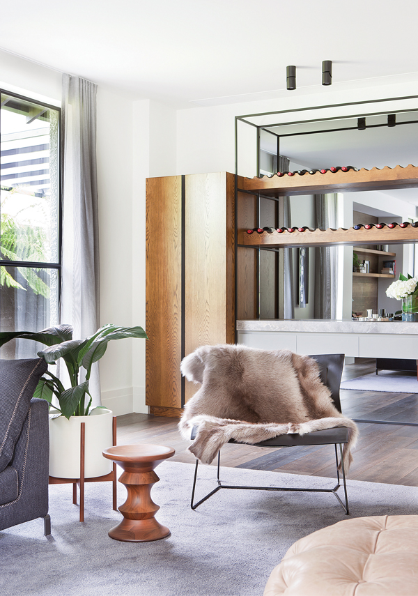
This effect is carried throughout the main volume of the house, though it does not translate to a narrowing effect. Rather, Rowe has created three distinct zones, progressing from lounge to dining to kitchen with the Van Dyck table (Rodolfo Dordoni for Minotti) and Manta chairs (Rodrigo Torres for Poliform) more internally located to deny the shotgun effect. A large custom grey rug (Artoz) signifies and unites the lounging area, where the gravitas of a B&B Italia Ray sofa (Antonio Citterio) provides both a structural and emotional boundary. Offsetting this is the minimal chic of a Walter Knoll Cuoio lounge chair and the curves of a Michel Ducaroy-designed Ligne Roset Togo limited edition ottoman. A deerskin adds a layer of texture, while softening the whole, and increasing cohesion of the three quite disparate elements. Cabinetry is beautifully delivered with framed structures surrounding the solid central portion on one wall. For the end wall the order has been reversed, with a pair of solid cabinets separated by a framed and mirrored void. In both cases the effect is the same increased feeling of lightness.
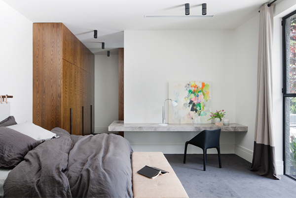
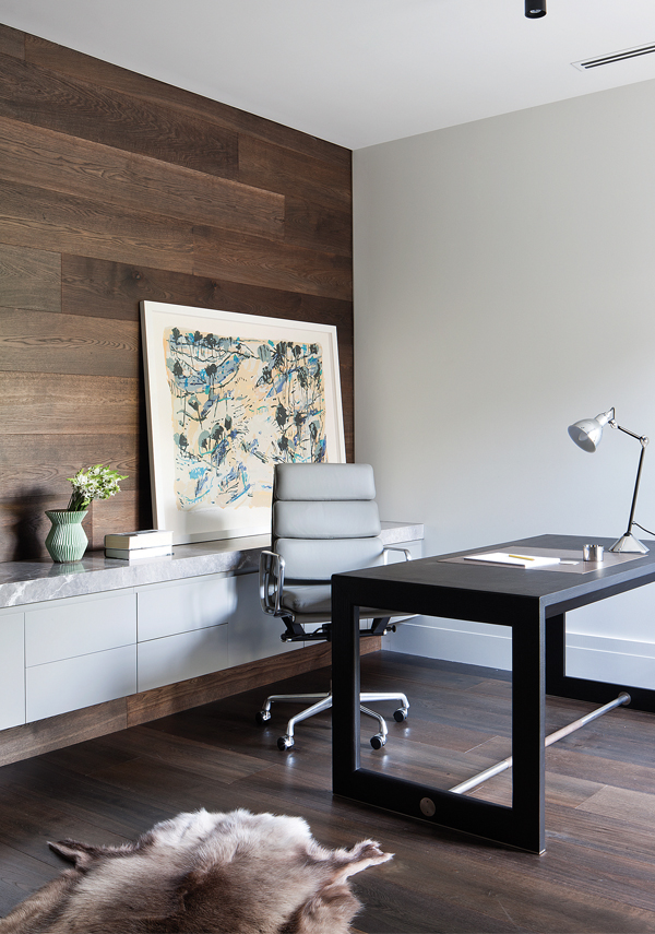
The principal bedroom also benefits from Rowe’s clever use of timber, with squat wardrobe feet highlighted rather than hidden. Leather strap handles are a perfect solution for this home, where they embody the overall ambience of simple, tactile, masculine and warm elements, beautifully combined. It is in this room that another of Rowe’s quirks presents itself. With such a minimal palette, there was room to play and play she did, with a marble ensuite bench that continues from bathroom to bedroom, as it wraps the wall to become a desk. Genius.
The house is in fact full of attention to details that eliminate visual clutter and spatial redundancy; the floor length curtain to cover a small bathroom window, for example. Just as effective is the full-length mirror to the side of the sink rather than the typical truncated arrangement. Perhaps more striking though is Rowe’s use of horizontal and vertical squares, rectangles and circles to expand and clarify a room, without overburdening it with detail. The result is a masculine interior of strength and tactile beauty. It is also somewhat akin to an old fashioned conservatory, where the garden and interior exist as one: a fluidity of design and a continuum of details.
You Might also Like


Related Stories
© Niche Media 2026