
Whites Dispensary
Share
Architect: Studio Equator
Photographer: Anne-Sophie Poirier
In our design for Whites Dispensary, Studio Equator wanted to achieve a distinctly different look in an industry that is deeply rooted in a traditional and unchanging aesthetic. The aim was to design an interior and visual identity to increase the dispensary income while maintaining steady growth in the beauty, health and luxury goods sections, presented through an environment that emphasises personal service and a trustworthy brand.
The ultimate goal is to reposition the brand to better service the market, and in doing so, change the way companies behave in an industry that hasn’t changed in decades. With this refreshed concept, Studio Equator has allowed the visual identity to grow with the ability to change quickly and keep up with customer demands and challenges.
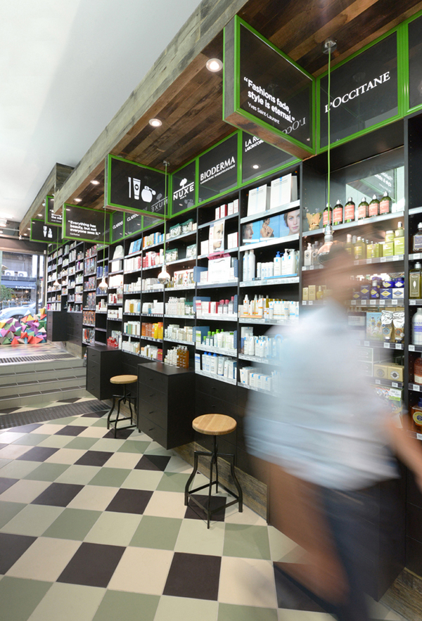
Reclaimed wooden horizontal panelling cloaks the façade of the shop, and showcases the new logo. An organic use of materials and authentic chemist and medicinal symbols support the overall design.
Large-scale graphics pinpoint the Whites philosophy that ‘health is the measure of wealth’ with well-known sayings from some of the worlds most influential spiritualists. Colour, Materials and a finishes scheme of raw timber, green, white, black and gold separate each section – Health, Wellbeing, and Beauty.
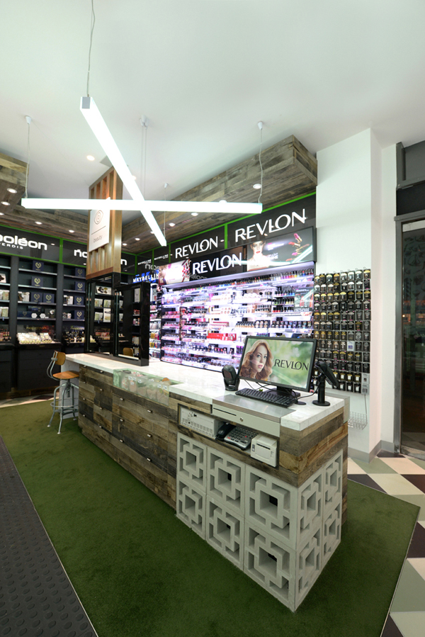
The interiors reflect a contemporary look and feel often showcased in the fashion and hospitality sectors. The checkerboard tiled floor, custom joinery, reclaimed grey skin aged timber, decorative concrete bricks, green carpet, cross-shaped large scale lights and industrial furniture create a sense of warmth framing the products and allowing them to stand out. The beauty products contrast with the natural feeling of the dispensary proposition and thus stand out in its earthy luxurious approach.
A custom set of icons with reference from original medical symbols was created to promote White’s services and products, reflect the brand typography and enhance the pharmacy’s way-finding.
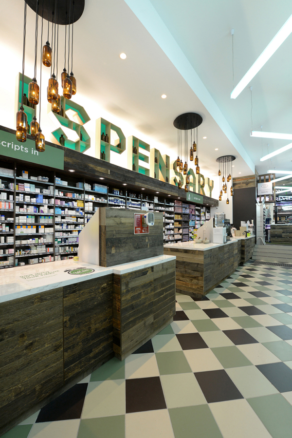
Bespoke large scale 3-dimensional typographical forms were designed and hand-made as a central visual point serving as both signage and shelving. These feature shelf-letters are softly back illuminated, and positioned above the dispensary area, with medical bottles sitting on the shelves as decorative props.
The sculptural letterforms are supported by custom medical bottle LED chandeliers, which are now a Studio Equator signature piece.
© Niche Media 2026