
Neon heritage: TRA workspace by Jose Guttierez
Share
All images courtesy Jose Guttierez
The fit-out, for a repeat client called The Research Agency, was carried out at the same time as the firm strategically rebranded itself as TRA. This timeliness meant the fit-out works could be designed to not just meet the company’s human resource objectives with respect to space, but to also physically represent the company’s ambitions and objectives, the essence of its business, in architectural form.
TRA had outgrown the 200sqm office (a ‘Gold Pin’ winner at the 2010 Best Awards) we designed for them in 2010. A 400sqm replacement space was found within a run-down, 100-year-old heritage building within the regenerating area of Britomart, near Auckland’s port.
TRA is a leading-edge research and analytics business at the forefront of its industry. A key part of the agency’s role involves gathering and analysing consumer information, and offering insights that unlock and drive new avenues of growth. From the outset of our concept design, we wanted to play on the capture and processing of information, and translate what TRA does into the architecture of the space.
The existing space, located on the top floor of the heritage building, featured two hipped-roof forms with a central 7m high loft set between them. All of the timber trusses and structure were exposed and uncared for and in some areas there were signs of fire damage. However, we saw the raw nature and patina of this existing space as an advantage. This history and character of the building could be accentuated and immortalised within the new office, rather than hidden.
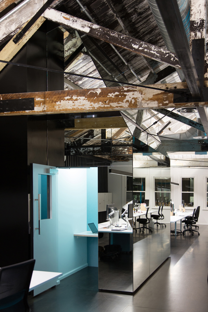
The spatial brief asked for an open plan office for 40 staff. A boardroom was required, as was a series of smaller meeting rooms and a staff break-out area. In order to preserve the character and not dominate the existing space, the new spaces were created by the insertion of pragmatic volumes within the existing framework. These volumes were then clad with mirrored panels, which dematerialises, reflects and accentuates the raw fabric, history and patina of the building.
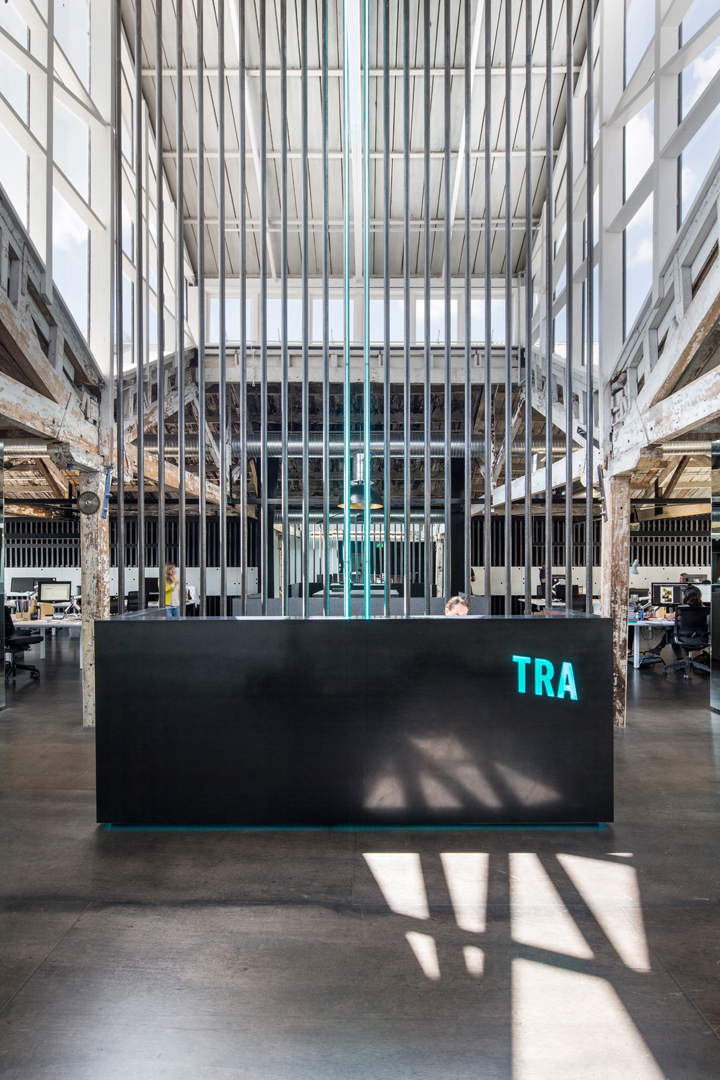
As part of the rebranding, TRA commissioned artist Paul Hartigan to create a neon artwork of their new abbreviated name TRA. Playing off this, neon was introduced into the heart of the space to represent the continual flow of information/data running through the company; it is ethereal, energy filled, and on the go – 24/7. Heavy materials such as solid timber and raw steel were selected for their mass and weight, and to contrast the ethereal nature of the neon. These materials also reference the steel and timber prevalent throughout the existing building, and that of the port across the road – the first stop for many building products imported into Auckland.
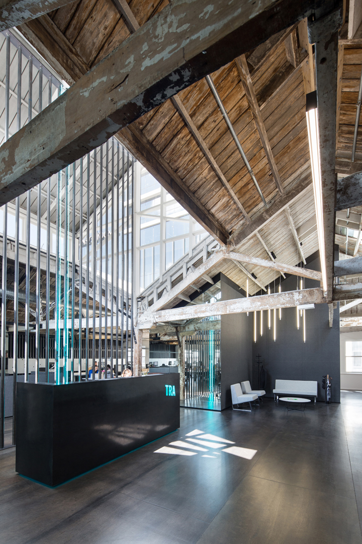
Locating the reception underneath the 7m high sky-lighted loft gave us the potential to play off against those consistent themes of lightness and weight while emphasising the cathedral-like proportions. The reception desk was designed as a heavy monolithic sculpture, enhancing the tension between light and mass, the ethereal and the tangible. The steel screen behind it spans the full seven-metre height, creating a vertical axis that draws attention to the height, lending gravitas to the space. This vertical axis also creates the impression that the screen runs right through the heart of the building, through the office floor, and up to the heavens above.
Throughout the office, the existing timber floorboards were damaged beyond repair and unable to be salvaged. Rather than replicating these with a new equivalent, we took the opportunity to create something unique. A module of 1.2m x 2.4m stained meranti plywood panels was used for the floor surface. The size of the panels enhances the scale of the space. The way they are positioned – in a repetitive staggered pattern across the entire floor – creates a grid that imposes order and sets up a rational framework upon which the process of information flow, embodied by the neon, can be expressed. To further enhance the structural order the mirrored wall panels, in the same module size as those on the floor, are precisely aligned with the meranti flooring, which balances the effect of the less perfectly aligned industrial timberwork of the ceiling.
To improve acoustic performance in the large, open space, black acoustic insulation, held in place by vertical sections of raw steel, was introduced onto the back walls of the workspace. The brief also called for individual lockers for each staff member: these were envisaged as a line of floating data – physically realised through patterns on white cabinetry – set within the vertical steel. The pattern of circular cutouts set within this form removed the additional cost of hardware for the lockers. The circle pattern is also applied to the kitchen cabinetry.
Modern open-plan offices require private areas for focused work or phone calls. At TRA, a mirrored volume, with two small retreats within, was created within the central back wall of the workspace. Stepping into these is equivalent to a pause in the data flow, a move away from the light and into a smaller more intimate space, a contrast to the high-energy environment outside.
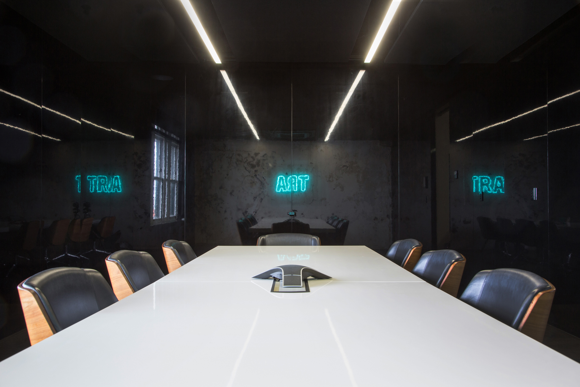
The boardroom, as a key place of experience to visitors to TRA, needed to be an exquisite space. The room is a formal summary of the design moves executed in the larger space. High-gloss surfaces make this room akin to stepping into a black-mirrored box. It is rectangular in plan, with high-gloss cut-and-buffed black-lacquered panels on three of the four walls and one wall left raw and untouched, to give reference to the patina of the existing building.
Through careful positioning of the panels around the existing window, a concentrated focus on the location, the reflections of the nearby water, and the rest of the city was achieved. Acoustic panels, incorporated into the ceiling, enable the space composed primarily of hard surfaces to function well as a place for conversation and presentation. As a happy coincidence, the neon TRA signage positioned on the untouched wall reflects the word ART onto the mirrored surface adjacent – an element of word play that provides a great conversation starter for all those that come to visit.
© Niche Media 2026