That Old Chestnut by FIGR Architecture makes richness and vibrance go hand in hand with city vibes
That Old Chestnut by FIGR Architecture makes richness and vibrance go hand in hand with city vibes
Share
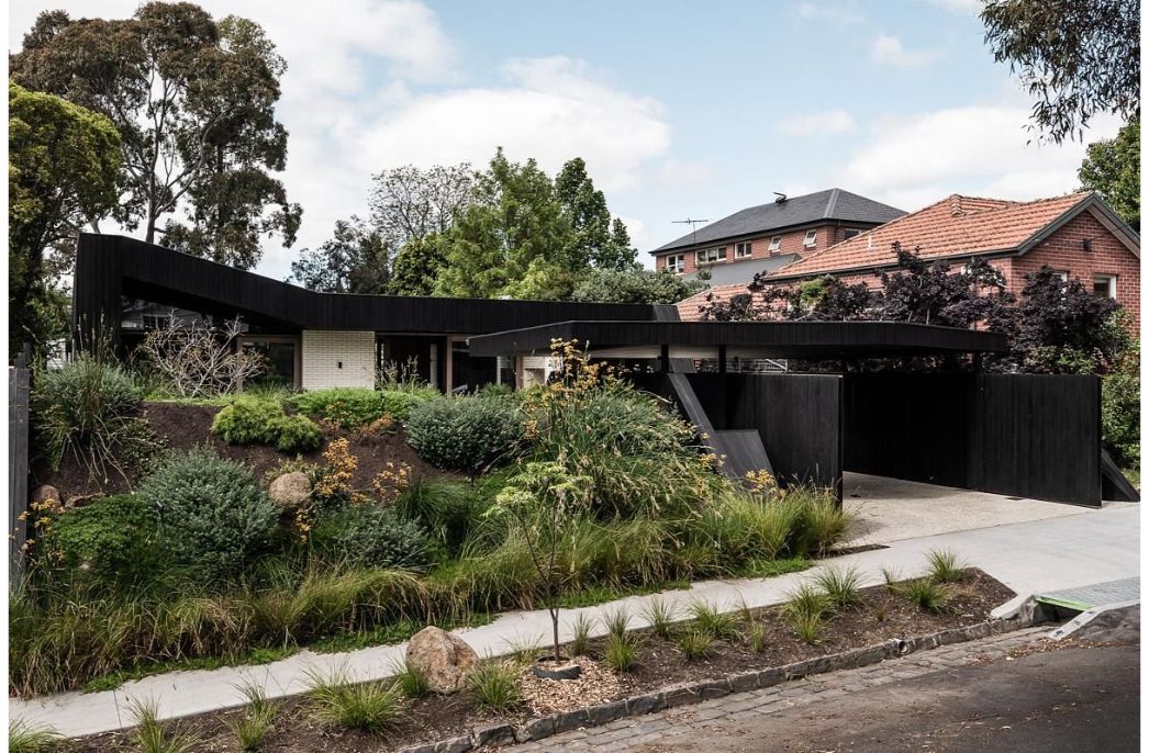
FIGR Architecture Studio’s motto is about acknowledging that the most important part of creativity is the work before the work that magnifies the true particulars of a project. This is even more accurate with its recent project The Old Chestnut.
As cities incrementally and inevitably densify, everyone looks to occupy the tiny nooks and crannies for a place one can call home.
Located among the hubbub of delivery trucks, bicycles and a never-ending procession of vehicle traffic, this project sits within a minute 160 square-metre site, backing onto a key commercial precinct within Cremorne in Melbourne.
Despite the site’s context, the sheer richness and vibrance of the area enable this place to become a long-term place of residence.
“Form and materials are influenced by context – we wanted to keep the pallet raw and honest,” shares one of the studio leads Michael Artemenko.
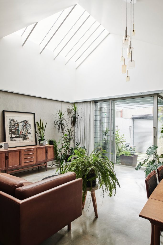
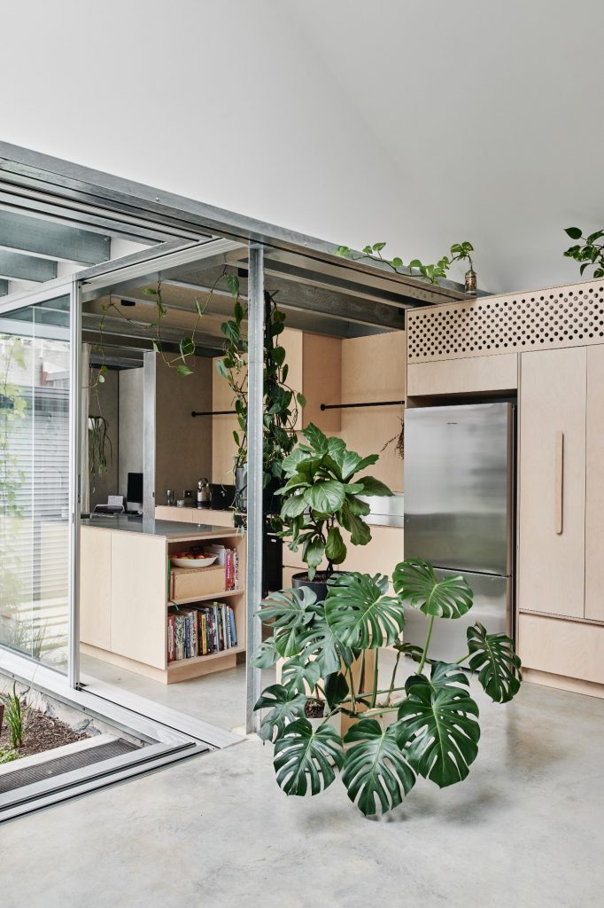
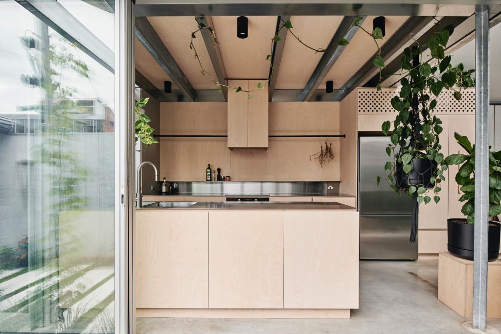
“In essence, we used three finishes – concrete, timber, and steel. Exposed galvanised steel purlins, raw plywood, and burnished concrete floors, like a warehouse.
“The corrugated zincalum roof sheeting is a homage to the neighbouring vernacular and we didn’t want the building to stand out with contemporary metal finishes such as standing seams or trim deck roofing.”
For FIGR Architecture Studio, catching the passer-by’s curiosity is a testimony to the quality of a project.
“We like the idea of a second look,” says Artemenko.
“When you do catch a glimpse of the extension from a distance it looks familiar in context however with enough variation that hopefully keeps the passer-by curious.
“The main building form of the extensions can be categorised by the typical gable/barn profile of the cottages.
“There is a slight asymmetrical shift towards the northern boundary where the skylight is.
“This was done with two strategies in mind; to bring as much light/volume into the space as well as to give protection from having views of the sky blocked by future developments.”
The design brief seeks to maximise comfort, solar passive design and access to natural light, made all the more challenging due to an impending 12-storey development to be constructed nearby.
To resolve this, the volumes of the proposed additions were planned out in collaboration with the adjoining neighbour who at the time was granted a planning permit for a two-storey extension to the north of the subject site.
By working together, views of the sky were in effect doubled and mutual visual privacy for both properties was achieved without the need for physical privacy screens.
The layout is an intentional departure from the typical open plan plug-in to the back of an older house.

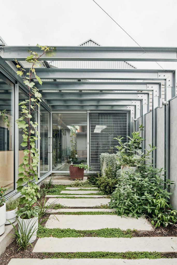
Instead, functions and spaces straddle the perimeter of the backyard so as to create a continuous interface and connection with the garden and landscaped pergola.
Complete with worm composting and a rain garden, the compact but the hard-working backyard is irrigated with a 2500-litre rainwater harvesting tank, provided in addition to solar-boosted hot water and above and beyond code requirements.
The concrete, timber and galvanised steel materiality of the house are imagined as unapologetically gritty and robust.
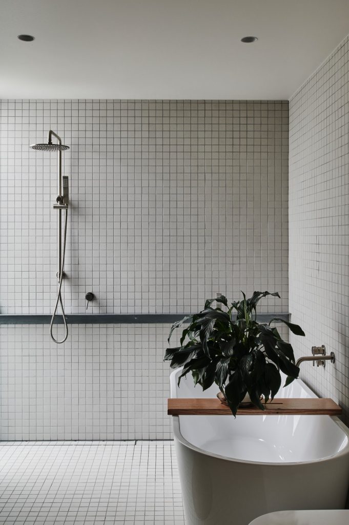
The latter of which, a natural and necessary reference to the immediate historical context of workers cottage roofscapes, seen in the local area.
Inside, the walls are lined with Australian spotted gum veneer panels finished with water-based non-solvent sealers and prefinished cement sheets.
Plasterboard is used sparingly and only where necessary, such as the tall ‘eggshell’ skylight internal volume, intended to diffuse and amplify incoming daylight.
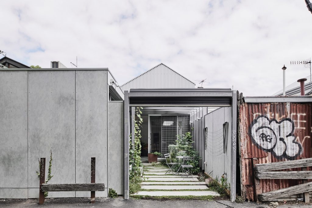
The biggest challenges on this project resided in being contextually appropriate and context integration.
“Having a lack of but in order to work with very little to achieve a lot.
“The detail came through using off-the-shelf items and re-appropriating them in an unconventional way.
“Getting less with more. Doing small takes big thinking.”
Discover also how Manta Ray Coffee Roastery by We Are Humble features a wabi-sabi feel.

