

Surface design reframed through five new material expressions

Share
With THE EDIT. A new material language, Neolith has introduced five sintered stone surfaces that explore the relationship between colour, texture and emotion, positioning material as an active participant in shaping architectural experience.
Material selection has long been central to the way architects and interior designers establish the character of a space. Beyond durability and performance, surfaces influence how interiors are perceived, how light moves through them and how people respond to their surroundings. For Neolith, this relationship between material and emotion is the starting point for THE EDIT. A new material language, a concept that positions surface design as a means of architectural expression.
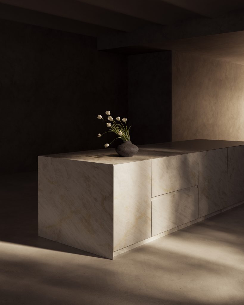
Following the official launch of the collection at Spazio San Pietro in Monastero during Marmomac 2026 in Verona, the sintered stone specialist has now revealed the five new surfaces: Pale Fossil, Glazed Opaline, Dorset Mist, Serene Emerald and Calacatta Viola. Each has been developed around a distinct emotional and aesthetic quality, translating the characteristics of natural stone into a contemporary material palette for architecture and interiors.
Rather than presenting the products launch as a straightforward expansion of its product range, Neolith has framed the five surfaces as individual codes of expression, associated with serenity, amplitude, equilibrium, renewal and empowerment.
“More than a selection of new models, THE EDIT. A new material language represents a way of understanding material as a tool of expression,” says Nieves Contreras, chief brand officer at Neolith. “Material is no longer a secondary element within the project, but what defines the atmosphere, influences perception, and remains in the memory long after leaving a space.”
The approach shifts the conversation from surface appearance alone to the broader role of materiality in establishing atmosphere, identity and sensory experience.
Five surfaces, five sensibilities
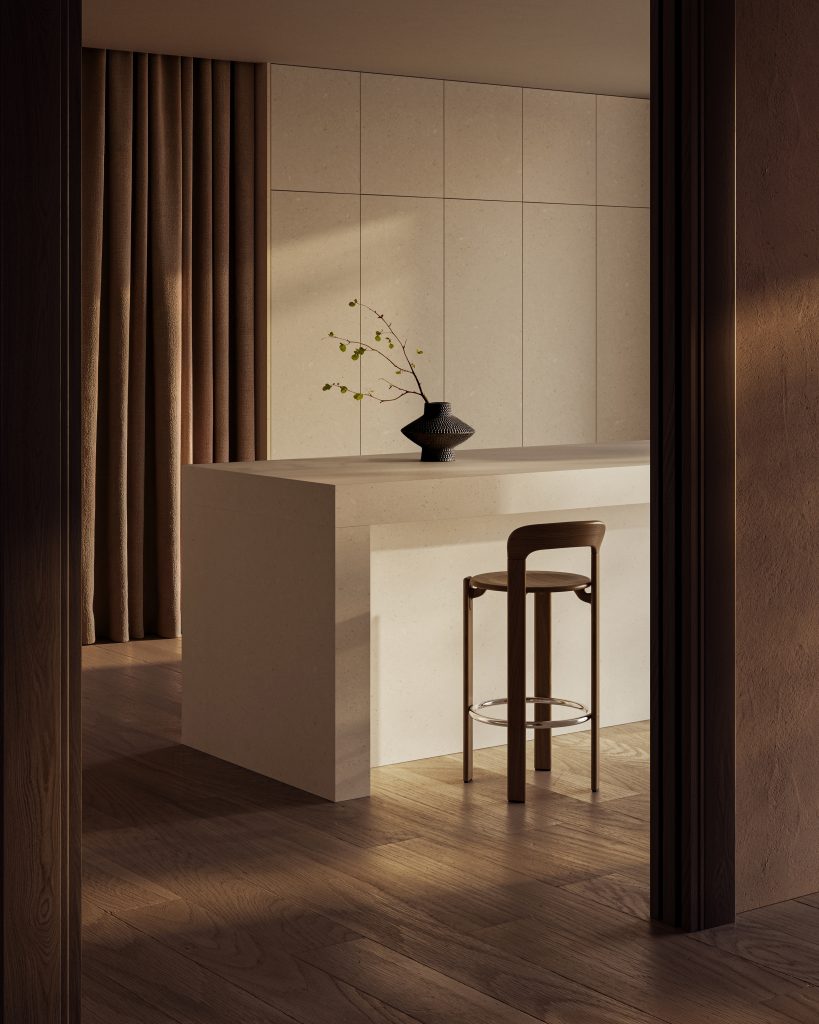
Pale Fossil explores the quieter end of the collection, drawing on the visual language of compact natural stone. Its ivory tones and fossil inclusions reference geological time, introducing subtle variation and depth while maintaining an understated overall appearance.
Conceived around serenity, the surface lends itself to interiors where material continuity and restraint are central to the design intent. Its softly mineral character offers an alternative to more overtly decorative stone patterns, supporting spaces that prioritise calm, permanence and a sense of belonging.
Pale Fossil is available in Neolith’s new Honed finish, complemented by a subtle digital texture that reinforces the surface’s tactile qualities and naturalistic appearance.
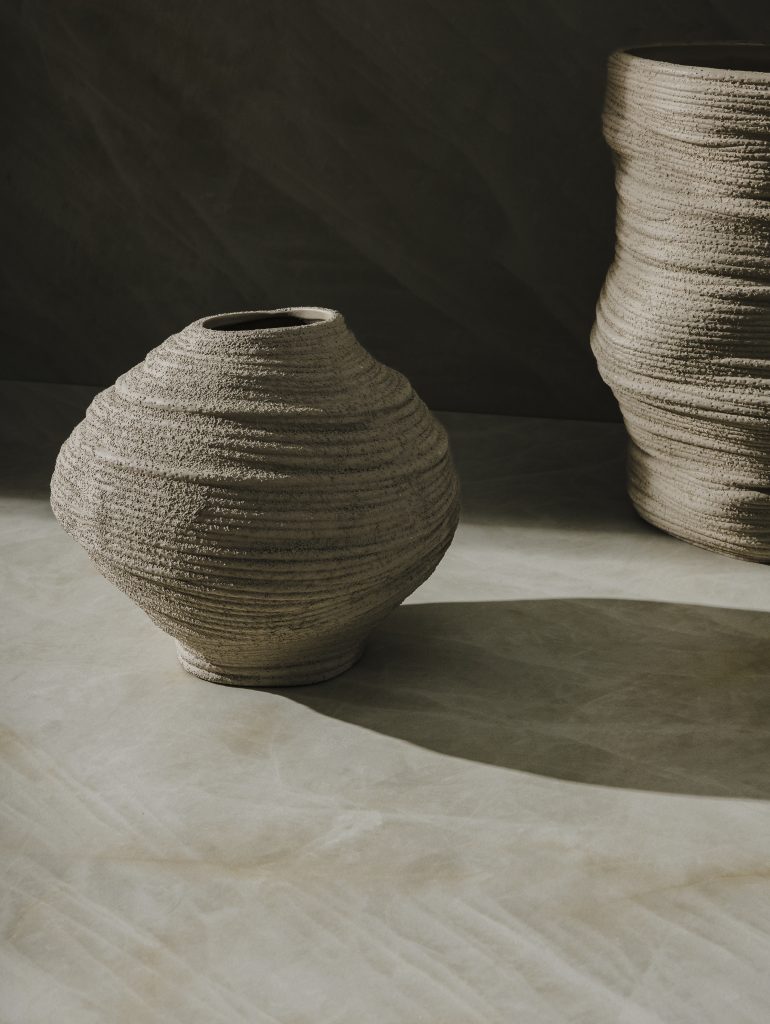
Where Pale Fossil emphasises stillness, Glazed Opaline is concerned with light and visual expansion. Inspired by luminous white quartzite, its delicate veining and crystalline inclusions create movement across a pale ground. The resulting surface has a sense of depth that shifts with changing light, introducing fluidity without relying on strong colour contrasts.
Associated with amplitude, Glazed Opaline is suited to schemes seeking a sense of openness and visual continuity. Its Natural Touch finish combines a softly tactile quality with digital texturing, balancing the precision of a manufactured surface with the visual complexity of natural stone.
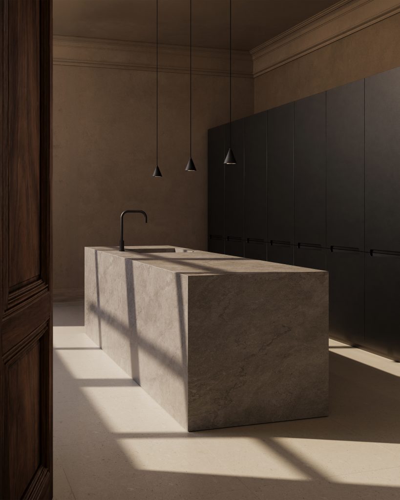
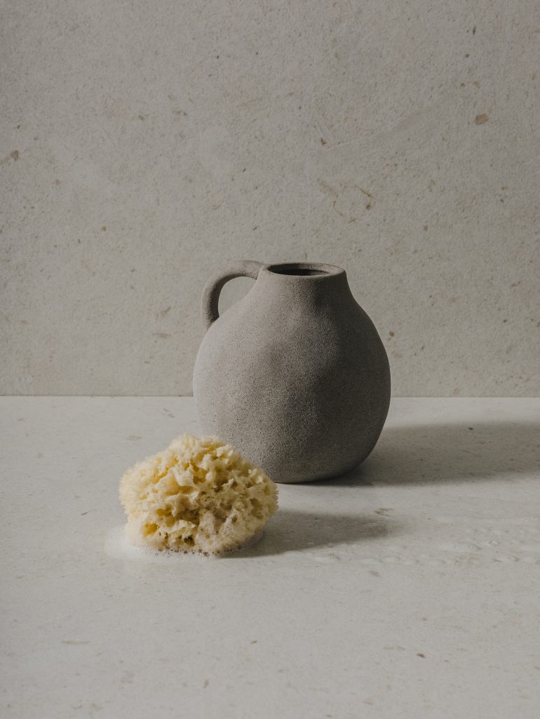
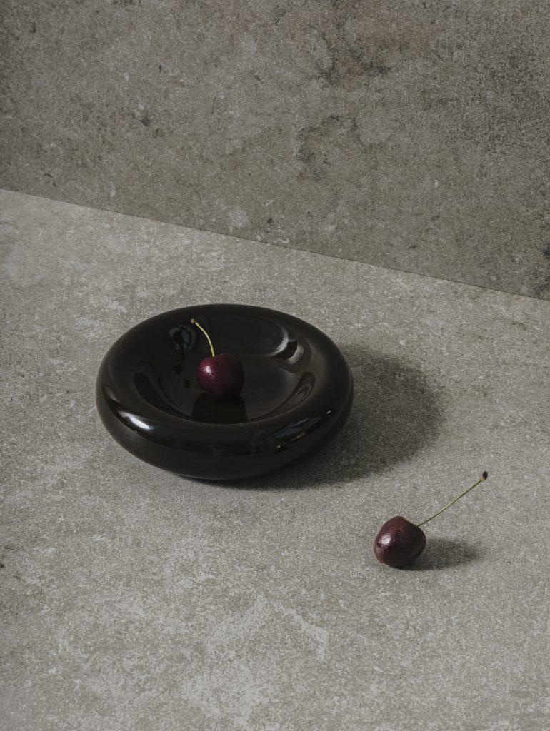
Dorset Mist takes a more architectural direction. Referencing grey-toned limestone formed during the Upper Jurassic period, the surface draws on a material tradition associated with enduring buildings and monuments. Its mineral texture and restrained palette establish a sense of solidity, giving it a measured presence within contemporary interiors.
The emphasis on equilibrium makes Dorset Mist a considered option for projects where the material palette needs to provide visual structure without dominating the composition. Its new Petra finish introduces a matte, stone-like appearance, reinforcing the surface’s understated character.
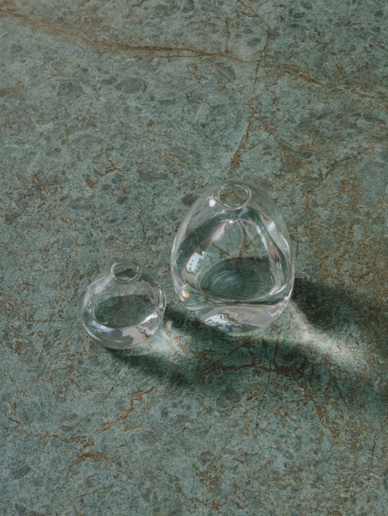
Serene Emerald introduces a more pronounced connection to biophilic design. Its restrained green tone draws on associations between nature, restoration and wellbeing, offering an alternative to the neutral palettes that frequently define contemporary interiors.
Rather than using green as a purely decorative accent, the surface is conceived as a way of establishing a more enveloping relationship between material and environment. Its association with renewal reflects an interest in spaces that encourage calm and reconnection, particularly as designers continue to consider how interiors can support everyday wellbeing.
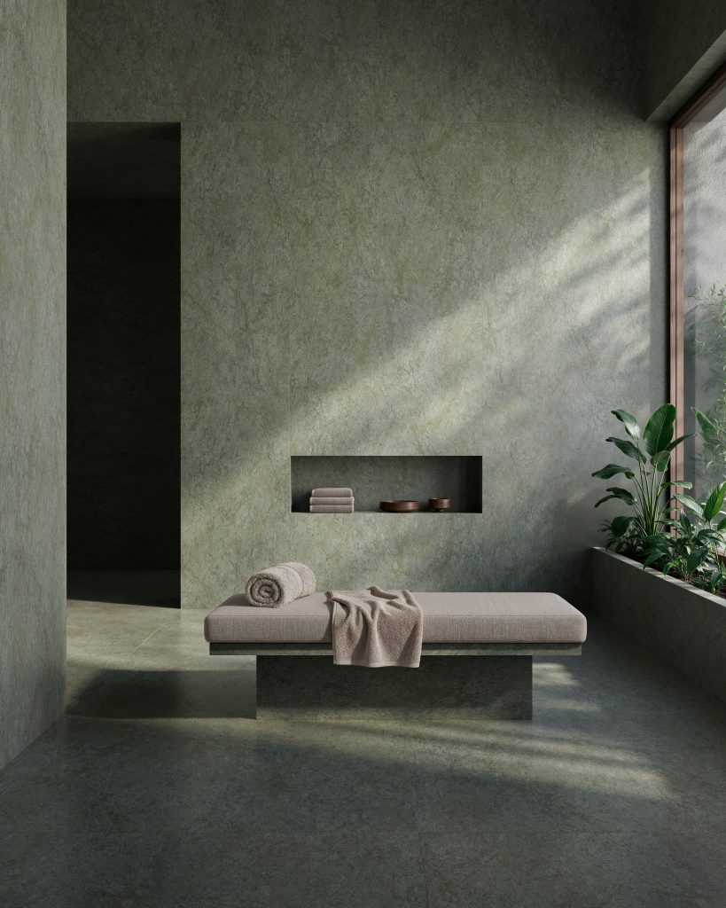
Available in the Petra finish, Serene Emerald combines a matte appearance with delicate digital texturing to build depth and emphasise its naturalistic qualities.
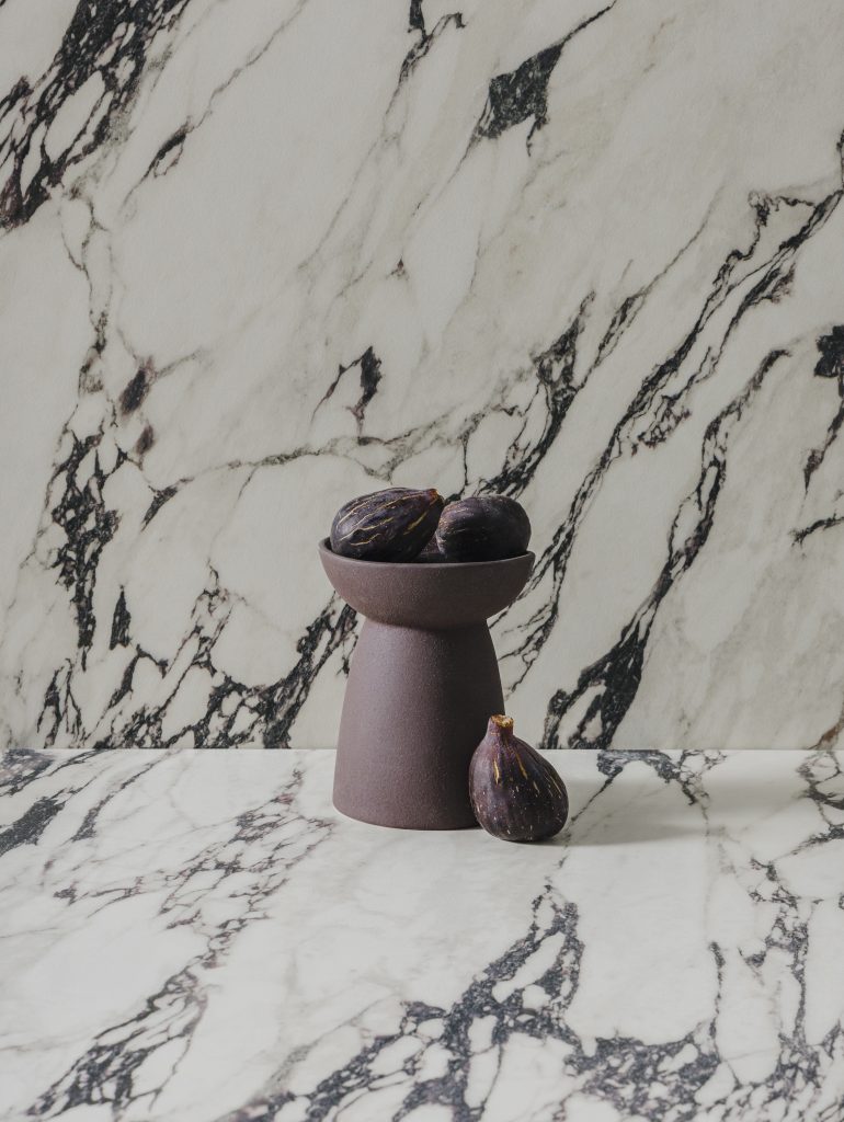
At the more expressive end of the concept, Calacatta Viola introduces a graphic contrast. Burgundy and purple veining cuts across a light base, drawing on the dramatic character of Italian marble while establishing a distinct contemporary identity.
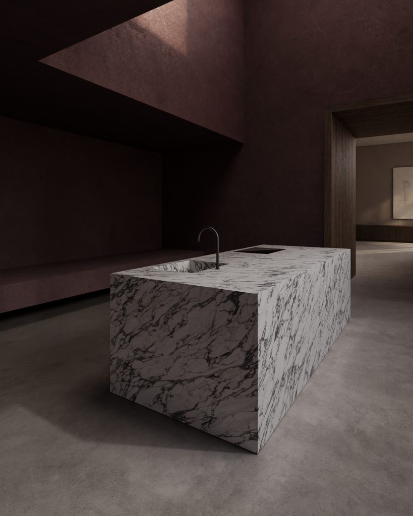
Its association with empowerment signals a deliberate move away from the discreet use of stone as a background element. Instead, Calacatta Viola is intended to command attention, allowing the surface itself to become a defining feature within a kitchen, bathroom or other interior setting. The Natural Touch finish provides a softer tactile counterpoint to the intensity of the veining.
Beyond the visual
The conceptual framework behind THE EDIT. A new material language was developed in collaboration with Judith van Vliet, founder of The Color Authority and an international colour strategy specialist. Her contribution helped shape the relationship between colour, texture and perception, giving each surface a narrative that extends beyond its physical characteristics.
The experience also incorporates an original sound component. Banjo Soundscapes created five musical pieces inspired by the identities of the individual materials, extending the overall concept into an exploration of how surfaces can be understood through multiple senses.
This broader approach reflects a growing design interest in material as an experiential element rather than simply a specification decision. Colour, finish and pattern can establish hierarchy, reinforce a project’s conceptual direction or influence the atmosphere of a room. By articulating these qualities through five distinct identities, Neolith offers designers a framework for considering how surface selection can contribute to the wider design narrative.
“With THE EDIT. A new material language, we present a new way of understanding our surfaces: not only as high-performance materials, but as codes capable of turning architecture into an emotional experience,” says Contreras.
Images: Supplied.
For further information visit Neolith.
You Might also Like


Related Stories

© Niche Media 2026