Pared back detailing and curves: inside The Daily Edited flagship
Pared back detailing and curves: inside The Daily Edited flagship
Share
Highly attuned to the client’s aesthetic, Pattern was given free creative control over The Daily Edited (tde) flagship store. Co-editor of inside Gillian Serisier takes a look at how the largely online entity is using bricks and mortar to provide experiential support to its accessories brand.
Having previously worked with tde, Pattern has leveraged the feminine aspect of the brand while pushing hard against cliché. The result is a space that is minimal, fresh, highly refined and feminine in the sense of an attuned balance between strong lines, colour and warmth.
Internally wrapping the entire space with a seven-eighths wall of soft peachy pink above a site-poured white terrazzo floor, the interior is immediately both gentle and spare. It is not sparse, however, with each element within the curve a considered extrapolation of the minimalist aesthetic. “Colour is a design element within the space, rather than a feature. Detail was kept clean, minimal and without embellishment. It’s pared back to not feel fussy or traditionally feminine,” says Lily Goodwin, co-director (with Josh Cain) of Pattern.
Within this remit, the entirely bespoke interior calls on form and variation to define elements. Branding, for example, is delivered as gold lettering on glass and as a backlit cut-out on the curving pink wall.
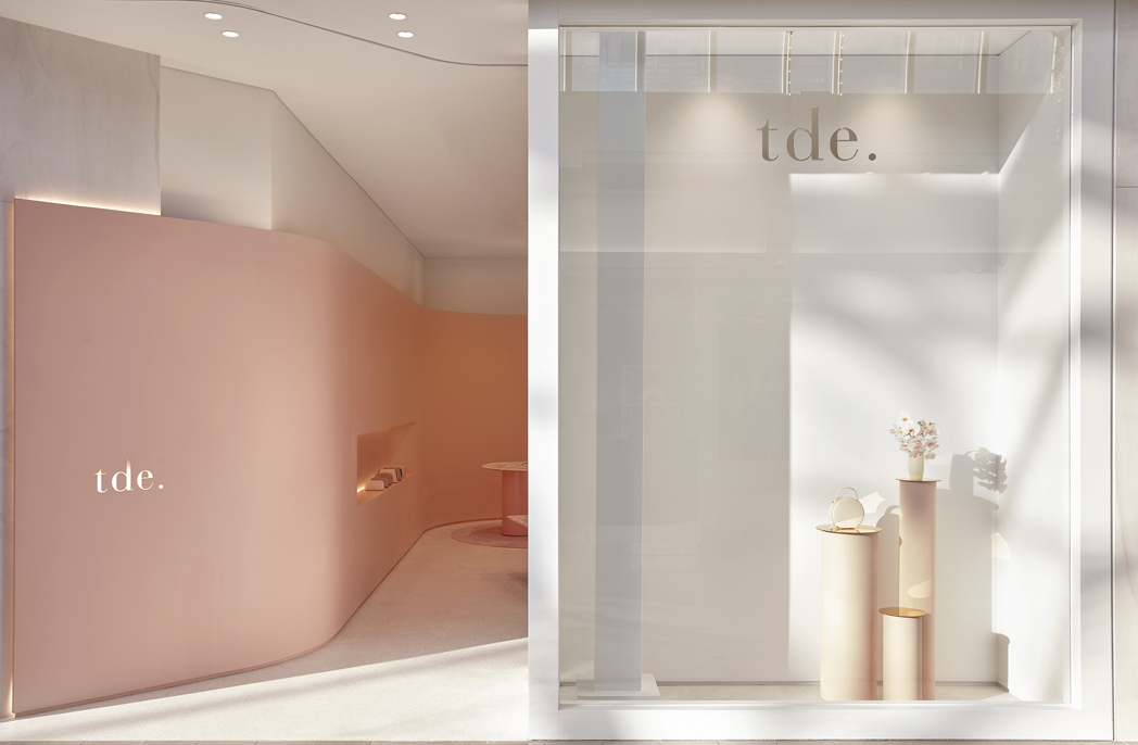
Golden disks play light through the window space
Shelving, is similarly conceptual, in that it is present but not obtrusive. Integrated into the wall, the primary display shelf is a pink on pink recess that neatly contains an array of accessories without interrupting the undulation of pink. Gently lit by concealed LED lighting at top and bottom, there is a shadow cast within the cavity that gently reiterates the wall’s undulation. Subtle and elegant, it is also a nod to the mid-century futurist vision, which in turn references the nature of tde as a hitherto and primarily online experience.
The more traditional shelving system in white powder-coated aluminium is fabulously sketch-like. Perforated shelves add to the illusion, with light seeming to play through the shelves, while the shadows cast by displayed objects are slightly more solid. It is a nice illusion and goes well towards understanding the very light touch Pattern has brought to this project.
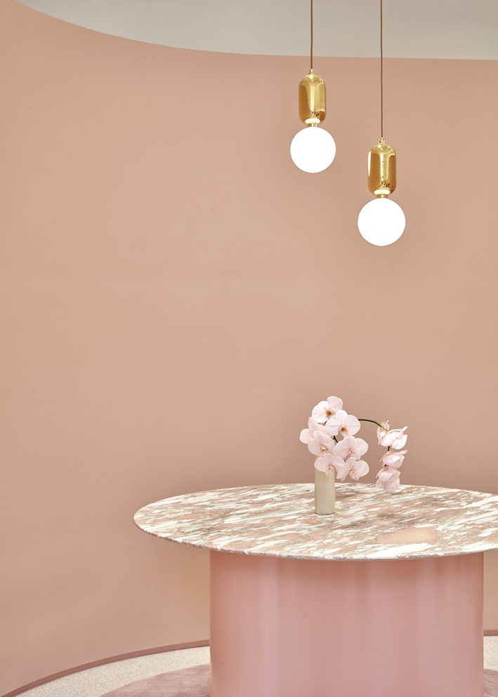
Bespoke tables in Norwegian pink marble (Artedomus) create punctuations of pure form within the space. Mimicking the wall’s curve and creating an exaggerated channel, the round iteration sits above a single sheet of curved metal in the same pink as the wall. The line is further exaggerated by a bespoke rug in the same pink that uses textural variation to suggest a fine line pattern of repeating curves.
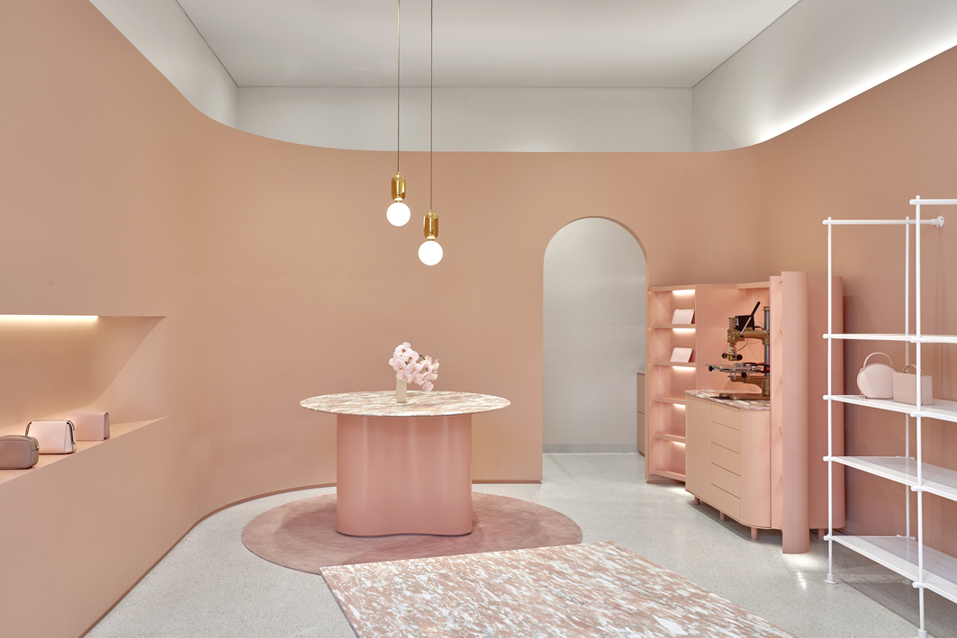
Sculptural form is contained within a single enveloping wall of curving pink
“Nothing is fussy. The rug, which we worked on with Designer Rugs, uses a minimal pattern to deliver texture and depth. It’s pared back and refined,” says Goodwin. Hanging above the table is the only introduced design object – a pair of Jaime Hayon Parachilna Aballs pendant lamps (Ke-Zu). This, however, is no casually selected lighting solution, but rather an act of appreciation for the designer’s work and shared design philosophy of form and aesthetic. “He is a favourite designer of ours and similarly works with pared back detailing and curves that speak to this aesthetic,” says Goodwin.
The shorter rectangular iteration of the table is a lovely piece of stonework with solid crossed supports of marble below a perfect length of this sumptuously coloured material. “We wanted everything in the store to be loved and precious, with nothing on the shop floor that was run of the mill,” says Goodwin.
As the space is just 60 square metres, and in consideration of its Chadstone Shopping Centre location, the creation of a presence attuned to the brand required a subtle theatricality. Plinths in the same colour as the interior have been rendered a shade lighter by white walls and floor. Casting beautiful reflections of colour and light, disks of gold mirrored capping on the plinths take full advantage of the store’s ground floor position, which affords the whole with flooding light. The displayed objects add further to this subtle theatricality with shadows playing across the walls.
And, while the Pattern design team has played with natural light in the window display, it has countered that in the interior by using soft floods to create an interior enveloped by a soft glow. It has also created an interior that is a delight of scale and whimsy. The fine shadow line of the wall base as a counter to the ribbon of pink and square lines of the supporting architectural volume, for example, gives the whole both gravitas and a feeling of lightness.
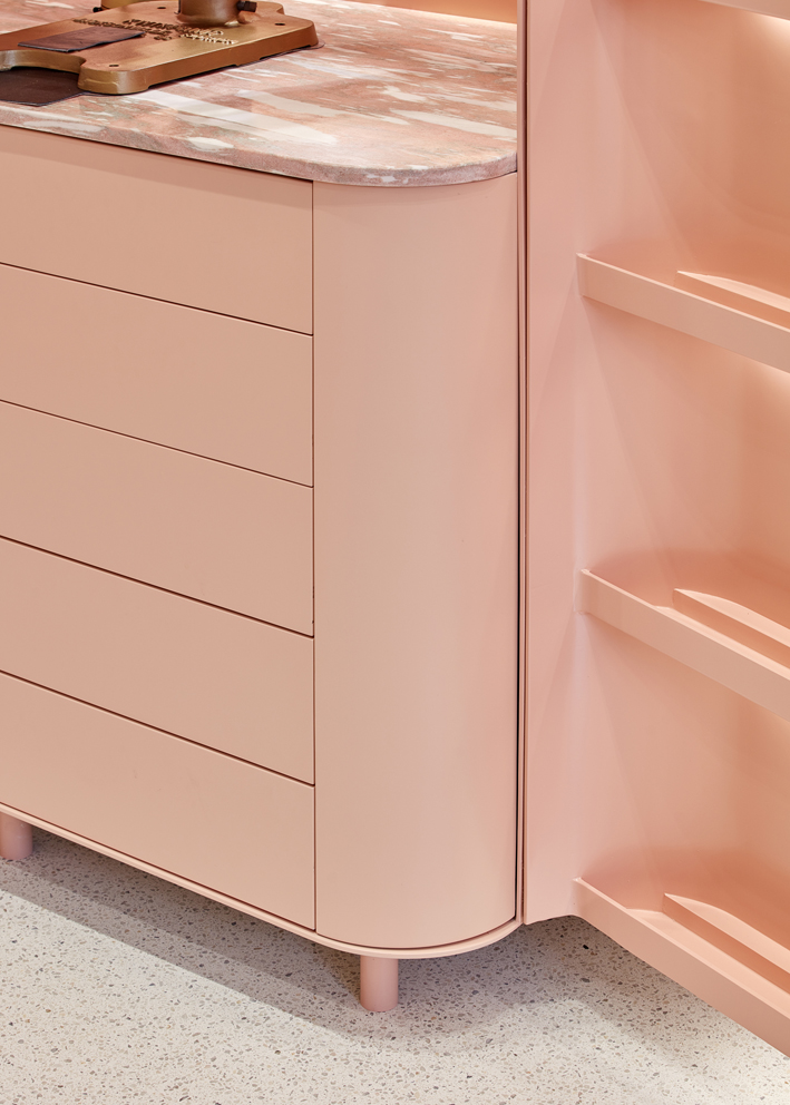
Detail of cabinetry is spare and precisely aligned to allow materiality to dominate
An arched door frame is both inviting and delineating and Pattern has worked both options with a store nook of gorgeous pink cabinetry designed to be seen, while a soft internal curtain truncates view and signals the staff only area.
It is, in fact, a project of precise and considered detailing. Each element is honed to deliver subtlety of colour, texture and form and nothing more. Rather, each element is part of the whole, and the whole is glorious.
Photography by Sean Fennessy.
This article originally appeared in inside 101 – available online and digitally through Zinio.
You Might also Like
