Pantone + friends’ colour of the year predictions for 2020
Pantone + friends’ colour of the year predictions for 2020
Share
Credit for yearly colour predictions naturally comes from across the pond, with Pantone perhaps the best known brand (and OG) behind the trend.
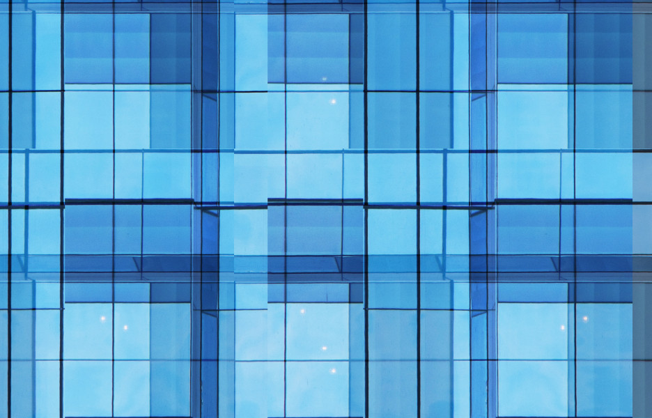
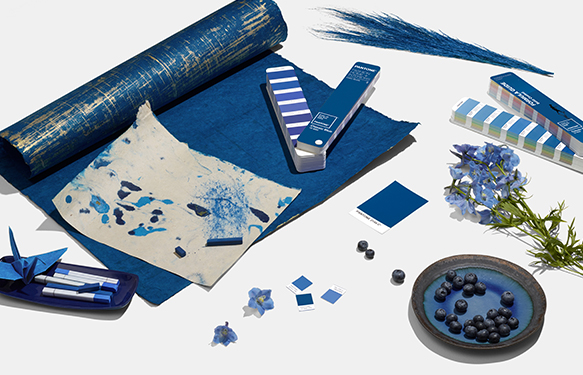
The self-described universal language of colour just released its choice for 2020. It’s Classic Blue.
Pantone describes the shade as: “a reassuring presence instilling calm, confidence and connection. Associated with the return of another day, this universal favourite is comfortably embraced.”
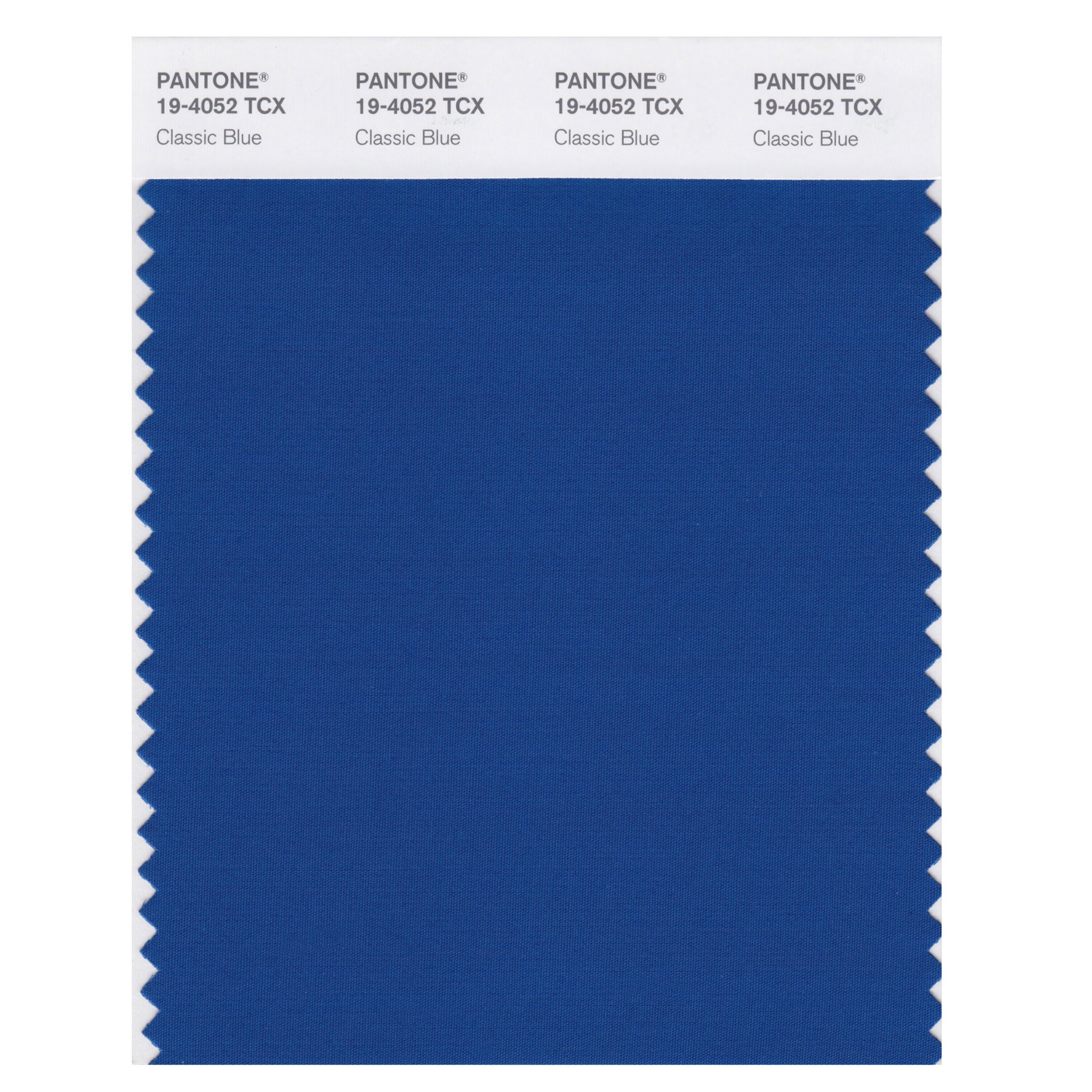
In what are pretty hefty expectations for an inanimate object, Pantone says the blue is “imprinted in our psyches as a restful colour”, bringing “a sense of peace and tranquility to the human spirit, offering refuge. Aiding concentration and bringing laser like clarity. A reflective blue tone, Classic Blue fosters resilience.”
The company says the tone is already being used in fashion, interior design, textiles and graphic design.
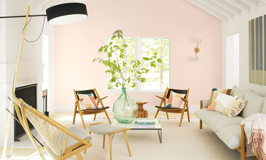
Picking up on the trend are brands like Benjamin Moore. Its colour for 2020 is a fresh pink hue that represents “a new dawn of idealism, design and living”.
Keen not to be left in the dust, Australian paint brands are getting in on the colour prediction action, and while they mightn’t have the clout of Pantone, their selections are an interesting insight into the local design scene and the direction it’s heading.
With that in mind, ADR has rounded up the 2020 paint colour predictions from the top Australian and Australian-loved paint brands.
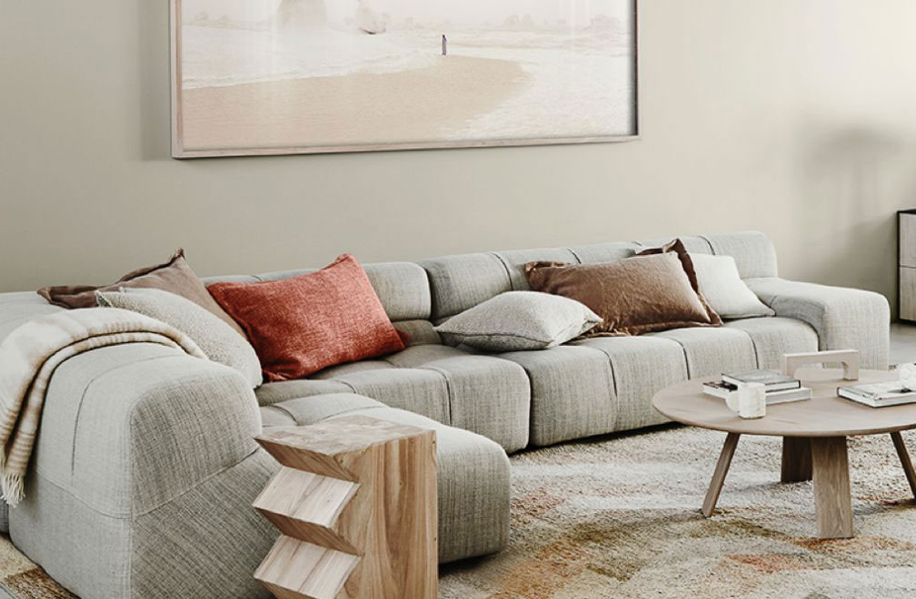
Essence – Dulux
Dulux declares: “a sense of nostalgia has been creeping into design trends for a while now, and in 2020 this will be expressed with ’70s references” – think shades of eggplant and curd alongside warm timbers and touches of coloured ceramics and glass.
Essence is a mix of mixes, soft, earthy greens and blue greens with a sprinkling of bold ’70s accents like plum, mustard and dusty violet. The company is calling it “nature’s palette”.
The UK mother company also chose a cool-tone shade of green called Tranquil Dawn for its colour of the year, saying it “embodies the nation’s mood on the approach of a new decade”.
Equilibrium – Haymes
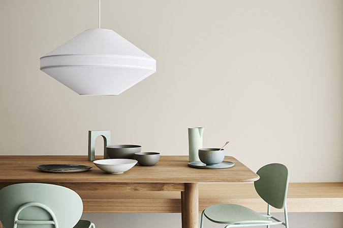
Haymes is on a similar nature quest with its latest colour library – Equilibrium.
Equilibrium explores “our powerful connection to nature, bringing it to the forefront of interior spaces by referencing the colours of nature”.
Green being the colour that bridges and connects. Fresh mint tones sit alongside earthy tones providing tension between the two.
Finding an equilibrium between nature and new technology, colours “sit together in a way that feels calm, refreshing and effortless, showing how both can live together seamlessly infusing a fresh and balanced approach.”
Natural Connection and Bright Future – Wattyl
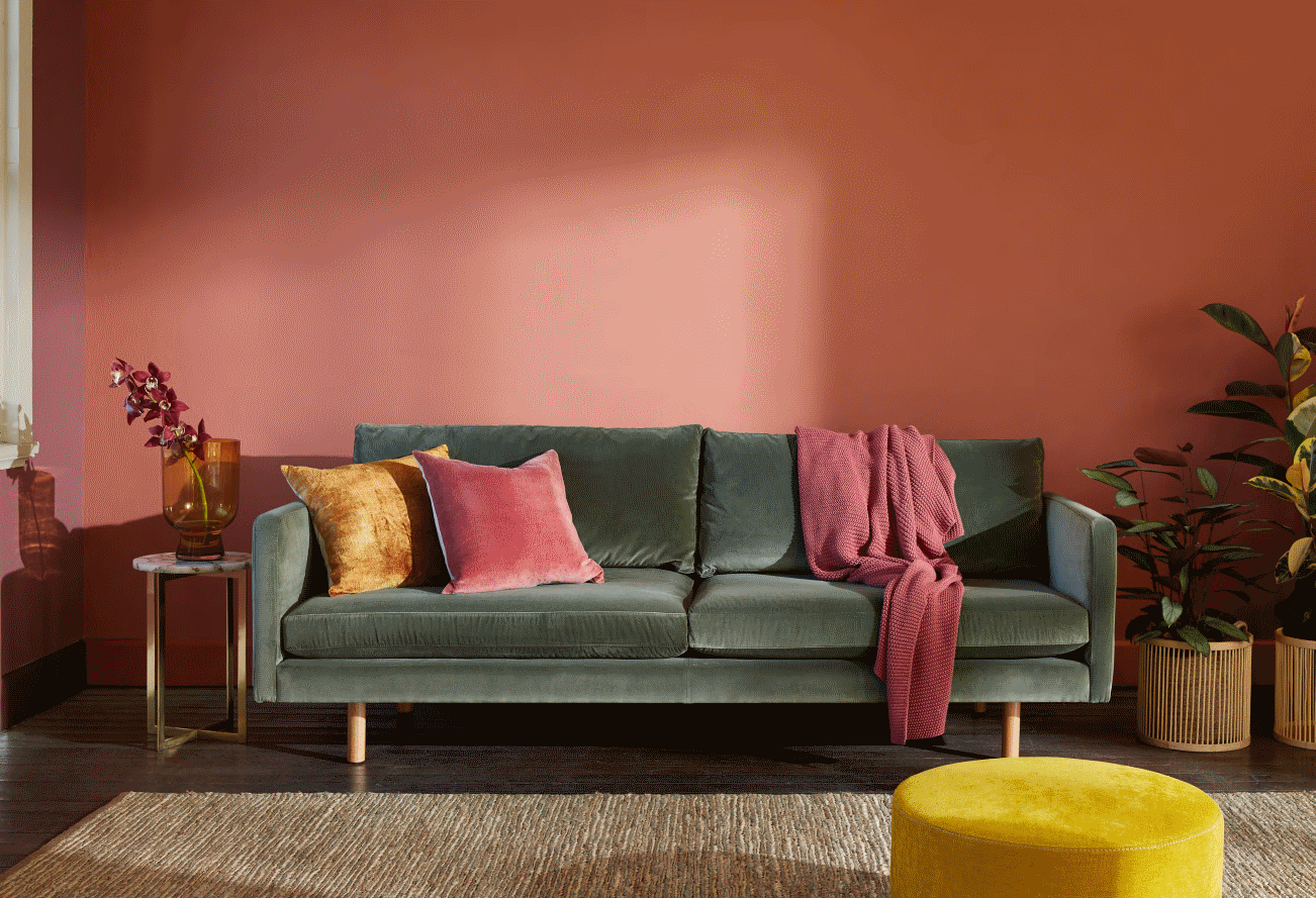
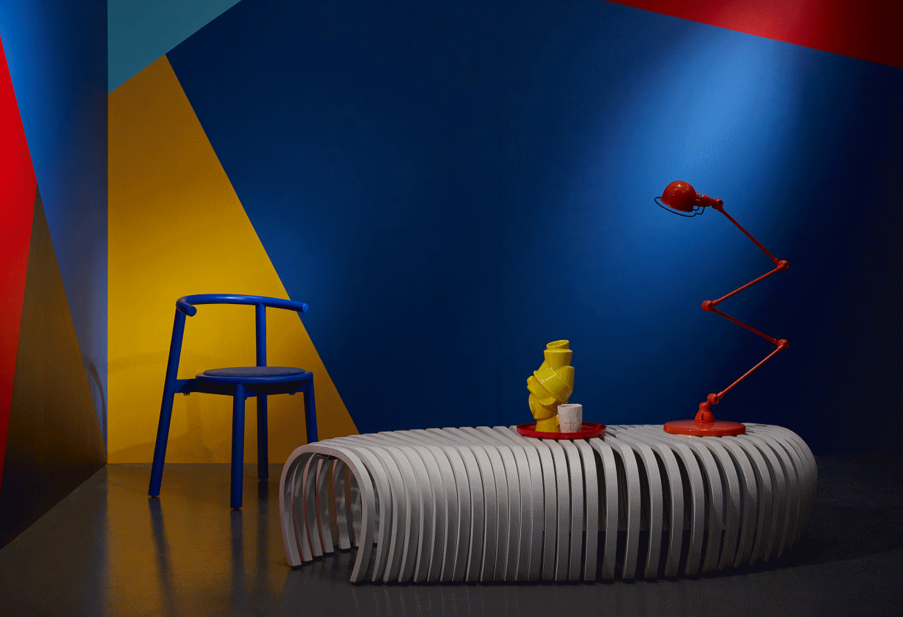
Wattyl is hedging its bets with two predictions, picking up on the two biggest themes of the 2020 colour scene – nature and the digital.
Natural Connection calls for us to “reconnect with our natural environment and borrow from our past, when times were more simple. We desire the tactility of the organic and embrace the unrefined tones that connect us with nature.”
The palette layers warm, spicy colours and organic textures to channel the feel of “a glorious, sunset”.
Bright Future, on the other hand, deals with our obsession with social media and comments on how “it’s becoming harder to tell what is real and what is digital” and that “we don’t seem to care about the difference”.
It’s a mixture of geometric and organic shapes and high energy colours including one that is very similar to Pantone’s Classic Blue.
Night Watch – Taubmans
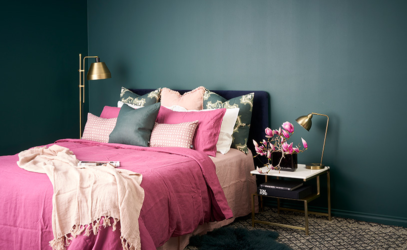
Encompassing the tones of a dense tropical forest, Night Watch is a natural shade that is “chic, effortlessly timeless and destined to be a favourite in both the home and workplace given our urge to reconnect with nature in today’s tumultuous society.”
The green is only one of 200 colours that Taubmans has put forward for the new decade.
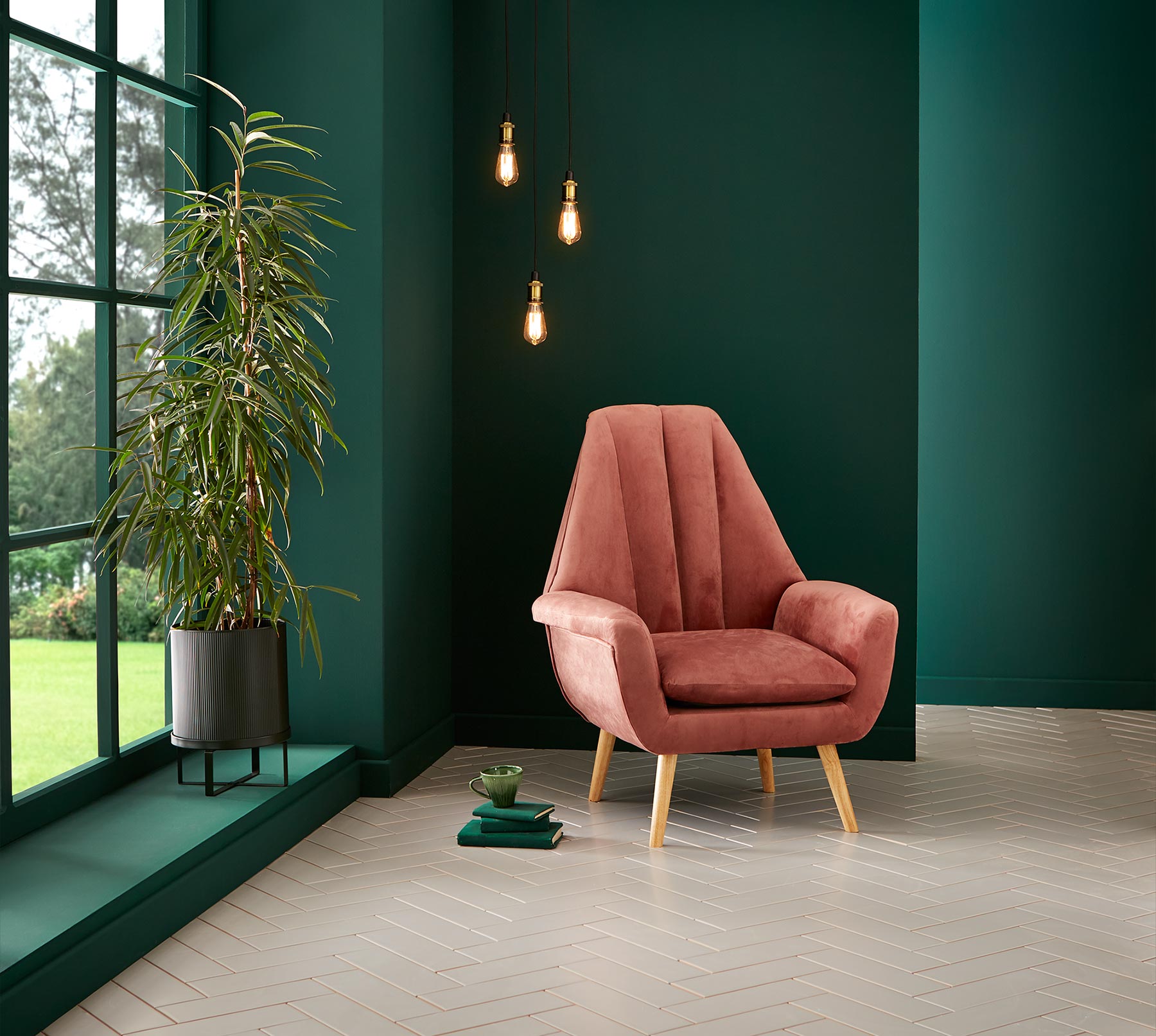
Adeline – Graham & Brown
Graham & Brown has named their 2020 Colour of the Year after Adeline, the given name of the famous author Virginia Woolf, and it’s along the same vein as Taubmans’.
Adeline is a deep rich bottle green hue whose natural qualities work perfectly with most other colours. This statement paint colour picks out the leaves of the company’s Bloomsbury wallpaper.
Lead photo: Haymes’ Calibrate Colour Forecast Vol-13 Positive Light
You Might also Like
