
Art Processors push the boundaries of exhibition design at MONA’s ‘Namedropping’
Art Processors push the boundaries of exhibition design at MONA’s ‘Namedropping’
Share
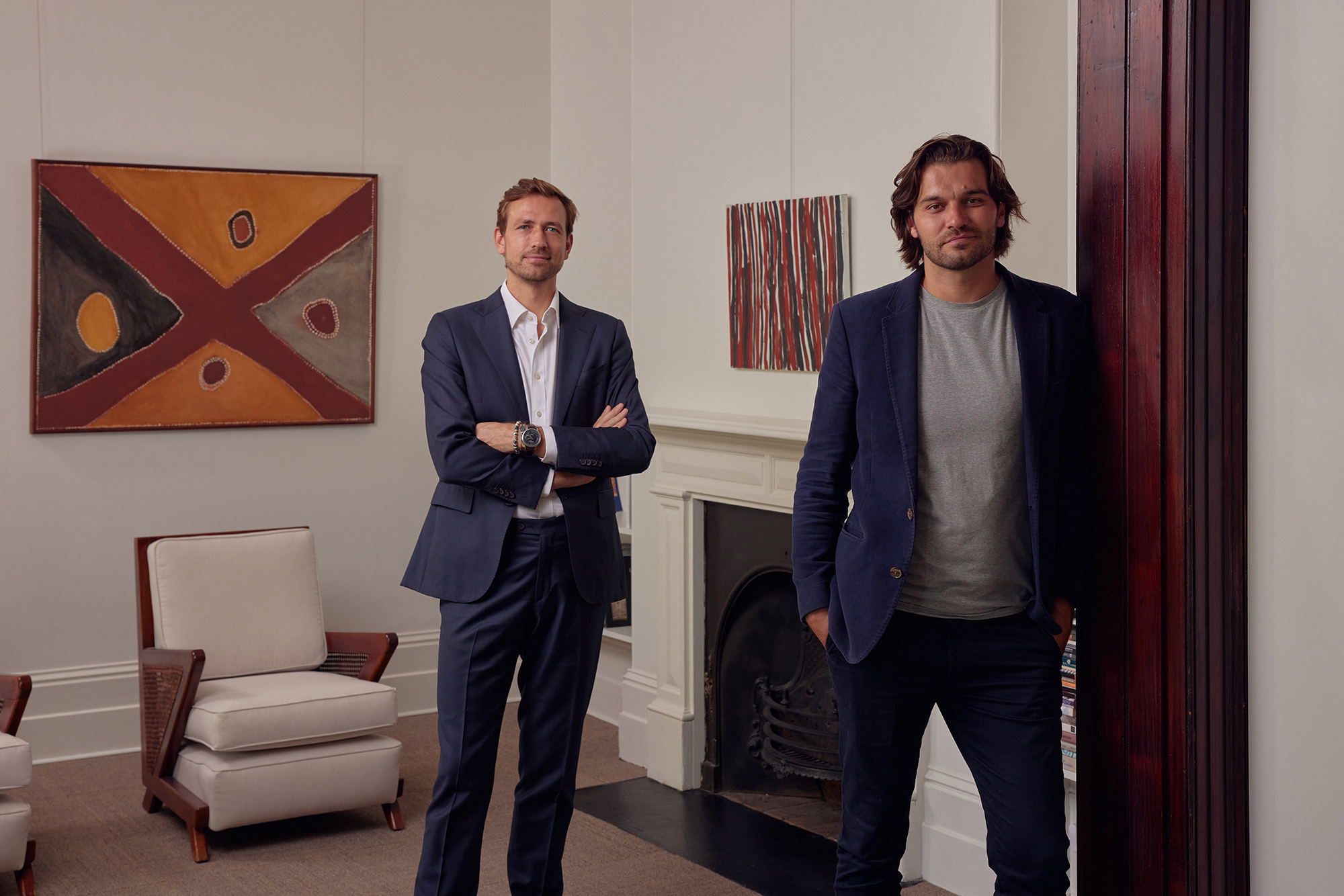
The new ‘Namedropping’ exhibition, running until April 2025 at Tasmania’s Museum of Old and New Art (MONA), is displayed in a correspondingly “bold and unapologetic” context courtesy of experience designers Art Processors. Exhibition design director Tara McDonough walks Australian Design Review (ADR) through the design’s intent and the unique freedom of making a MONA exhibition.
Australians are used to MONA courting controversy among high-brow art critics and the general public alike. From its display of Belgian artist Wim Delvoye’s poo machine, the nude solstice swim held during MONA’s Dark Mofo festival or, more recently, the forged Picassos hanging in its women’s toilets, MONA frequently doubles down in the face of outrage.
Its new exhibition ‘Namedropping’ is similarly, unsurprisingly provocative. Curated around the concept of status, Namedropping asks why we are drawn to certain objects and people.

“What makes the big names big: Porsche, Picasso or Pompidou? What is the nature of status and why is it useful? Is it just culture, or is there something deeper?” MONA’s exhibition description reads.
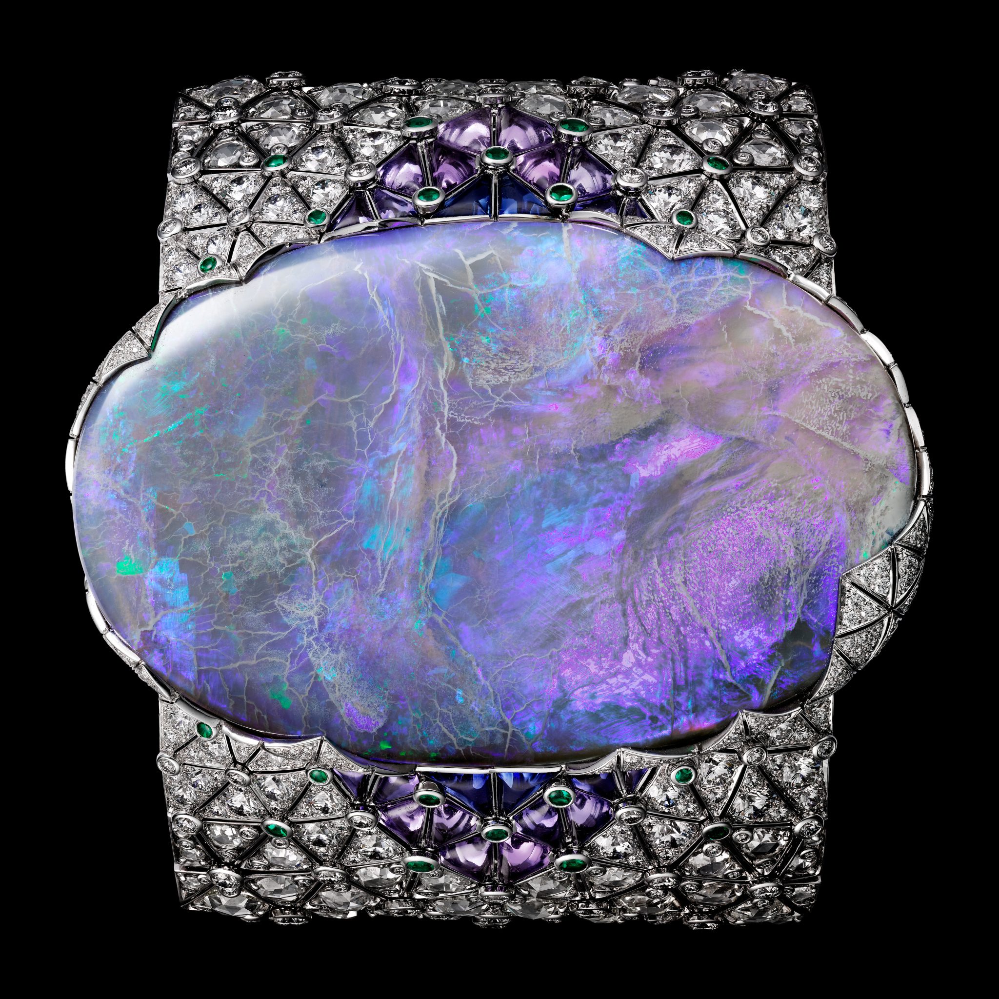
To help answer this question, Namedropping displays an array of art and objects. These include an ‘unofficial portrait’ of Queen Elizabeth II, an opulent chandelier that witnessed the end of the Vietnam War and the world’s only copy of the Wu-Tang Clan’s fabled seventh studio album.


How do you draw these disparate works together in a meaningful display? Art Processors exhibition design director Tara McDonough says the scope of the exhibition, and MONA’s appetite for the unconventional, allowed her multidisciplinary team to push the boundaries.
“Ideas of status, its usefulness and what makes the big names big led us to design Namedropping in a way that gave these themes bold expression,” she says.
“Visitors move through spaces that sit in tension with one another and that also embody the idea of creativity itself as a status enhancer.”

The journey through Namedropping
Entering the show, visitors might feel that they’re walking into a standard exhibition. They soon discover a garage roller door that signals the entrance to a pine-lined “man cave” with a gleaming 1977 Holden Torana parked next to a poker table.
What follows is a red gloss room fashioned on MONA’s iconic Fat Car, a richly hued space displaying He Xiangyu’s lifesize leather tank against a monogrammed wallpaper, and a gleaming stainless steel cube with rubber flooring that riffs on the gym and the human quest for physical attractiveness as a measure of status.

Visitors can bid to have their names featured on the gallery walls alongside artworks via interactive LED banners.
“It’s a riff on donor panels in traditional art galleries, where wealthy philanthropists pay to have their names on the walls of esteemed institutions,” McDonough explains.
She says the exhibition was designed as a counterpoint to the restrained minimalism that has traditionally characterised gallery design.
“There is a marked departure from the traditional ‘white cube’ aesthetic that has dominated museum and gallery design for decades,” she says.
“We’re always promoting exhibition environments that are much more bold and audacious in this regard.”

For artwork exhibitions, while experiments in colour, form and materiality can all enhance the viewer’s experience of a show, McDonough says the challenge is always to “know when to stop”.
“The relationship between an artwork and its display demands reverence for the work and an awareness of the need for restraint. We create a space that complements the work rather than dominating it,” she says.
Art Processors’ brief came directly from MONA’s curatorial team who were in close contact with several artists and institutions. While many of the artworks are drawn from MONA’s private collection, several were loaned from Paris’ Centre Pompidou, which supplied clear instructions on the proposed display, including conservation and mounting requirements.
“The MONA curatorial team provided a clear briefing to us on how each work should be displayed, giving consideration to the artistic intent, how the visitor might encounter the work and its relationship to other pieces in the space,” McDonough says.

3D modelling and ‘The O’
To aid in this process, Art Processors created 3D models of the entire exhibition space and each zone within it. Realistic flythroughs were iteratively developed for each part of the exhibition, allowing the curators to see the design as a visitor would, and make adjustments long before the construction phase commenced.
This is not the first time Art Processors has lent its technical prowess to MONA. The team invented ‘The O’ mobile technology, which MONA founder David Walsh has described as “the thing that gave me the freedom to create in the way that I wanted to create”.
The O is the mobile technology by which visitors access content about the artworks nearest to them, replacing traditional wall labels. It’s a central part of the MONA experience and is the key enabler for MONA’s unique and often radical approach to exhibition design.
“Once you remove the requirement for a label beside every artwork you’re freed up to design the exhibition for maximum impact,” McDonough says.
“Lighting can be more dramatic and atmospheric. Artworks can be arranged in unusual and novel displays. And the audience gets instant access to wildly differing perspectives from the artists and MONA’s creator, David Walsh.”

The MONA experience
According to McDonough, working with MONA is a “very different experience” to working with more traditional galleries. Her team doesn’t face the institutional parameters that can sometimes limit creative expression.
“From the rejection of traditional wall labels to their trademark darkly lit galleries, MONA has always embraced risk, and the approach to Namedropping was no different,” she says.
“While we had to ensure the design still felt like a MONA show – think intimate passages and darkly coloured walls – we were encouraged to push our design in weird and wonderful ways.”
Reflecting on the beginnings of this process, McDonough remembers the curators ended the exhibition briefing meeting with a simple request to ‘make it look good’.
“I’m proud to say we met the brief.”

Photography by MONA/Jesse Hunniford. Images Courtesy the Museum of Old and New Art, Hobart, Tasmania, Australia.
You Might also Like


Related Stories
© Niche Media 2026