Frost Collective creates “modern gothic” branding for Queen & Collins
Frost Collective creates “modern gothic” branding for Queen & Collins
Share
Sydney-based strategic design agency Frost Collective have led the branding for GPT Group’s $238 million Queen & Collins project.
The redevelopment by Kerstin Thompson Architects and BVN Architecture integrates multiple buildings in Melbourne’s famed Gothic Bank precinct into a ‘city within a city’.
GPT Group sought out Frost Collective to create the communications strategy and digital launch for Queen & Collins. ADR spoke to Frost Collective strategy director Cat Burgess about creating branding collateral that mimicked the gothic architecture.
ADR: Could you explain the digital showcase and how it echoes the design motifs of Queen & Collins?
Cat Burgess: Digital was really key to the communication strategy for Queen & Collins. Because our campaign was all about building intrigue, we started out with a teaser video that juxtaposed gothic-style language with unexpected imagery and renders of the development. It created a sense of mystery and modern gothic that was perfect for this development.
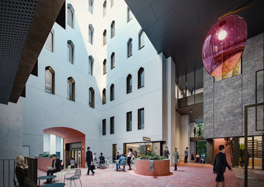
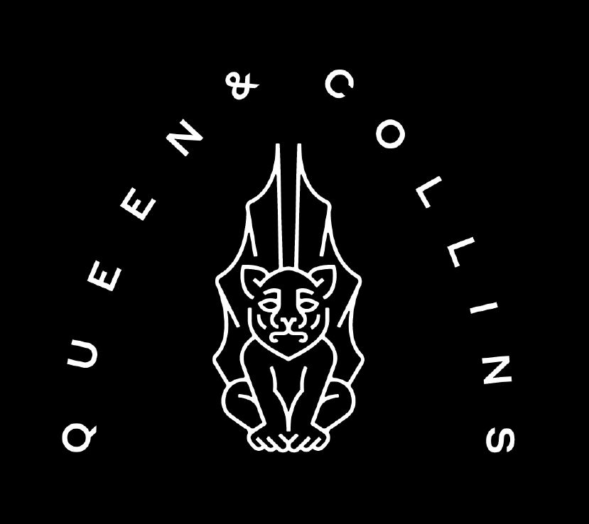
The fabric of the place is heroed and reinterpreted in the design. The logo itself draws inspiration from one of the gargoyles on the Collins Street façade of building, the many archways, windows and gothic forms across the four different buildings in the development also star in the marketing, as abstracted shapes that frame images and information.
In a very real sense, we have brought the gothic history back to life in a modern and intriguing way.
ADR: What were the dynamics of the consultations with GPT Group?
CB: From the outset, GPT wanted to do something different and befitting of the special heritage character of the development. They were open to new ideas and driving a strong sense of personality in the brand and marketing.
A lot of this work was produced during the early days of lockdown due to COVID-19, and a very strong dynamic developed between our teams as we were all deeply committed to the vision for the project and doing it justice. It’s often said that visionary work requires visionary clients – this was definitely the case here.
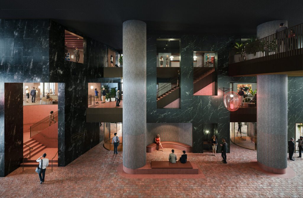
ADR: How would you describe the branding of Queen & Collins?
CB: The brand idea for Queen & Collins is all about ‘The Rewards of Character’. The idea is to celebrate everything that makes the site unique, also championing people to connect to their own individuality as the secret to success.
The idea was brought to life by creating an actual character for the brand identity – a modern gargoyle.The whole marketing approach has been based around creating intrigue, and building a story that has a lot of different dimensions over time.
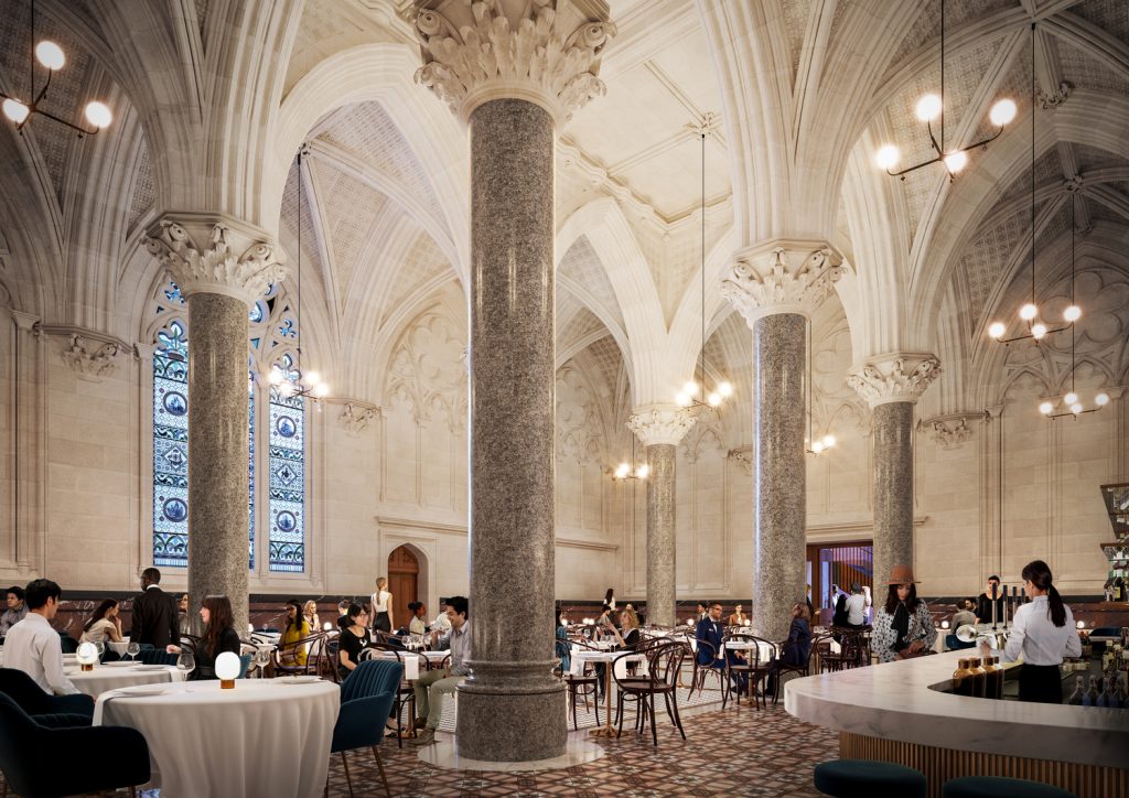
The branding journey started with pieces that captured peoples’ imaginations and left them wanting to know more. The site was wrapped with a hoarding of gothic-inspired words and fantasy-like photography to make people stop and ask, “what’s that” rather than hard-sell marketing.
Vince Frost, founder and CEO of Frost Collective, spoke to architect Chris Bosse in the latest episode of Business of Architecture and Design podcast. Have a listen here.
Renders courtesy of GPT Group, Kerstin Thompson Architects and BVN.
You Might also Like

