Colour my world – Haymes Colour Library Volume 13
Colour my world – Haymes Colour Library Volume 13
Share
Once upon a time, suppliers to the design industry, such as paint or furniture manufacturers, could take time out annually to consider what the preferred colour palette for the year ahead may be. But the world is very different today.
Now we have Instagram and myriad other social media channels, which means that the latest trends and concepts can be devised and disseminated around the world almost instantaneously.
At Haymes Paint we found that our old system had simply become outdated. We used to make regular trips to Milan and the other top trade fairs, come home with our research and then hold on to that for up to 12 months before dropping it into the market.
Understandably, this system doesn’t work anymore. It takes no account of how quickly things move and how accessible trends and information have now become to a lot of our market segments.
The answer was easy to find – a digital platform called the Colour Library. From this we can produce volumes whenever we see fit, based on what we see coming into the market.
Importantly, the Colour Library can be incredibly responsive and timely – reacting in terms of colour and materiality, but also regarding what may be happening in the wider world. Our colour palettes can now be informed by the social, economic or political landscape or even the environment itself.
We take those strands and influences and then put them into context for the Australian lifestyle.
With this responsive framework, we are no longer tied to strict timelines and schedules, but can be purely driven by the climate around us. When we see elements in the market that are relevant and that we can tie back into the stories of our products, that’s when we know the time is right for a new release. We become the conduit for the ideas floating about in the ether, taking those nebulous concepts and making them tangible in the form of a range of new colours and tones.
With colour, much of the time there isn’t a huge shift in the preferences and popular choices. But there will be nuance and hints in tone and shade. For example, green may be a thing for a couple of years, but the spectrum of greens and how they associate with other colours can change quite specifically.
Volume 13
For the latest iteration of Haymes’ Colour Library there is a noticeable thread and associated feeling running through the offerings. In a time of chaos and upheaval across the world – politically and socially – we have noticed a yearning for reassurance, for sanctuary and relief away from the turmoil. We see our role as looking at the global outlook and talking about it in a positive way, using colour to elevate moods. The ranges reflect this with groupings entitled Calibrate, Equilibrium, Positive Light and Home Grown.
With Positive Light, for instance, there are colours derived from the ocean and the intensity, strength and beauty there, but we’re also touching on the fragility and thinking about what we can do in terms of addressing that.
We are also thinking about the bigger picture – about using pieces in our homes that may lessen our footprint on the world, and in particular lessen the negative effects we are having on the ocean at the moment.
The plastic that’s being deposited within the ocean is a scary and overwhelming problem, but we are trying to talk about that in a way that’s really positive for people and empower them by thinking about all the things that they already have, and how they can repurpose them.
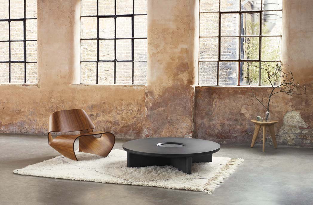
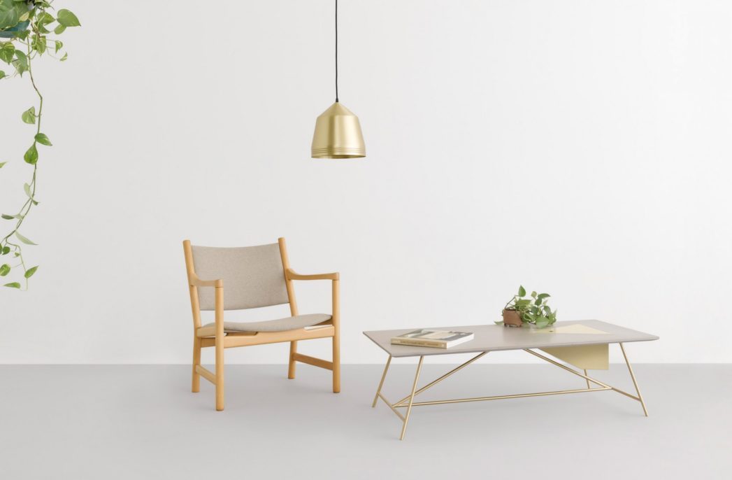
So in the Colour Library photography you will see items that have been strategically placed. For example, there’s a piece of denim that has been stitched back together from old denims and has now been made into a throw.
Above all, the Colour Library has been put together to inform as to what’s available and how it can be used, but then it’s up the individual. Colour and our response to it is a deeply personal thing – but what we can do is show people the options and let them then select from the palettes in a way that is meaningful to them.
Download the Volume 13 Colour Library report here.


