
Dulux releases their 2015 Colour Forecast
Dulux releases their 2015 Colour Forecast
Share
Above image styled by Bree Leech and Heather Nette King for Dulux.
Australian paint manufacturer Dulux has released their colour forecast for the new year, with a superbly styled photographic series predicting up coming trends and new directions in design.
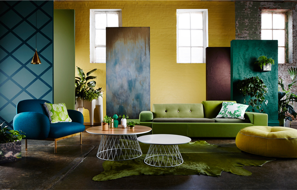
Entitled Connection, the latest colour forecast is a visual expression of current issues including social connectivity in the digital age, as well as humanity’s relationship with the earth and diversity in an increasingly globalised community. In developing the forecast, Dulux drew on inspiration from global trends influencing a range of creative industries, including art, fashion and interior design.
The forecast is divided into four distinct style concepts titled Wildland, Silentshift, Modhaus and Earthwerks. Each photo composition is the product of collaboration between Dulux and leading Australian designers. Wildland and Silentshift were styled by Juliet Moore and Ben Edwards of IDEA winning architectural practice Edwards Moore, while textile designers Bonnie Ashley and Neil Downie (owners of Bonnie and Neil), created Modhaus and Earthwerks. Stylists Bree Leech and Heather Nette King also contributed a vignette to each of the themes.
Wildland
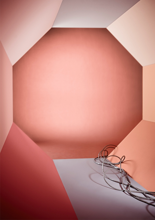
By far the most restrained colour palette in the forecast, with melancholy slate blues and greys reflecting the stark beauty of the natural world. The moody hues reference textural neutrals and organic materials, such as stone, leather and wood.
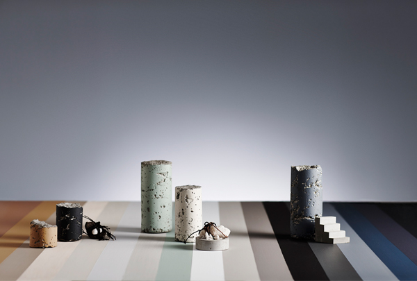
Above image styled by Bree Leech and Heather Nette King for Dulux
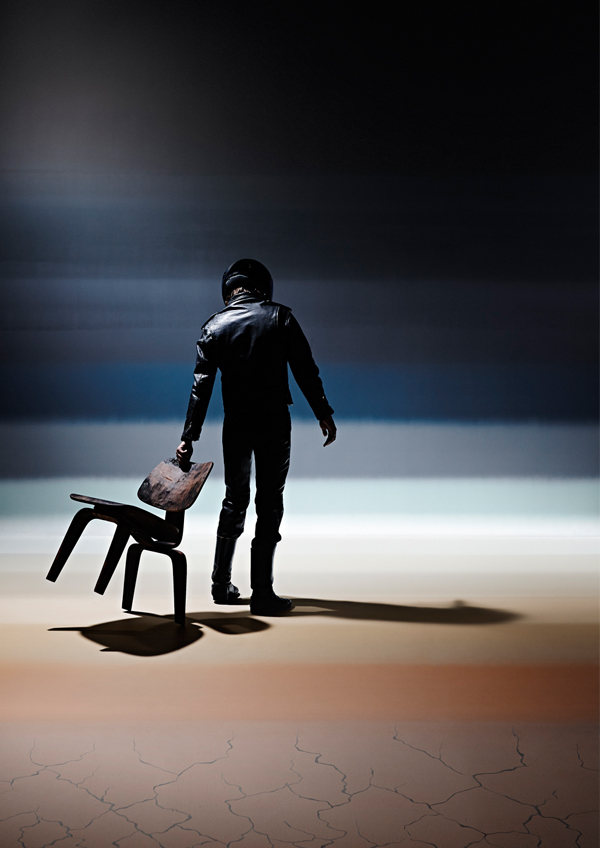
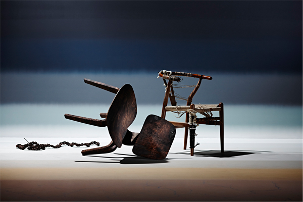
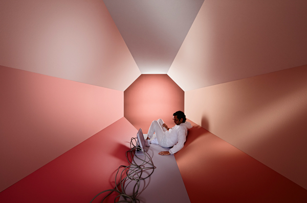
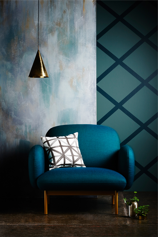
Silentshift
Edwards Moore used the muted pastels in this palette to signify an escapist realm; a retreat from the overstimulation of the digital age, with the title of the theme suggesting a safe, restful place. The soft warm colours are complimented within the composition by rounded edges and diffused lighting.
Above image styled by Bree Leech and Heather Nette King for Dulux.
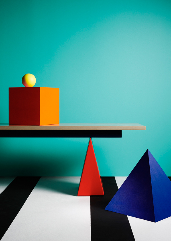
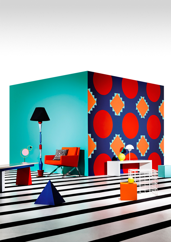
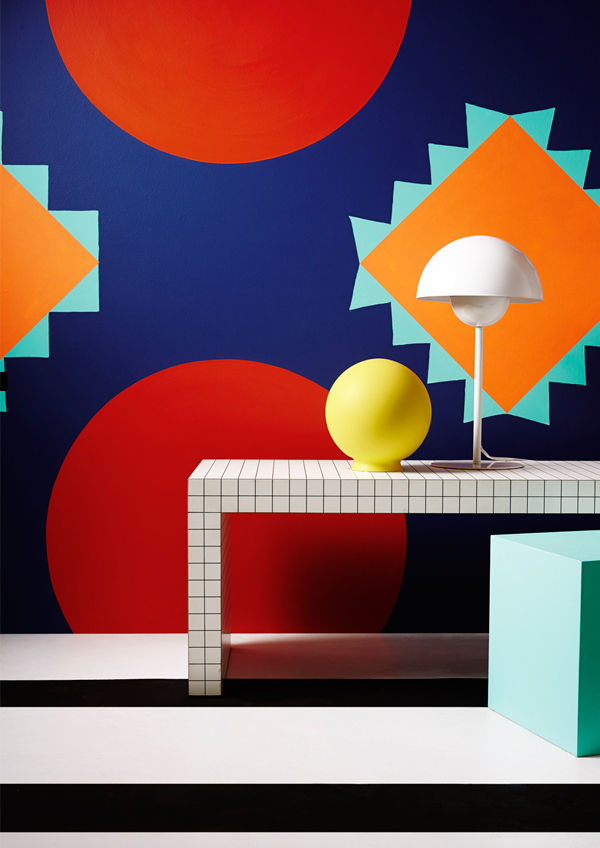
Modhaus
In contrast to the previous themes, Modhaus uses an exuberant kaleidoscope of vivid colours. Bonnie and Neil bring their expertise in textile and pattern design to express the energetic palette, a playful nod to the geometry and bold kitsch of the 1980s Memphis design movement.
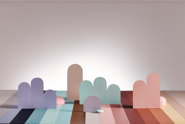
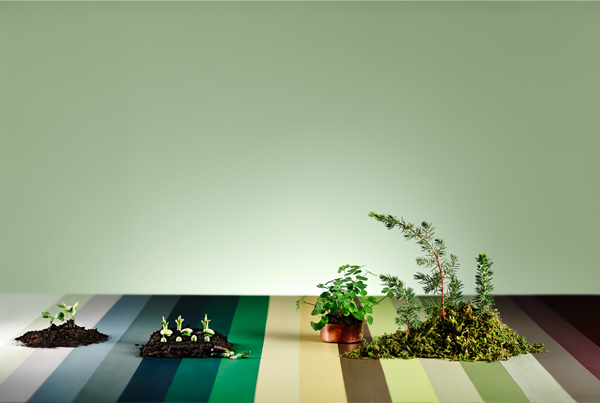
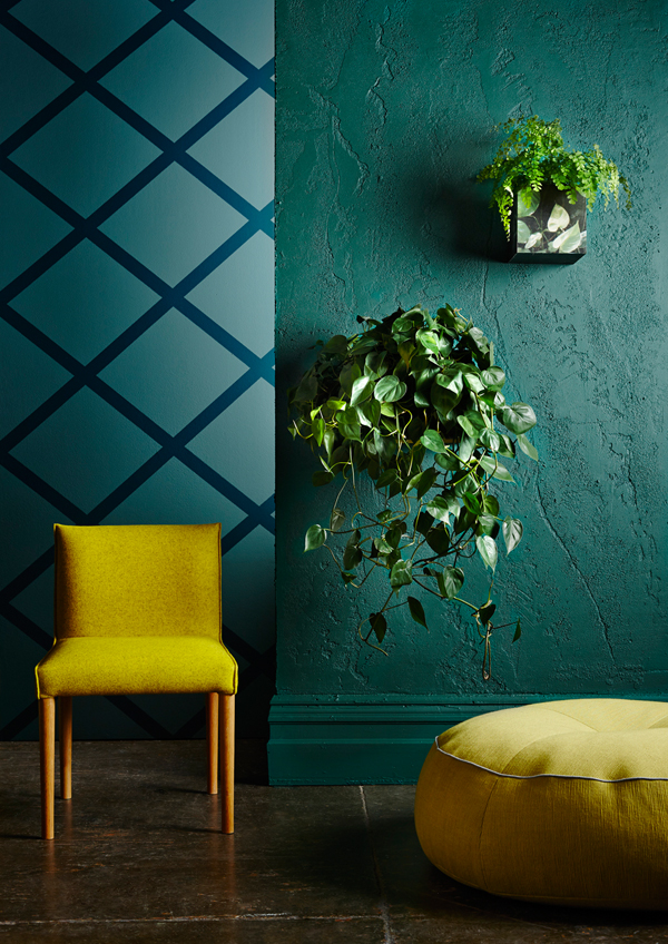
Earthwerks
This palette includes a range of calming greens and browns, representing the environment. The particular hues chosen for the theme reinforce the timeless, restorative appeal of colours found in nature, and highlight the importance of maintaining a connection to the earth.
Above image styled by Bree Leech and Heather Nette King for Dulux.
For more information on the 2015 Dulux colour forecast, visit Dulux.
© Niche Media 2026