
Snøhetta designs second Norwegian Aesop store
Snøhetta designs second Norwegian Aesop store
Share
Photography by Stephen Citrone, courtesy Aesop.
After designing Aesop’s Prinsens Gate store, Snøhetta was again recruited by the skin care brand for their second Norway outlet, in Oslo.
Situated on the ground floor of a functionalist 1940s apartment building, the 63-square metre interior draws inspiration from original details and materiality, imagining them anew.
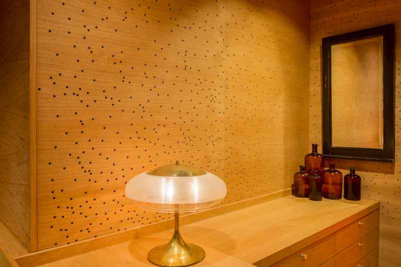
A geometric motif from the existing timber detailing of the host building became the starting point for the design direction. Drawing inspiration from the woodworking technique intarsia, this motif inspired meticulously crafted three-dimensional oak panels. These bespoke panels clad the wall and counter, giving volume and a sense of authenticity and calm.
Yellow lighting is decorated and partially shaded by custom lighting fixtures, the glow warming the timber further. This lighting enhances the faceted panels while combining with the greys and browns of Aesop’s branding for a masculine yet gentle surrounding.
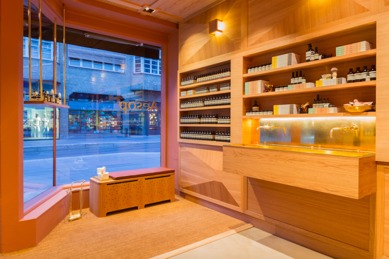
The same oak furnishes the ceiling plane, built-in shelving, and a perforated dividing wall that reveals glimpses of light from a concealed stairway. The stairway has been restored to its original location, leading to the basement level staff and storage area. The use of oak and brass details on the sink creates a warm and calm atmosphere in the store.
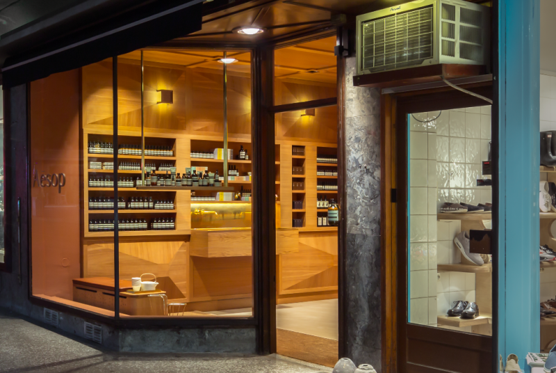
From the outside, particularly on the cusp of dusk, the store omits a warm and welcoming glow, soft and enchanting.
Since their retail beginnings – Aesop opened its first store in St Kilda in 2004 – the chain has prided itself on working with, and respecting, the history of an area and what is already in place. Every store features a different design and theme, and Aesop collaborate with a range of designers and architects to create truly original retail experiences.

For example, Aesop’s store in New York was produced as a collaboration with architect Jeremy Barbour, and features reclaimed copies of The New York Times as primary construction material. Inspiration for the Kyoto store was drawn from Jun’ichirō Tanizaki’s In Praise of Shadows, machiya townhouses, and the vertical alignment of traditional Japanese text. This resulted in a monochromatic palette, a play on light and shadow, and the retail and entrance area separated by a curtain of blackened mesh.
Last year ADR interviewed Aesop’s first lead architect for Asia Pacific, Kian Yam, and retail development and construction coordinator, Tim Mather, about their design for the Flinders Street store. Read the story here.
You Might also Like


Related Stories
© Niche Media 2026