Mim Design creates a new retail destination for e&s
Mim Design creates a new retail destination for e&s
Share
Mim Design has created a new retail space for kitchen, bathroom and laundry appliance retailer e&s designed to feel like an extension of home.
Retail is dying – haven’t you heard? We are told this constantly with facts and figures announcing that online purchasing is king, while the local high street is a mere shadow of its former self and shop sales are plummeting.
Well, someone forgot to tell the bad news to Rob and Mike Sinclair, joint managing directors of e&s. With a grand new store in Preston, nine kilometres north of Melbourne, this retail phoenix has risen, showcasing an astounding array of kitchen, bathroom and laundry products spread over a mind-boggling spatial footprint of 3000 square metres.
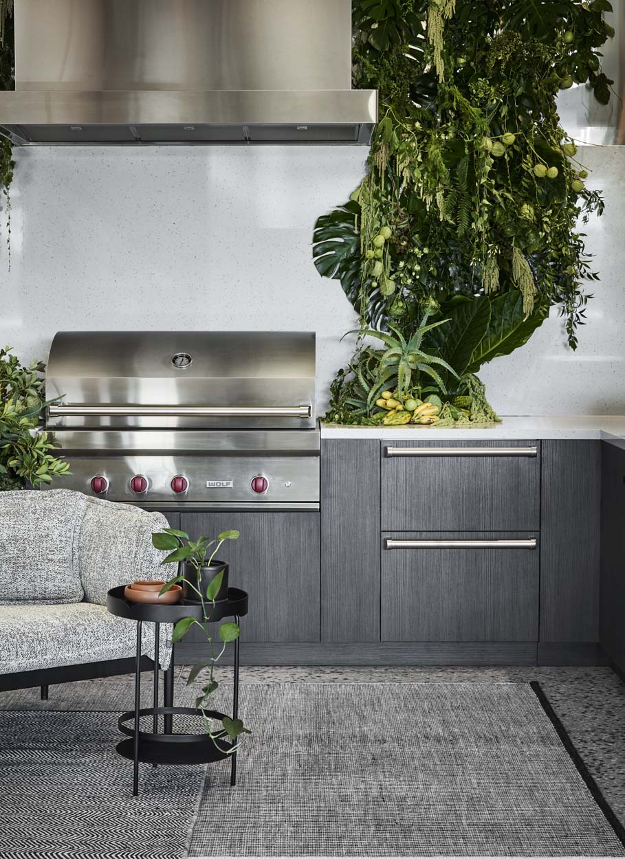
As an investment, it speaks volumes for e&s and the team’s belief in shopfront retailing in Australia, but as a design statement, it is unsurpassed in both form and function, thanks to the design prowess of Mim Design and project lead Emma Mahlook. e&s saw a gap in the market of the underserved northern suburbs and so has filled the void with a store that is not only a destination par excellence for white goods shopping, but also a lifestyle enhancer and an extension of ‘home’ on an imposing scale.
Rob Sinclair believes that online selling has succeeded because retailing has failed its customers, and so, putting both money and the e&s brand on the line, he is inspirational in his offering that showcases some 50 brands with literally tens of thousands of products to see and touch.
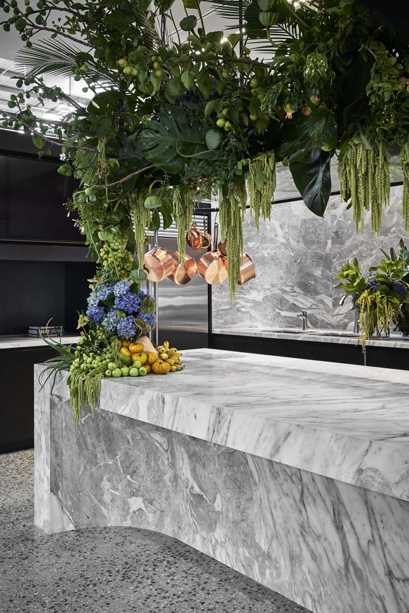
With such an enormous project at hand, Mim Design’s challenge was to present both the e&s brand and its partners in an aspirational light, inject the enormous space with a human dimension and display the multiplicity of products in a more homogenous distinctive design.
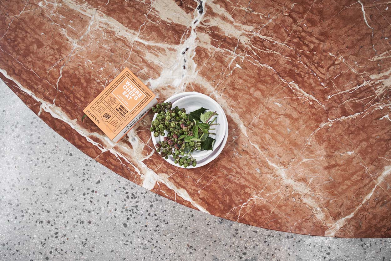
As a former Masters store, the building was just another large warehouse with an eight-metre high ceiling and pitched roof; however, Mahlook has taken the concrete floor back to expose the aggregate and there are lovely highlights of black, tan and grey.
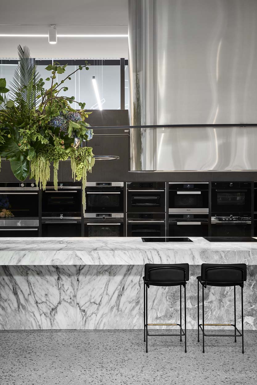
The colour palette is white, grey and black with copper, silver and gold accents and the touch of blue in the soft furniture adds a restrained residential touch. On arrival there is a reception desk clad with Arabesco Grigio marble. To the left is the kitchen area, to the right the bathroom and laundry products and at the very rear refrigeration.
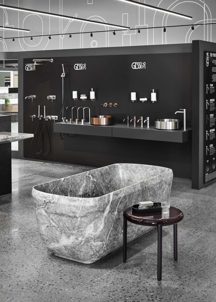
Throughout the floor plan major brands have been positioned around the perimeter of the store with a large square-shaped promenade that enables the visitor to traverse through all areas. Multiple products have also been positioned within the central area contained by the corridor and there is ample opportunity to look through, around and over areas to tantalise the experiential shopping tastebuds.
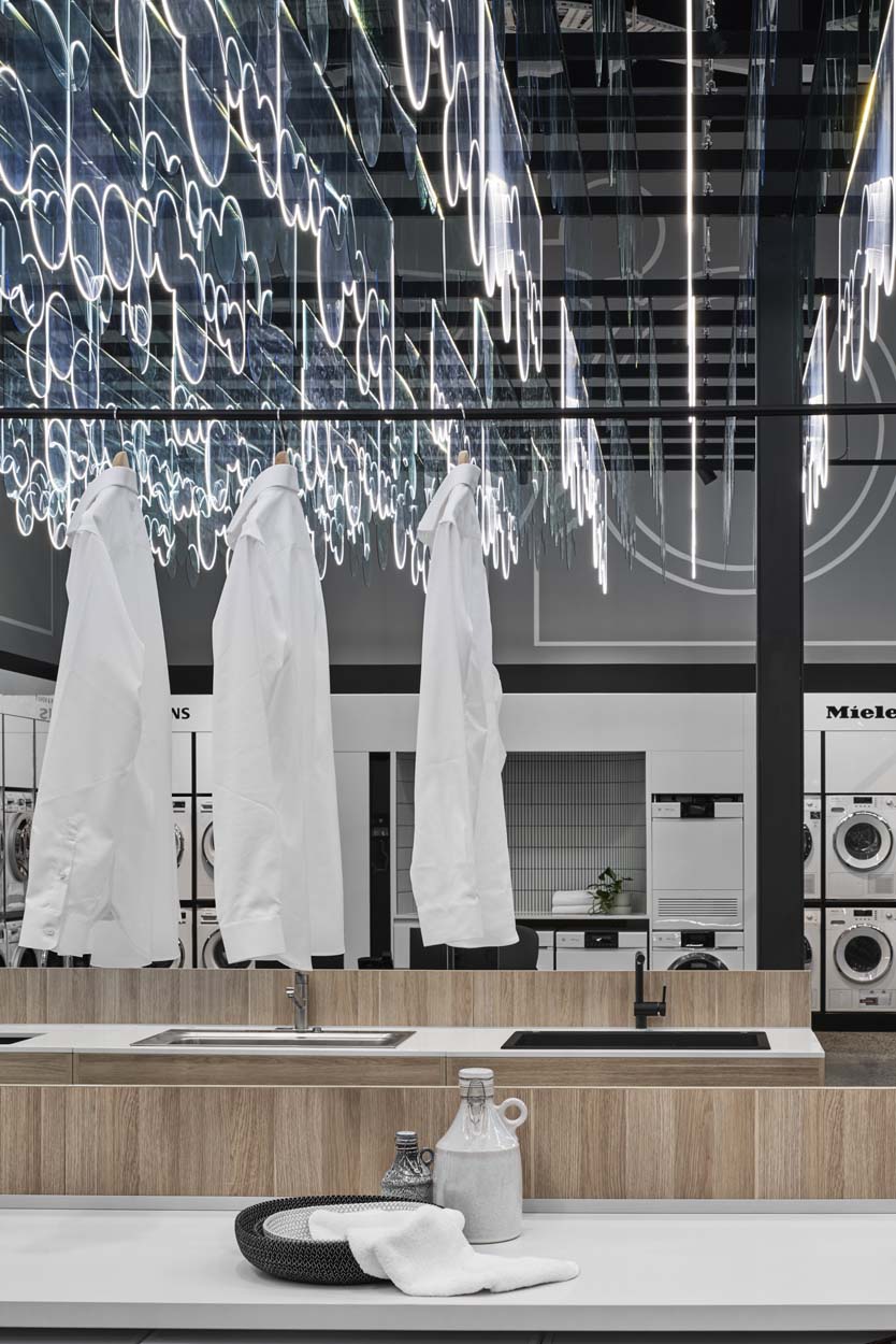
At the rear of the store is the wine refrigeration area, refrigerators are in front of this and to the side is the laundry area moving into the bathroom accessories, taps, basins, baths and wet shower area. Again every product is displayed within its own family and although this all sounds overwhelming, the truth is it is an outstanding showcase that allows encompassing views of all ranges and easy product comparison at a glance.
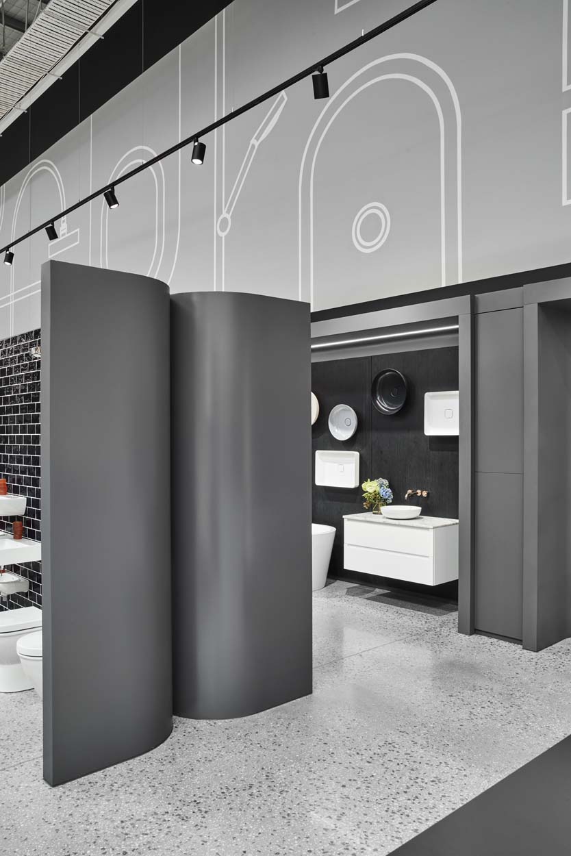
Suites of products are displayed in uniform custom-built display units and overt branding is kept to a minimum allowing the objects to do the talking. The genius of this project is that the entirety of the showroom is within the parameters of a uniform display style – a challenge with so many brands, each with its own historical branding and display styles, logos and colours.
To keep a more contained visual style for the interior, Mahlook supplied three separate colour palettes and a large variety of natural and reconstituted stone, veneers, wallpapers, laminates and paints as the base for each brand to choose a design direction.
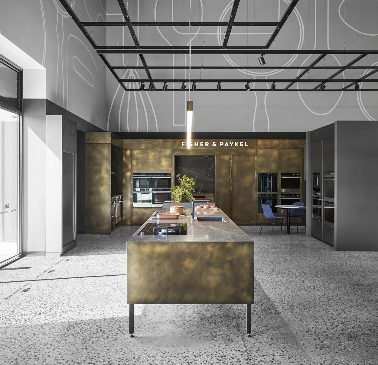
Of course, each installation features something a little different to complement a particular colour and materiality; for example, Sub-Zero Wolf has included a fabulous striated copper and brown glass splashback behind ovens and cooktops and V-Zug features a cooktop encased within a curved white-tiled back and benchtop.
Giant-sized graphics have been used to great effect within the interior to denote the key product areas, with outlines of glasses above the wine refrigeration section, enormous spoons, cutting boards and other implements in the kitchen area, as well as a variety of faucets and taps in the laundry space.
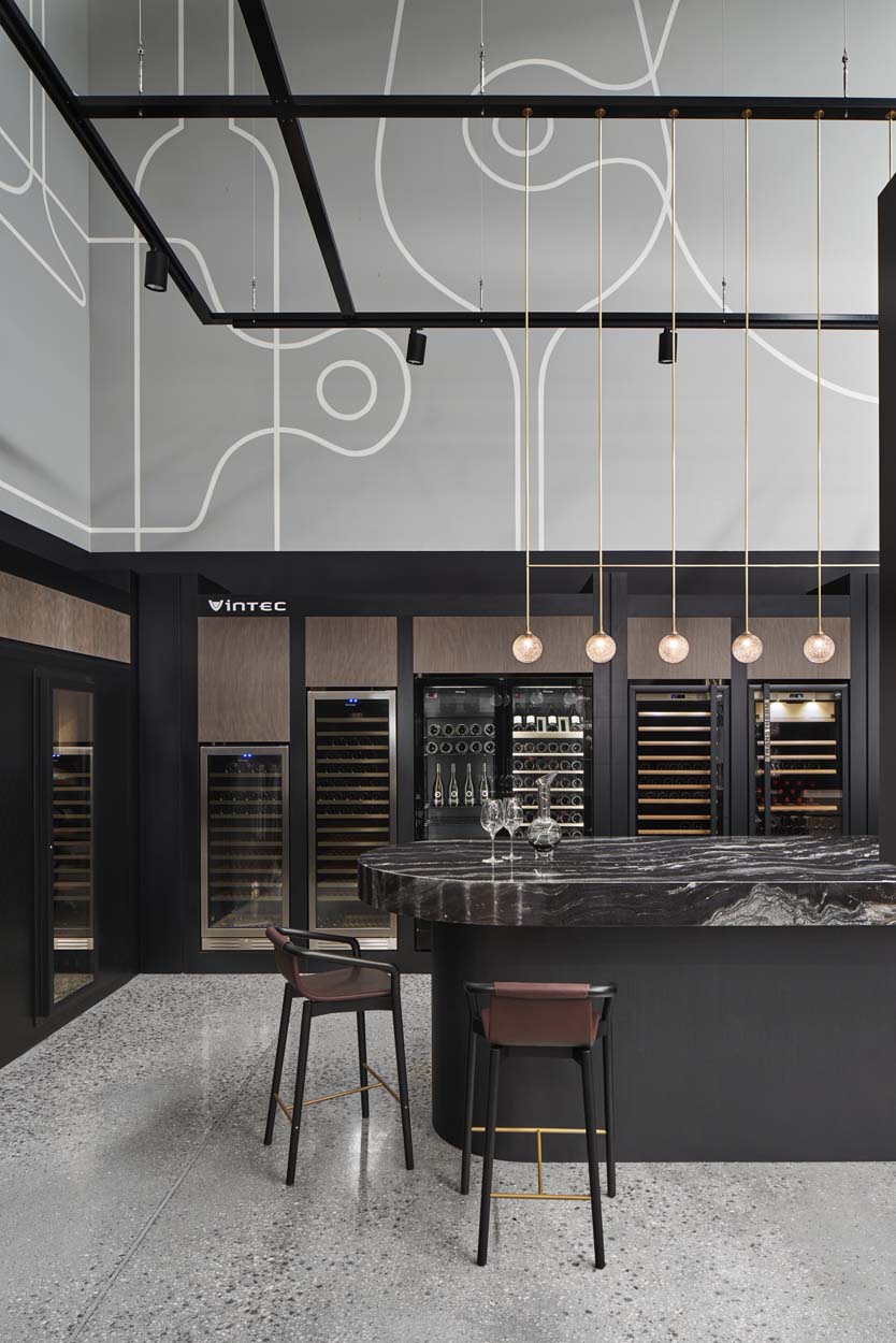
These hand-painted white on grey stencilled artworks (Strini Industries) have been placed on every wall and serve as an easy wayfinding device, while also providing a sense of proportion to the building. Directly above the graphic decorations, the pitch of the roof and the exposed beams and steel have been painted black and there is a large network of slim pendant strip LED lighting that overhangs the entire footprint of the floor space.
Photography by Peter Clarke
This article originally appeared in inside 105 – available online and digitally through Zinio.

