INK uses aged brass and black Paperock board in Sydney jewellery store
INK uses aged brass and black Paperock board in Sydney jewellery store
Share
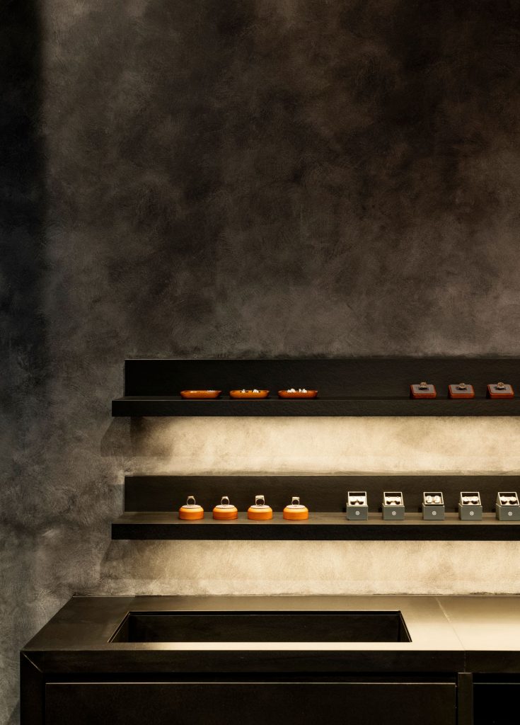
INK Interior Architects fitted out AHW Studio’s Sydney store in aged brass and black Paperock board to reflect the “tactility” of the family-owned brand’s jewellery.
The studio’s material choice embodies the brand’s ethos, which celebrates “the beauty of imperfections” when sourcing vintage watches from all over the world and repurposing them into rings, pendant necklaces and other jewellery pieces.

“At the very first briefing meeting, the client talked about the materials they use to create their unique jewellery pieces and it was interesting to hear their process,” INK director Dana Vuletic tells ADR.
“They communicated their appreciation for vintage watches and burnished metals, so naturally this became a springboard for the interior.”
Just 15 square metres, the store in Sydney’s Strand Arcade moves away from the traditional jewellery store tropes of “bright lights and locked glass cabinets”.
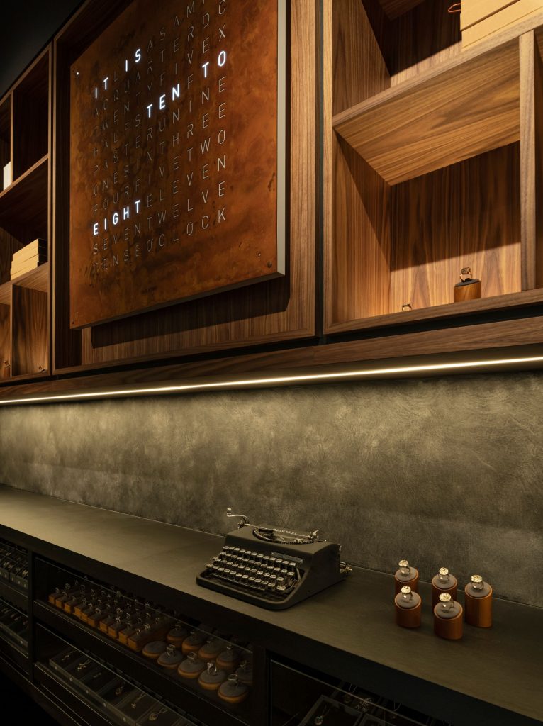
Instead, bench height displays wrap its perimeter with pieces open and available for customers to browse and try on.
Lighting is focused to draw attention to products, which are “no larger than the palm of your hand”, while a handmade Colossal pendant light from Melbourne’s Lost Profile Studio defines the space.
The “beautiful, unassuming finish” of Paperock – a board made from layers of compressed paper – has been paired with a French wash paint finish that was applied by hand on all the walls.
“The Paperock is incredibly hard wearing and has a tactile matt surface that gains some lustre when it’s finished with oil,” says Vuletic.
“The paint adds another layer of detail and richness to the project, but doesn’t compete for attention.”
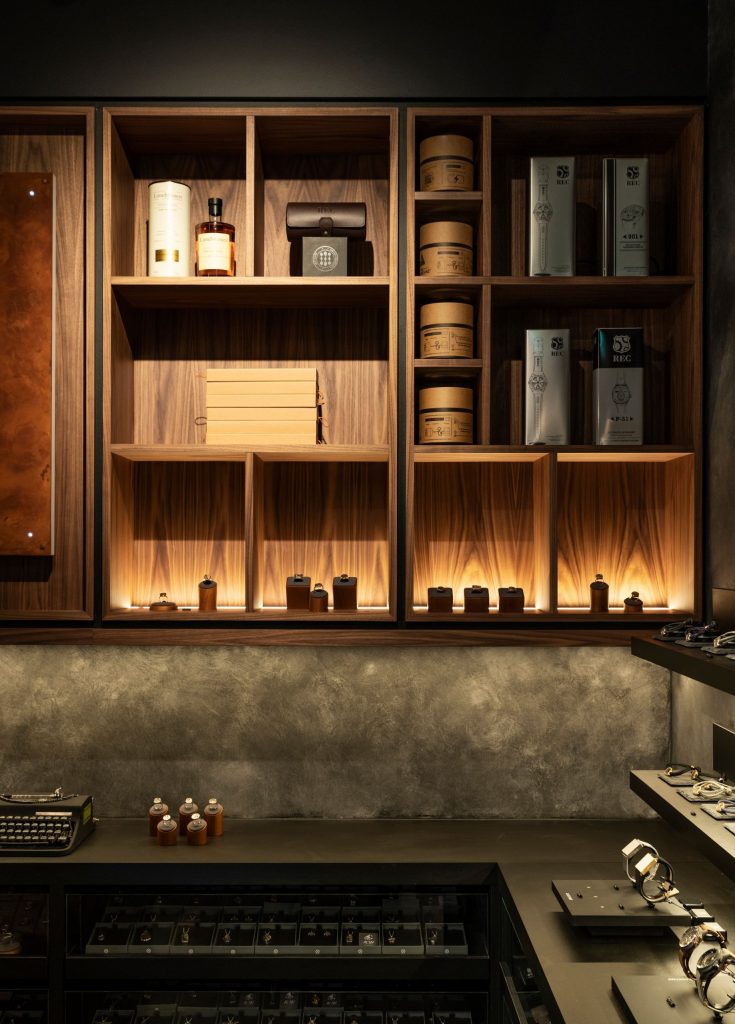
Completing the space is the point of sale, which is clad in aged brass sheets, providing a “strong connection” to the product.
“We selected finishes that have beautiful variation and patina. The type of materials that seem to get better with age,” says Vuletic.
“It’s refreshing to work with a client that loves the imperfect. In five years’ time, the aged brass could take on blackened edges and fingerprints, while the stained timber floor will have natural distressing from foot traffic,” she adds.
“We were energised by this concept of the store changing and developing over time. It doesn’t need to be shiny and perfect to be beautiful.”
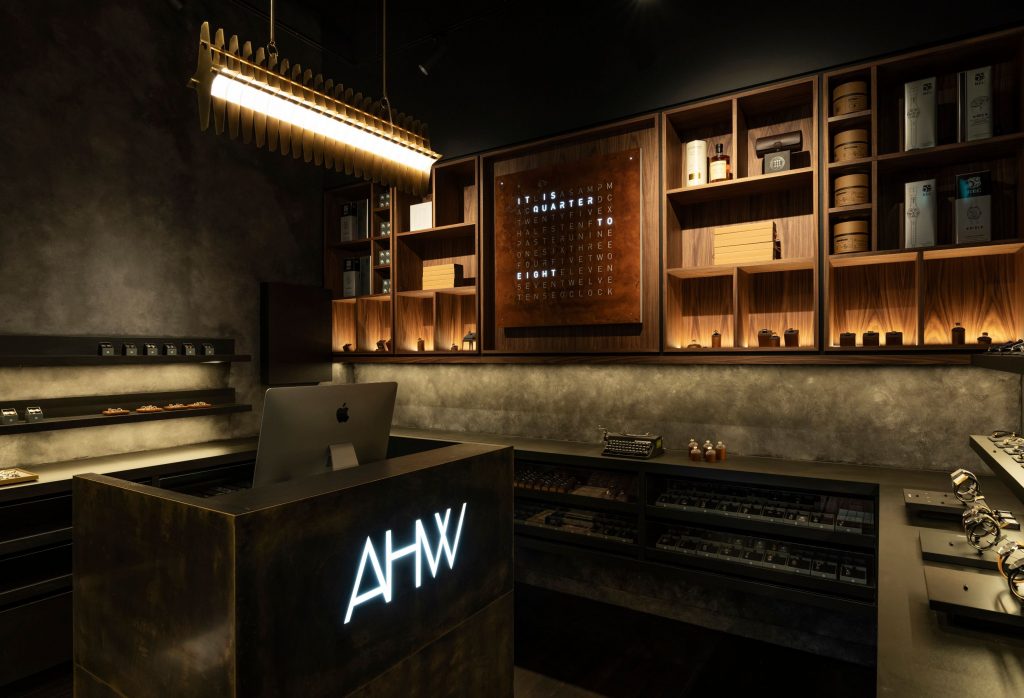
Along the back wall of the store, a large walnut timber joinery displays an oversized clock, packaging and sentimental vignettes
“It’s quite a large display and visible from outside the store, so it piques the interest of passers-by,” explains Vuletic.
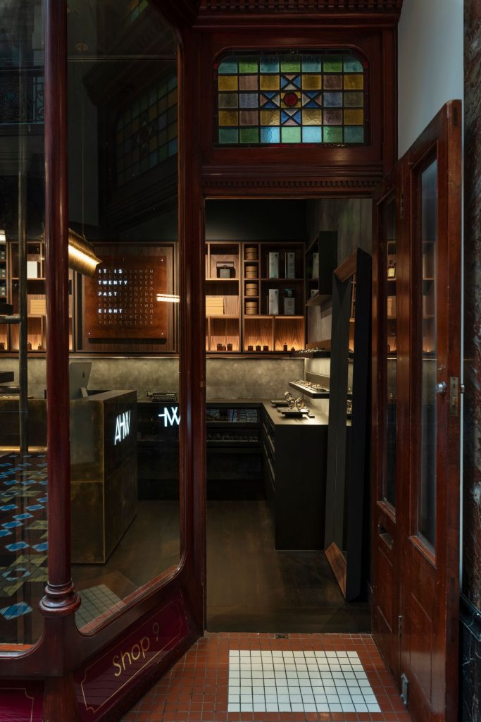
While the fitout for AHW Studio was completely new, the shopfront display presented a challenge for INK in that it had to be self supporting without modifying the existing Heritage timber work.
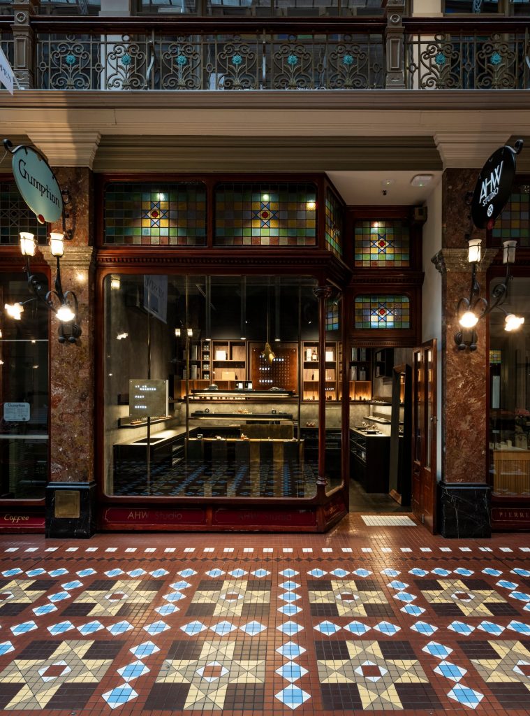
“These tenancies have quite high ceilings, so the structure spans about four metres,” says Vuletic.
“The challenge here was to ensure that, visually, the proportions looked right. It needed to function well for the retailer, but also be easy to construct and carry into the store via the narrow doorway.”
Aged brass posts span the display from floor to ceiling and carry thin black floating shelves that act as a “welcome contrast” to the strong, monolithic interior.
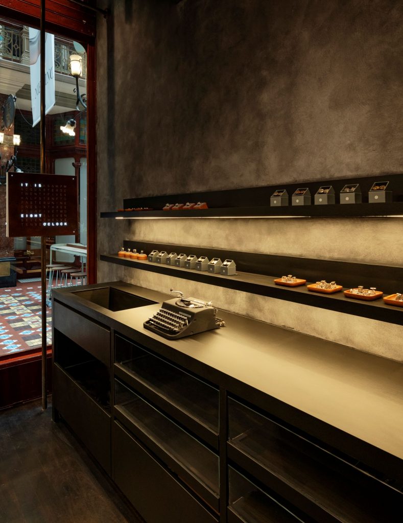
“While it looks simple at first glance, subtle shadow lines, detail junctions and select different lighting types highlight product, creating shadow play and intimacy within the space,” concludes Vuletic.
“We have curated the store and focused on both macro and micro details, in the same way AHW Studio approaches its jewellery design process.”
Founded by Vuletic in 2014, INK Interior Architects is based in Sydney with a focus on retail and hospitality interiors. The studio’s aesthetic is contemporary with masculine accents paired with texture, neutral colours and raw materials.
Also in Sydney, YSG chose a moody and timber-tinted interior for its Four Pillars Gin bar, which opened earlier in the year.
Photography: Michael Wee.

