
Flying High: Christchurch International Airport by BVN
Flying High: Christchurch International Airport by BVN
Share
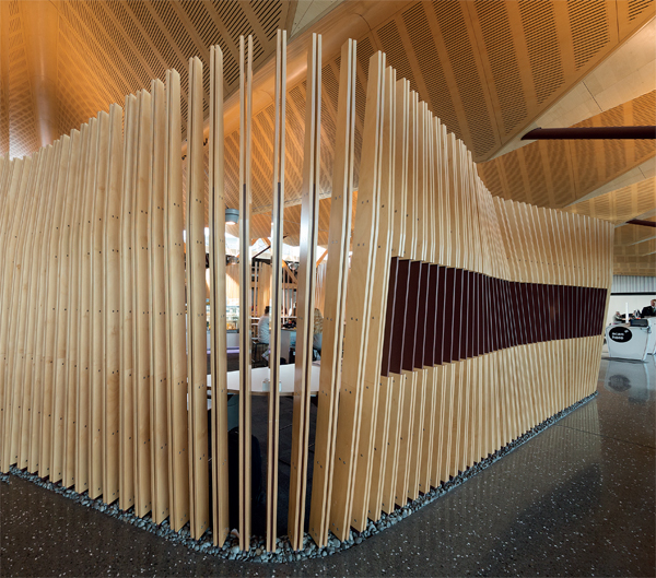
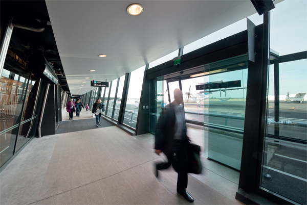
Image above: Lounges reference the large swathes of seaweed found on the beaches of the south island. Opposite: Angled windows and a sleek modernity celebrate air travel with a sense of arrival.
Project: Christchurch Regional Airport Lounge
Text: James Fergus
Location: Christchurch, New Zealand
Designer: BVN in association with Jasmax
Photography: John Gollings
Tena koutou world, Christchurch Regional Airport Lounge has affirmed its place in the league of airports par excellence. Designed by BVN in association with Jasmax and winning accolades, including the IDEA international category for 2014, the airport is sensitively harmonious with the landscape, people and culture of New Zealand. It is also incredibly switched on to the actual needs and realities of travel, while affording a sense of occasion that acknowledges the event status of air travel.
No shopping mall aesthetic, no nasty banks of unsleepable chairing, no icky flooring and no gruesome colour schemes: even the exterior is a thing of beauty, wit and elegance. It is, in fact, so far from the run of the mill as to be extraordinary.
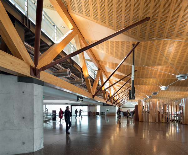
Vaulted ceilings reference the mountainous landscape, endorsing a sense of the monumental.
As a symbol of the strength and style of a country, the delivery of this important building plays a vital role in asserting the identity of New Zealand on a world stage. Designed and commenced prior to the earthquakes that wrought havoc and destruction on Christchurch, there is unsurprisingly an element of the phoenix rising strong and fearless from the ashes that goes well towards the healing process. “The character that was brought to the building was appropriate for a community trying to forge an identity and, although that sounds rather immodest of me, I think always in architecture what we’re trying to do is to dovetail cultural aspirations with place-making,” says BVN national director James Grose.
Driving the project, Air New Zealand and the Christchurch Airport Authority similarly viewed the airport as a means of defining an identity, as Grose explains. “Air New Zealand is a really interesting company. They recognise that they’re from a small country and that that whole country is forging out an international image of being a sustainable, green, very happy, polite, nice and witty kind of place to be. And, of course, the Christchurch International Airport Authority was vital. It is really important to acknowledge the contribution that the client makes, in two respects: one is the individuals who work on the project team, but secondly the culture of the client that allows that level of cooperation and collaboration to work.”
Echoing rather than mimicking the landscape, the interior design borrows from a diversity of natural form to assert that identity without labouring visual catchcries. Mountainous shapes are revisited as vaulted volumes of timber, rivers are referenced in the aggregate rich polished flooring and the great swathes of kelp to be found on the South Island beaches inform the curved seating. Making these huge gestures appropriate to the human condition is a contextual interrelated domesticity permeating the whole, as Grose notes.
Winner of the IDEA International Category for 2014, Christchurch Regional Airport Lounge is far more than a place to bide your time between flights, as New Zealand correspondent (and traveller) James Fergus discovers.
“It’s the combination of the materials that sit in juxtaposition to each other, and especially the concrete floor,” he says. “We put larger aggregate in the floor, both quartz, which is white, and bluestone, which is blacker, so that you get very much a sense of that domestic warmth to the floor. But, also the idea of the utilitarian surface, and then thirdly the contextual reference to the great big rivers that come down full of the melting snow in spring, which, if you look at those rivers from the air, they look like they’re full of aggregate.”
The lounges continue this relevance and domesticity as soft flowing forms, though what makes them surprising is their very existence in an airport. These are sumptuous islands of repose. Large enough for a family to cluster, separate enough for travel weary strangers to keep their distance, they are also sympathetically comfortable to the inevitability of missed flights, delays and airport layovers.
“It was designed first of all in response to the way that people actually sit: so teenagers flop and lie and disregard most things, older people tend to sit and read or maybe use their laptop or something, kids might be rolling down the inclined ends of the furniture or jumping over the top of them or whatever. So, in our design proposition for that furniture, we talked about reflecting human activity, rather than the sterile airport waiting room rows of seats that you normally get,” says Grose. As a visual device, the scale and character of the organic forms provides a welcome respite to the orthogonal geometry of the rest of the building. The result is a composed contrast between the organic elements and the timber and steel. In some ways, the lounges assume the role of a human figure in a landscape painting, in that they contextualise the macro and micro concurrently without denying the human need to relate to both the awe of one and familiarity of the other.
The humanness of the building is palpably New Zealand in nature: strong, warm, proud, able… yet, it is far less clichéd than that. Specifically, it is regional and in being so it is reflective of a culture with different values and criteria for quality than a metropolitan society: “I think the robustness and the straightforwardness, and especially the utilitarian character of it, resonate… the building has a certain modesty about it, which resonates with people who are implicitly modest.” Manifest within a simple material palette of cement, wood, steel and wool in their appropriate natural tones, there is a modesty of sorts.
“People won’t recognise the abstract reference to the literal idea, but the form of the building will resonate with people about air travel and small-scale air travel,” James Grose
On the other hand, it is unabashedly an event of magnitude. Driving this aspect home is the façade as seen from the ground arrival. Where most airport entrances are a matter of haste driven channelling, where the exterior is bypassed, BVN elected to orchestrate a sense of arrival. Comprising a large rectangular arch over another, the effect, while not monumental or daunting, is to slow the visitor by acknowledging the building, the arrival and the pending travel. It also prepares the traveller for the experience of the interior by setting the stage. From the airside, the experience is similarly stage-managed. Inbound passengers are met by a dark charcoal expanse in the form of the wing tips of the particular aircraft used in the region. This is split by a meeting window angled to reference the side of an aeroplane wing. Subtle, wry and with the same restrained use of referents as the interior. “People won’t recognise the abstract reference to the literal idea, but the form of the building will resonate with people about air travel and small-scale air travel,” says Grose.
He is right. The brilliance of this project lies in the reassertion of flying as a thrilling event. It has the wide-eyed awe of a first-time traveller, rather than the jaded cringeworthy whine of long haul complaint. It is beautiful, conceptually brilliant, masterfully executed, an exemplar of New Zealand-ness and it says, ‘Wow, we are going to fly, isn’t that neat?’, and it is! 
Article by James Fergus for (inside) Interior Design Review.
Enter your project in IDEA Awards here idea-awards.com.au
You Might also Like

Related Stories
© Niche Media 2026