

Colour as design strategy in the workplace
Colour as design strategy in the workplace

Share
Colour has always been a key component of the designer’s handbook, but it’s only recently that we’ve started to understand why certain colours make us feel certain ways. Through understanding the psychology of colour, Herman Miller is repositioning the use of colour as a design strategy, creating human-centric, impactful products with purpose.
When it comes to workplaces, colour can influence productivity, help define social spaces, and create calm atmospheres that support wellbeing. While individuals have personal tastes, certain hues can evoke common responses. Understanding these patterns allows designers and workplaces to leverage colour as a design strategy, not just decoration.
There have also been several studies in recent years that demonstrate how colours and patterns shape neurodivergent experiences, providing greater insight into the impact of over- and under-stimulating palettes in different environments. The more brands conduct research to understand the role of colour, the more it can be applied to support purpose, place and product within workplace environments.
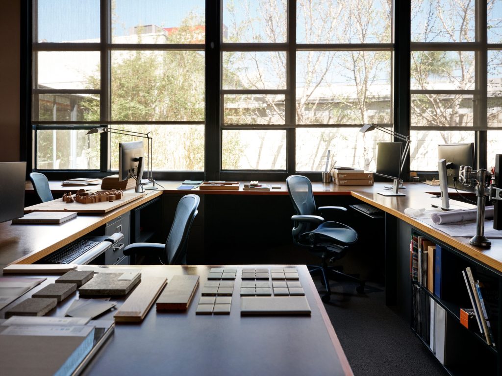
Colour signals spatial functions
At Herman Miller, this research and thinking is already underpinning product design ideology. As part of the wider MillerKnoll group’s research, Herman Miller has been looking into how colour influences our experience of time, energy and interaction. They’ve found that cool blues often support collaboration, while soft greens encourage reflection and focus. Warmer tones, such as terracotta, amber and muted yellows stimulate sociability, making them well suited to informal spaces such as cafés and lounges.
Knowing the influence of these colours provides Herman Miller with the ability to tailor products for the behaviours and spaces for which they’re intended, intuitively reinforcing the function of different spaces through strategic colour choices. This research also helps products integrate into spaces as part of a holistic design vision, reducing visual clutter.
The psychology of colour associations
In 2010, psychologists Karen Schloss and Stephen Palmer from the University of California coined the Ecological Valence Theory, which provides a causal explanation for why people generally prefer some colours over others. The study suggested that people prefer colours associated with positive experiences of the natural world, for example, blue is a popular colour due to its affinity with clear skies and healthy waterways.
These associations can also be geographically specific. In Australia, eucalyptus greens and clay pinks speak to us in the same way forest greens and the deep blue of lakes speak to the alpine regions of Europe, and how burnt sienna and sandy neutrals speak to the American Southwest desert landscapes. These hues do more than reference landscape; they tap into deeply held psychological associations with calm, restoration and the familiar.
Biophilic design, the practice of integrating natural elements into built environments, has been shown to support mental and physical wellbeing. In line with Schloss and Palmer’s theory, biophilic-inspired colours can therefore be powerful tools in workplace design.
Understanding the impact of colours is the first step, but applying that understanding in place is where the opportunity lies.
Applying colour in the workplace
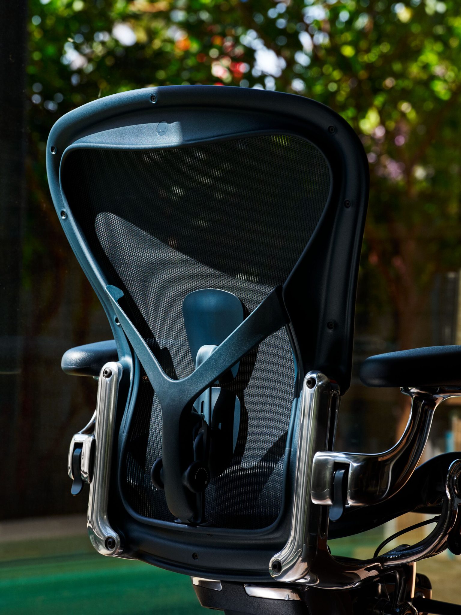
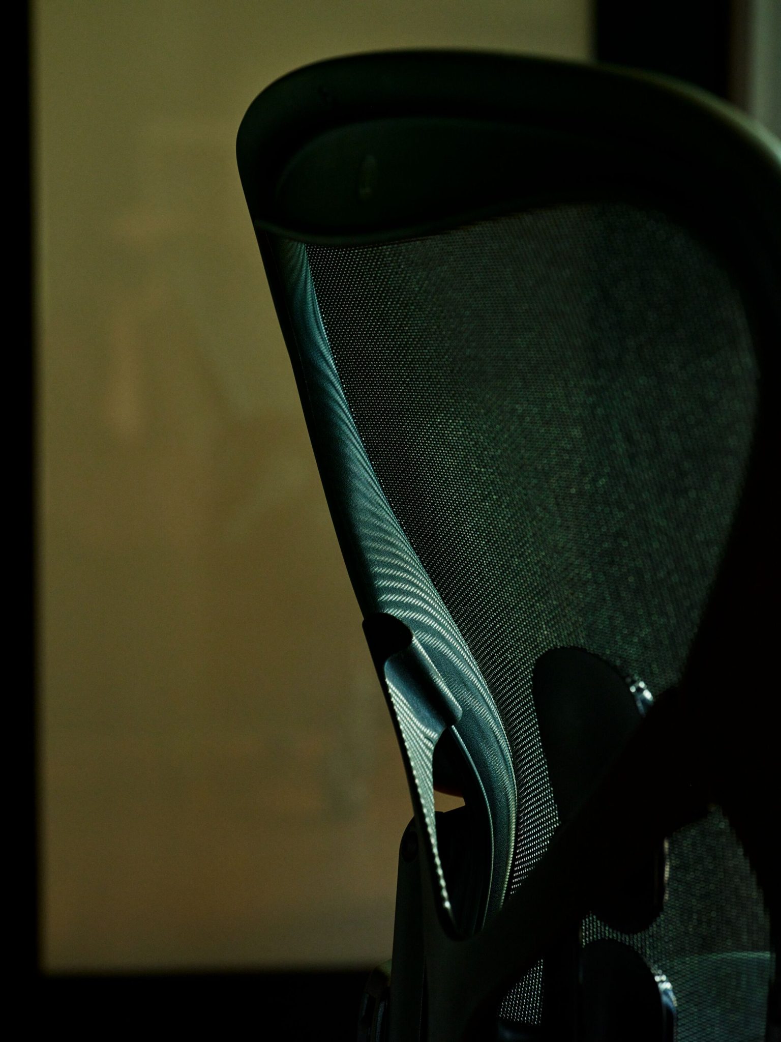
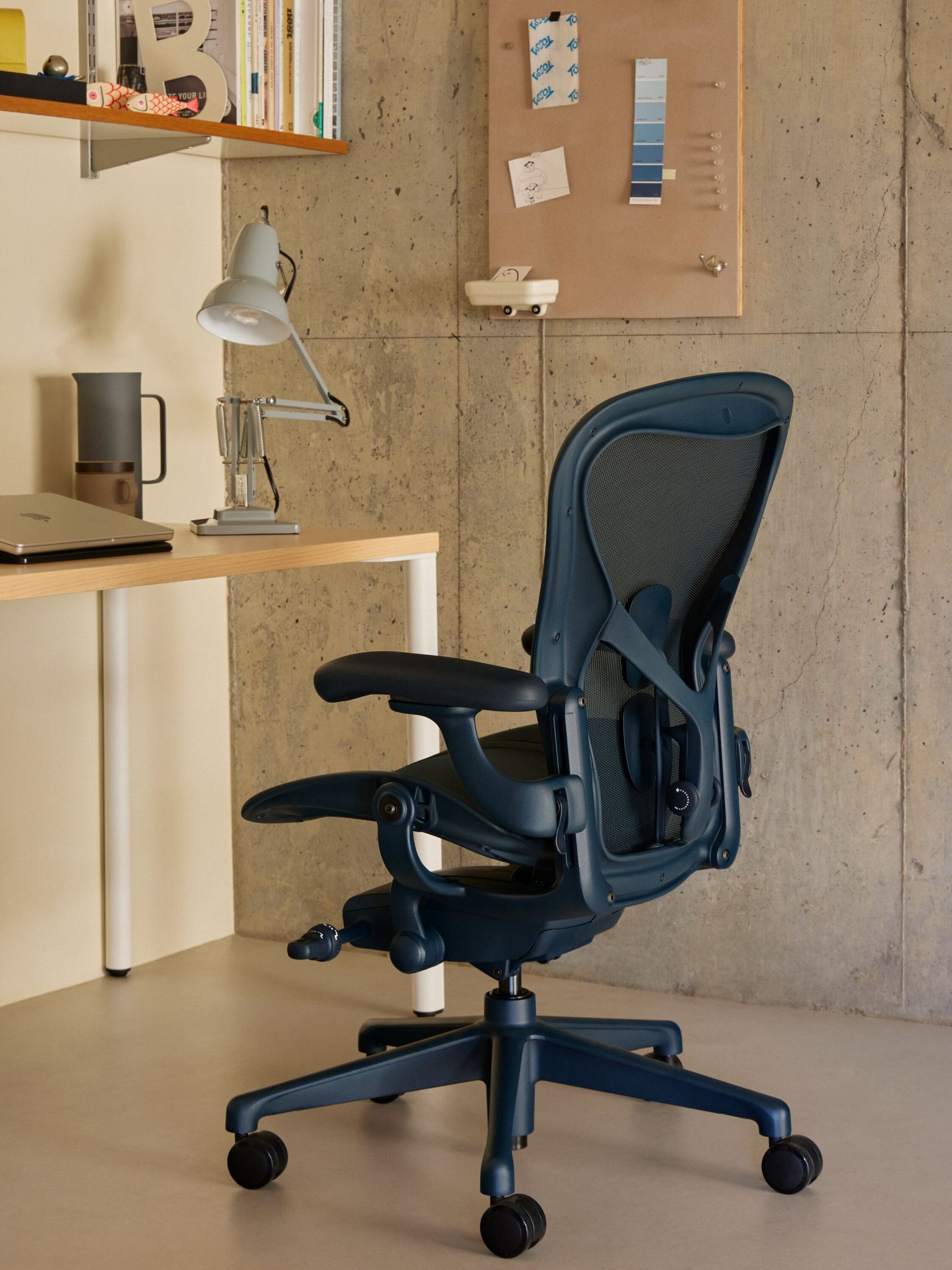
Reflecting place through design is something Herman Miller is practicing through new colour options for its iconic Aeron Chair. The newly launched hues of Jasper and Nightfall respond to the brand’s research on biophilic design and psychological colour theories. A refined, near-neutral green and blue respectively, Jasper and Nightfall are designed to bring subtle colour cues to the workplace with depth and warmth. Aeron in Nightfall can help reinforce collaborative environments when paired with deeper blue palettes, while Aeron in Jasper can complement sage, olive and biophilic-inspired tones in more focused work settings.
By creating holistic spaces where the furniture is part of the narrative, designers can create workplaces that indicate functions intuitively without signage. When furniture and interiors are aligned, the result is an environment that feels intentional and streamlined, allowing people to perform at their best, free from visual distractions.
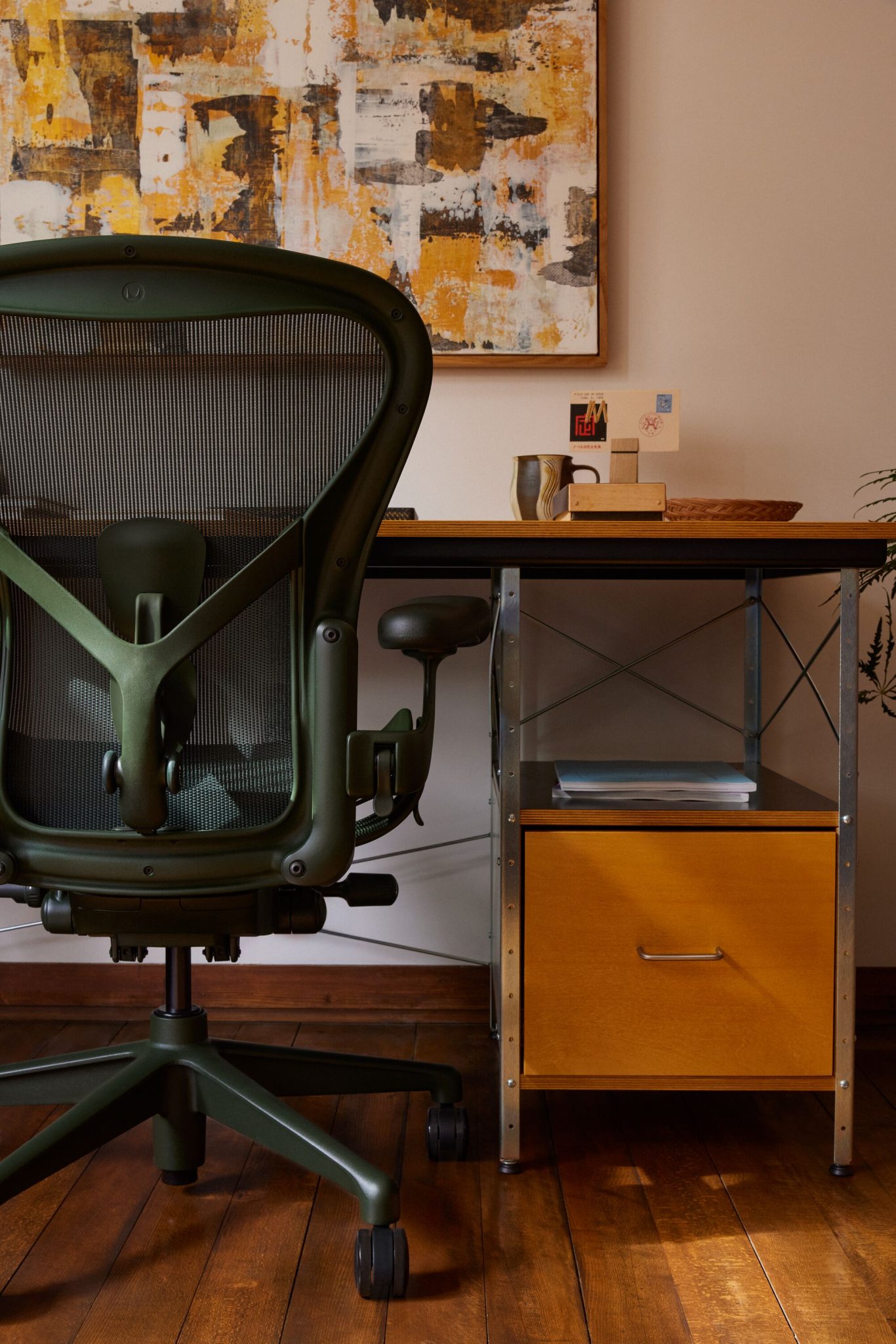
The evolution of the Aeron Chair
For a product like Aeron, which has evolved through multiple generations, colour represents more than aesthetic an option. Rather, it’s an extension of performance. Introducing new colours into a product requires engineering and careful calibration of material, texture and finish. To achieve the Jasper and Nightfall finishes, Herman Miller needed to align plastics, textiles, and structural components so that the chair would continue to be read as a singular, intentional form.
For almost four decades, Aeron has been synonymous with the Herman Miller brand, setting the benchmark for ergonomics, sustainability and design. A significant update came ten years ago with new neutral finishes and ergonomic enhancements, followed by the introduction of ocean-bound plastics. Now with the addition of Nightfall and Jasper, Aeron‘s legacy is being advanced again, this time through colour.
Herman Miller continues to demonstrate its forward-thinking approach to design, responding to the latest research and evolving their products to meet the ever-evolving expectations of the workplace.
Images: supplied.
You Might also Like


Related Stories

© Niche Media 2026