
A. Baker
Share
Above image: Remnant traces of fire damage have been exposed as a feature of the walls’ surface including the clear outlines of artworks
Location: Canberra, Australia
Design: DesignOffice
Text: Gillian Serisier
Photography: Scottie Cameron
Positioned between the two major arms of the NewActon precinct in Canberra, A. Baker by DesignOffice, while a destination in its own right, is also the nexus of this incredibly urbane hub of design excellence.
NewActon is located between the lake and university and is ostensibly the invention of the Molonglo Group. The complex comprises three main stages (South, East and Nishi), each exhibiting a unique personality and increasing degree of sophistication.
That said, Mocan & Green Grout, a cafe that encapsulates everything cool in its advocacy of fresh vital foods, beautifully designed bikes and a groovier than thou aesthetic, has just opened in NewActon South. To the west, the Fender Katsalidis Architects and Suppose Design Office designed multipurpose Nishi, incorporates Hotel Hotel, residential accommodation, commercial offices, retail and a cinema complex (DesignOffice). So sustainable that it is generating more power than it can use, it has been officially classed as a power plant.
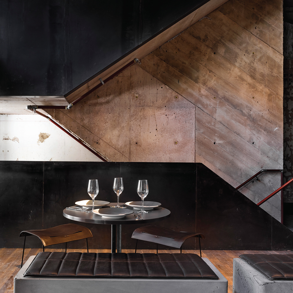
A minimal palette of stone, concrete, timber and metal has been matched with reduced colour to create grand sculptural presence
The central portion and former Hotel Acton has been rigorously transformed into the Diamant Hotel (SJB), an exhibition display (DesignOffice) and a hospitality precinct. It is here that A. Baker makes its presence felt.
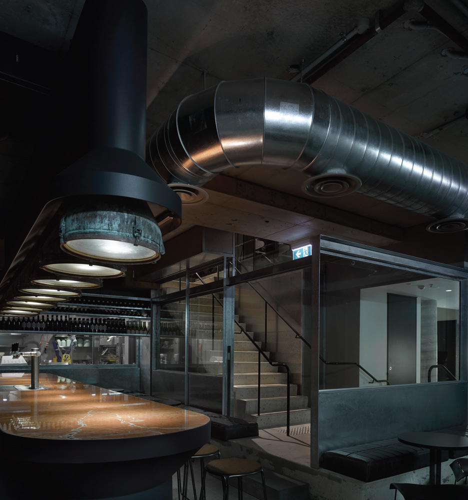
As a conduit between the precinct venues, it is a requisite that A. Baker be as metaphorically approachable as it is physically an east/west means of circulation. As such, the venue, while open plan and fluid, comprises a cafe, bakery, restaurant and cocktail bar, all of which visually coalesce without impeding the overall volume, while providing sufficient nooks for intimacy. Comprising a ground floor and basement, DesignOffice’s transparent treatment of the stairwell allows a visual continuity throughout.
The building suffered a fire in June 2011 and consequently the internal space was completely blackened, an aspect the owners particularly liked and required as integral to the design. As such, there was very little to be done to the walls, DesignOffice principal Mark Simpson explains, “There were a few places where penetration through to other surfaces and tenancies needed to be in-filled, but otherwise they just have a matt sealant sprayed onto them.” Moreover, DesignOffice approached the blackened interior as a vehicle for exploring spatiality, so that the palette remains within the scope of charcoal, while flow and visual dynamism are achieved through the introduction of large sculptural forms.
“There was a quality about the shell that could be left as it was. It came down to the idea that A. Baker had a slightly sculptural sense in terms of the interventions that were made into that space”, says Simpson.
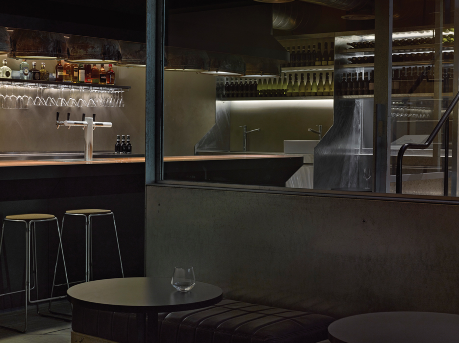
Maritime lamps provide a sculptural and horizontal form above a bar surface of heavily veined red Alicante marble
Effectively, the insertions are a response to the materiality of the charred walls within tonal variation, simplicity and their quality as standalone objects. “We tried to pull it back to a reasonably edited palette, metal, steel (galvanised and sometimes painted); the bluestone was really about the way it is used in its weight and size and mass. Although there is consideration about its form, it is really about making a permanent confidence. And the fact that they have the most beautiful veins through them when you start working with such large pieces,” says Simpson.
The large diamond sawn bluestone counter (Bamstone) and kitchen surround, for example, is a stunningly simple form that, as Simpson claims, relies on both the physical qualities and aesthetic attributes of its own materiality. A sculptural element in its own right, the whole is then anchored by an extensive canopy concealing the kitchen’s mechanical utilities, for a grand visual statement.
Solid bluestone is also used in the bakery seating. Again the forms are sculpturally austere and visually clean against the timber flooring. This is also where the first of the leather seating pads of the project are experienced. “The leather is fully aniline, so it will patina, it will wear. The tenancy is designed to wear and wear well, so in 10 years it will look different, but it will look good,” says Simpson. Indeed, the rare physical beauty of this leatherwork is not to be ignored and DesignOffice went to great lengths to find a craftsman capable of working with such thick soft leather (Uliks Furniture working with the Space Range from Global Leather).
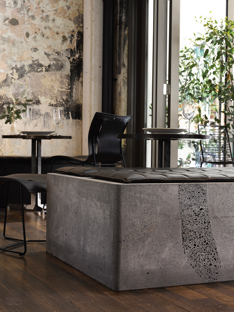
Subtle variation in textual presence and tone lend depth of character that is in fact very far from black
In doing so, DesignOffice provide an important conceptual statement to echo the qualities embodied in A. Baker as a celebration of the artisanal craftsmanship of baking bread.
Within this rubric, it was also important to expose the processes and kitchen of the venue as a bakery, where the animation and activity is visible throughout the space. DesignOffice has handled this aspect exceedingly well. The cafe to the east sits snuggly beside the kitchen and counter, and feels actively engaged. The more formal portion of the restaurant, however, fans out in a series of Walter Knoll Cuoio chairs (Living Edge) and stools by Don Cameron in a configuration that, while acknowledging the kitchen, is more spatially independent and inwardly focused. Moreover, the choice of seating allows patrons a variety of options, including outdoors, where black Don Cameron tables and Hay Hee chairs (Corporate Culture) provide a visual continuum of the whole.
The basement level encapsulation is a response to specifics of the commercial brief, which required the stairwell be used for both hospitality venues’ bathroom access. This was compounded by a requirement that the bar be visible from the ground floor when walking east to west, and that it must also be securely locked when not in use. DesignOffice’s solution is far more beautiful than these pragmatic requirements suggest. Working with Peter Ivanoff (also responsible for the magnificent stairway in Corporate Culture – Melbourne) to create a sliding wall of open bars, again nods to artisan craftsmanship and the inherent quality of materiality.
From within, the bars exhibit a robust elegance playing light against light, while the opposite allows the bars to create a strong geometric stripe against the dark interior. It also permits patrons a controlled interaction with the upper floor determined entirely by which way they stand.
Bespoke pads of sumptuously thick aniline leather provide a user-friendly seat to diamond sawn bluestone
Surprisingly, the insertion of the stairs was not contested, as Simpson explains: “The Heritage consultants were keen for that to happen, provided it presented as an intervention. They were quite happy for the building to evolve, but didn’t want any blurred boundaries between what is Heritage and what is a new expression. Basically they didn’t want any faux Heritage.” This approach is very much in keeping with international trends that advocate a bare wall over a reproduction wallpaper or feature.
The basement bar is perhaps the most sumptuous of the sculptural forms. Realised in a striking, heavily-veined, red Alicante marble, its own materiality is once again central to its beauty. A set of industrial, maritime lights sourced by the owner in India, provide the primary lighting. These have been placed across the bar as a reiteration of sculptural form, thereby adding weight to the whole as a robust vertical countered only by the low built-in seating that once again boasts the sumptuous leather seating. Augmenting both seating and lighting are Walter Knoll Cuoio stools (Living Edge), Ox Design Smed bar stools (Great Dane) and lighting by Light Project.
The fact that A. Baker is visually splendid is perhaps the most obvious attribute, yet it is the paradox of being born of fire that gives this beauty edge. In pairing the burnt interior with the materially robust mass of bluestone, steel, leather and marble, DesignOffice has created a series of sculptural interventions that both direct and enthral patrons. It has also created a means to return the focus to the human interactions within the space, whether they be in the kitchen, dining, sipping a coffee or enjoying a cocktail. Canberra is changing and, with projects like A. Baker at the vanguard, there is much to hope for.
© Niche Media 2026