
Designer Selects – Inside Sophie Robinson’s bold, unapologetically joy-filled world
Designer Selects – Inside Sophie Robinson’s bold, unapologetically joy-filled world
Share
British interior stylist, designer and journalist Sophie Robinson is renowned for her bold, vibrant approach to interiors and her fearless use of prints and textures. Here, Robinson takes time out from her busy filming schedule of her own show, Dream Home Makeovers with Sophie Robinson, to share the designer furniture pieces and artworks that spark joy.

Basket weave rug, Harlequin x Sophie Robinson for Brink and Campman

I’m obsessed with rugs and love the way they layer pattern and colour, and bring softness to a room. The trick with a maximalist scheme is to make sure every element is considered – and every element is another opportunity to add something interesting. This basket weave rug was designed to support my fabric and wallpaper collection with Harlequin and is the perfect backdrop. I love the simple grid pattern that gives structure to more flamboyant floral prints and the pink and red colourway is one of my all-time favourite colour combinations.
Chalice bowl by Henry Holland
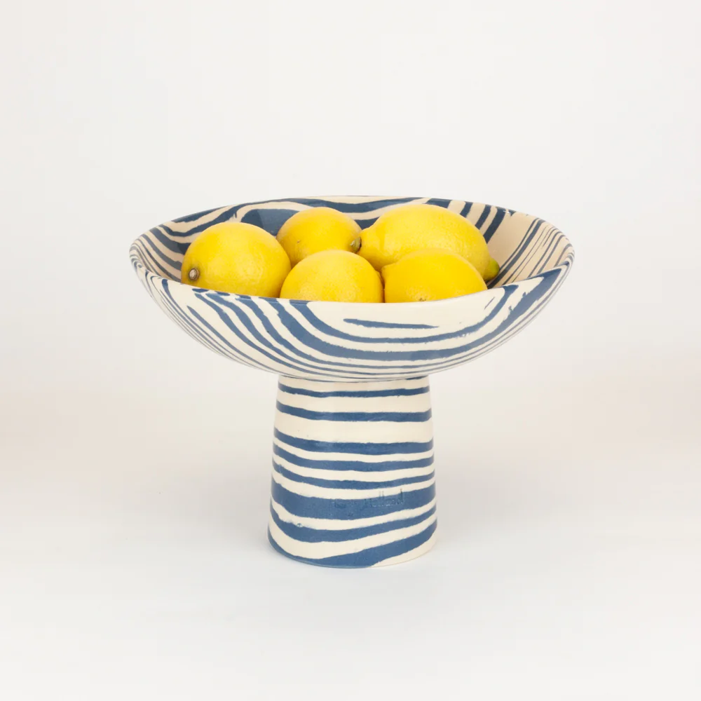
I love that Henry, who was a fashion designer in a previous life, turned to pottery during the COVID lockdown and has now spawned a fabulous new career channelling his irreverent style to ceramics. I love this rather melted and squiggled effect of mixing two coloured clays together. The result is something quite covetable that looks perfect centre stage.
Love Token framed print by Becky Blair
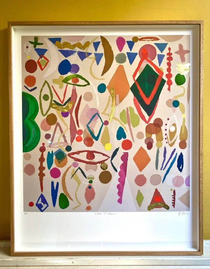
Fine Art Giclee Print with hand finished details of gold foil and fluorescent colours.
Printed on 300GSM Archival Quality Fine Art Paper.
Each print is a signed edition of 50.
Size of print is 54 x 57cm
Size of paper is A1 (59.4 x 89.1cm)
400 Pounds
Becky is a dear friend of mine and fellow lover of colour. I am lucky enough to have many of her original paintings and drawings in my home, all of which spark joy. She is a master of colour and mark-making and this print is a particularly pleasing palette. She takes her inspiration from both within and from places that she has travelled, of which Australia is a favourite for inspiration.
The Shuffle table by Mia Hamborg, 2010, for &Tradition


I love design that’s playful and this occasional table fills me with a sense of joy. Inspired by children’s wooden stacking toys, you can construct the table as you wish, so the final shape, colour combination and height are up to you to decide. I think anything that takes us back to our childlike selves should have a place in your home.
Rainbow lacquer tray, Matilda Goad
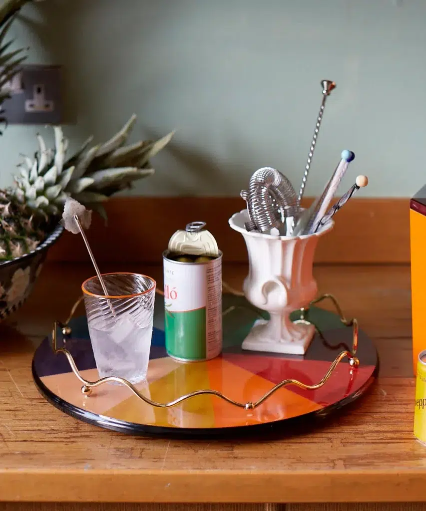
I’m a sucker for a rainbow and I love how this drinks tray depicts the colour wheel. Quite often bright colours can look childish, but this special piece is beautifully crafted using traditional marquetry techniques, stained wood and a layer-upon-layer-high lacquer finish. It’s rainbows but for grownups and would look super chic on the sideboard or drinks cabinet.
Melting pot table, Dirk van der Kooij

This table is a triumph on so many levels. Visually, I love the painterly, colourful patterns made by the melding of recycled plastics. It gets a big tick in terms of sustainability too. But I also love the slight chaos of the design process as you never really know what a made-to-order piece is going to turn out like. I think this element of experimentation is to be embraced in all areas of design. I fear that if we try to control our design processes too much, some of the creative spark and magic is lost. I hate overly considered environments, so this element of creative chance really appeals to me. Isn’t it glorious!
Into the woods mural, Harlequin x Sophie Robinson

This mural has a very special place in my heart as it was designed especially for me by the team at Harlequin. Flora, in the design studio, painted a depiction of my woodland garden here in Sussex. I love the broad brush strokes, the vivid colour palette and the way it has been patterned repeatedly so you can paste it all the way around the room like a wallpaper. This gives the feeling of being utterly ensconced within this magical woodland.
All images source from the supplier or stockist.
For more artfully inclined design inspiration, check out Larissa Haddad’s selections.
You Might also Like


Related Stories
© Niche Media 2026