
The Hydro Majestic
The Hydro Majestic
Share
All images by Andrew Merry.
For those not familiar with the Hydro Majestic, the Hydro, as it is fondly known, is a grand wedding cake of a building in the heart of New South Wales’ Blue Mountains at Medlow Bath. And if the town name sounds a wee bit English, this is thanks to the original owner and department store heir, Mark Foy, who lobbied hard for the name change from the none too salubrious ‘Brown’s Siding’. In a somewhat similar gesture, the refit, courtesy CRD design studio led by Peter Reeves, transforms the most recent version of the hotel completely.
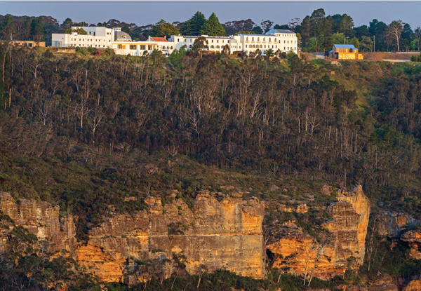
Seen from the canyon, the Hydro Majestic sprawls along the cliff top at Medlow Bath.
And, while many have an idealised version of the hotel in mind, the truth of its pre-refit aesthetic was in fact a hodgepodge of design brilliance and travesties. All of which was overlain by the mock Heritage fad circa 1988, where peach met aqua met burgundy and gold (and everything else was Brunswick green, oxblood and more gold).
Building commenced in 1903 with the Hydro originally serving as Australia’s first health resort and holiday destination for the rich and famous, including Sir Arthur Conan Doyle, Julius Blau (of 4711 perfume fame), the Rajah of Pudukkottai, Dame Nellie Melba and Australia’s first Prime Minister, Sir Edmund Barton, who actually died at the hotel in 1920. The 4 July 1904 grand opening saw guests met at Penrith by a volley of cars, with proceedings only slightly marred by a snowstorm.
Comprising a magnificent ballroom, a picture gallery for viewing other guests, lounges, dining rooms, a casino (for entertainment, not gambling) and accommodation, the Hydro was Australia’s first foray into hospitality. With most staying for several weeks, it was, moreover, the Australian version of its namesake, Bath. Generating its own electricity (four days before Sydney) and that of the town, the resort boasted state-of-the-art hydropathic therapy run by Swiss therapist Dr George Baur. More pragmatically, it benefited from its own steam laundry, freezing facility, sewage treatment and telephone system.
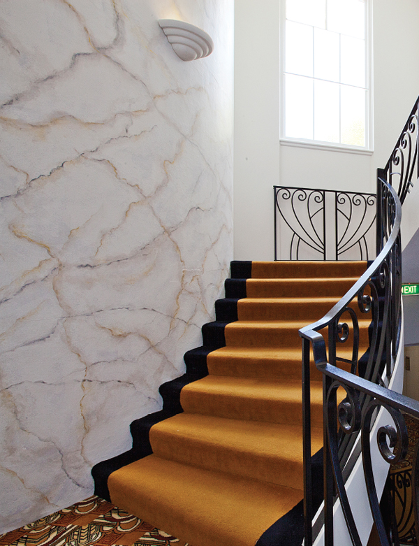
The Belgravia lobby pays tribute to Dorothy Parker and the Streamline Moderne era.
In 1922, a fire destroyed part of the building, including the accommodation and gallery wing. Undeterred, Foy spent the next 14 years rebuilding and, in 1946, completed his vision with Belgravia: an additional building of accommodation over a grand lounge.
Sprawling along an impressive 1.2 kilometres of cliff top, the building fully engages the spectacular mountain view, an aspect not lost on CRD’s principal Peter Reeve, who has introduced the view from arrival. It is, in fact, an assortment of buildings, an assortment of periods and an assortment of refits. Before the refit, it was also an assortment of Heritage trends, which read as a great many paint layers.
Reeve has done his homework and worked closely with Heritage consultancy, Graham Brooks and Associates, and, in particular, associate director Jonathan Bryant, to ensure both a dynamic new interior and adherence to the particulars of the various periods. Reeve recalls the joy of a giant chunk of plaster falling from a wall to reveal the red paint he had been arguing for.
Effectively a mix of Edwardian and Victorian, with some art nouveau elements, the bones of the building are about light and simplicity, a throwing open of the windows and banishment of drapes. And it is this aspect that Reeve has embraced with a return to glamour, an extraordinary amount of maths and a delightful sense of fun. Take the ballroom, for example.
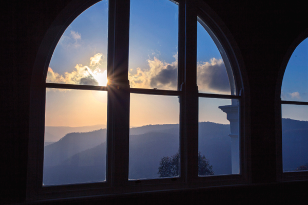
Arched windows frame the magnificent view.
Comprising a series of three buildings built at 20-year intervals over 60 years, its ceiling heights, window shape, cornice detail and scale are all at odds. Delivering a singular reading was achieved with the addition of dado and picture rails, bespoke wallpaper by Karie Soehardi, from Ella and Sofia, that expands and contracts a false cornice detail and wall surface to skew perspective to a consistent scale. Similarly, where round windows give way to square, the square iterations have been reframed with wooden fretwork to present as round.
Arguably the crown of the project is the Chicago-built casino dome. Reeve has done well here to bring the colour scheme back to the white of high Edwardian style (Murobond Paints). (The white was continued to the whole exterior once a wall was stripped back to the original layer.) The bespoke pendant light in the style of Edwardian lamps effectively contextualises the periods as complementary, in that the light is appropriately scaled and lacking in decorative flourish, so that it acts as a foil for the dome, while balancing the whole.
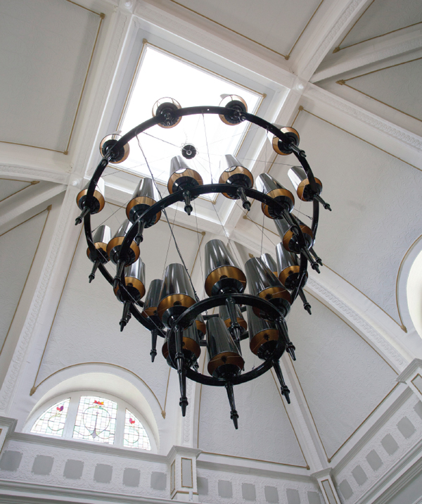
A bespoke chandelier in the style of Edwardian lamps activates the Chicago built grand dome and draws attention to the details.
A centrally placed round banquette in chartreuse velvet (Warwick) above a central motif in the bespoke carpet reiterates the symmetry, while outward flowing stripes and another band of the ironwork motif carpet both expands and contains the whole. A collaboration between CRD and Brintons, the carpets draw on architectural details and motifs from the Hydro’s rich design catalogue to create bespoke and fitting solutions that acknowledge the original attention to detail.
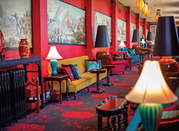
Fabric too has played a vital role in the design, with rich velvets, silks and colour used throughout. This is seen to its most lavish effect in Cat’s Alley, where Reeve has reupholstered existing furniture and introduced new pieces, via a range of Chinese market sourced antique fabrics that recall the Edwardian craze for everything Chinese. Bespoke wallpaper, again in collaboration with Karie Soehardi, draws on the mask of the last Empress of China, with an incorporated digital motif.
Ostensibly a gallery room for showing off, the room required an ostentation that only a curtain trim of peacock feathers could provide. And while the idea is outlandish, the execution is flawless with a diaphanous tourmaline silk softening the peacock shades. The more discreet chair pillows are only so by comparison with elaborate Chinoiserie fabrics and rich black feather trim. The Brintons/CRD carpet again bears mentioning with a bold and very large chrysanthemum motif executed in Chinese red on black that continues through to the Salon du Thé. In this room, sumptuous lounges give way to red mock-crocodile seating in another nod to an Edwardian fad, while the wallpaper (Soehardi with CRD) has here drawn on the original William Morris pattern, Willow Tree.
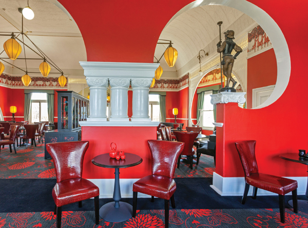
Rich red walls highlight the graceful curves, while red mock-crock seating add a charming element to the Salon de Thé.
Ceramics in rich reds, blues and greens continue the theme through both of these rooms, while softer shades have been selected for elsewhere. Interestingly, the ceramics are mostly of the period, with Reeve sourcing and shipping a container directly from China for the project. Moreover, the furnishings are also genuine with most bespoke (and made in Australia), while others were refurbished or reupholstered to suit.
The Hydro remains a conglomeration of buildings and, to some extent, this rambling excursion through eras gives it its charm. It is also a field in which Reeve is most comfortable, given his declared love of Dorothy Parker and the Streamline Moderne era. As he explains, “I have indulged that most in the Belgravia, which was added to the project late in the piece. It was the 1940s element to the hotel and so it was a perfect fit in style to use the influences of Dorothy Parker and, in particular, the Fairmont in San Francisco.” The result is a lobby of extraordinary flamboyance, style and character. Again a very large floral motif carpet from Brintons in pale silver grey on black provides the foundation, while columns of painted marble and wrought iron railed stairs lend a Hollywood touch.
Rich red walls highlight the graceful curves, while red mock-crock seating add a charming element to the Salon de Thé.
Andrew Merry’s large black and white photographs of the hotel’s details are another glamorous element, with a nod to the theatrical. Fabric is again key with a large ecru on black floral motif (Fabric Pavilion) demarking the lounging area from the more formal woven gold spot on black velvet (also Fabric Pavilion) used in the dining area. And glamour is close at hand with large ceiling sconces in a burnished copper gold over black chandeliers.
There really never was a purely art deco Hydro or a Victorian Hydro or even a Streamline Hydro. What exists is a bit of everything and Reeve has done well to not fight this or allow one aspect to have dominance. Rather, he has recontextualised the separate elements as complementary.
Moreover, and quite importantly, he has captured the grandeur of both architecture and view and, in doing so, he has returned the hotel to Mark Foy’s vision within the milieu of contemporary expectations of luxury and ‘wow’ factor.
This article appears in (inside) magazine issue 87, available now in newsagents and on Google Play and Zinio.
© Niche Media 2026