
Home by SJB
Home by SJB
Share
Extraordinarily grand yet entirely a home, there is a kind of majesty to this SJB interior, which features an almost fetishist approach to detail.
As the client is one that SJB, and in particular Kirsten Stanisich, has worked with on numerous projects, there is not only history, but a familiarity and mutual respect ingrained in this project. “There are not many clients I’m prepared to have a stoush with about where we go with the design,” says Stanisich.
This intimacy, plus the client’s age had a profound effect on the design engagement, pushing Stanisich to combine materiality and furnishing from a broad perspective where fashion is anathema to taste. “She looked at things in a different way. I’d show her something and she’d say, ‘That’s fashionable, I hate it. Don’t give me any of that fashionable stuff, I just don’t want it’.”
Bordering on regency in scale and style, the grand Heritage home with additional annex was deemed enough of an architectural statement in itself. Instead, “the client wanted a really beautiful home to live in,” says Stanisich.

SJB managed to create a bathroom that was accessible, but without ugly grab rails.
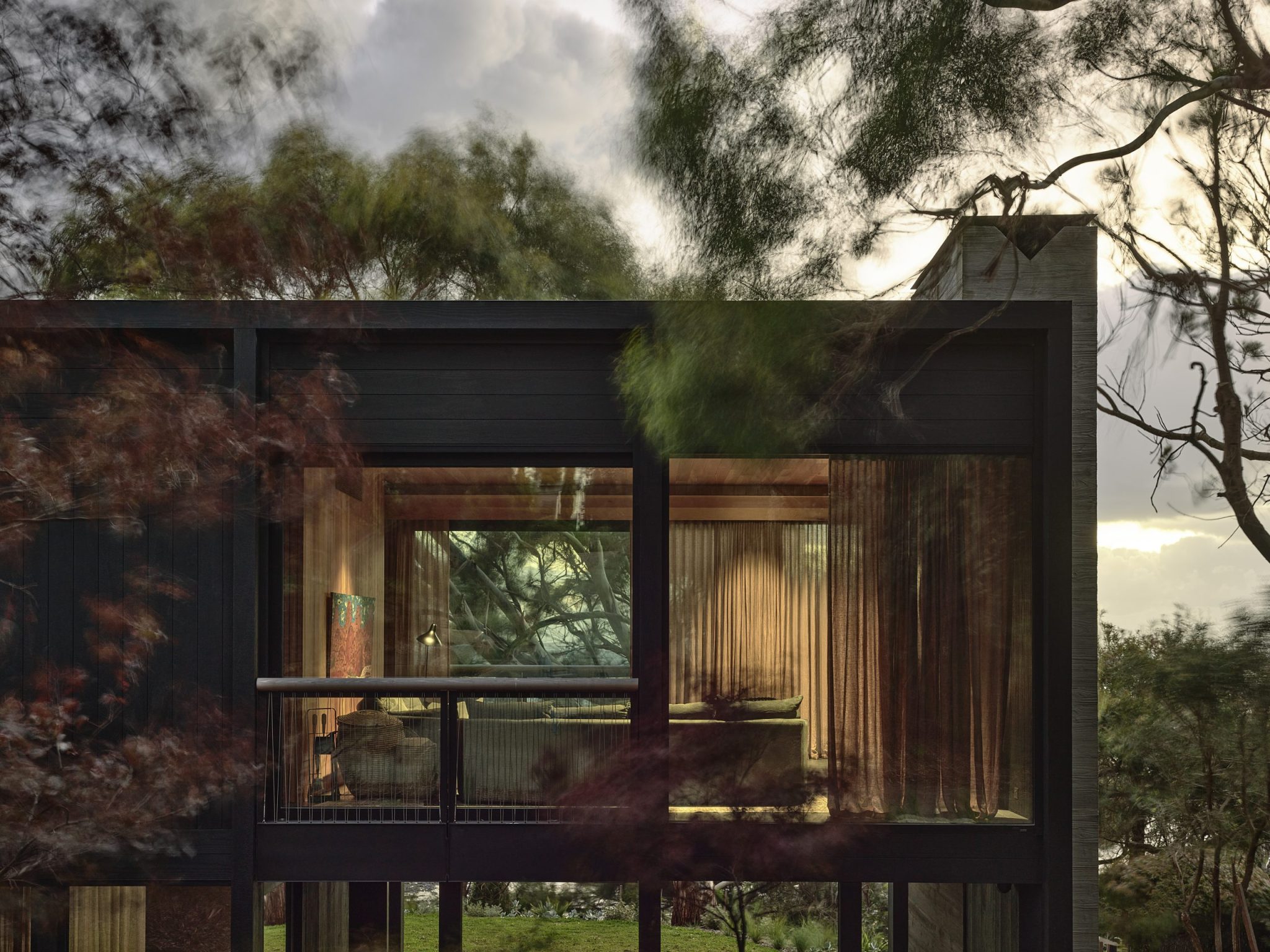
To this end, interior architectural details were retained, but simplified to broad expanses of soft grey walls and architraves, while blackbutt floors were refinished, but not overly so. The result is a foundation of broad expanses of single colour from which to play. And play they have, with texture, colour, form, pattern and the silky sheen of metallics coalescing towards a magnificent home.
Contained and framed by huge Anatolian rugs (Robyn Cosgrove Rugs) the main living area flows from living to dining with the rugs defining these separate areas. The rug in the lounge area has rich tones of gold and bronze, which are muted by navy, burgundy and mossy green, in a formal composition of intricate patterns and motifs.

The scale and light of the room, however, counters this richness as the mood shifts considerably between night and day. Moreover, it provides a sumptuous underpinning to the furnishings. Here, a pair of Minotti Aston armchairs (dedece) in wine flanks a Bell side table from Classicon in emerald and copper (Anibou), while the glorious form of Naoto Fukasawa’s Drawn coffee table for Glas Italia (Space) anchors the whole.
Large bespoke cabinets with grey silk doors and gold leaf detailing conceal television and books, while adding a slight Chinoiserie edge to the aesthetic language. Chic and sumptuously long, the drapes are an elegant solution to the client’s conscious decision to make the house as energy efficient as possible.

In the dining area, the rug is also magnificent. Looser and sparser of motif, its rich colours and large emblems are again in a formal arrangement with, in this case, a large dark border surrounding a field of greens, rose and gold. The unabashed addition of the sharp angularity of the Röthlisberger Canto dining table and Torsio chairs (Anibou) makes an impressive statement reminiscent of Andrée Putman’s spatial acumen. That is, rather than counter the juxtaposition with a third element such as a large pendant over the table or painting, the composition and scale of table and rug is sufficient to hold the space and requires no further embellishment.
In the (very large) kitchen, this sense of scale is further explored with a great expanse of counter that encompasses both utility and freestanding table. The craftsmanship of the table is singularly impressive, as is the joinery with the same piece of timber used for all detailing. It is here that the client’s abhorrence of fashion played a crucial role and Stanisich was able to introduce the oft maligned burled maple. “She didn’t see it as a problem, she didn’t think it was daggy or eighties. She just thought it was beautiful and, as a finish, it’s as valid as anything else,” says Stanisich.

Similarly, the existing glass bricks were never contextualised to the eighties or contrived in the slightly mocking parlance of a hipster aesthetic. Rather, their attributes of gorgeous glowing light, urban grid of modernist appeal and the way the soft colours of the world outside are introduced to the room were all factors taken into account. The grid is picked up in the wall tiles and large French limestone pavers, while any stylistic categorisation is rendered moot by the minimal Viabizzuno lighting and glorious Andreu World table and brilliant blue Expormim chairs (both Kezu). The Parachilna Chinoz lamp (also Kezu) adds just the right amount of character, while its form softens the whole.

Where this interior really breaks new ground is the bathroom. One of the primary needs of the client was accessibility, but Stanisich told her, “I’m not giving you grab rails.” Instead, the room has been designed to allow freedom of movement with rounded marble placed appropriately for holding and leveraging weight. “The whole accessibility needs have to be covered – it needs to be to [the Building] Code, but just because you’re ageing you don’t have to live in something ugly,” says Stanisich. To this end mosaic was introduced to provide grip, though the first iteration in pink “horrified” the client and was summarily rejected as “far too girly”.

SJB managed to create an accessible bathroom without ugly grab rails.
The close pattern of white on white mosaic tiling has been treated as a texture, in that visual junctions are shifted outside the functional line. In doing so, the material has taken on a new role in creating soft curves that blur junctions and visually detract from the functional purpose. It is also exceedingly beautiful with the soft round forms matched with Flos wall lights (Euroluce) and the silky grain of eucalypt timbers used in the cabinetry.

SJB managed to create an accessible bathroom without ugly grab rails.
There is a sense of quality and tactility to this home that is hard to define. On the one hand, it is sumptuous and rich; on the other, it is streamlined and elegant. And herein lies its beauty. Each object, item of furniture and material selection has been chosen for a combined strength of individual merit and contribution to the whole.
Moreover, the client’s personality and years are etched in not only the choices, but also the solutions. It is a remarkable bathroom for any age, but particularly impressive as an alternative to the ‘ugly’ options usually offered. Moreover, the client’s age was a benefit in seeing through fashion and prescribed outcomes to create a truly unique and brilliant home that suits her personality well.
Photography by Anson Smart.
This article originally appeared in inside 98 – available at shop.niche.com.au or digitally through Zinio.
—
See more of SJB’s work in Cantala, here.
You Might also Like


Related Stories
© Niche Media 2026