
HASSELL Sydney Studio
HASSELL Sydney Studio
Share
Above image: The quiet room occupying a bridge between the west and east portions of the upper floor provides a vertical frame to the lower level bookcase
Project: HASSELL
Location: Sydney, Australia
Design: HASSELL
Text: Gillian Serisier
Photography: Nicole England
The sheer size of Sydney Harbour is impressive, as is the wharf and the abundant light and robust wooden stairs leading through the Pier 8/9 labyrinth. Rather than create a divide, these elements have been fully realised in HASSELL’s refit and development of its new, much expanded office space. Whether arriving by stairs or elevator, the foyer, behind glass, is immediately present. Incredibly large, spanning two floors and the full width of the building, it is also undeniably glamorous, with water views on each side and a seemingly endless supply of light.
Working with a reductive material palette of steel, concrete, glass and marine ply, the space comprises a delineated and structured volume of multipurpose design. Exhibiting robust elements of the pier’s history, as well as a minimal aesthetic, the space is at once calm, evocative and clear. A single low bench in floating steel spans the building width to lead the visitor from door to reception.
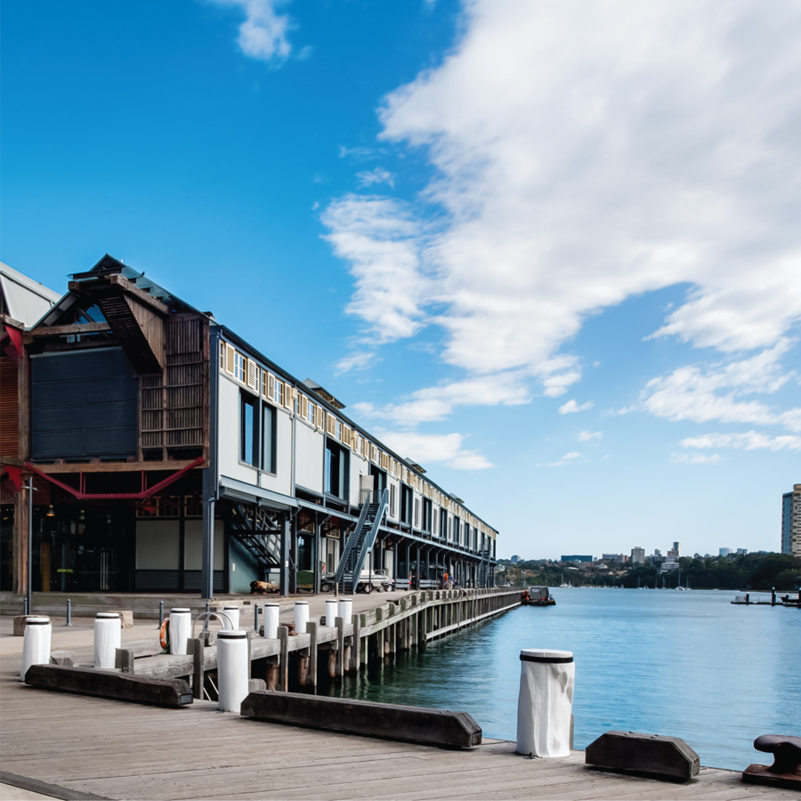
The Heritage listed circa 1913 pier 8/9 provides a grand platform for HASSELL Sydney studio
Again a single form of bespoke eight-millimetre raw mild steel has been used to guide the visitor into the space by running parallel to the far window. Though this iteration, being slightly higher than its predecessor, also fulfils the role of reception desk and informal meeting place. Moreover, it often doubles as a bar, while the initial low steel form becomes seating, a stage or a display area as needs dictate. This is in fact a far more important aspect than for most offices as a means to facilitate HASSELL’s socially active platform of interdisciplinary communication.
Once within the main volume, the various sculptural elements of the space become apparent. Using marine ply in a series of oversized steps spanning the internal width of the void, the space flows by stages to the upper level. Contained by pre-existing white steel balustrades and glass, the ply has been lime-washed white (Porters) in keeping with any use of ply in the vertical, including the exposed wooden floors on the upper level (horizontal use is realized as natural.) The lightness of colour, or lack of colour, while visually tied to the neutral of the cement tiles (CFC from CSR) and large white U-beams flanking the void, is also an acknowledgement of the active harbour views, in that no colour has been engaged to compete.
The steps themselves, while visually interesting and propelling the eye upwards, are also highly practical as informal meeting areas and seating for the many talks and presentations given in this area. They also answer the organisation’s philosophical directive: “The fundamental strategy of our culture of engagement led us to design the bleachers, be it with clients, internally, the community (e.g. theatre guys from nearby) or, in the future, perhaps students. It was a key part of the approach to knowledge and design leadership to ensure we had a space that could really attract and facilitate a better level of engagement. It’s another dimension to our expanded fields or open source culture that we aim to nurture, but now with a space that can make it work,” says HASSELL, speaking as a collective.
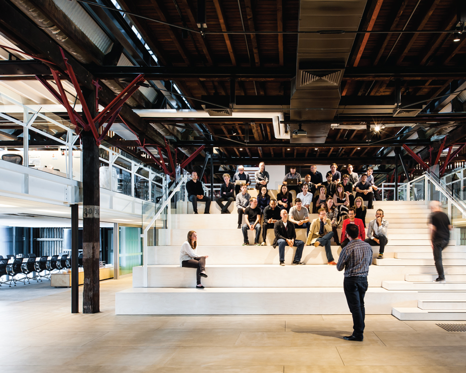
The studio’s central void is made vital through an expansive wall of ply seating
The Heritage elements of the wharf, while lending themselves to this minimal palette of colour and material, have also in many ways been more forcibly revealed. The large pillars in the foyer, for example, were previously hidden, as was much of the overhead beams. These elements, while robust and potentially dominating, have been made light by HASSELL’s innovative use of materials to create a delicately nuanced environment.
To illustrate, steel has been used as a delicate element in the fine lines of the table and seating. The low ceilings to either side of the void are another example. For these, HASSELL has utilised a metal ceiling panel (Armstrong) developed in the US for airports and large utility spaces. It is in fact the first time this material has been used in Australia.
Comprising a powder-coated mesh of white rippled steel, the material has a robust quality that has been transformed into a delicate baffle, where hidden lights are further muted to create a dappled presence that works well with the flood of light coming in from the main windows. The windows themselves are another element of the Heritage space more completely incorporated into the fitout under HASSELL’s direction. Where in the previous iteration lower windows were concealed to create a uniform and expected experience of central positioning, HASSELL has adopted the idiosyncrasies of the windows as a feature. Moreover, the lower windows unexpectedly create cameo framings of the water below.
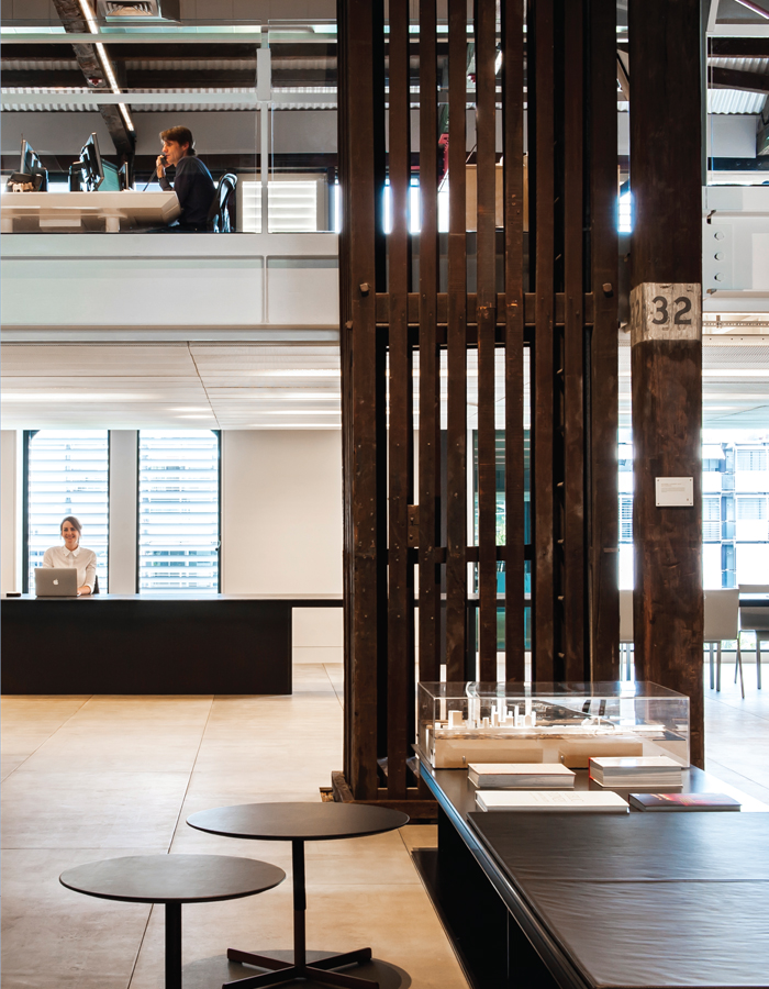
Inside the studio
In keeping with this use of Heritage, the large wooden walls and sliding doors running across the space have been absorbed into the design in a number of different ways. On the upper floor, they create a break between interior and architectural divisions, while allowing the whole a continuity. On the lower level, their use has been somewhat more theatrical. Below the working floors are large, glass encased meeting rooms. The eastern is the largest; however, the western is arguably the more interesting as it looks directly into the active model making room. Internally framed by the wooden slats of the Heritage wall at its back and a huge window on to the harbour to the west, the room provides a succinct vehicle for showcasing the internal workings of an architectural practice.
Historically, the circa 1913 wharf was transformed a decade ago by Bates Smart with a clear and linear makeover. Much of that refit remains, as does HASSELL’s previous office furniture, which has been given fresh purpose in the new offices.
These concessions to the past, while of financial benefit, are also in keeping with HASSELL’s policy of reuse, which is driven by a stratagem of quality from inception. As such, the revisited chairs are classic Eames side chairs, while the task chairs are Aeron chairs from Herman Miller. The former have been relegated to library and meeting rooms, while the latter have been classically teamed with custom designed Unifor workstations. To the standard version, a large, shallow and lockable drawer has been added.
Being project driven rather than collective, each team works as a group. As such, it is the team that repositions at project commencement rather than a daily reinvention. Existing furniture such as the Cannot table and Filament table, Swan chairs and Croissant low lounge have been revisited with Artek E60 stools (Anibou) Jean-Marie Massaud’s Bob table for Poltrona Frau (Corporate Culture), Kristalia’s Degree side table (Fanuli), Kaleido trays from Hay (Corporate Culture) and an antique Kilim (Koskela).
Spatial clarity is afforded in the work zones through individual lockers, which have been built into the hall walkways. These allow desks to be relatively clutterfree, while separate desks running parallel to the workstations are designated for the hands on paper and printing side of design. As a concession to the ever-expanding number of bike commuters, showers and large lockers have also been added.
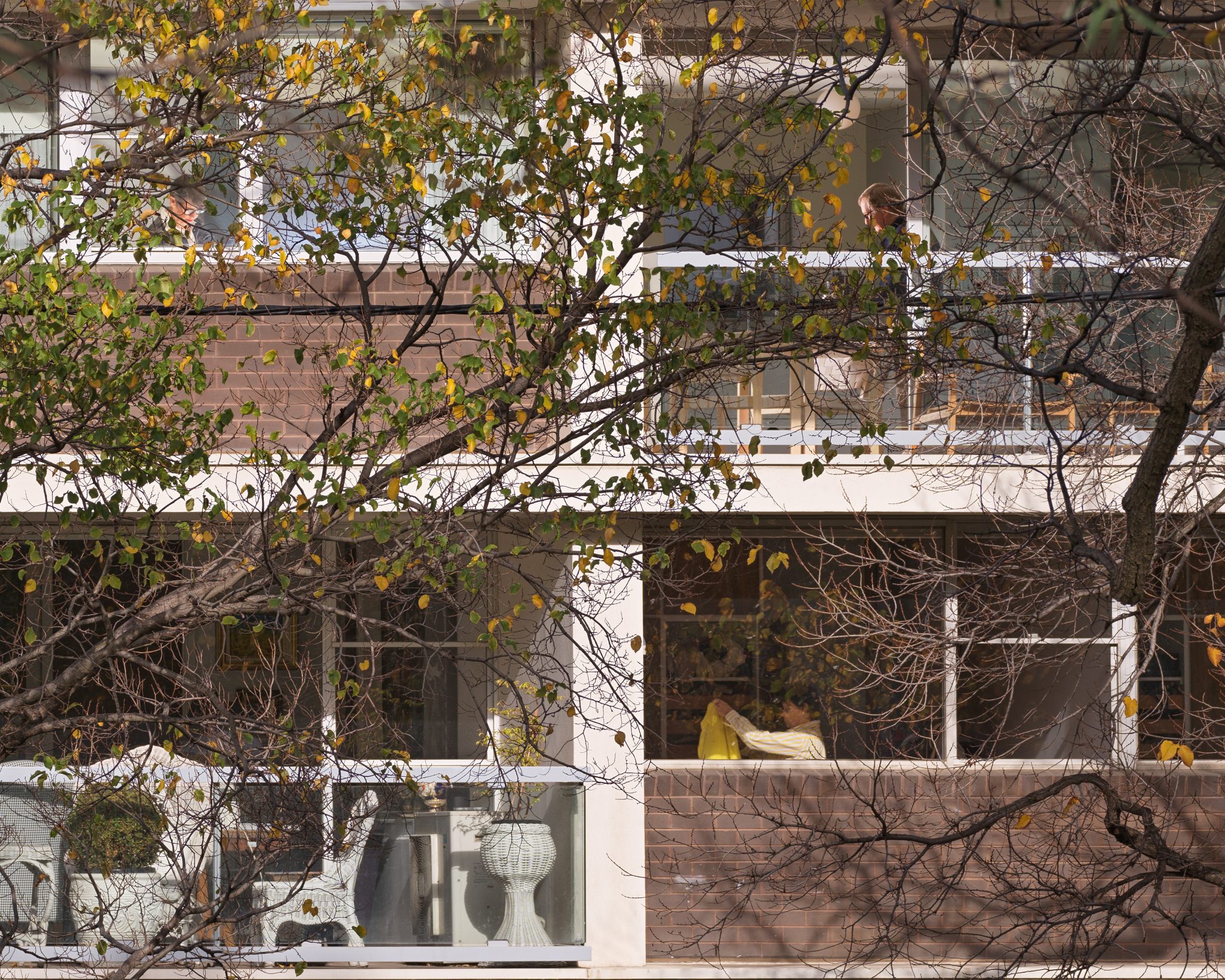
Spatially, the building is complex, with bridges and walkways connecting the various levels and sides of the building. Rather than bypass these elements, HASSELL has integrated them as both functional and decorative elements. The walkway crossing the upper portion of the library, for example has been finished on its underside with the same cement tiles used in the foyer. Also, overlooking the library of raw ply shelving is an unusual closed-in balcony accessed from walkways to either side. With a dark tinted glass front, HASSELL has created quiet rooms that, while practical for the user, present as a Kubrick-like tableau, where the occupant – facing straight out – is suspended in an internally lit, but dark pod of silence.
Such a large space could easily have been compromised by a desire to create more pedestrian proportions. HASSELL has quite cleverly taken the opposite approach by embracing the volume wholeheartedly, while making it extremely user friendly. HASSELL has also created a space of sufficient spatial variety to support the various psychologies of such a large office. This is further developed by a furniture selection that is vastly diverse. Moreover, in remaining within a reduced material palette HASSELL has allowed views of Sydney Harbour to fill both sides of the foyer without interruption. Importantly, it feels very much like a Sydney environment – bright, airy and of the sea.
You Might also Like
Related Stories
© Niche Media 2026