Colour is the design hero of this pop-up store
Colour is the design hero of this pop-up store
Share
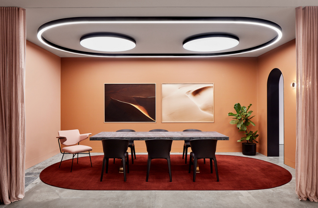
Christopher Elliott Design was given carte blanche to design a pop-up store for shoe brand Phare and used the opportunity to use bold colour as the main element of the design.
Due to the impermanence of a pop-up store, Christopher Elliot Design had to ensure the design had little impact on the existing space, paint aside. As a result, the approach was to be bold with colour on the walls and use colour blocking to draw customers’ attention to the product and in doing so, concealing the elements the practice couldn’t control.
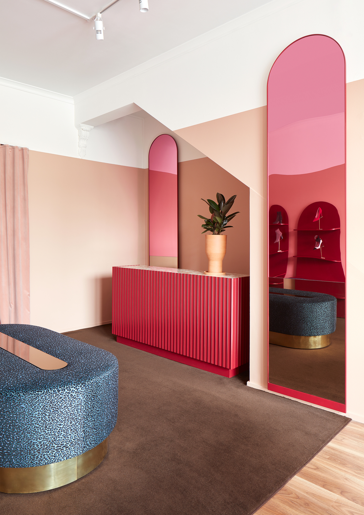
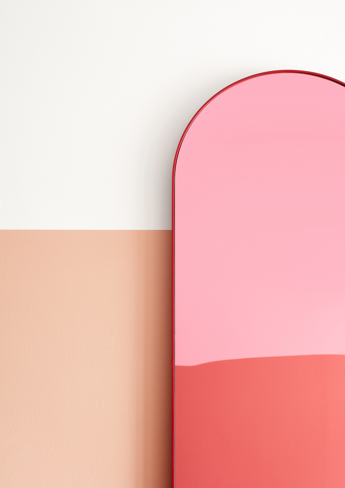
“We had a strong vision that you should feel bathed in warmth being in the space,” explains Christopher Elliott, principal designer. “The sun-kissed hue of the walls – inspired by warm skin tones – creates a mellow light, appealing to all.
“This is further enhanced by the feature mirrors that are a combination of bronze mirror (perfectly positioned for customers to view themselves wearing a new pair of shoes) and pink perspex mirror (that distorts the reflection of the upper body, ensuring the focus is on the shoes).”
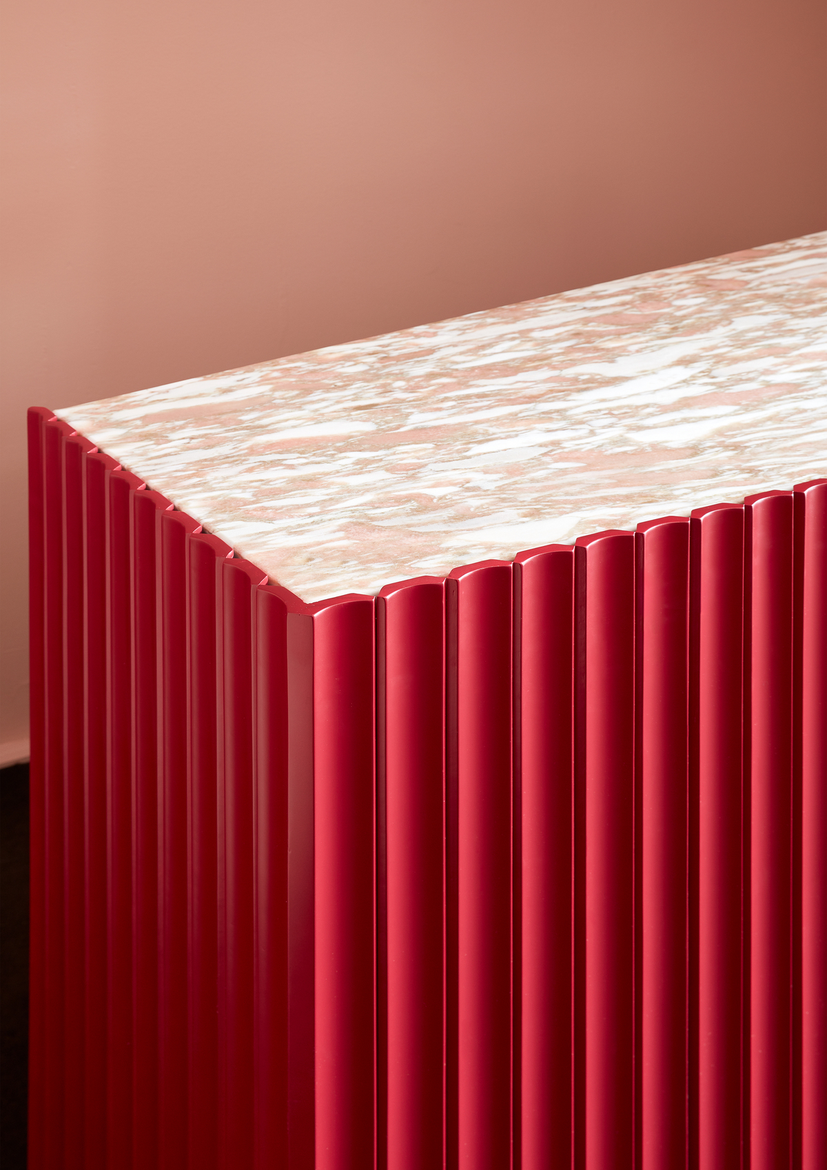
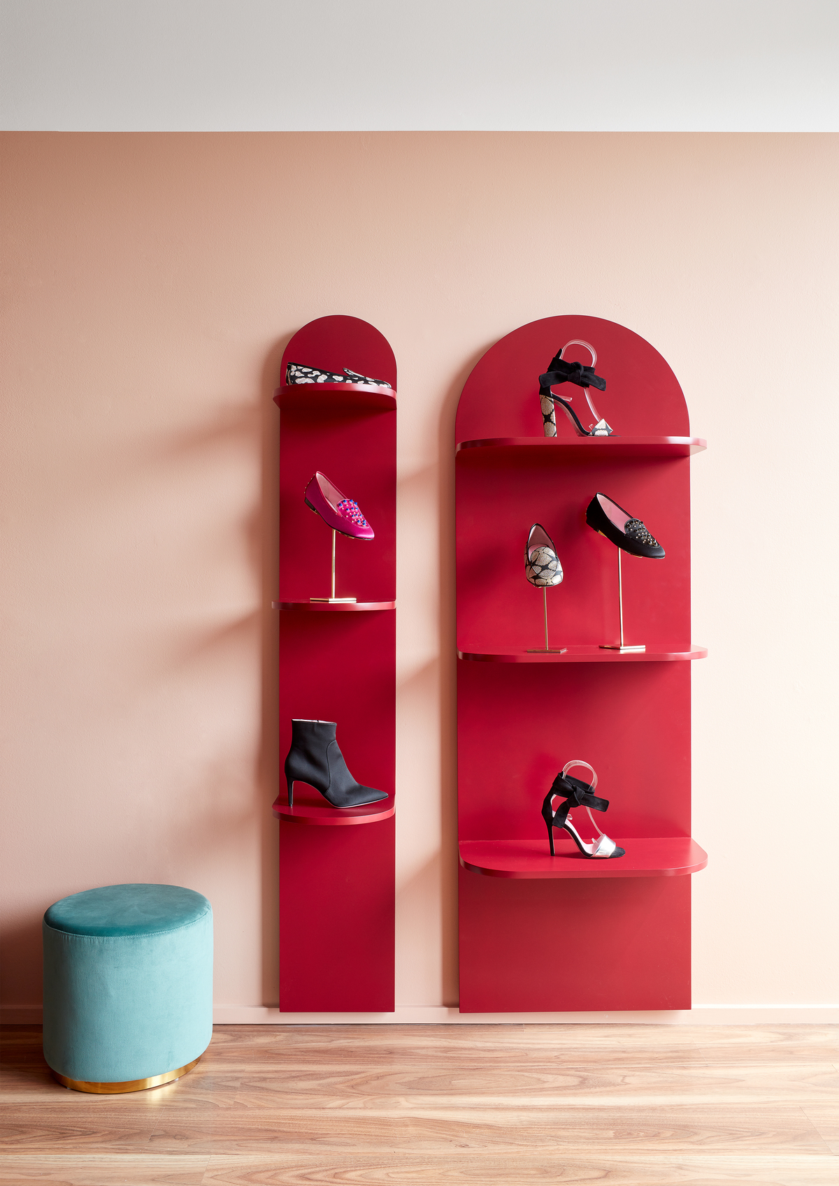
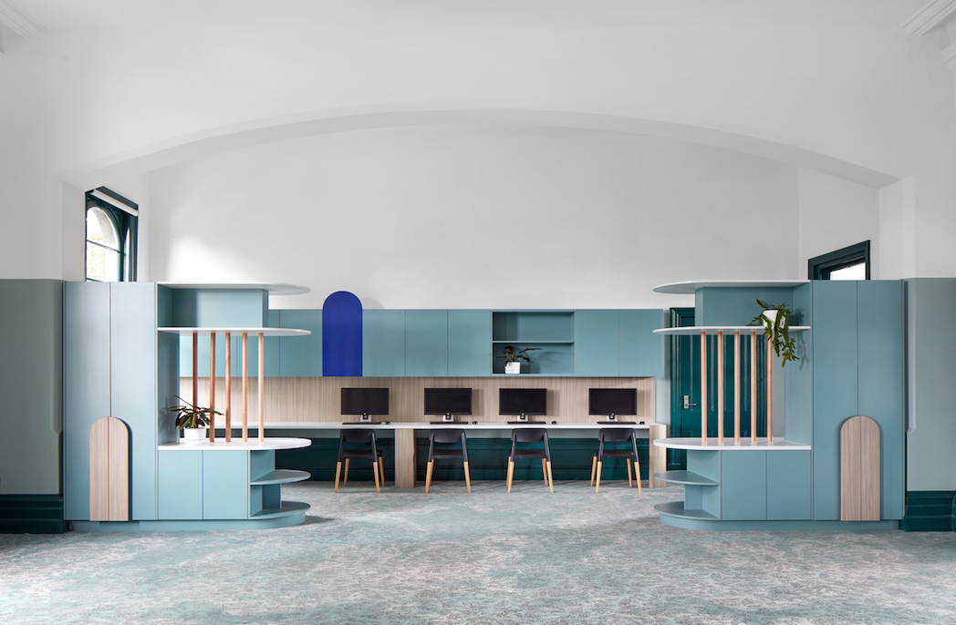
The forms of the design are a nod to classic Italian architecture, which is the brand’s country of production. The famous arch shape dominates the design but also suggests a softness. The space plays upon the contrast between hard and soft elements, reflecting the aesthetic of Phare’s product range.

Photography by Jack Lovel
You Might also Like
