
Ways of Colour
Share
Written by Marcus Piper, Images courtesy of the designers.
A powerful tool in the kit bag of any designer, colour can be a tricky thing. Used wisely it can guide our mood, shift our perception and even change the size of a room. In 1960 French painter, Yves Klein, proved you can own a colour, while today brands globally define themselves through careful selection and execution of their Pantone chip.
In recent years, designers – particularly of the graphic persuasion – have used new technology and printing techniques to push the spectrum of their on-screen and printed gamuts. Gradient blends and transparency, along with the right choice of paper or finish ,have given visual communicators a new dimension in which to exist.
For some, like Klein, colour and the way it is perceived can become a life’s work. Over 25 years German artist Josef Albers investigated the subjective experience of colour through his Homage to the Square series. A body of more than 1000 works exploring the illusion of space created by adjacent colours on a two-dimensional plane. In an almost identical period of time, US artist James Turrell converted an extinct volcano into a warren of apertures through which visitors could explore those same concepts of light, colour and spatial perception.
For Dutch textile manufacturer, Febrik, a shift in colour was also a relatively long time coming. Working with designer Marc Thorpe, the company spent three years developing the Blur textile exclusively for furniture brand, Moroso. Initially created for Thorpe’s own sofa, the investment in development has proven worthwhile, with Moroso releasing pieces designed by Daniel Libeskind, Ron Arad and Atelier Oï, all draped in the shifting colours of Blur.
Blur was developed digitally, though completely refined by hand and produced using traditional machines. As the brand’s founder Jos Pelders points out “instead of printing pixels, we knit pixels”.
The Iris table, a limited edition designed by Barber and Osgerby in 2007 for Established and Sons, utilises a very simple concept to create its form. Tapered aluminium sections, each anodised for slightly different lengths of time, create gradations around the diameter of the table. “With this piece we decided to turn the whole thing on its head and see if we could design with colour and then allow the form to follow,” says Edward Barber. Citing the piece as a departure in process for the studio, he adds, “While colour is an important part of a finished design, it is not always a starting point. Colour hasn’t informed the shape or the structure of any piece that we’ve done before.”
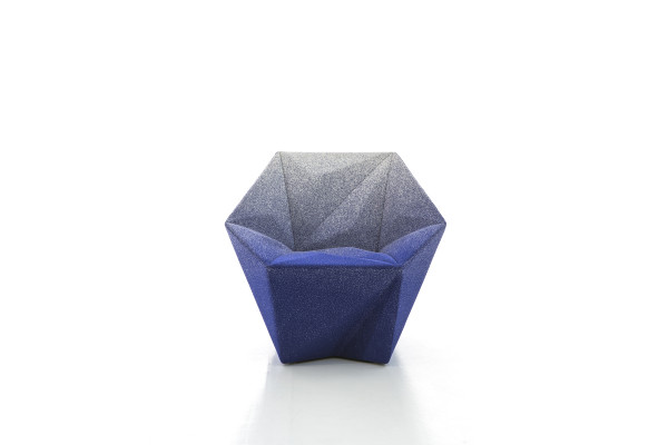
French designer Arik Levy has also found himself pushing the possibilities of manual processes with his Split chair, designed for Czech manufacturer Ton. Finished in a hand- sprayed gradient, “the end result is amazing – because it is a handmade technique, with each chair inherently unique and no two exactly the same,” he says. Similar to the Blur textile, using such a technique by hand requires not only the artisan’s skills, but also a complex understanding of colour.
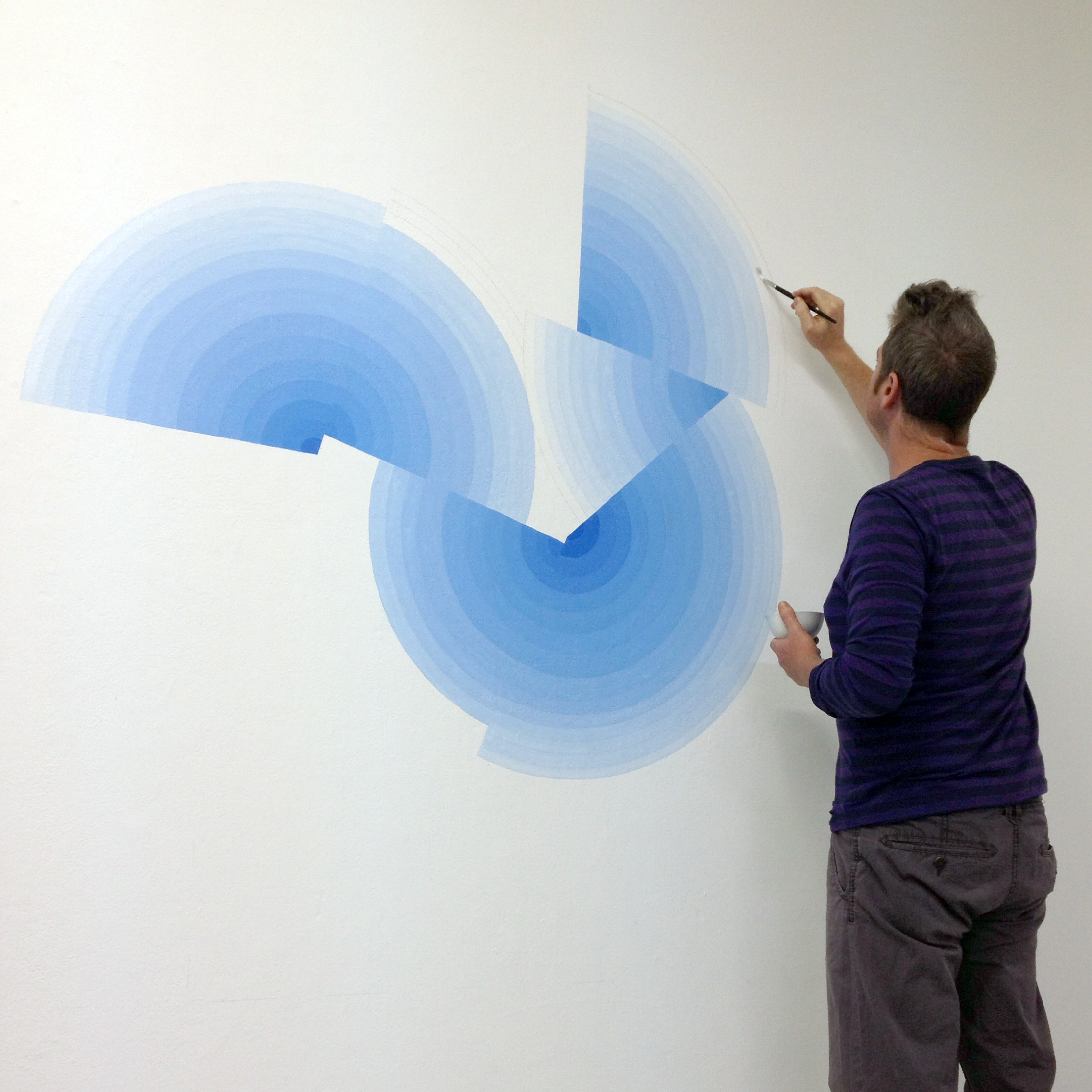
Having just completed a major installation at Carriageworks for Sydney Contemporary 15, artist Ham Darroch’s skill of eye and hand creates work that generates quite complex discussions about space and form. Describing a recent work, The Measure, Darroch says, “It’s all painted by hand to a pencil line, so quite a disciplined and concentrated effort is needed to install the work. It’s as precise as I can make it and still retain a handcrafted feel. The colour has been made from many blues, including cobalt, ultramarine and cerulean, but also its opposite on the spectrum to settle it down a bit. The execution of the gradient of colour is very much integral to the success of the work as a large change in tone will greatly alter the spaces I want to create.” Darroch’s work, often becoming sculpture through application of found objects such as table tennis bats and rabbit traps, creates movement and space through his understanding of colour – transforming the objects far beyond their original context.
Darroch uses colour shifts to describe depth in a single plane though, inversely, translucency also allows colour to change as it is viewed. Direct engagement between the viewer and an object through a tinted plane or material can create an interaction with an object or space, making it a joy to experience.
Japanese designer Jo Nagasaka uses material density to achieve a different type of shift in colour and visibility with his Slope table. The table, standing at an angle, is topped with a wedge of coloured resin, providing a level surface and gradually revealing the beauty of the timber beneath.
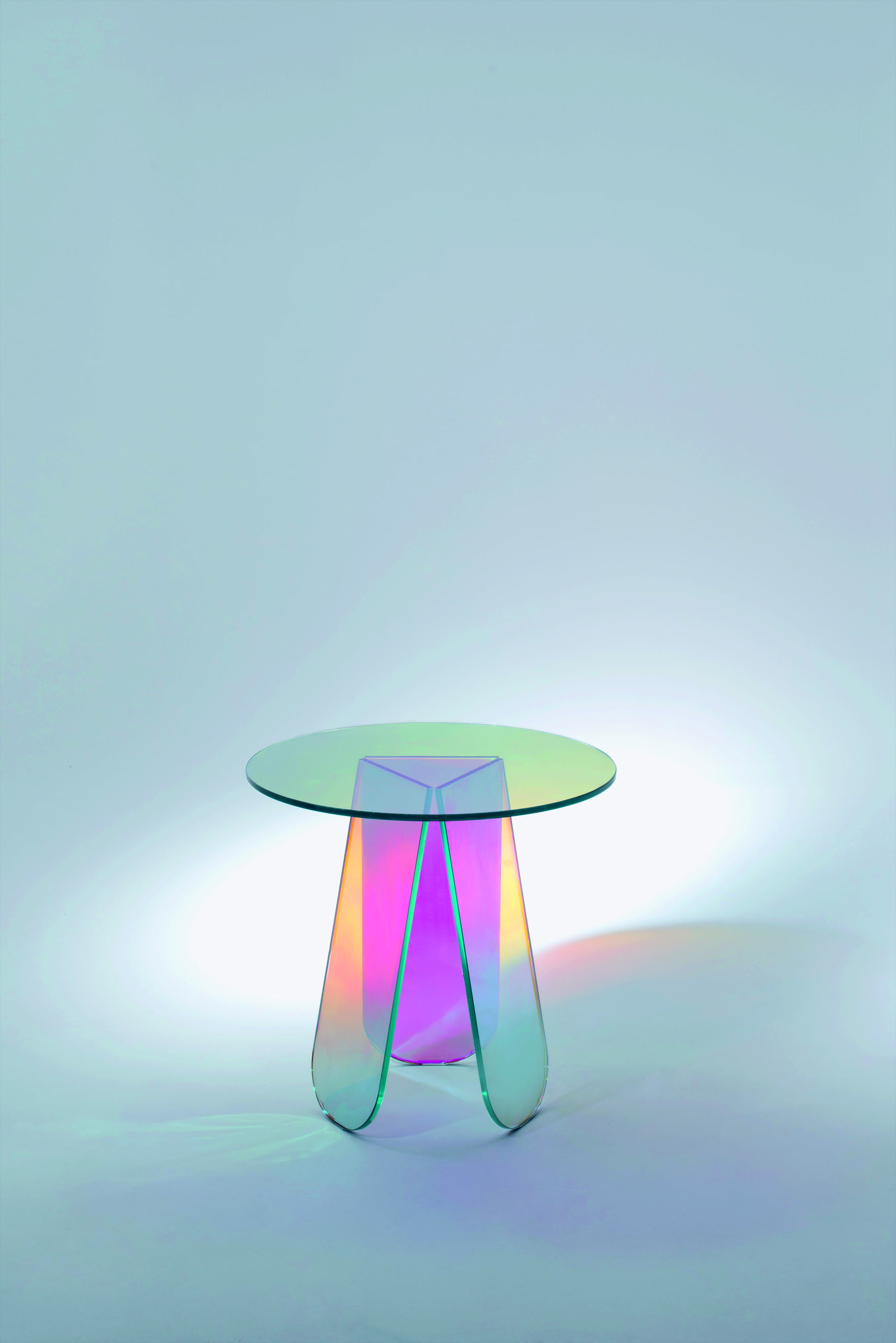
Patricia Urquiola and Ronan and Erwan Bouroullec also explore these possibilities with manufacturer Glas Italia, creating furniture that defines its own densities and colourways based on the observer’s viewpoint. Urquiola’s Shimmer range and the Diapositive collection by the French brothers, both made of laminated glass, have an ability to shift perception, extending themselves through the projection of light and shadow.
Another Japanese designer, working on the stores for fashion designer Issey Miyake, turned a film developed to blur vision of ATM screens into a vision-shifting architectural product. Lumisty, a transparent film applied to glass, appears frosted or clear depending on the angle at which it is viewed. Used predominantly in retail and workplace projects, the film can also be used to provide increased privacy in high density developments without the loss of natural light.
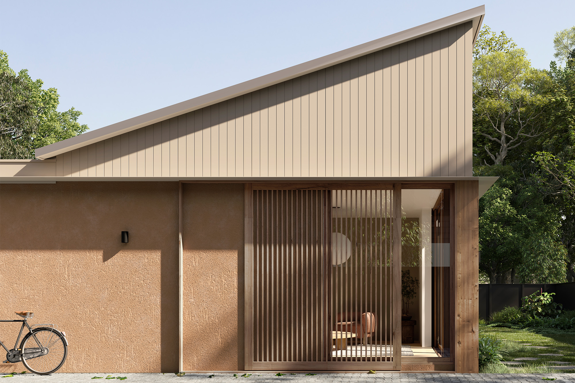
Balancing natural and emitted light, Sydney architect Eoghan Lewis has used transparency to create a multifunctional translucent wall for his client’s painting studio in Tempe. Triple-glazed in polycarbonate, Lewis says the facade “insulates the space, keeps out UV and brings in a very delicate light … it acts like a piece of furniture for the studio and the translucent qualities of the skin quietly reveal its function. LEDs embedded within the frame transform the studio into a glowing lantern at night.”
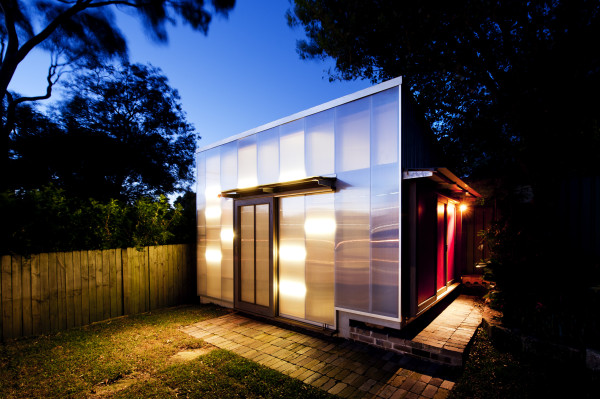
Part of a much-praised project, the studio sits at the rear of a Heritage-listed sandstone cottage that Lewis has delicately converted. Additions to the existing building are clad in Australian spotted gum imbued with a UV stain, giving the timber a vivid “almost Yves Klein blue”, says Lewis, which will weather off to reveal the timber’s natural silver grey over time.
In the same way architects such as Will Alsop use copper cladding to create an evolving colourscape (Pekham Library Alsop and Stormer, 1999) or the way that sandstone rusts due to the iron in the sand, Lewis is leaving the shift in colour to nature. “The speed of greying in the timber will vary depending on the orientation and level of exposure to the elements,” says Lewis. “We imagine it becoming more and more beautiful over time.”
You Might also Like
Related Stories
© Niche Media 2026