
Jardan Melbourne by IF Architecture
Share
All images appear courtesy of James Geer.
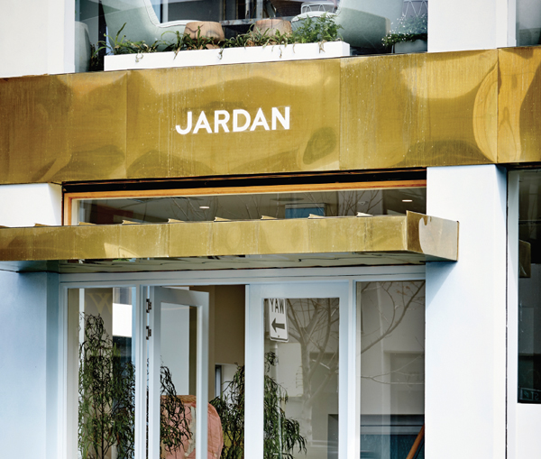
Creating the perfect backdrop to explore design options, IF Architecture puts concept and materiality into play for Jardan’s new Melbourne showroom.
Working within an aesthetic of sublime subtlety, Iva Foschia of IF Architecture has created a layered and rich platform for Jardan’s Melbourne showroom. From a conceptual perspective, the task of forming a furniture showroom is both simple and complex. On the one hand, the foundational layer must be capable of supporting a vast range of products without interfering visually or physically with their display – as such it must be simple. Conversely, it must stand alone to simultaneously sit beyond fashion while being highly aspirational.
Brass features and full glazing coalesce to frame portions of the showroom as interior vignettes of domestic harmony.
IF’s deftly handled material selection works well to this purpose. The Australian Orazia Gold marble from Chillagoe (near Cairns) makes this point well. Richly coloured in red, cream, grey and olive, it makes a sumptuously opulent addition as timber embedded stairs. “It’s all about the detailing to showcase how it was made. We took advantage of the isolated moments where those elements of material could really be featured: where you read the timber and inlay and the marriage of those two elements,” says Foschia.
Material richness and the detail of craftsmanship are moreover delivered in accord with the project brief of highlighting Australian craftsmanship, products and material (in keeping with Jardan’s offering). Australian blackbutt, for example, has been used in several different ways. In the case of the stairs, it becomes a feature surrounding the marble, but also alone as the under stair surface as a ceiling of lively zigzags.
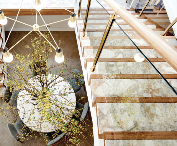
Orazia Gold marble from Chillagoe in Queensland provides a rich complexity to the Australian blackbutt staircase while a Jardan light feature activates the void.
Concurrently, the same timber has been polished as a fine grain handrail made luxurious by the addition of brass posts. The quality of being Australian is explored as a concept well beyond the material, with IF embedding cultural references as well as Australian materials. The main flooring of a herringbone variant realised in brick tiles (Robertson’s Building Products), for example, is a direct reference to the same floor in Walter Burley Griffin and Marion Mahony Griffin’s home in Eaglemont – the only home they designed for themselves. IF has extended the metaphor through the lower floor of the showroom by designing the layout as an extrapolation of the Eaglemont home.
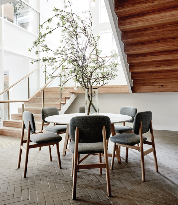
The flooring pays homage to Walter Burley Griffin and Marion Mahony Griffin, while the layout is an extrapolation of their Eaglemont home.
This works perfectly for the showroom with framed expanses of five by five metres sitting within the domestic. Smaller spaces and stand-alone areas for the display of single items round out the offering as a highly flexible and future-proof environment that can be changed and adapted as product lines change. How they are presented, however, is both clever and unique. From the outside, the two storeys are cantilevered, allowing the street corner to be fully glazed to the edge. At night in particular, but also during the day, the effect is to frame the internal portions physically with architectural lines, while the transparent corner blurs the juncture between intimate and commercial.
The result is a wholly permissive look into a home – a very aspirational home – but a home nonetheless. Internally, this is continued with portions ascribed specific roles: living, lounge, outdoor, kitchen and library, with multiples whenever necessary. There is, however, no sense of room jumping, rather a framing device has been used throughout that demarks both a domestic height and scale without obstructing an overall view or ease of flow.
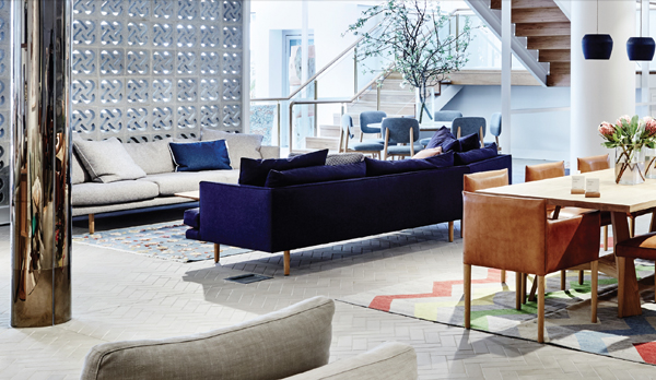
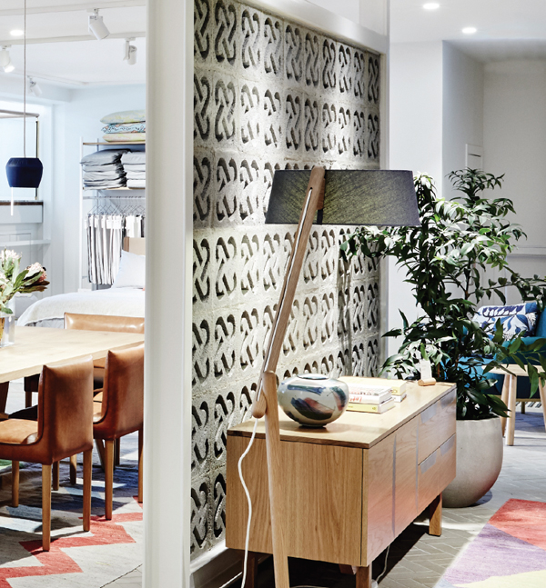
Breeze blocks designed to incorporate the Jardan logo bring textural variance without clutter to the whole. Brass cladding transforms the utility of columns into a luxurious feature.
A particularly interesting extension of the Griffin homage is the use of breeze-blocks. But these are very far from the breeze-blocks of yore. Designed as a collaboration between IF Architecture and Seesaw, and made by the Natural Image Group, the brick aperture denotes the stylised J or double heart of the Jardan logo. Left in the neutral shade of cement, they provide a visual texture that pairs well with the overall paint tones of natural white (Dulux) and the soft blues and greys (Bauwerk).
Where this diverts, and where it should divert, is the children’s pod. This fabulous corner is slightly raised (a car park intrudes into the space from below) with flooring of Bolon woven vinyl and bespoke wall finishes. Using a pattern of IF’s design, Seesaw created a wallpaper graphic using photographs by James Geer, while the flooring follows the same slotted triangle arrangement in shades of blue. What makes this work is the way the colours are a variation of the whole presented in a very lively and kid-friendly fashion.
Lighting has been addressed practically, with the track lighting matched to render the colours true to natural light. Adding visual drama and weight, the lighting also provides a means of visual cohesion, in that each design space has the ability to have the pendant changed easily. As such, the lighting can be married with each tableau as it is created. More importantly, Jardan is now producing its own line of lighting, including the magnificent pendants hanging in the stair void that reference the stars of the Southern Cross, and the showroom provides the perfect vehicle for contextual display.

Incorporating the contract team within the design functions as both an on-hand resource and first-hand experience of an agile work environment.
Complementing the architectural design acumen of the Griffins is a nod to the avant-garde of Melbourne’s Heide Museum of Modern Art and, in particular, the art patrons John and Sunday Reed. “The Library references Heide and the Reeds as a place where friends, artists and writers can find a spot for sitting – a beautiful space to come into as a designer, look through books and have a coffee, use the space as an extension of the office. [It’s] really encouraging specifiers to have meetings there,” explains Foschia. This concept is further evidenced on the second floor where the Jardan design team and contract team sits within the retail floor. As on the ground floor, where the indoor/outdoor delineation is discreet but clearly made, the difference between public and in-house is readily apparent on the upper level. Ostensibly, this allows a firsthand experience of the products at work as Foschia explains: “If you’re a specifier, you can walk into Jardan and see an office system in use.” This is further made real by the ability to use the curated showroom spaces as breakout zones in the same way a designer would in an office.
Aspirational, elegant, engaging and really very beautiful, it is also practical, specifier savvy and client focused. The layered approach IF has taken to including Australian cultural references – specific to the community the project is addressing – is particularly interesting. As is the use of Australian materials in ways that don’t mimic their European or US counterparts. And all of this is without mentioning the rather fabulous brass clad columns or the added fake column to give the whole symmetry. IF is in fact a very interesting design house.
Review by (inside) co-editor, Gillian Serisier.
© Niche Media 2026