
Designing where difference belongs
Designing where difference belongs
Share
Designing for early learning is often about soft corners, bright colours and safe thresholds. But what happens when a space must speak to children who experience the world in wildly different ways?
At The Sanctuary Early Learning Centre Health and Knowledge Precinct, architecture becomes a quiet collaborator, shaping experience without instruction. Every surface, volume and void has been carved with intent, not just to include, but to invite children of all abilities to engage in ways that work best for them.
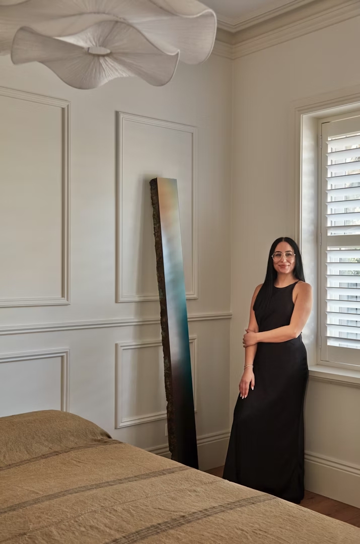
SJB project architect Katherine Luu says designing for inclusivity is a paradox. “You create a space tailored for some, but risk making it exclusive to others,” she warns. “The challenge is striking that balance. Inclusivity isn’t about having one perfect answer; it’s about creating an environment where children have agency – where they can choose spaces that make them feel safe and comfortable.”

Designing beyond categories
In the world of early learning design, true inclusivity is a rare achievement. It asks architects to move beyond checklists and codes, to consider how space might hold difference without compromise. For Luu, this tension shaped the project’s central challenge – not to design for one type of child, but to design for all of them.
The solution wasn’t a singular answer, but rather a multitude of possibilities. From there, the design of the centre became a landscape of choice, offering pathways rather than prescriptions. “It’s about agency,” Luu explains. “Design a space that offers choice. There’s no one right answer – just lots of little ones.” That mindset laid the foundation for what would become a complex living design, sensitive to every unspoken need. In a space where agency matters, how those choices are made becomes everything.
Shaping agency through space
Luu’s approach to ‘spaces within spaces’ is subtle yet powerful. “When an individual is oversaturated or uncomfortable, it’s important to allow them agency to move themselves into a different space,” she says. While adults can name these feelings, children, particularly those with sensory sensitivities, need environments that anticipate their needs.

Classrooms feature discreet nooks – barely a metre wide – offering sanctuary without the feeling of isolation. “We built little locks, hidden activity bowls, mirrors, whiteboards and Velcro boards. It’s a beautiful, nurturing experience,” Luu shares. These spaces reframe the notion of withdrawal, transforming it from exclusion into something ordinary, even celebrated. “It allows them to retain dignity, to stay in control of their space and emotions,” she says.
This is more than for the individual, it’s cultural. Peers witness these quiet departures, and soon the act of seeking calm becomes as routine as choosing a book or picking up a paintbrush. It’s here the building speaks, not through instructions, but through texture, colour and light.
The psychology of cues
Luu and her team harnessed subtle design languages to make the environment legible and safe for users. “It’s about providing consistent rules that aren’t verbal,” she says. Visual cues replace commands. Soft secondary colours take the place of harsh primaries, reducing sensory overload while offering clarity.

The joinery reads like a gentle invitation. “When there’s a certain shape or colour, it’s an invitation. It’s a subtle way of saying, ‘Come in – this is yours,’” Luu explains. Everything is designed to be read by a child before it’s understood by an adult, from the warm timber, real materials and consistent bathroom layouts. Even in the outdoor spaces and sightlines are carefully arranged to allow children to spot their classroom, offering a quiet, constant sense of place. Yet designing for children comes with its own peculiarities, because sometimes, what they ask for isn’t what they need.
Designing without direct feedback
Ask a child what they want and they’ll tell you about slides and trees, not about calm, safety or sensory refuge. “Sometimes what’s best for them isn’t what they’re drawn to,” Luu says. That tension means good design must translate what children cannot articulate.

Rather than guessing, the team collaborated closely with educators, therapists and families. “You have to rely on the expertise of others,” Luu admits. Even then, advice evolved. Early feedback from Autism Queensland recommended separate therapy spaces. Later, that guidance reversed. “Removing a child created a stigma. They should stay, not be pulled aside.”
The design responded, pivoting without losing its essence. Spaces became adaptable, able to hold shifting views without betraying the project’s integrity. Inclusivity here isn’t static. It lives, breathes and listens. While the centre belongs to the children, it still holds space for others.
Spaces that serve all
Care doesn’t belong to one group alone. With that in mind, Luu made certain the centre included space for the people supporting these children every day. “It’s not just for kids in wheelchairs or those who are sensory sensitive,” she says. “It’s also for educators.”
Furniture heights cater to both standing and seated adults. Circulation spaces accommodate mobility aids. Staff areas are warm versus institutional. “It was really important to show that inclusivity doesn’t come at a cost,” Luu explains.

This clarity of purpose shapes the way adults work and care within the space. It transforms what might otherwise be seen as extras into essentials. In Luu’s world, good design is mutual. “The centre uplifts, not just functions,” she says. “It respects the labour of care, offering environments that soften stress and hold dignity.” Crucially, this inclusivity and rigour haven’t dulled the beauty. It’s sharpened it.
Beauty without compromise
Too often, accessibility is associated with sterility, as though practicality can’t be beautiful. Luu reflects that view. “Accessibility can sometimes scream sterile,” she says. “That’s not the case here.”
The centre is filled with light, timber, layered colours and deliberate textures. “When you go in, it’s so wonderful and amazing,” Luu adds. “As soon as you start to unpack the details, people are amazed. In this project, we treated beauty as a mission, not a sacrifice.”

Every restriction, every challenge, was embraced as a creative force. “Good designers take a challenge, break it apart and make it the primary function,” Luu says. “Here, inclusivity is not an afterthought but the soul of the space – reshaping what Australian education can hold and who it can hold it for.”
Images by Cieran Murphy
Learn more about inclusivity design for children on ADR.
You Might also Like
Related Stories
© Niche Media 2026