

Two minds, one colour language: the Chromatic Alphabet comes to Melbourne
Two minds, one colour language: the Chromatic Alphabet comes to Melbourne

Share
As Paola Lenti collects Italy’s highest design honour, sister and CEO Anna Lenti touches down in Melbourne to unpack the philosophy behind the brand’s 44 colour families.
When Paola Lenti accepted the XXIX Compasso d’Oro Career Award at Milan’s ADI Design Museum in May, she made a point of sharing the credit, telling the audience the recognition belonged equally to her sister and long-time business partner, Anna. It is a sentiment that captures something essential about how the eponymous Italian brand has grown from a small craft workshop in 1994 to a global name in indoor and outdoor furniture, and it is on full display at de de ce’s Melbourne showroom, where Anna Lenti hosted a hands-on workshop on 7 July introducing the Australian design community to the brand’s Chromatic Alphabet.
Having spent decades as a… wait for it… nuclear engineer before joining the family business in 2000, Anna Lenti brings a different sensibility to the partnership than her sister, who trained in graphic and fashion set design. “To be an engineer is to think in a certain way, to organise, to do things in a way that can be applied to a lot of different kinds of activity,” she says. Rather than positioning that background as a departure from creative work, Anna describes it as the necessary counterweight to Paola’s instinct for colour and material. “In our company it’s always a combination of some order that I try to instil into everything and the great creativity of my sister.”
An alphabet 30 years in the making
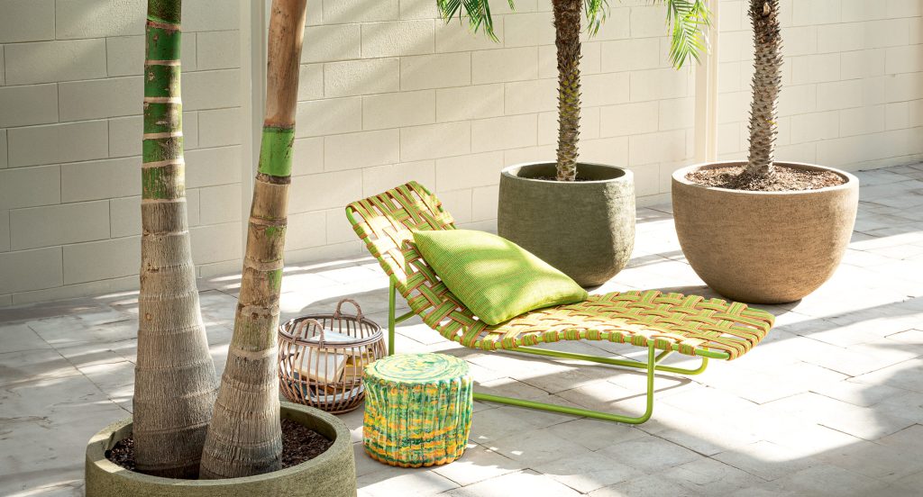
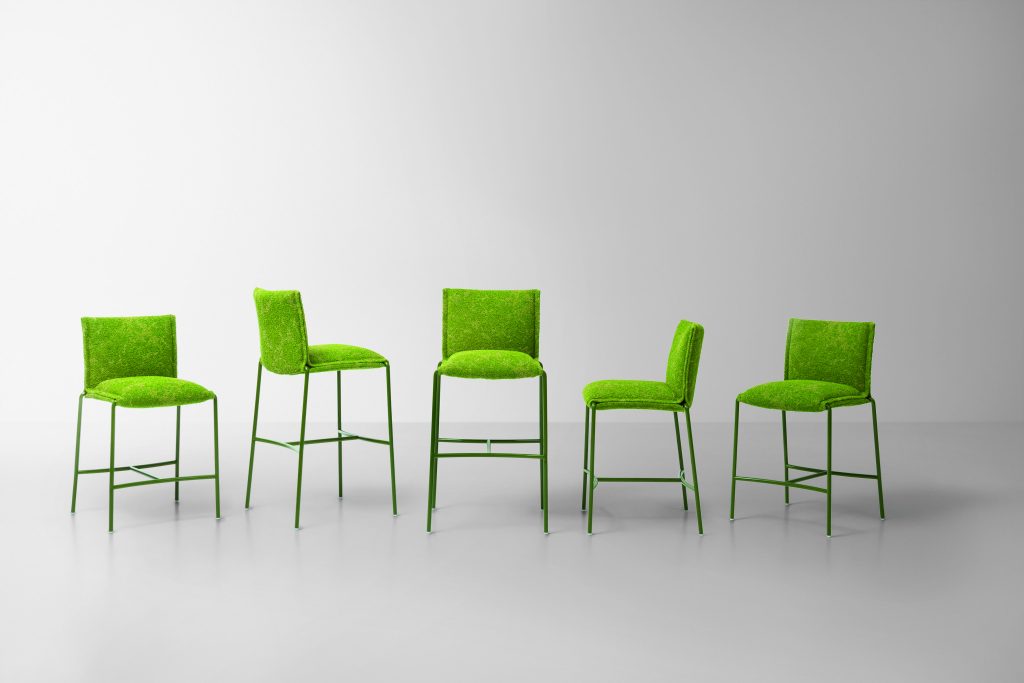
Spanning fabrics, ropes, ceramics and tiles, the Chromatic Alphabet organises more than three decades of Paola Lenti’s material research into 44 distinct colour families, each one threading consistently across every surface and texture the brand produces. Anna says the system emerged from a practical problem, not a grand design brief. “What’s easy for us to put together in our own way is not as easy for people outside the company,” she says, describing how mood boards eventually gave way to a more rigorous structure. “Step by step, every time we introduce a new colour or material, we try to place it within one of the existing families or, if it doesn’t fit, we build a new one.”
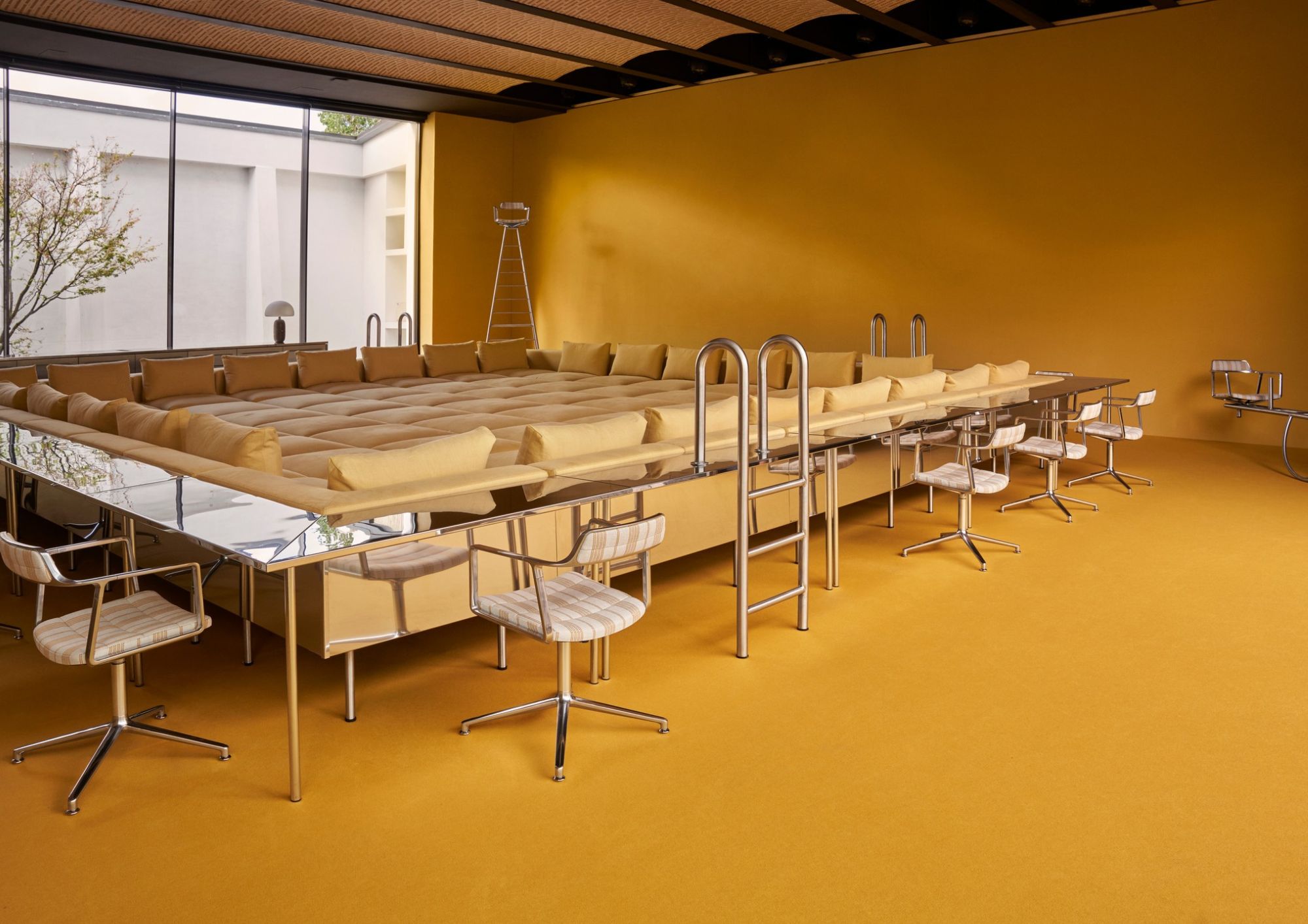
Unveiled during Milan Design Week earlier this year, the Alphabet made its Australian debut at de de ce Melbourne, where visitors could see the concept applied directly to products. Pieces on display included the sculptural Bambou seating collection, the richly textured Telar armchair, and the sunbeds and loungers from the Baleari range, alongside a rotation of the brand’s outdoor rugs, each demonstrating how a single colour family carries through completely different materials and constructions without ever feeling repetitive.

Asked how that consistency survives contact with industrial-scale production, Anna points to the human hands still involved at every stage. “We can’t really say it’s an industrial collection, but, because the company has grown, we now have to look into a production that is industrial, but where the human element is still very important.”
She notes that variation between individual rugs and furniture pieces is intentional rather than a flaw to be engineered out. “It’s always a compromise, but always in the direction [of being] unique, to create a unique product.”
Sustainability as a material discipline
Importantly, Anna is quick to separate the brand’s sustainability commitments, which include ocean-bound plastics and recycled textile offcuts, from its colour development. “This is not really constrained by colour. The colour selection is more constrained in material selection,” she says, explaining that outdoor performance requirements often rule out otherwise appealing options.
“Many times we have made a decision that probably is not in the direction of what the market wants. Clients sometimes want fabric that is completely waterproof, but to be waterproof most of the time you have to combine different materials together, and this is not sustainable, because at the end of the life you cannot recycle the material,” she says.
The company’s position, she adds, is consistent: “The decision of the company is always in the sustainability direction, not in the easiest way.”
The relationship between the sisters remains, in Anna’s words, an “essential fellowship” built on never shutting down Paola’s ideas outright. “What I never do is try to stop creativity, because creativity has to be free,” she says. “To say ‘no way’ is something that is not in our DNA. We say we haven’t learned yet how to do it, but we always try to find the solution.”

Reflecting on what draws her back to Australia year after year, Anna points to a shared sensibility around outdoor living. “The people in Australia enjoy and live outside, and our collection is moving in this direction,” she says. “We have tried to create some sort of combination between images from the colour of Australia and our colour, and you see how they match up perfectly.”
Photography by Sergio Chimenti.
You Might also Like

Related Stories

© Niche Media 2026