Elevating spaces: Downside Up house
Elevating spaces: Downside Up house
Share
Architect Weian Lim shares insight into Downside Up house, an exercise in designing ‘big home features’ on a small footprint.
AR: How did the Downside Up house project come to you and how did it evolve?
Weian Lim: The owner of the house is a builder with whom I have a prior working relationship. He had originally purchased the long-vacant property with the intention of giving the house a simple cosmetic facelift to add to his investment portfolio. He contacted our studio to get a second opinion and, after a couple of conversations about the site’s potential, it became apparent that something more exciting could be realised in this place.
What were the existing conditions?
The house is located on a corner allotment that is pinched in by the main street (Richardson Street) and a laneway (Little Greig Street), which gives it its irregular, triangular ‘pizza’ shape that tapers towards the rear. The south side of the house is backed up against a double- storey neighbour; its two-storey red-brick wall runs almost the entire length of the subject site.
The original house was a double-fronted weatherboard Victorian in a near dilapidated state. As a classified ‘Significant Heritage Place’, many of the house’s external finishes and internal appurtenances had been left untouched for many years. The multiple lean-tos towards the rear of the site are not unusual for this era’s typology – these tacked-on structures are prone to adaptation in response to functional requirements and this is evident in the varying heights and roof pitches that indirectly reflect the physical constraints forced upon them by the site’s irregular geometry.
There were signs of rudimentary renovation attempts by previous owners, such as replacing the flooring in the living and kitchen areas with vinyl tiles, and erecting a new outhouse structure tacked on behind the laundry. But, by and large, the original house remained untouched and was in need of love.
Tell us about the brief and what it involved.
The brief started off with the basic functional premise of maintaining a three-bedroom house at the very minimum, and making use of the neighbour’s double-height boundary wall to introduce a second storey volume to the rear of the property.
In contrast to the convoluted and dimly lit layout of the original house, the new extension had to be well lit, feel larger than it is (despite its small footprint) and ultimately marry in seamlessly with the front Heritage building.
Our client understood the challenges and constraints the site presented and was open to creative ways in crafting a design solution. We were given a very wide berth throughout the design process to pitch any and all ideas to the client, all the while mindful that no compromises could be made to abundance of light, affordance of space and quality of workmanship.
What was the inspiration for this project?
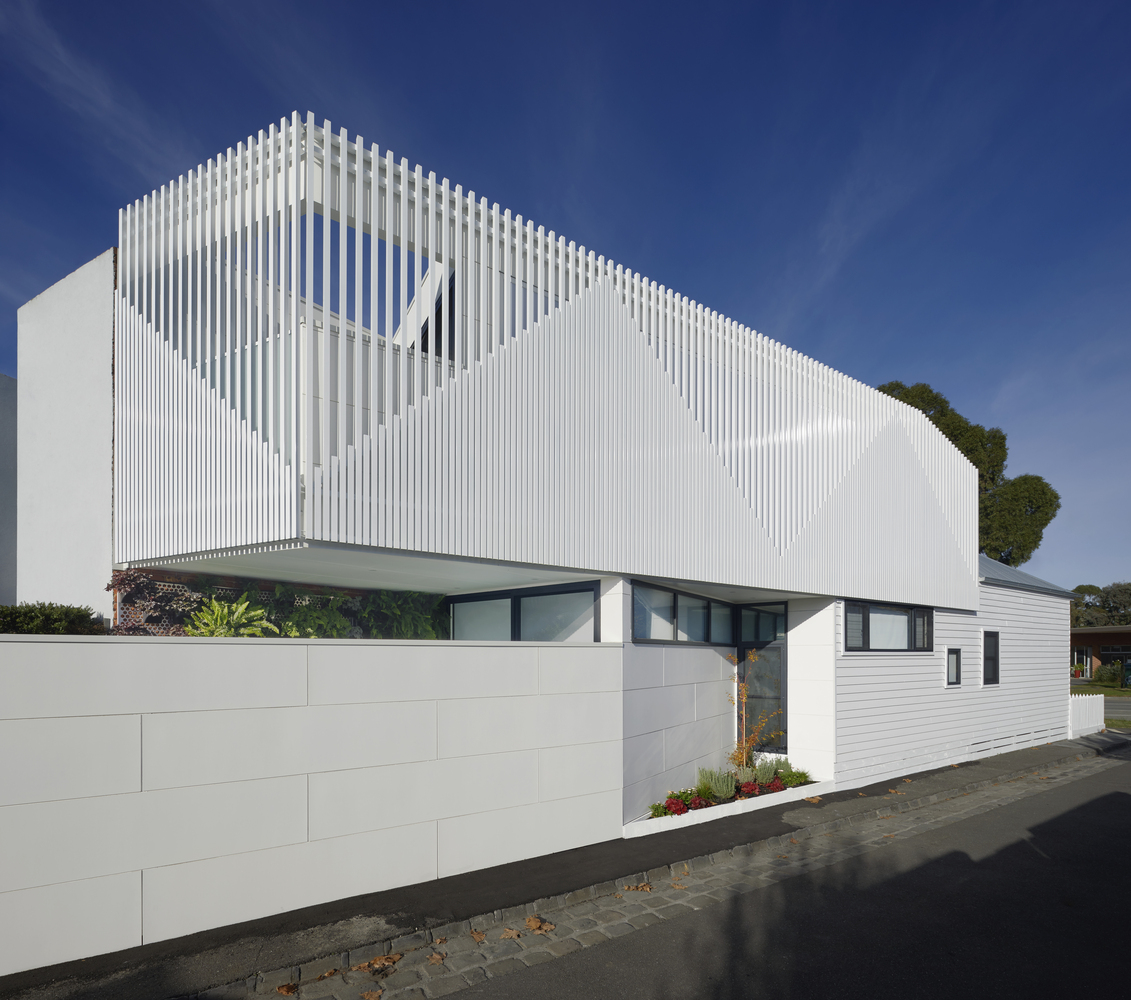
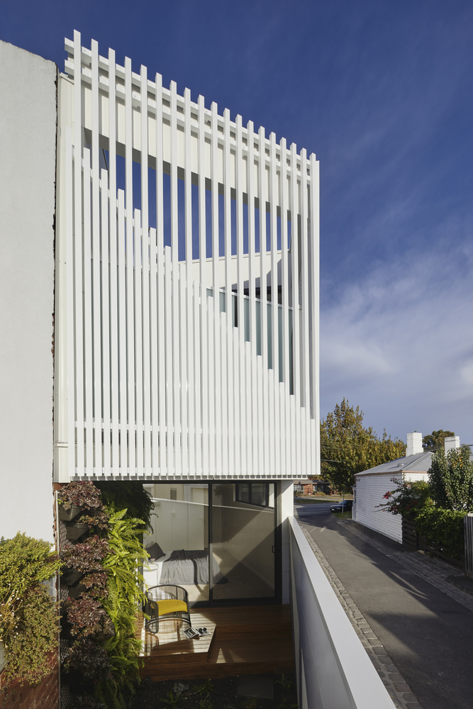
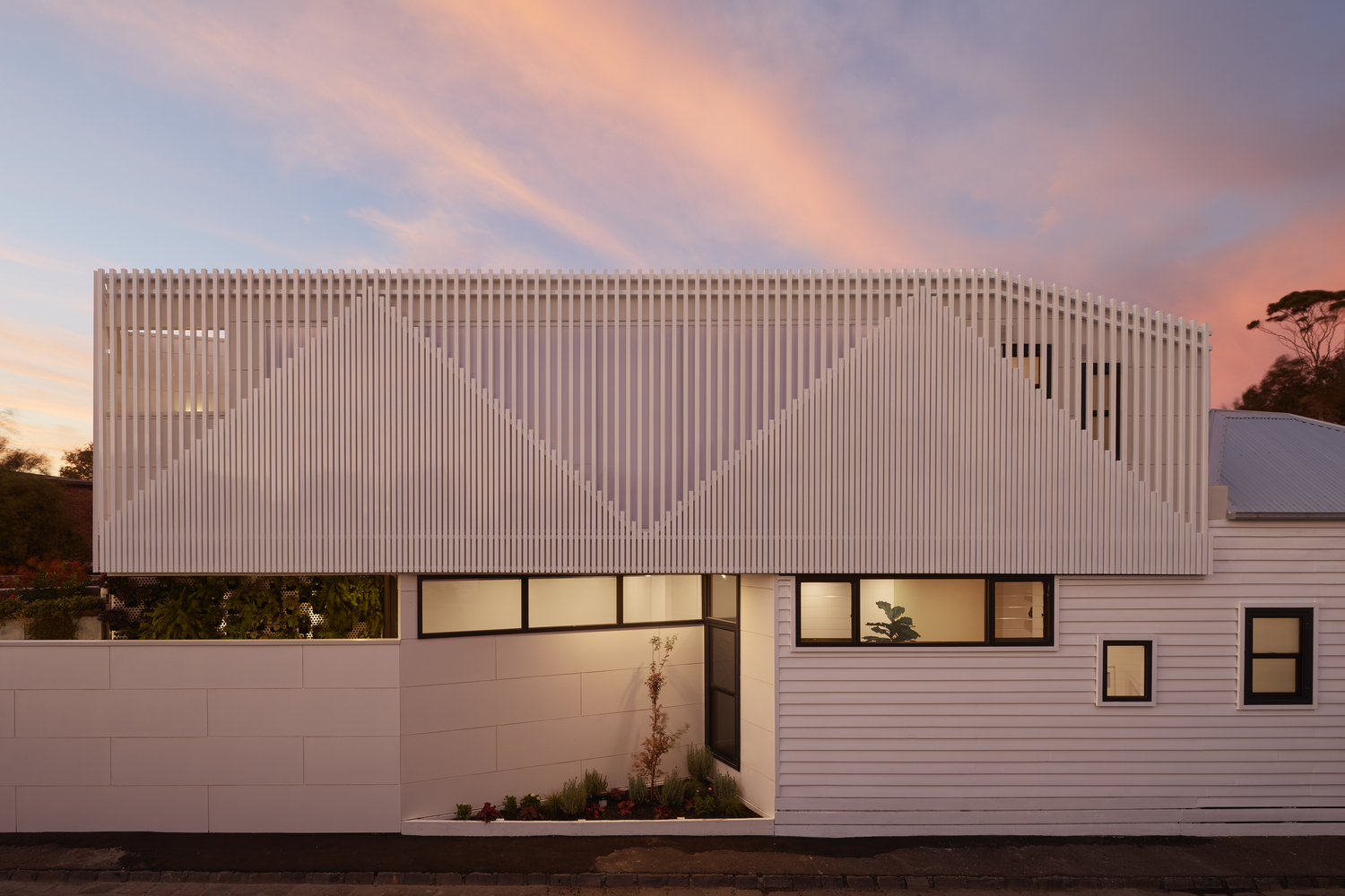
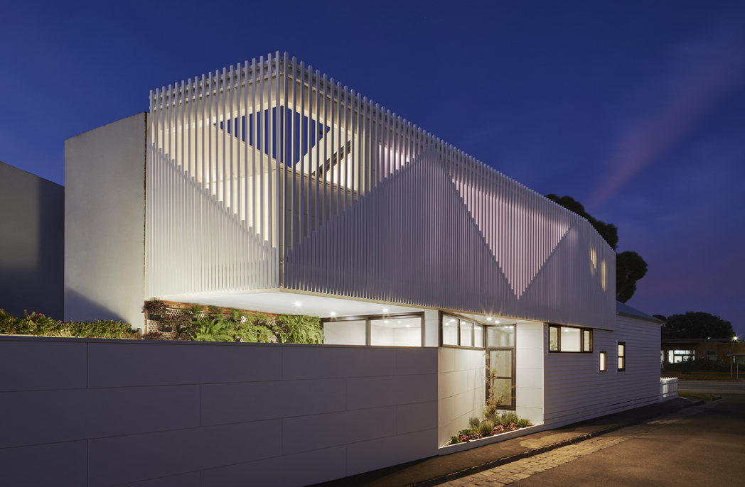
The façade treatment and articulation of the new addition drew inspiration from the previous forms of the old lean-tos. The new façade celebrates the classic pitched roofs of old Victorians in the neighbourhood by referencing these triangular shapes in the upper floor’s external batten screen. This batten screen not only presents a clear external graphic to the laneway, but also protects privacy by shielding views into the neighbour’s gardens. A full-height, clear polycarbonate wall on the internal face of the upstairs living spaces still allows for northerly light into the rooms. During the day, soft daylight illuminates the elevated living spaces and, when the sun sets, these spaces become lanterns under the night sky.
How did you make your material choices?
We wanted the new building design to be contemporary, but still be able to complement the existing weatherboard structure. A strong colour palette of whites was employed to elevate the visual impact the house has along the street and laneway, and give it a crisp and clean look that the original building was in desperate need of. Even though we were adding a lot more building, it still needed to feel light and bright. And nowhere else is that more evident than in the moment you walk through the front door and face a full-height sashless window at the end of the hallway to lead your eye to an outdoor garden and beyond.
The polycarbonate wall plays a part in bringing more light into the belly of the home. Rather than succumbing to a traditional solid wall punctuated with windows, we designed this PC wall to literally be a ‘wall of light’ and emanate diffused daylight uniformly into the main living zones.
In working with neutral tones, the selection of external and internal finishes became more vital in order to introduce texture via different building materials. New insertions such as windows and glazed sliders are framed in aluminium to contrast against the double-sash, timber- framed windows of the old house. In extending this choice of material, the batten privacy screen comprises aluminium extrusions to achieve a machine-grade uniformity that juxtaposes wonderfully against the hand-laid weatherboard cladding of old. A cement composite sheet panel product was used for the new boundary fence, arranged in a stretcher-bond pattern to add to the collection of geometries along the laneway elevation.
How involved was the client throughout the design process?
As the homeowner was the builder, the line between builder and client was very fluid, which resulted in a collaborative process from day dot. A lot of trust was placed in us to fulfil the brief and then some. There was no preconceived notion from either party of what the final house should look like, so there was implicit trust in the design process and the result is a house that is responsive to its immediate context and highlights the best attributes of the site.
Were there any specific requests or things you had to take into account during the design process?
One of the other stipulations in the brief was to rescue the front of the house, which was in a severe state of disrepair. We worked closely with the local council and its Heritage adviser to achieve a design outcome whereby the new addition can be undoubtedly contemporary and distinguishable without diminishing the significance and character of the Heritage building. Part of the new addition’s building volume is moulded by the regulatory Heritage guidelines of the area, particularly sightlines from the street. Much time and care was spent during the design process to find the right balance of geometries to ensure that the Heritage building still maintains its presence when viewed from the main street, but turn the corner into the laneway and the new addition has its moment to shine.
We worked very hard from the outset to ensure we were not wasteful in apportioning space where space is a premium. This is evident in the final layout, which remained faithful to the original schematic design drawings. This meant we were tussling and fussing over millimetres to make sure the proportions of every single room were just right.
What environmental considerations are there in the design?
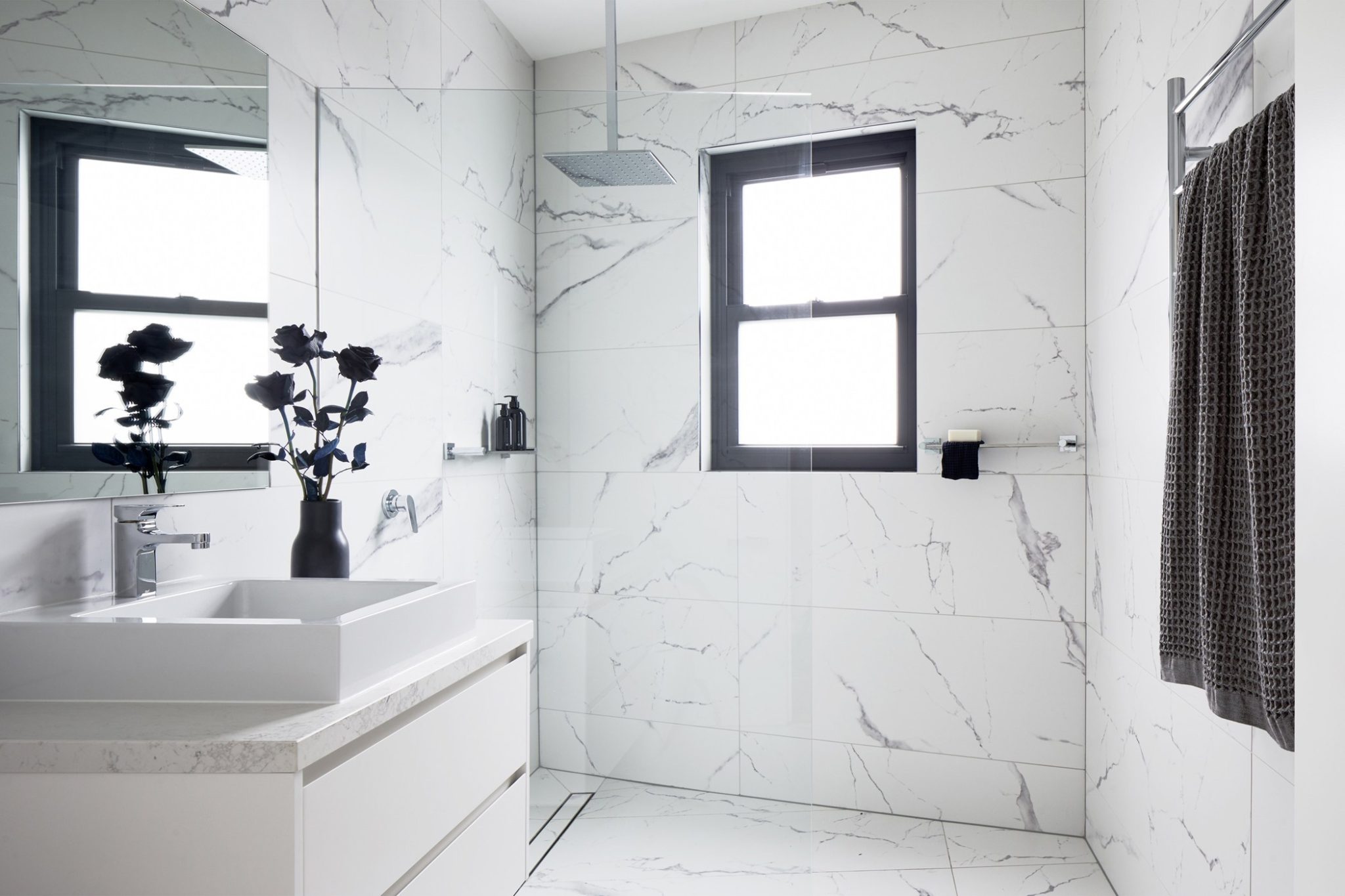
The house was designed with good passive design fundamentals in mind. The main living spaces are elevated and face good solar orientation to the north. Inherent sun shading is addressed partly from the batten screen, as well as from the light diffuser insulation in between the polycarbonate sheets. A high level of thermal insulation is also achieved with this cavity insulation.
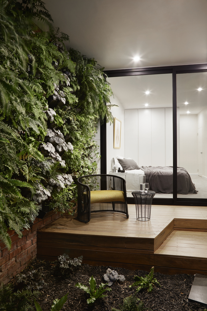
Vertical gardens in the front verandah and rear yard are positioned to face north. At ground floor level, windows are located to promote natural cross-ventilation on a warm day. Highlight louvre windows in the master bedroom allow for passive heating and cooling. All new glazing and skylights are double-glazed for thermal efficiency.
What were the biggest challenges and how were they resolved?
The shape and size of the site were always the primary constraints that the architecture had to work with. We knew that a typical ‘rear-ground- level-extension-facing-a-backyard’ treatment was impractical for this house, so we subverted the status quo by promoting the living spaces upstairs and having all bedrooms organised at ground level. This allows us to borrow inherent privacy and security afforded by a new boundary wall facing the laneway, and have the bedrooms feel sheltered. Upstairs, the living spaces now sit above the neighbouring roofline and are able to open towards uninterrupted views and daylight.
What is your favourite element of Downside Up House?
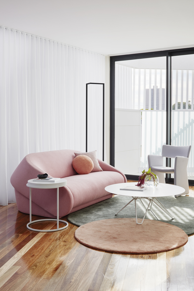
Our favourite space is the upstairs open living area with the end-to-end polycarbonate wall. The room is bathed in a constant soft glow that negates the need for artificial lighting throughout the day.
There is so much variance in light and shade coming through the polycarbonate, and when the sun hits the wall just right, the triangular shades of the batten screen beyond reveal themselves to add another narrative layer to the space.
How do you feel about the completed project?
It has been a reassuring experience that our client was able to recognise the value an architect can bring to a project, aside from the perfunctory and necessary.
We are grateful to our client for having put so much trust in us as designers and to be able to repay that faith by exceeding his expectation of what this house could be. We are also thankful that we had this opportunity to test out ideas and keep a dialogue going with the homeowner to receive any post-occupancy feedback.
Photography by Tatjana Plitt
This article originally appeared in AR159 – available online and digitally through Zinio.

