
Something old, something new with Studio Kate
Something old, something new with Studio Kate
Share
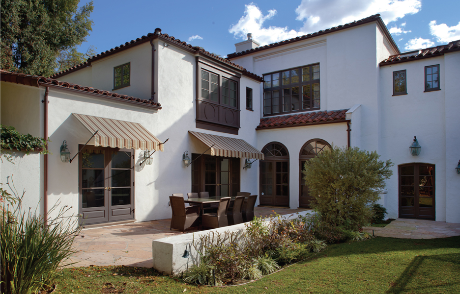
Set on a leafy street in Rushcutters Bay, Studio Kate and its retail offering, Casa by Kate Nixon, feel like something you may wander past on a walk through Paris.
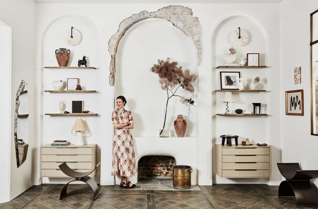
There is a clear aesthetic being conveyed by Kate Nixon that has that wicked illusion of looking easy. The palette is neutral, the forms are organic and you can purchase a curated selection in her Rushcutters Bay store, Casa by Kate Nixon. Wanting to expand the client/designer relationship beyond the intense design phase, Nixon’s store offers both curated and Kate Nixon designed interiors objects, ranging from vases and candles to rugs and soft furnishings. The pairing of studio and retail effectively offers both a foray into the immersive relationship of the design studio and a showcase of her very particular style.
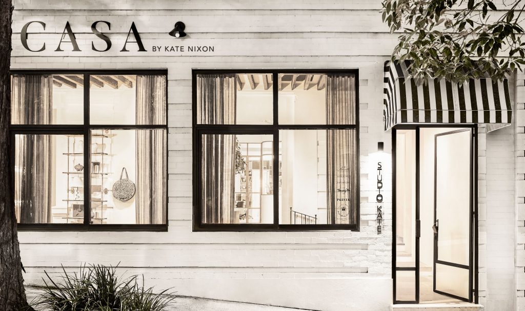
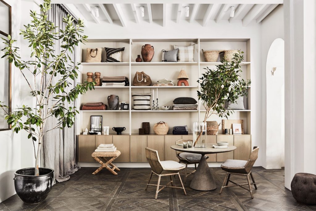
Facing the street, the retail portion is discreetly realised as an architectural equivalent of a fine line drawing with black steel framed windows set into the neutral façade. A simple black and white striped canopy compounds the graphic nature of the design. As does the view into the store, which continues the black on neutral theme. Within, the experience is anything but stark; rather, it is a discovery of nuanced textures and tones of brass, stone and timber with a reclaimed parquetry floor lending warmth throughout.
Having been built around 1880 and reinterpreted many times since, including the most recent iteration as a gym, the building interior of about 120 square metres, was all but invisible. Removing two false ceilings, Nixon found ceiling heights to 4.2 metres, plaster detailing and myriad architectural quirks. She discovered, for example, the front portion of the interior had once been the exterior wall, all of which she has embraced and highlighted as part of the new design. “We kept all the beautiful bevelled insets and original arches from the front of what would have been the original exterior of the building: that was a really cool discovery,” says Nixon. Great pains were taken to reclaim a section of vaulted ceiling, but too many years of having plumbing punched through the brickwork made it unsafe to retain. Instead, Nixon remade the arch in Italian terracotta to highlight the materiality of the area as a new design element.
The internal shift from retail floor to studio, while not predicated on existing architecture, uses the architectural style of an Art Deco storefront to continue the story. Set behind aged brass-framed windows and curved fluted glass the studio, while physically separated, has visual continuance. Moreover, a material shift from parquetry to terrazzo and an inset brass ‘K’ subtly add definition without truncation. Conversely, boundaries are blurred, with client meetings often held within the retail space. “We wanted to feel connected, but we also wanted to try to create some separation for privacy and noise between the two spaces,” says Nixon. From an aesthetic perspective the Studio is sleeker, with design detailing used to conceal technology and the accoutrement of work. Desks are clear and well considered to occupy a tight space without feeling cramped.
It is also a studio designed for her own particular use with desk space for a flexible and growing staff. Small things like hand shower attachments for taps to fill the large vases, and a rail for bags and coats, are woven into the design. The bathroom is particularly delightful with a carved washstand and floors made from the stone offcuts from the rest of the fitout. Fluted glass and brass detailing marry back to the retail/studio transition, while a CNC perforated sheet of oak has been used to create a really beautiful face for what is ostensibly the lockers.
The kitchen, which occupies a minute corner space in the interstitial area between studio proper and retail, performs beautifully as the visual marriage point. Rather than forgo the large borders of European design to accommodate standard appliances and storage, Nixon has designed a layout of essential precision that fits around her ideal. “I really wanted to give it those divisions that have a Mediterranean look in the kitchen with these big divides. But that, of course, was losing space, and because that was just purely aesthetic, everyone was fighting for the practical side. It was lots of calculating, lots of figuring out,” says Nixon. To her credit, she got her way and there is absolutely no compromise with a full complement of appliances concealed beautifully.
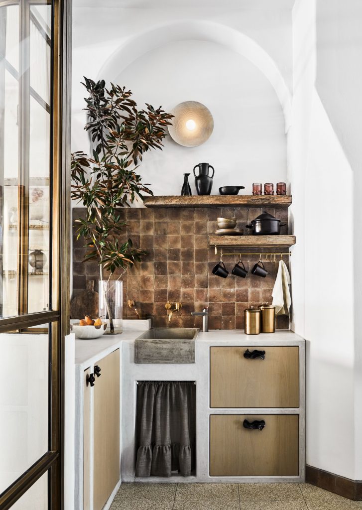
A curtained section softens the whole (and aerates the pipes), while concealed and very clever storage, (remember those vertical slots in caravans for tea towels?) has allowed the alcove space above the sink to remain uncluttered. “It’s one of my favourite walls in that space because it’s got this incredible bevel and the angled wall, which I love. I’ve never seen that created in modern architecture, so, I really wanted to celebrate that aspect.”
This thinking has been continued throughout the Casa with loose elements all occupying the lower third, while original architectural detailing occupies the upper third with introduced ceiling details such as beams the vaulted ceiling. Ephemeral elements, such as plants and organic arrangements of flowers and branches, act as transparent connective devices to marry the whole. Display cabinets are simple and essentially act as a holding zone for objects moved into tableaus throughout the store.
As the interiors editor of Australian House and Garden magazine and a stylist of calibre, her market is to some degree assured. What this fails to convey, however, is a tenacity of design acumen that leaves a lot of qualified interior designers in the dust. Arguably, her skill lies in the fact that she has never capitulated when told she can’t do something. The solid stone pendent hanging in the powder room, for example, was, at 42 kilograms, a piece team said could not happen. “I got told it couldn’t be done, which I hate being told. And then we worked out a way,” says Nixon, who had the ceiling reinforced and is delighted with the outcome. Moreover, she is a smart businesswoman, and most usually referring to herself as the director, has staffed her enterprise with interior architects and architects of considerable skill.
Photography by Maree Homer.
This article originally appeared in inside magazine, which is on newsstands and available online now!
You Might also Like


Related Stories


© Niche Media 2024